Minimal Text Background Ideas for Social Graphics
Choose simple, readable backgrounds for social graphics with practical ideas, contrast checks, layout guidance, and export tips.

The best background for a text-led social graphic is usually quiet: a solid color, a restrained texture, a softly blurred photograph, or open space. The background should give the message room to breathe, preserve contrast at phone size, and support the tone of the post without becoming the subject.
Start with one short message, choose a background treatment that leaves a clear reading area, and inspect the finished design at the size people will actually see. Adobe’s beginner guidance recommends one clear message, hierarchy, limited type choices, and a mobile readability check (Adobe social media graphics guide). Canva similarly advises keeping background texture simple, with limited colors and an uncluttered composition (Canva background design guide).
1. Choose the background after defining the message
Write the exact words before decorating the canvas. A short announcement, quote, product benefit, or call to action can work as one visual unit. Supporting details belong in the caption or a second slide. Trying to place a headline, explanation, disclaimer, URL, and several calls to action on one graphic usually produces a crowded background and weak hierarchy.
- Write one primary sentence. Aim for a phrase that can be understood without zooming.
- Mark the important word. This receives the strongest size, weight, or color treatment.
- Reserve a reading zone. Decide where the text will sit before choosing a photo or texture.
- Pick the simplest background that fits the tone. Add complexity only when it improves meaning.
Hierarchy comes from size, weight, placement, spacing, and contrast. The viewer should know what to read first without studying the composition. Keep the number of fonts and colors limited; Adobe’s typography guidance identifies size, spacing, color, contrast, and framing as factors that affect legibility (Adobe typography guidance).
2. Six minimal background ideas
Single-color field
A single color is the most reliable starting point. Use a light field with dark type or a dark field with light type. Calm neutrals, muted brand colors, and deep tones leave the message in control. Keep the palette restrained and check the actual lightness difference rather than relying on color names such as “blue” and “yellow.”
For a series, define a small set of approved background colors and vary only one role at a time: background, primary text, and accent. This creates consistency without forcing every post to look identical.
Two-tone blocks or a simple overlay
Divide the canvas into two broad color areas, or add one translucent shape behind the text. Use related tones for a calm result or a carefully chosen contrasting pair for emphasis. The text zone should remain even; avoid a boundary running directly through a line of type.
A panel is especially useful when the rest of the composition contains a photograph or a stronger color. An opaque panel gives maximum clarity. A translucent panel preserves more of the image but must be checked over every part of the underlying content.
Subtle paper-like or geometric texture
Texture can add depth without adding a new subject. Use small marks, a limited color range, and low opacity. Fine grain, a quiet paper fiber, a sparse grid, or a few broad geometric shapes can work. Canva’s guidance describes texture as a way to create depth while keeping the composition simple.
Zoom out until the graphic is approximately phone-sized. If the texture is the first thing you notice, reduce its contrast, scale, density, or opacity. A texture should be felt before it is consciously inspected.
Softly blurred photograph
Choose a photo that contributes atmosphere and crop it so a relatively quiet region sits behind the words. Blur only enough to separate the subject from the type. A tonal overlay can make the result more consistent than heavy blur. Canva’s text-and-image guidance recommends creating space for type and using blur when detail competes with the words (Canva text and image guide).
Look for photographs with a naturally plain sky, wall, floor, or out-of-focus area. If every part of the image contains faces, high-contrast edges, or small objects, cropping alone may not create a usable text zone.
Clear text panel over an image
Place the headline on a simple rectangle, rounded rectangle, or narrow vertical panel. The panel can be solid, lightly transparent, or a gradient that fades into the image. Keep its edges away from the text and provide generous internal padding. This approach gives you a predictable reading surface while retaining the photograph’s context.
Open space as the background
Do not add decoration when the composition already has enough structure. A large area of empty color or a quiet crop can make a short quote or call to action feel deliberate. Open space also gives you room to increase type size and line spacing, which helps mobile readers.
3. Compare treatments before you commit
Use the same message on three quick variations: a solid field, a texture, and a photo or panel. Compare them using the following criteria.
| Criterion | Question to ask | Typical adjustment |
|---|---|---|
| Legibility | Can the words be read immediately at phone size? | Increase lightness difference, add a panel, or simplify. |
| Visual busyness | Does the background compete with the message? | Lower opacity, blur, crop, or remove detail. |
| Tone | Does the treatment suit the purpose and brand? | Change hue, texture character, or image subject. |
| Flexibility | Can the text move without landing on a busy area? | Choose a photo with natural quiet space or use a panel. |
| Consistency | Can this treatment work across a series? | Define reusable colors, overlays, and spacing rules. |
These criteria synthesize the contrast, hierarchy, spacing, and consistency principles in the Adobe and Canva guidance. They are a practical review method, not a published performance test.
4. Protect readability and accessibility
Contrast depends on luminance, not hue alone. Two different hues can have similar lightness and become indistinguishable for some readers. The W3C’s WCAG 2.1 explanation describes minimum contrast requirements and why luminance contrast matters (W3C contrast guidance).
- Use a clear difference between the text and the background.
- Inspect the exported file at the likely display size, not only while zoomed in.
- Increase type size and line spacing when the message must work on small screens.
- Do not communicate meaning through color alone; include words, weight, shape, or position.
- Add a solid or translucent panel when a photo remains unpredictable.
- Check the design in grayscale to reveal weak lightness separation.
- Keep a clean focal point and avoid placing type over faces, fine patterns, or high-contrast edges.
A quick phone-size check
- Export the graphic at its intended dimensions.
- Open it on a phone or reduce the preview until it is roughly the size of a feed card.
- Look away, then look back: can you identify the main message immediately?
- Ask someone else to read it without zooming.
- If reading requires effort, simplify the background before changing the wording.
5. A repeatable workflow in any design tool
- Create the canvas. Use the destination’s current export requirements, then leave breathing room around the text.
- Add the message. Establish headline, supporting line, and optional brand mark in that order.
- Build a plain version first. Test the message on a solid field before adding imagery.
- Introduce one background treatment. Try texture, photo, blocks, or open space, but keep the reading zone stable.
- Set the contrast. Adjust lightness, overlay strength, type weight, and spacing.
- Preview at phone size. Check both the feed-sized view and the full-resolution export.
- Export a lossless master. Keep an editable source file and export the platform version separately.
- Review the crop. Make sure the message survives the platform’s preview and any square or vertical crop.
Minimal HTML/CSS prototype
This self-contained example lets you compare a solid field, a texture, and a blurred image before recreating the chosen direction in your design tool. Replace the image URL with an image you are licensed to use.
<!doctype html>
<meta name="viewport" content="width=device-width,initial-scale=1">
<style>
  :root { --ink: #14202b; --paper: #f2eadb; }
  body { margin: 0; display: grid; place-items: center; min-height: 100vh; background: #ddd; }
  .card { width: min(90vw, 720px); aspect-ratio: 1 / 1; position: relative;
          display: grid; place-items: center; overflow: hidden; color: var(--ink);
          font: 700 clamp(2rem, 7vw, 4.5rem)/1.05 system-ui; text-align: center; }
  .solid { background: var(--paper); }
  .texture { background: var(--paper);
    background-image: radial-gradient(#b6a98f 0.8px, transparent 0.8px);
    background-size: 14px 14px; }
  .photo::before { content: ""; position: absolute; inset: 0;
    background: linear-gradient(90deg, rgba(255,255,255,.9), rgba(255,255,255,.35)),
      url("licensed-photo.jpg") center/cover; filter: blur(2px); transform: scale(1.04); }
  .photo span { position: relative; max-width: 75%; padding: .6em .8em;
    background: rgba(255,255,255,.82); }
</style>
<div class="card solid">One clear message</div>
<!-- Try class="texture" or class="photo" for the other treatments. -->
6. Common mistakes and fixes
| Problem | Likely cause | Fix |
|---|---|---|
| Text disappears over a photo | Detail and type occupy the same visual level. | Crop to quiet space, blur lightly, add an overlay, or use a panel. |
| Colors look attractive but unreadable | Hue differs while luminance remains similar. | Change lightness or use a stronger neutral panel. |
| Texture looks dirty after export | Marks are too dark, dense, or fine for the output size. | Reduce opacity and density; inspect the compressed export. |
| Graphic feels crowded | Too many messages, fonts, or decorative elements. | Keep one primary sentence and move detail to the caption. |
| Template feels inconsistent | Every post uses a different treatment. | Reuse a small color palette, spacing scale, and text position. |
| Type is clipped in previews | Important content sits near a crop or edge. | Move the text inward and inspect the actual preview crop. |
7. Or skip the browser setup
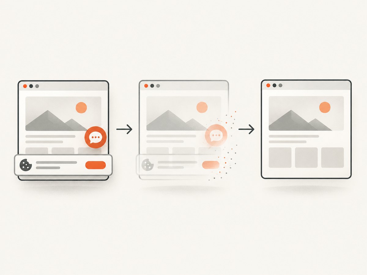
If you need screenshots of a finished social graphic, landing page, or design preview, ScreenshotNeo returns a PNG, JPEG, WebP, or PDF from one GET request. It can capture a full page or one CSS-selected element, apply custom CSS and JavaScript, emulate dark mode and device presets, wait for a selector, delay, or network idle, and resize the output. Cookie and consent banners, newsletter popups, and chat widgets are removed before capture; each step can be turned off.

Only clean shots are billed. Bot checks or CAPTCHAs, blank pages, timeouts, failed loads, and cache hits cost nothing, and the response identifies the result with X-Page-Verdict and X-Billed headers. ScreenshotNeo also provides an MCP server for AI agents with take_screenshot, get_page_info, and capture_pdf.
See the ScreenshotNeo API documentation for the complete option list. The basic request is:
curl -G "https://api.screenshotneo.com/v1/shot" -d access_key=YOUR_API_KEY --data-urlencode url=https://stripe.com -o shot.webpimport requests
r = requests.get("https://api.screenshotneo.com/v1/shot", params={"access_key": "YOUR_API_KEY", "url": "https://stripe.com"}, timeout=90)
open("shot.webp", "wb").write(r.content)const q = new URLSearchParams({ access_key: 'YOUR_API_KEY', url: 'https://stripe.com' });
const res = await fetch(`https://api.screenshotneo.com/v1/shot?${q}`);For social graphics, useful options include a custom viewport or one of 12 device presets, retina scale, transparent background, image resizing, custom CSS, hiding selectors, waiting for a selector or network idle, and caching with a TTL you choose. You can also supply headers, cookies, a user agent, Authorization, timezone, geolocation, or block selected ads, trackers, requests, and resource types. Async jobs, signed webhooks, bulk capture of up to 100 URLs per call, signed public image links, HTML/CSS-to-image, and the usage API cover larger workflows.
Capture reliability and cost notes
- Use a wait condition when fonts or images arrive after initial HTML.
- Use a fixed viewport and retina scale when comparing a series.
- Cache stable pages with a TTL to avoid repeated work; cache hits are not billed.
- Inspect
X-Page-VerdictandX-Billedwhen diagnosing a result. - For many variants, submit bulk or asynchronous jobs instead of holding one long request open.
ScreenshotNeo has 1,000 shots per month free with no card. Paid plans start at $5 for 3,000 shots; Growth is $15 for 15,000, Pro $39 for 60,000, Scale $99 for 250,000, and Business $249 for 1,000,000. Yearly billing gives two months free, and every feature is available on every plan. Create a free ScreenshotNeo account and start with the 1,000 free screenshots.
8. Troubleshooting ScreenshotNeo captures
| Symptom | Cause | Resolution |
|---|---|---|
| Blank or incomplete image | The page is still loading or blocked. | Wait for a selector or network idle; inspect the page verdict. |
| Consent dialog remains | The relevant cleanup step was disabled or the banner is unusual. | Keep consent cleanup enabled and hide the remaining selector with custom CSS. |
| Web font is missing | Capture occurred before the font request completed. | Wait for network idle or a selector whose styling depends on the font. |
| Element is clipped | The selector’s box is smaller than its content. | Capture the full page or adjust CSS dimensions and padding. |
| Unexpected dark or light result | Site theme follows the emulated preference. | Set the desired dark-mode option explicitly. |
| Request takes too long | Third-party resources or scripts delay load. | Block unnecessary resource types or trackers and add a targeted wait. |
9. FAQ
Should every text graphic use a plain background?
No. Start plain, then add texture or photography only when it supports the message and remains readable at phone size.
Is blur always better than an overlay?
No. Blur reduces detail; an overlay gives more predictable contrast. Use whichever creates the clearest reading zone with the least visual interference.
How many colors should a minimal graphic use?
There is no universal number. A small palette is easier to keep coherent; test lightness contrast rather than counting hues.
Can I put a long paragraph on the image?
Short text is usually easier to organize and read. Put supporting explanation in the caption or a follow-up slide.
When should I use a text panel?
Use one when a crop, blur, or color adjustment cannot keep the type clear across the entire text area.
Can ScreenshotNeo capture one design element?
Yes. Pass a CSS selector to capture one element, or capture the full page when you need the complete composition.


