Smart Resize: Design Once, Render Any Size
Learn how to build one flexible source design and reliably render it for social, video, websites, print, and responsive interfaces.

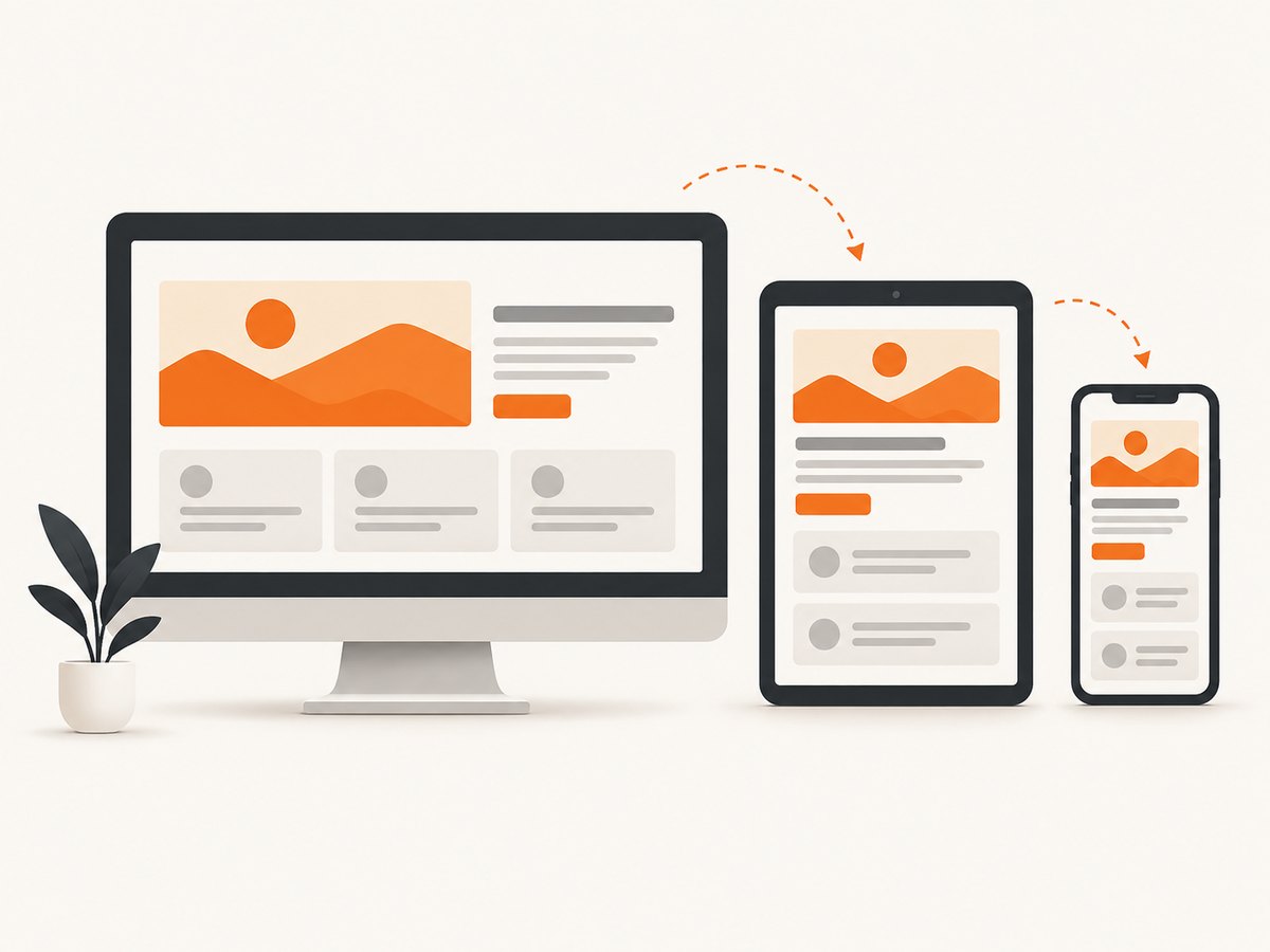
Smart resize means creating one adaptable source design and producing dependable outputs for every destination. It is not a universal stretch button. A reliable workflow combines editable layers, deliberate aspect-ratio choices, cropping, repositioning, responsive constraints, and—when pixels are missing—controlled canvas expansion.
The direct answer to “How do I resize one design for every platform?” is:
- Keep the subject, background, and text editable or separable.
- List the real output ratios before editing.
- Choose crop and repositioning when the existing pixels cover the target.
- Use generative expansion only when you need additional canvas.
- Use responsive constraints and Auto Layout for interfaces instead of stretching screenshots or bitmap exports.
- Set minimum and maximum bounds, then inspect every generated output for hierarchy, artifacts, and brand consistency.
What smart resize actually changes
A resize can change more than width and height. It may change the crop, the location of the focal subject, the amount of negative space, line wrapping, button placement, and the balance between image and text. Treating all of those changes as a single scale operation is why many “responsive” graphics look broken.
| Situation | Best transformation | Main risk |
|---|---|---|
| The target ratio is close and all important pixels exist | Crop and reposition | Cutting off the subject or text |
| The target is wider or taller than the source | Expand the canvas, then review generated areas | Edges, repeated patterns, or objects that do not match |
| An interface must adapt to content | Constraints, responsive rules, and Auto Layout | Unreadable type or components collapsing |
| A public web image needs multiple deliveries | Export deliberate variants and use responsive image markup | Large files, slow loading, or the wrong crop |
Start with a flexible source design
Separate the main subject from the background and keep text editable. Adobe instructor Rob de Winter describes the reason clearly: “Separating your subject gives you full control over layout and layering.” A flattened bitmap makes every later ratio change a destructive edit.

Use a source file that can move
- Put the focal subject on its own layer or frame.
- Keep logos and icons as vectors where possible.
- Keep headlines and labels as editable text.
- Use a background that can be extended or safely cropped.
- Mark a safe area around faces, products, and important text.
- Record the intended focal point so another editor can reproduce the crop.
Do not design only for the first export. A source file is successful when it can produce a wide thumbnail, a vertical story, a square card, and a responsive web asset without rebuilding the composition.
Define output ratios before editing
Write down every actual destination. Common examples include 16:9 for wide video and banners, 9:16 for vertical video and stories, 4:5 for social feeds, 1:1 for square cards, 4:3 for presentations, and 3:4 for portrait layouts. Adobe Firefly’s documented presets include 1:1, 4:3, 16:9, and 3:4; Adobe tutorials also demonstrate 16:9, 9:16, and 4:5 workflows.
| Ratio | Typical use | Planning question |
|---|---|---|
| 16:9 | Video thumbnails, presentations, hero banners | Can the subject remain visible with extra horizontal space? |
| 9:16 | Stories, vertical video, mobile-first creative | Does the focal point still work when the sides disappear? |
| 4:5 | Portrait social feed posts | Can the headline stay readable above the fold? |
| 1:1 | Square cards and avatars | Does the composition survive equal width and height? |
| 4:3 | Slides and older display formats | Is the additional vertical space useful or empty? |
| 3:4 | Portrait print and editorial layouts | Can the hierarchy support a taller reading path? |
Choose crop, reflow, or canvas expansion
Crop and reposition an image
Use cropping when the source already contains enough pixels. Move the subject toward the safe area, protect faces and product edges, and choose the crop deliberately for each ratio. A different crop is often more faithful than inventing new surroundings.
Expand the canvas when pixels are missing
Photoshop Generative Expand and Firefly Expand can add canvas and generate surrounding content that matches the image. Use this when a wide banner needs more background or a portrait version needs additional space above and below. Generate variations, select the most coherent result, and retouch visible seams.
Inspect hands, faces, product edges, repeated textures, signs, and any newly generated text-like areas. Generated surroundings can be plausible at a glance while still failing close review.
Reflow an interface instead of stretching it
For UI work, the correct model is responsive layout. Figma states that Auto Layout lets frames respond dynamically to content changes and makes designs responsive and adaptable. Define direction, spacing, padding, alignment, and wrapping rules so components rearrange when text or viewport size changes.
Use bounds to protect hierarchy
Set minimum and maximum dimensions for logos, buttons, text blocks, cards, and media. Figma’s resizing guidance recommends bounds so objects do not collapse too small or grow beyond usable limits.
- Give logos a minimum readable width.
- Give body text a maximum line length.
- Set buttons to fit their label with stable padding.
- Allow cards to grow until the layout reaches its maximum width.
- Define image aspect ratios so media does not distort while loading.
- Keep a minimum gap between the focal subject and the canvas edge.
A layout can technically fit and still fail. Check type hierarchy, contrast, tap targets, and reading order at the smallest and largest supported sizes.
A practical responsive image implementation
For a website, export deliberate variants rather than asking the browser to download one enormous image and shrink it. The following example uses a responsive picture element with art-directed crops.
<picture>
  <source media="(max-width: 600px)" srcset="hero-portrait.webp">
  <source media="(max-width: 1000px)" srcset="hero-square.webp">
  <img
    src="hero-wide.webp"
    alt="Product dashboard on a laptop"
    width="1600"
    height="900"
    loading="eager"
    decoding="async"
  >
</picture>
The three files should be composed intentionally, not produced by blindly scaling the wide original. Include intrinsic dimensions to reduce layout shift, use modern formats where supported, and verify that the chosen crop keeps the subject and text in view.
Automate checks with a small JavaScript model
You can represent destination rules as data and use them in an export script or build process. This does not replace visual review; it makes the required variants explicit.
const targets = [
  { name: 'wide', width: 1600, height: 900, focalX: 0.5, focalY: 0.5 },
  { name: 'square', width: 1200, height: 1200, focalX: 0.5, focalY: 0.45 },
  { name: 'portrait', width: 1080, height: 1350, focalX: 0.5, focalY: 0.4 },
  { name: 'vertical', width: 1080, height: 1920, focalX: 0.5, focalY: 0.35 }
];

for (const target of targets) {
  console.log(`${target.name}: ${target.width}x${target.height}`);
  // Pass these values to your image tool or design export step.
}
Or skip the browser setup
If your goal is to produce screenshots of responsive pages at many viewport sizes, ScreenshotNeo can render the page for you. One GET request returns a PNG, JPEG, WebP, or PDF. The API supports any viewport, 12 device presets, retina scale, full-page capture with lazy images loaded, one-element capture by CSS selector, dark mode, custom CSS and JavaScript, and image resizing. See the ScreenshotNeo documentation for the complete option set.
curl -G "https://api.screenshotneo.com/v1/shot" -d access_key=YOUR_API_KEY --data-urlencode url=https://stripe.com -o shot.webpimport requests
r = requests.get("https://api.screenshotneo.com/v1/shot", params={"access_key": "YOUR_API_KEY", "url": "https://stripe.com"}, timeout=90)
open("shot.webp", "wb").write(r.content)const q = new URLSearchParams({ access_key: 'YOUR_API_KEY', url: 'https://stripe.com' });
const res = await fetch(`https://api.screenshotneo.com/v1/shot?${q}`);Cookie and consent banners, newsletter popups, and chat widgets are removed before the shot. Bot checks, blank pages, timeouts, failed loads, and cache hits are not billed; response headers identify the page verdict and whether the request was billed. You can wait for a selector, a delay, or network idle; block ads, trackers, requests, or resource types; provide headers, cookies, a user agent, Authorization, timezone, or geolocation; hide selectors; click an element; choose transparent backgrounds; cache with a TTL; create signed links; submit async jobs with signed webhooks; capture up to 100 URLs per bulk call; and inspect usage through the usage API. An MCP server provides take_screenshot, get_page_info, and capture_pdf for Claude, Cursor, and other MCP clients.
There is a free plan with 1,000 shots per month and no card. Paid plans start at $5 for 3,000 shots; yearly billing gives two months free, and every feature is available on every plan. Start with the free ScreenshotNeo account.
Review every generated size
Automation creates candidates; review creates quality. Use a repeatable checklist for every ratio.
- Subject: Is the focal object fully visible and placed intentionally?
- Type: Are headline, label, and body sizes still hierarchical?
- Edges: Are there halos, seams, warped lines, or clipped objects?
- Brand: Do colors, logo clear space, and visual tone remain consistent?
- Context: Does the image make sense in its real placement?
- Delivery: Is the file format, pixel density, and file size appropriate?
Performance, reliability, and cost
Performance
More variants increase storage and build work, so generate only the destinations you actually serve. For websites, use intrinsic dimensions, modern formats, lazy loading below the fold, and an appropriately sized source. For screenshot automation, cache stable pages with a chosen TTL and avoid waiting longer than the page requires. Network-idle waits are useful for dynamic pages but can delay pages with persistent analytics connections; a selector wait is often more deterministic.
Reliability
Keep the source file as the canonical asset and record the crop or focal point for each destination. For generative expansion, retain the selected variation and the cleanup edits. For automated screenshots, treat bot checks, blank pages, timeouts, and failed loads as explicit outcomes; ScreenshotNeo exposes page verdict and billing headers so a pipeline can decide whether to retry.
Cost
Design cost is mostly review and cleanup time. Generative expansion may require several variations and retouching. Delivery cost grows with pixel dimensions and the number of variants. ScreenshotNeo bills only clean shots; cache hits and failed or unusable captures cost nothing. Choose the smallest output that meets the destination’s quality requirement.
Troubleshooting smart resize problems
| Problem | Likely cause | Fix |
|---|---|---|
| The subject is cut off | Centered crop used for a non-centered focal point | Store a focal position per ratio and reposition before export. |
| Text becomes tiny | Whole composition was uniformly scaled | Keep text editable, reflow it, and set minimum type sizes. |
| Generated edges look artificial | Expansion crossed a repeated pattern or object boundary | Generate another variation, mask the area, or use a simpler crop. |
| UI cards collapse | No minimum width or content constraint | Add minimum and maximum bounds and test long content. |
| Page screenshots show a popup | Popup appears after the initial load | Wait for a selector or delay, then hide the popup selector before capture. |
| Screenshot is blank or incomplete | Page failed, timed out, or lazy content was not ready | Use full-page capture, wait for a selector or network idle, and inspect the page verdict header. |
| Different runs produce different generated backgrounds | Generative expansion is variable | Save an approved output and use deterministic layout rules where repeatability matters. |
FAQ
Is smart resize the same as responsive design?
No. Smart resize is the broader workflow for producing multiple outputs. Responsive design is the rule-based behavior of an interface as its available space and content change.
Should I always use generative expansion?
No. Crop and reposition when the source already covers the target. Expand only when the required canvas is missing and the surrounding content can be reviewed safely.
How many source designs should I maintain?
Keep one canonical source whenever its layers and rules can support all destinations. Create a separate source only when the message, hierarchy, or art direction fundamentally changes.
What is the fastest way to validate many responsive layouts?
Capture representative viewport sizes, compare them against the same review checklist, and automate repeatable screenshot runs. ScreenshotNeo can capture multiple URLs in one bulk call and supports device presets or custom viewports.
Can I resize a screenshot without changing the underlying page?
Yes, but that only changes the image. If you need to verify how the page reflows, capture the page at each target viewport so the browser performs the responsive layout.
Final checklist
- Canonical source has separable subject, background, and editable text.
- Every real destination and ratio is listed.
- Each output has an intentional crop, reflow rule, or expansion decision.
- Minimum and maximum bounds protect type, logos, buttons, and media.
- Exports are checked for artifacts, hierarchy, subject placement, and brand consistency.
- Web delivery uses suitable dimensions, formats, and loading behavior.
- Responsive pages are captured at representative viewports and reviewed before release.
Design once, but decide deliberately how each destination should behave. That combination of flexible source assets, explicit rules, and systematic review is what makes smart resize dependable.