The HTML Image Element: Syntax and Usage
Learn the HTML img element, from accessible alt text and responsive srcset to stable layouts, performance, security, and practical examples.
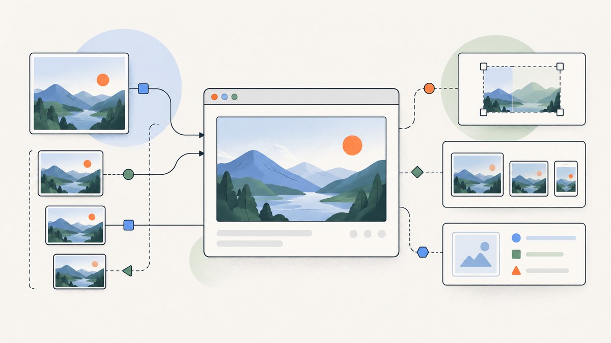
The HTML image element embeds an image with <img>. A correct baseline includes an image URL and a useful alternative text:
<img src="photo.jpg" alt="A caption describing the subject">img is a void element, so it has no closing </img> tag. At least one of src or srcset must be supplied. The alt attribute is the textual replacement for the image and is the key accessibility requirement. See MDN’s img reference and the WHATWG HTML Standard for the normative definitions.
1. The minimal, correct img element
Start with the smallest element that meets the image’s purpose:
<img src="team.jpg" alt="The support team in the office">Use an empty value for decorative artwork that adds no information:
<img src="divider.svg" alt="">Do not omit alt. For an informative image, describe the information or function rather than listing every visible detail. If the image is inside a link or button, describe the destination or action:
<a href="/account">
  <img src="avatar.jpg" alt="Open Priya's profile">
</a>
An image’s alternative is replacement content, not a tooltip or a place to repeat nearby prose. If a chart communicates values, provide those values in surrounding HTML or a linked table as well.
2. Core attributes and what each one does
| Attribute | Purpose | Practical guidance |
|---|---|---|
src |
Fallback or primary image URL. | Always provide a usable fallback, including inside picture. |
srcset |
A comma-separated list of image candidates. | Use width descriptors such as 400w, or density descriptors such as 2x; never mix descriptor types in one list. |
sizes |
Hints at the rendered slot width for a width-descriptor srcset. |
Required when width descriptors are used. Make conditions match your CSS layout. |
alt |
Textual replacement and accessibility fallback. | Use concise, purposeful wording, or alt="" for decorative images. |
width, height |
Intrinsic dimensions and aspect ratio. | Provide accurate values to reserve space before loading and reduce layout movement. |
loading |
Loading-priority hint. | Use lazy below the fold; keep critical imagery eligible for immediate loading with eager or the default. |
decoding |
Decoding preference. | async, sync, or auto; it is a hint, not a guarantee. |
crossorigin |
Controls credentials and cross-origin fetching. | Set it only when the image and the consuming API require a particular CORS mode. |
referrerpolicy |
Controls referrer information sent with the request. | Choose a policy appropriate for third-party hosts and privacy requirements. |
Intrinsic dimensions establish the aspect ratio. CSS controls the final size:
img {
  max-width: 100%;
  height: auto;
}
These attributes do not force an image to render at its intrinsic pixel size; they let the browser reserve the right shape while CSS scales it.
3. Writing useful alt text
- Identify the purpose. Ask what a person must know if the pixels are unavailable.
- Keep it concise. A short replacement is usually better than a visual inventory.
- Include visible text when it carries meaning. Do not make essential words available only inside an image.
- Describe actions for controls. “Download the invoice” is better than “arrow icon.”
- Use empty alt for decoration. This lets assistive technology skip separators and purely ornamental backgrounds.
<!-- Informative -->
<img src="revenue-chart.png" alt="Revenue grew from $20,000 in January to $32,000 in March">

<!-- Decorative -->
<img src="sparkle.svg" alt="">

<!-- Functional -->
<button type="submit">
  <img src="save.svg" alt="Save changes">
</button>
4. Responsive images with srcset and sizes
Responsive images prevent a narrow phone from downloading a needlessly large desktop file. With width descriptors, srcset lists candidates and sizes describes the slot the image will occupy. The browser combines those hints with viewport width and pixel density, while retaining discretion for user conditions such as bandwidth.
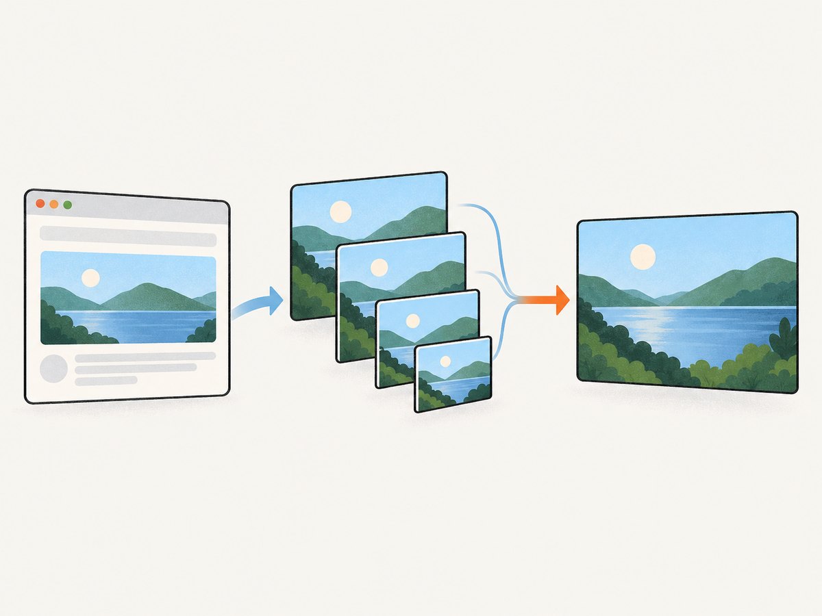
<img
  src="photo-800.jpg"
  srcset="photo-400.jpg 400w, photo-800.jpg 800w, photo-1200.jpg 1200w"
  sizes="(width <= 600px) 100vw, 800px"
  width="1200"
  height="800"
  alt="Mountain lake at sunrise">
The first matching sizes condition describes the slot width; the final value is the default. If your CSS makes the content column 640px wide, say so:
<img
  src="article-800.jpg"
  srcset="article-480.jpg 480w, article-800.jpg 800w, article-1200.jpg 1200w"
  sizes="(width <= 700px) calc(100vw - 2rem), 640px"
  width="1200"
  height="800"
  alt="A developer reviewing a code sample"></img>
The final snippet should not include a closing tag in real HTML because img is void; it is shown only to highlight the common mistake. Use:
<img
  src="article-800.jpg"
  srcset="article-480.jpg 480w, article-800.jpg 800w, article-1200.jpg 1200w"
  sizes="(width <= 700px) calc(100vw - 2rem), 640px"
  width="1200"
  height="800"
  alt="A developer reviewing a code sample">
There is no universal savings percentage: results depend on source dimensions, compression, device density, network, viewport, and browser.
5. Density switching with 1x and 2x
Use density descriptors when the same composition is available at a small number of pixel densities. The src value can act as the 1x candidate:
<img
  src="logo.png"
  srcset="logo.png 1x, logo@2x.png 2x"
  width="160"
  height="40"
  alt="Acme home">
Do not combine 1x/2x with 400w/800w in the same srcset. Choose width descriptors when the rendered slot varies substantially; choose density descriptors for a fixed-size logo or icon.
6. picture for art direction and formats
Use picture when the composition changes at a breakpoint (art direction), or when you want to offer a different format. The nested img is mandatory as the fallback and carries the alternative text:
<picture>
  <source media="(width >= 800px)" srcset="hero-wide.webp">
  <source type="image/avif" srcset="hero.avif">
  <img src="hero.jpg" width="1600" height="900" alt="Person cycling on a mountain road">
</picture>
Source elements are considered in order. If a condition or format is unsupported, the browser continues until it reaches a usable source or the fallback img. Keep the fallback accessible and complete.
7. Preventing layout shift
Reserve the image’s aspect-ratio space by supplying accurate width and height values. Then let CSS scale it:
<img src="map.jpg" width="1200" height="675" alt="Map of the trail network">If you crop into a fixed box, use CSS deliberately:
.thumbnail {
  width: 100%;
  aspect-ratio: 4 / 3;
  object-fit: cover;
}
Do not guess dimensions. Incorrect values reserve the wrong shape and can create a different jump when the image arrives.
8. Loading, decoding, and priority
loading="lazy" asks the browser to defer images near or below the viewport. It is appropriate for article thumbnails, galleries, and comments that are not needed for the initial view. The hero image or a logo needed for the first render should normally remain eager:
<img src="hero.jpg" width="1600" height="900" alt="..." loading="eager" decoding="async">
<img src="recommendation.jpg" width="640" height="360" alt="..." loading="lazy" decoding="async">
loading and decoding influence browser behavior but do not guarantee a scheduling decision. Correct dimensions, reasonable source sizes, compression, and a reliable image host still matter.
9. Cross-origin, referrer, and privacy considerations
An image request can expose its URL and referrer and can involve credentials or CORS. Review the third-party host, caching policy, and data sent in query strings. Use explicit controls when required:
<img
  src="https://cdn.example.test/photo.jpg"
  alt="Product package"
  crossorigin="anonymous"
  referrerpolicy="strict-origin-when-cross-origin"
  width="1200"
  height="800">
These attributes do not make an untrusted host safe. Avoid putting secrets in image URLs, and configure the server’s CORS and cache headers to match how the image is consumed.
10. Capturing image-element examples for documentation
If you need a stable screenshot of an img example for documentation, review, or a visual regression check, a browser automation script can load the page and capture it. The do-it-yourself approach gives you full control over the browser:
import { chromium } from 'playwright';

const browser = await chromium.launch();
const page = await browser.newPage({ viewport: { width: 1280, height: 900 }, deviceScaleFactor: 1 });
await page.goto('https://example.com/image-demo', { waitUntil: 'networkidle' });
await page.screenshot({ path: 'image-demo.png', fullPage: true });
await browser.close();
For a single element, wait for it and capture its bounding box:
const image = page.locator('article img').first();
await image.waitFor({ state: 'visible' });
await image.screenshot({ path: 'img-element.png' });
In production, account for consent banners, lazy-loaded images, animations, bot checks, timeouts, and pages that never reach network idle. Set a bounded timeout, wait for the selector you need, and record failures with the URL and browser version.
11. Or skip the browser setup
ScreenshotNeo provides a single GET request for PNG, JPEG, WebP, or PDF captures. Its cleaner accepts cookie and consent banners before capture and removes more than 60 known consent platforms, newsletter popups, and chat widgets; each step can be turned off. Bot checks and CAPTCHAs, blank pages, timeouts, failed loads, and cache hits are not billed, and response headers identify the page verdict and billing status.
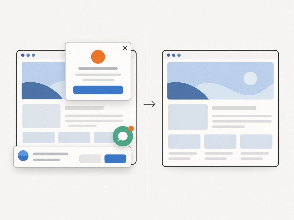
See the ScreenshotNeo API documentation for all 63 options, including full-page capture with lazy images loaded, CSS-element capture, dark mode, device presets, custom viewports, retina scale, PDF paper settings, custom CSS and JavaScript, clicks, selector waits, delay or network-idle waits, request blocking, headers, cookies, user agents, authorization, timezone, geolocation, transparent backgrounds, resizing, TTL caching, signed links, asynchronous jobs and webhooks, bulk capture, usage, and the OpenAPI specification.
cURL
curl -G "https://api.screenshotneo.com/v1/shot" \
  -d access_key=YOUR_API_KEY \
  --data-urlencode url=https://stripe.com \
  -o shot.webp
Python
import requests

r = requests.get(
    "https://api.screenshotneo.com/v1/shot",
    params={"access_key": "YOUR_API_KEY", "url": "https://stripe.com"},
    timeout=90,
)
r.raise_for_status()
open("shot.webp", "wb").write(r.content)
Node.js
const q = new URLSearchParams({ access_key: 'YOUR_API_KEY', url: 'https://stripe.com' });
const res = await fetch(`https://api.screenshotneo.com/v1/shot?${q}`);
if (!res.ok) throw new Error(`Screenshot failed: ${res.status}`);
const fs = await import('node:fs/promises');
await fs.writeFile('shot.webp', Buffer.from(await res.arrayBuffer()));
ScreenshotNeo also has an MCP server with take_screenshot, get_page_info, and capture_pdf tools for Claude, Cursor, and other MCP clients. It offers 1,000 shots per month free with no card; paid plans start at $5 for 3,000 shots. Create a free ScreenshotNeo account.
12. Troubleshooting checklist
| Symptom | Likely cause | Fix |
|---|---|---|
| Broken image icon | Wrong URL, missing file, or server error. | Open the URL directly, inspect the network response, and verify deployment paths and case sensitivity. |
| Screen reader says nothing useful | Missing or vague alt. |
Write replacement text that conveys the image’s purpose; use empty alt only for decoration. |
| Wrong responsive candidate | sizes does not match the rendered CSS slot. |
Measure the slot at each breakpoint and update the condition and fallback size. |
| Layout jumps while loading | Missing or inaccurate intrinsic dimensions. | Set accurate width and height; use height:auto in CSS. |
| AVIF/WebP not displayed | Unsupported format or invalid picture order. |
Keep a broadly supported JPEG/PNG fallback in the nested img. |
| Lazy image never appears in a test | Screenshot taken before it enters the viewport or before the request finishes. | Scroll it into view, wait for visibility and completion, or disable lazy loading in the test fixture. |
| Cross-origin canvas is tainted | The image server does not return compatible CORS headers. | Configure the image host and matching crossorigin value, or proxy the asset. |
13. Performance and operating guidance
- Generate candidates near the actual display widths instead of shipping one oversized master everywhere.
- Compress each format and measure real transfer size; responsive markup cannot compensate for huge source files.
- Reserve space with intrinsic dimensions to protect cumulative layout stability.
- Lazy-load content below the fold, but keep the primary visual available for the first render.
- Use a CDN with cache headers suited to immutable, versioned filenames.
- Test slow networks, high-density screens, zoom, dark mode, keyboard navigation, and a screen reader.
- Treat third-party hosts, referrers, cookies, and query strings as operational and privacy decisions.
For automated capture, reuse browser sessions where appropriate, set finite navigation and selector timeouts, wait for the exact image state you need, and cache stable pages. A screenshot service can reduce browser maintenance, but you still need to choose viewport, output format, waits, and access controls deliberately.
14. FAQ
Does every img need alt?
Yes. Meaningful images need a concise replacement; decorative images need alt="".
Can I use only srcset?
Yes, at least one of src or srcset is required, but a fallback src is useful for compatibility and clarity.
When do I need sizes?
Use sizes with width-descriptor candidates such as 400w. It tells the browser how wide the slot is likely to be.
Is picture faster than img?
Neither is automatically faster. picture lets you select a more suitable composition or format; correct candidates and compression determine the practical result.
Should dimensions be CSS or HTML?
Provide intrinsic width and height in HTML, then use CSS for responsive sizing and cropping.
What is the simplest way to capture a page image?
Use browser automation when you need custom interaction. For a hosted capture endpoint, ScreenshotNeo’s one-call API and MCP tools handle the browser setup and return the image or PDF.


