Why Testing Your Website at Different Screen Sizes Matters for User Experience
Learn why responsive testing matters, how to test breakpoints and devices, and how to automate screenshots for reliable coverage.
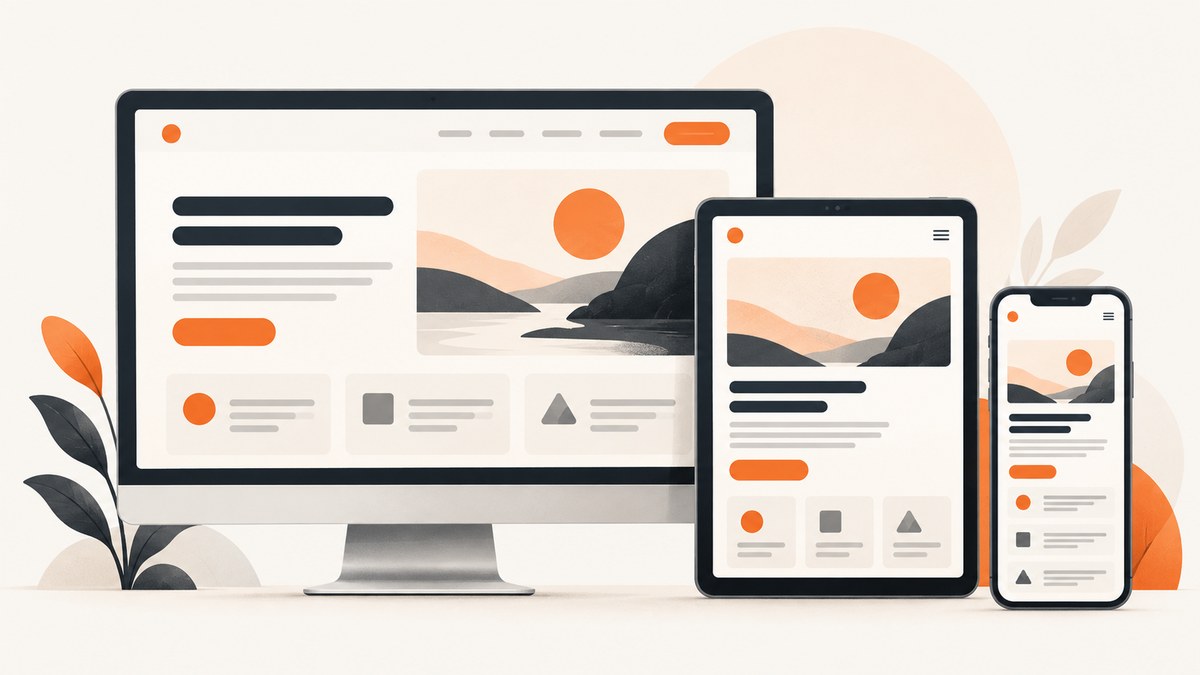
Testing a website at different screen sizes matters because a layout that works in one viewport can become unreadable, difficult to operate, or incomplete in another. Responsive testing checks whether content reflows, controls remain usable, images fit, and important information stays available as space and input conditions change. It is a validation practice: it finds failures in the layouts you test, but it does not prove that every browser and device behaves identically.
A useful process combines gradual viewport resizing, orientation checks, browser emulation, and targeted real-device checks. Automated screenshots make that process repeatable, especially when you need to compare many URLs or catch visual regressions in continuous integration.
What responsive testing catches
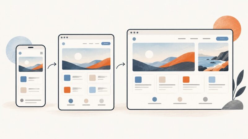
Responsive design aims to make pages work well across screen sizes and resolutions. A fixed-width layout can create horizontal scroll bars on a narrow device or leave excessive empty space on a wide screen. These problems are often invisible when a developer checks only a large desktop window.
At each width, inspect both appearance and operation:
- Readability: text should remain legible without forced zooming or awkward line lengths.
- Reflow: columns, cards, tables, navigation, and forms should rearrange instead of overlapping or disappearing.
- Information availability: resizing should not hide content or remove a required action.
- Control usability: buttons, links, menus, dialogs, and form fields must remain reachable and operable.
- Media behavior: images, video, charts, and embedded content should fit the available space.
- Performance clues: a mobile layout may expose oversized images, expensive scripts, or slow-loading components.
Viewport dimensions are only one variable. CSS media queries can also respond to features such as touch capability, pointer precision, hover support, orientation, and reduced-motion preferences. A layout may therefore look correct at a desktop width but still provide the wrong interaction model for a touch device.
See MDN’s responsive design guide, media query fundamentals, and web.dev’s responsive design basics for the underlying concepts.
How to test a website at different screen sizes
1. Start with a wide viewport
Open the page in a wide browser window and identify the major content regions and interactive controls. Record the expected structure: for example, a header with navigation, a two-column content area, a filter panel, a results list, and a footer. This gives you a reference for what must remain available as the viewport narrows.

Do not treat a named preset such as “desktop” as a pass condition. The important question is whether the page remains usable at the actual widths your audience encounters.
2. Resize through intermediate widths
Resize gradually rather than jumping from a large desktop preset to one phone preset. Intermediate widths reveal the exact point where a layout stops fitting comfortably. Test just above and below each breakpoint so you can see whether the transition is intentional.
Look for:
- navigation items wrapping into a second row or colliding with a logo;
- columns becoming too narrow before they stack;
- buttons shrinking or moving outside the visible area;
- images forcing horizontal scrolling;
- tables becoming impossible to read;
- sticky headers covering content after reflow;
- overlays, cookie notices, and dialogs extending beyond the viewport.
3. Check narrow layouts for reflow and access
At narrow widths, verify that no information is clipped or hidden accidentally. Scroll horizontally to detect overflow, then inspect the page at the top, middle, and bottom. A page can appear correct near the header while a footer, table, or checkout control still exceeds the viewport.
Check keyboard access as well as pointer access. A responsive layout should preserve focus order, visible focus indicators, and access to controls when the navigation changes from a horizontal menu to a disclosure button.
Chrome’s accessibility guidance connects viewport resizing with reflow: information and functionality should remain available when the viewport changes. Use the Chrome accessibility features reference as a checklist.
4. Rotate the viewport
Test portrait and landscape orientations where they matter. A tablet in landscape may activate a desktop-like layout, while the same device in portrait uses a narrow layout. Rotation can expose assumptions about fixed heights, sticky elements, video players, and modal dialogs.
Confirm that the document declares a suitable viewport:
<meta name='viewport' content='width=device-width, initial-scale=1'>Without the device-width setting, some mobile browsers render the page in a wider virtual viewport, so narrow-screen responsive rules do not behave as intended. MDN explains the effect in its viewport meta element reference.
5. Test interaction capabilities
Use media queries and emulation to test more than width. A touch-first interface may need larger targets and no hover-only actions. A pointer device can support hover previews that are unavailable on touch. Test keyboard-only navigation, touch taps, pointer hover, and reduced-motion settings when those capabilities affect the interface.
For example:
@media (hover: none) and (pointer: coarse) {
  .menu-item:hover .submenu { display: none; }
  .menu-button { min-height: 44px; min-width: 44px; }
}

@media (prefers-reduced-motion: reduce) {
  *, *::before, *::after {
    animation-duration: 0.01ms;
    transition-duration: 0.01ms;
    scroll-behavior: auto;
  }
}
Build a practical testing matrix
A matrix makes coverage explicit without pretending that every device model must be tested. Choose values from your analytics, support tickets, and product requirements.
| Dimension | Example coverage | What it can reveal |
|---|---|---|
| Viewport width | Wide, intermediate, narrow, and breakpoint edges | Overflow, awkward wrapping, broken transitions |
| Viewport height | Short laptop, tall desktop, short phone | Hidden controls, clipped dialogs, excessive fixed regions |
| Orientation | Portrait and landscape | Height assumptions, tablet layout failures |
| Interaction | Keyboard, precise pointer, coarse touch | Hover dependencies, target sizes, focus problems |
| Browser/device | Combinations important to your audience | Engine, font, hardware, and browser-specific behavior |
There is no universal list of required devices. A marketing site with mostly desktop visitors needs a different matrix from a field-service application used on touch phones. Keep a small smoke matrix for every change and a broader matrix for releases or high-risk components.
Use Chrome DevTools device emulation correctly
Chrome DevTools Device Mode is efficient for early checks. It can simulate viewport dimensions, device pixel ratio, orientation, touch input, throttled networks, and user-agent behavior. Use it to move quickly through widths and to reproduce a reported layout condition.
Emulation has limits. The desktop machine still supplies the underlying hardware, graphics pipeline, fonts, and browser environment. A simulated phone does not guarantee the same performance, text rendering, sensor behavior, keyboard behavior, or browser bugs as a physical phone. Chrome documents these limitations in Simulate mobile devices with Device Mode.
Run physical-device checks when the experience depends on real hardware, mobile browser behavior, camera or sensor input, virtual keyboards, slow CPUs, or a specific operating system. Treat emulation as broad, fast coverage and real devices as confirmation for material risks.
Automate screenshot checks with Playwright
Manual resizing is valuable, but automation gives you repeatable evidence for every pull request. The following Node.js example captures the same page at several widths and both orientations.
- Install Node.js and create a project.
- Run
npm install -D playwright. - Run
npx playwright install chromium. - Save the script as
responsive-screenshots.mjs. - Run
node responsive-screenshots.mjs.
import { chromium } from 'playwright';

const targets = [
  { name: 'phone-portrait', width: 390, height: 844, isMobile: true, hasTouch: true },
  { name: 'phone-landscape', width: 844, height: 390, isMobile: true, hasTouch: true },
  { name: 'tablet', width: 768, height: 1024, isMobile: true, hasTouch: true },
  { name: 'desktop', width: 1440, height: 900, isMobile: false, hasTouch: false },
  { name: 'breakpoint-edge', width: 1024, height: 768, isMobile: false, hasTouch: false }
];

const browser = await chromium.launch();
for (const target of targets) {
  const context = await browser.newContext({
    viewport: { width: target.width, height: target.height },
    isMobile: target.isMobile,
    hasTouch: target.hasTouch,
    deviceScaleFactor: target.isMobile ? 2 : 1,
    colorScheme: 'light'
  });
  const page = await context.newPage();
  await page.goto('https://example.com', { waitUntil: 'networkidle' });
  await page.screenshot({
    path: `artifacts/${target.name}.png`,
    fullPage: true
  });
  await context.close();
}
await browser.close();
In a real project, replace the URL, create the artifacts directory, and add assertions for critical elements. Wait for application data and fonts before capture. Avoid using screenshots alone as the test oracle: combine visual comparison with checks that navigation, forms, headings, and primary actions exist and are actionable.
Capture one element or the full page
Full-page screenshots show whether content extends unexpectedly, but they can be noisy for long pages. Capture focused regions when reviewing a header, pricing card, checkout form, or navigation component.
await page.locator('[data-testid="checkout-summary"]').screenshot({
  path: 'artifacts/checkout-summary.png'
});

await page.screenshot({
  path: 'artifacts/homepage-full.png',
  fullPage: true
});
Use stable selectors instead of positional selectors. Wait for a meaningful state, such as a loaded result count or visible navigation, before capturing. If content is lazy-loaded, scroll through the page or use an application-specific readiness signal so the screenshot represents the user-visible state you intend to review.
Or skip the browser setup
ScreenshotNeo provides a website screenshot API and MCP server. One GET request returns a PNG, JPEG, WebP, or PDF. It supports full-page capture with lazy images loaded, CSS-element capture, dark mode, 12 device presets plus custom viewports, retina scale, custom CSS and JavaScript, click actions, selector or delay waits, network-idle waits, blocked ads and trackers, custom headers and cookies, user agents, authorization, timezone and geolocation, transparent backgrounds, resizing, caching with a chosen TTL, signed links, asynchronous jobs with signed webhooks, bulk capture of up to 100 URLs, usage information, and an OpenAPI specification. Common parameter names used by other screenshot APIs also work, which can simplify migration. See the ScreenshotNeo documentation for the complete option list.

cURL:
curl -G 'https://api.screenshotneo.com/v1/shot' \
  -d access_key=YOUR_API_KEY \
  --data-urlencode url=https://stripe.com \
  -o shot.webp
Python:
import requests

r = requests.get(
    'https://api.screenshotneo.com/v1/shot',
    params={'access_key': 'YOUR_API_KEY', 'url': 'https://stripe.com'},
    timeout=90,
)
r.raise_for_status()
open('shot.webp', 'wb').write(r.content)
Node.js:
const q = new URLSearchParams({
  access_key: 'YOUR_API_KEY',
  url: 'https://stripe.com'
});
const res = await fetch(`https://api.screenshotneo.com/v1/shot?${q}`);
if (!res.ok) throw new Error(`HTTP ${res.status}`);
const buffer = Buffer.from(await res.arrayBuffer());
await import('node:fs/promises').then(fs => fs.writeFile('shot.webp', buffer));
ScreenshotNeo accepts and removes cookie or consent banners, newsletter popups, and chat widgets before capture. Each cleanup step can be turned off. Bot checks and CAPTCHAs, blank pages, timeouts, failed loads, and cache hits cost nothing; response headers identify the page verdict and whether the request was billed with X-Page-Verdict and X-Billed.
An MCP server exposes take_screenshot, get_page_info, and capture_pdf to Claude, Cursor, and other MCP clients. That lets an AI agent inspect responsive states without you wiring a browser into every workflow.
The Free plan includes 1,000 screenshots each month with no card. Starter is $5 for 3,000, Growth is $15 for 15,000, Pro is $39 for 60,000, Scale is $99 for 250,000, and Business is $249 for 1,000,000. Yearly billing provides two months free, and every feature is available on every plan. Create a free ScreenshotNeo account to start with 1,000 screenshots a month and no card.
Screenshot options for responsive coverage
Choose options based on the failure you are trying to detect:
- Viewport and device preset: reproduce a target width, height, device pixel ratio, and mobile behavior.
- Full page: reveal overflow and content that appears below the initial viewport.
- Element selector: isolate a component for focused review and smaller artifacts.
- Wait conditions: wait for a selector, fixed delay, or network idle state.
- Custom CSS: force a diagnostic outline or hide an unstable region while investigating.
- JavaScript and clicks: open a menu, dismiss a dialog, or switch a UI state before capture.
- Headers, cookies, and authorization: inspect authenticated or locale-specific layouts.
- Timezone and geolocation: check regional banners, date formats, and location-based content.
- Format and resizing: use WebP or JPEG for review artifacts and PNG when lossless pixels matter.
- Cache TTL: reduce repeated work for unchanged pages while keeping the freshness window explicit.
Troubleshooting responsive tests
The page has a horizontal scrollbar
Cause: a fixed width, long unbroken string, oversized image, or positioned element exceeds the viewport.
Fix: inspect the overflowing element in DevTools, use flexible widths and max-width: 100% for media, allow long text to wrap, and retest just below the breakpoint where the problem starts.
Content is missing in a screenshot
Cause: lazy loading, delayed data, a consent overlay, or a capture taken before hydration.
Fix: wait for a selector or network idle, scroll to trigger lazy content, and define an explicit application-ready signal. For private pages, supply the required cookies or authorization headers.
A hover menu cannot be tested on a phone
Cause: hover is not a dependable interaction on a coarse pointer or touch screen.
Fix: provide a tap or keyboard path, test the menu with touch emulation, and use media queries for hover-capable devices only.
The mobile layout appears zoomed out
Cause: the viewport meta element is missing or configured incorrectly.
Fix: add width=device-width, initial-scale=1, then retest portrait and landscape orientations.
Emulation passes but a real phone fails
Cause: hardware, browser engine, font rendering, virtual keyboard, performance, or touch behavior differs from the desktop emulator.
Fix: reproduce on the affected device, record the browser and operating system, and add that combination to the targeted real-device matrix.
Visual diffs change on every run
Cause: animations, rotating content, timestamps, ads, fonts, or network-dependent data create nondeterministic pixels.
Fix: disable motion for test runs, freeze time and test data, wait for fonts, remove unstable regions from comparison, and use a consistent viewport and device scale factor.
Performance, reliability, and cost considerations
Responsive coverage grows quickly when you multiply pages by widths, orientations, browsers, and states. Keep the fastest checks close to development: a few critical pages at breakpoint edges and one narrow and wide viewport. Run the broader matrix on release branches or after layout changes.
Parallel browser workers reduce wall-clock time but increase CPU and memory use. Limit concurrency in CI so the test host does not become the bottleneck. Reuse browser processes, isolate contexts, and save only artifacts that help diagnose a failure.
For API captures, cache stable pages with an explicit TTL, use bulk capture for up to 100 URLs when reviewing a collection, and use asynchronous jobs with signed webhooks when captures are slow or numerous. Check response status and the verdict headers before treating an image as a valid test artifact. ScreenshotNeo bills only clean shots; bot checks, blank pages, failed loads, timeouts, and cache hits are not billed.
Do not claim that a passing screenshot proves universal compatibility. It proves that the selected URL, state, viewport, input conditions, browser environment, and timing produced the expected result. Pair visual checks with semantic assertions, accessibility checks, and physical-device testing where the audience or feature requires it.
Release checklist
- Test wide, narrow, and intermediate widths around every layout breakpoint.
- Check portrait and landscape orientations where relevant.
- Verify the viewport meta element.
- Look for overflow, clipping, overlap, unreadable text, and unreachable controls.
- Exercise keyboard, pointer, and touch interactions.
- Check loading, empty, error, authenticated, and consent states.
- Capture full-page and focused element screenshots for high-risk components.
- Run browser emulation, then confirm material risks on real devices.
- Freeze animations and unstable data before visual comparison.
- Record the viewport, browser, device assumptions, and test date with each result.
FAQ
How many screen sizes should I test?
Use the smallest set that covers your audience and every breakpoint transition, then add widths just above and below those transitions. Analytics and support reports should determine which real devices receive confirmation testing.
Is responsive testing the same as mobile testing?
No. Responsive testing examines layout adaptation across environments. Mobile testing also includes real hardware, mobile browser behavior, touch input, virtual keyboards, sensors, performance, and operating-system behavior.
Can screenshots replace accessibility testing?
No. Screenshots can reveal visual clipping and layout regressions, but they cannot reliably verify semantics, focus order, screen-reader output, contrast in every state, or keyboard behavior.
Should I test every browser version?
Prioritize the browser and device combinations that matter to your audience and product risk. Use emulation for breadth and real devices when hardware or browser behavior is material.
When should I use a full-page capture?
Use it for overflow, long-form layout, and content-availability checks. Use element captures for focused component review and faster visual comparisons.