Responsive Web Design Examples and What They Teach
Learn from responsive design examples, then build layouts that adapt to their content while keeping essential information accessible at every size.
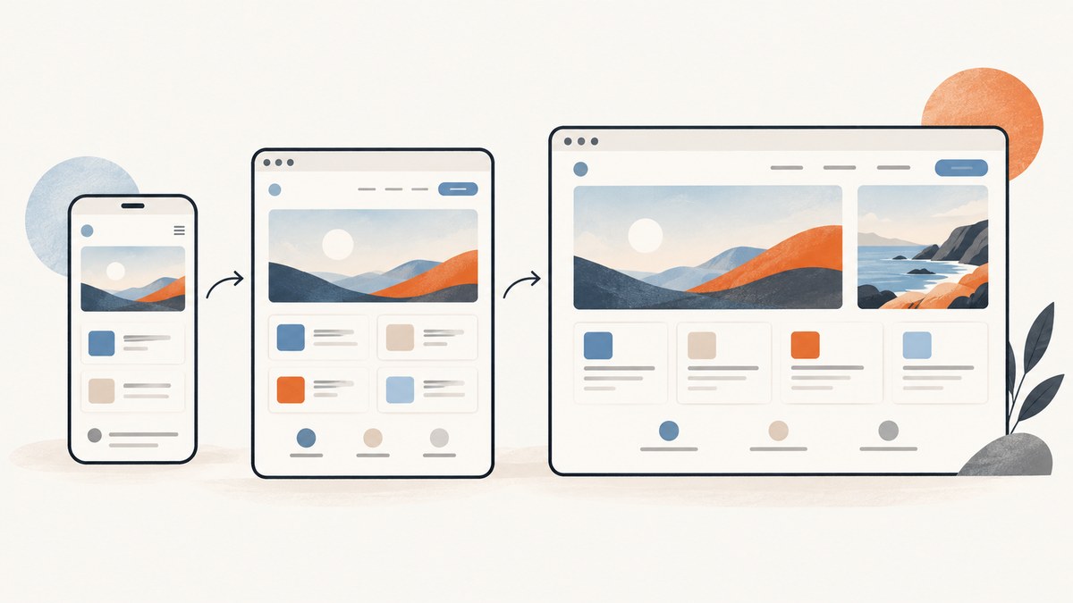
Responsive web design is an approach for making a page work across changing viewport sizes and contexts. It is not a fixed list of phone, tablet, and desktop dimensions. Begin with readable content and a layout that can flex; add a breakpoint when the content or composition needs a different arrangement. Use viewport media queries for changes driven by the page width, and container queries when a reusable component needs to respond to the space it actually receives. Keep essential information available at narrow widths and enlarged zoom. MDN’s responsive design guide describes the approach and the tools used to build it.
1. What the examples teach
Responsive design began as a combination of fluid grids, flexible images, and media queries. Ethan Marcotte’s foundational 2010 article framed those techniques as part of a broader shift: a web page should adapt to different viewing contexts instead of assuming one fixed canvas. Modern CSS gives developers more options, including Grid, Flexbox, intrinsic sizing, and container queries, but the central question remains the same: what should change when available space changes? Marcotte’s original article is useful historical context; current implementation choices should follow current platform guidance.
The published examples below are instructive because each demonstrates a distinct decision. They describe historical design work, not an audit of how those sites behave today.
| Example | Adaptation | Lesson | Review question |
|---|---|---|---|
| The Guardian timelines | Show an additional thumbnail above a wider breakpoint. | Use spare room to add optional visual detail and density. | Does the narrow version still communicate every essential point? |
| Tattly navigation | Hide a submenu at smaller widths and keep primary sections visible. | A compact hierarchy can help when space is constrained. | Are the omitted routes still discoverable and reachable? |
| BostonGlobe.com redesign | Design journalism for a range of browser-enabled devices. | Include different devices early in design reviews; avoid treating one composition as the definitive version. | Have real content and interaction been reviewed across widths? |
A List Apart documented the Guardian and Tattly patterns in its responsive design patterns article. A Book Apart’s historical Boston Globe redesign listing describes the relaunch; neither source establishes the sites’ current designs. Treat showcases as records of a decision at a point in time, not as a substitute for inspecting a current implementation.
2. Build the layout from content outward
A strong starting point is the narrow, single-column reading order. HTML naturally flows and wraps; CSS should add structure without making content depend on a specific screen size. Use Grid for two-dimensional page regions, Flexbox for one-dimensional groups, and intrinsic sizing to let components fit. Add media queries only where a real layout stress point appears, such as navigation wrapping, a card becoming too narrow, or a line of text becoming uncomfortably long. MDN recommends choosing breakpoints around layout needs rather than trying to target every device model, and using relative units for breakpoints. See MDN’s media query guidance.
A runnable responsive example
Save this as index.html and open it in a browser. It starts as one column, adds card columns when the available width permits, caps the reading measure on wide screens, and includes a deliberate breakpoint for the header layout. The card grid can change its column count based on its own width, even if the overall page is wide.
<!doctype html>
<html lang="en">
<head>
  <meta charset="utf-8">
  <meta name="viewport" content="width=device-width, initial-scale=1">
  <title>Responsive cards</title>
  <style>
    * { box-sizing: border-box; }
    body {
      margin: 0;
      color: #17202a;
      font: 1rem/1.6 system-ui, sans-serif;
    }
    header, main { padding: 1rem; }
    header { border-bottom: 1px solid #ccd3d8; }
    .header-inner {
      display: flex;
      flex-wrap: wrap;
      align-items: center;
      justify-content: space-between;
      gap: 1rem;
      max-width: 72rem;
      margin-inline: auto;
    }
    nav ul {
      display: flex;
      flex-wrap: wrap;
      gap: .75rem 1.25rem;
      margin: 0;
      padding: 0;
      list-style: none;
    }
    main { max-width: 72rem; margin-inline: auto; }
    .intro { max-width: 68ch; }
    .cards {
      display: grid;
      grid-template-columns: repeat(auto-fit, minmax(min(100%, 16rem), 1fr));
      gap: 1rem;
      padding: 0;
      list-style: none;
    }
    .card {
      min-width: 0;
      padding: 1rem;
      border: 1px solid #ccd3d8;
      border-radius: .5rem;
    }
    .card img { display: block; max-width: 100%; height: auto; }
    @media (min-width: 48rem) {
      header, main { padding: 1.5rem; }
      .header-inner { flex-wrap: nowrap; }
    }
  </style>
</head>
<body>
  <header>
    <div class="header-inner">
      <a href="#main">Field Notes</a>
      <nav aria-label="Primary">
        <ul><li><a href="#guides">Guides</a></li>
        <li><a href="#examples">Examples</a></li>
        <li><a href="#about">About</a></li></ul>
      </nav>
    </div>
  </header>
  <main id="main">
    <section class="intro">
      <h1>Design for the available space</h1>
      <p>A short introduction that remains readable as its container changes.</p>
    </section>
    <ul class="cards" id="examples">
      <li class="card"><h2>Flexible layout</h2><p>Cards form as many columns as their container can fit.</p></li>
      <li class="card"><h2>Useful hierarchy</h2><p>Content order remains meaningful in a single column.</p></li>
      <li class="card"><h2>Optional detail</h2><p>Use additional imagery only when it adds value.</p></li>
    </ul>
  </main>
</body>
</html>
The viewport meta element tells mobile browsers to use the device’s layout viewport rather than presenting a desktop-sized page scaled down. Without it, CSS viewport-width decisions may not match the expected narrow-screen layout. Images have a maximum width and automatic height so they shrink with their containing block without distortion. For content images that need different crops or resolutions, use HTML responsive image features such as srcset, sizes, or picture where appropriate rather than sending an oversized asset to every context.
3. Choose the right adaptation trigger
Viewport media queries
Use a media query when the page’s viewport width is what determines the change: for example, when the overall navigation and main content can sit side by side, or when a three-column page needs to become one column. A mobile-first base style keeps the small-screen default simple and lets wider layouts be layered on. Breakpoints are thresholds, not a device catalog. Resize continuously around each threshold and check just below and above it; many bugs hide in the intermediate sizes.
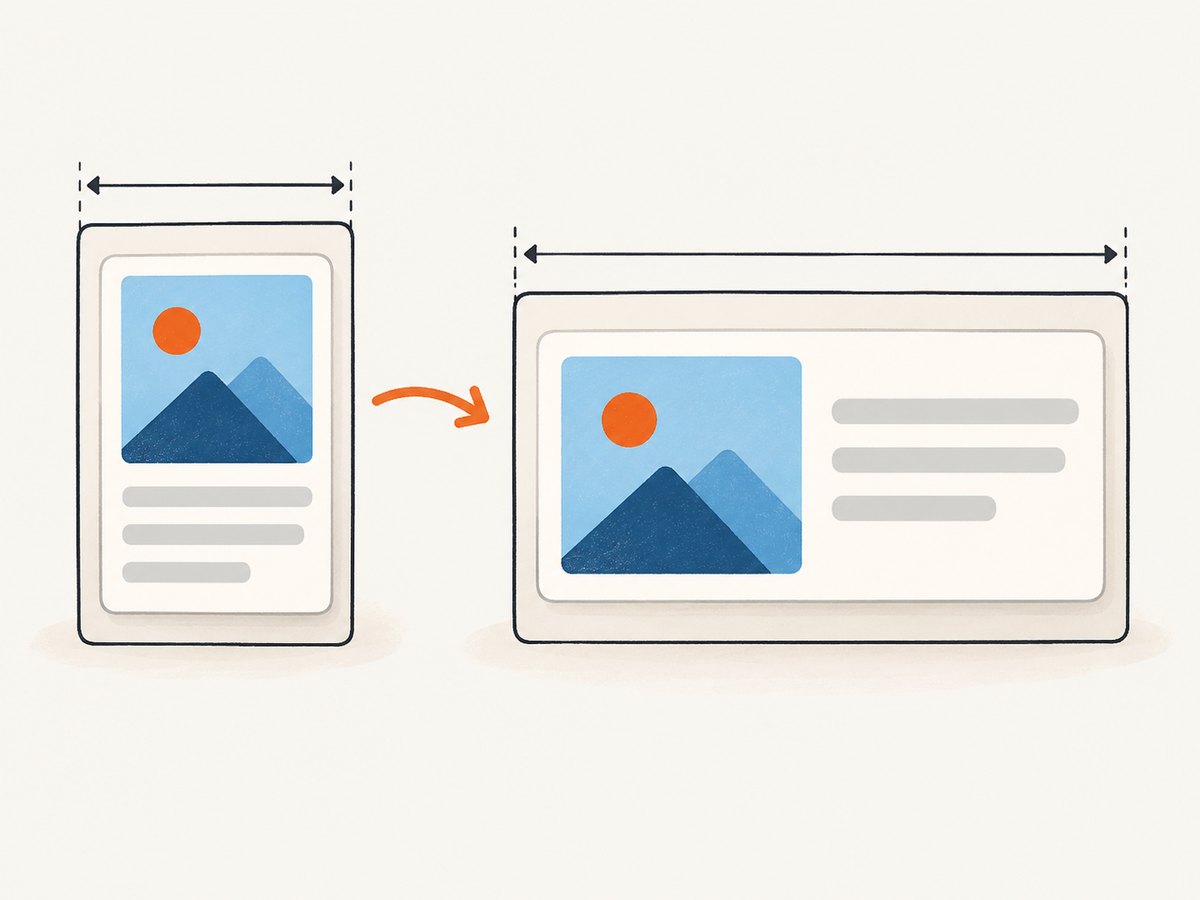
Container queries
A card, toolbar, or embedded widget may be placed in a narrow sidebar on a desktop viewport or in a wide content region on a tablet. Its available container width is a more relevant signal than the total viewport. Container queries allow a component to respond to the size of its containing block. Declare a query container and style its descendants based on that container’s size:
.product-region { container-type: inline-size; }
.product-card { display: grid; gap: 1rem; }
@container (min-width: 34rem) {
  .product-card { grid-template-columns: 12rem 1fr; }
}
Choose the trigger that matches the cause of the constraint. Use a viewport query for page-wide composition and a container query for a reusable component whose parent controls its available space. Consult MDN’s container query guide for the syntax and behavior.
4. Evaluate examples without copying them blindly
For each responsive pattern, ask what is changing and what remains invariant. A useful review compares the narrow, intermediate, and wide layouts, then checks whether the transition is fluid or a discrete switch. A column count that changes through intrinsic Grid sizing behaves differently from navigation that changes structure at a breakpoint. A design may also alter visual density by adding optional imagery, as in the historical Guardian example.

- Identify essential content. List the facts, controls, navigation routes, and media users need to complete the page’s task.
- Find the stress point. Reduce available width until a component becomes cramped or unreadable. Set a breakpoint there if flexible layout alone cannot solve it.
- Decide what may adapt. Change columns, spacing, crop, visual density, or navigation hierarchy. Do not remove information merely because the original desktop composition no longer fits.
- Inspect content order. CSS placement should not create a confusing sequence for keyboard users or assistive technology. Keep source order logical.
- Check the middle. Review widths between familiar device presets. A tablet, split-screen browser, sidebar, or resized desktop window can expose issues that named presets miss.
5. Accessibility and reflow checks
Responsive styling is part of accessibility work, but a responsive layout alone does not prove conformance to every accessibility requirement. Check that text can be enlarged, content reflows at narrow widths without forcing unnecessary two-dimensional scrolling, and controls remain reachable and operable. Preserve logical reading and focus order when visual arrangements change. W3C WAI describes reflow as a way to support users who zoom or use a narrow viewport; its guidance includes examples using CSS Grid and media queries. Read WAI’s explanation of WCAG reflow.
- Test at narrow widths and with enlarged text; inspect headings, tables, dialogs, forms, and long unbroken strings.
- Ensure navigation that is visually compact still exposes all required destinations in a usable way.
- Use visible focus styles and verify keyboard access after changing layout or hiding optional presentation elements.
- Do not use CSS to visually reorder information into a sequence that conflicts with the document’s reading order.
- Check images for useful alternatives and ensure content does not rely on color or spatial position alone.
6. Capture responsive states for review
A screenshot is useful for comparing the same page at multiple viewport sizes, documenting a regression, or sharing a design review. It shows a rendered state at one moment; it does not prove keyboard access, screen-reader behavior, or that every intermediate width works. Capture at a small width, at each layout transition, and at a wide width. If the page uses lazy-loaded media or delayed content, wait for it to appear before capturing.
For a local or production page, browser automation can capture exact viewport sizes. The precise setup depends on the browser tooling and runtime available in your project. Once captured, compare screenshots alongside direct interaction checks; visual diffing can flag changes but cannot judge whether the change is correct.
Inspecting a page with ScreenshotNeo
If you want rendered screenshots without setting up browser automation, ScreenshotNeo is a website screenshot API and MCP server. Its API accepts one GET request with a URL and returns an image or PDF. Set a viewport to inspect responsive states, and use its screenshot features to capture full pages or a CSS-selected element. The API also supports custom CSS and JavaScript, waiting for a selector, delay, or network idle, and device presets. See the ScreenshotNeo API documentation for available parameters.
7. Or skip the browser setup
Make a GET request with the target URL and your API key. This cURL example saves a WebP screenshot:
curl -G "https://api.screenshotneo.com/v1/shot" \
  -d access_key=YOUR_API_KEY \
  --data-urlencode url=https://stripe.com \
  -o shot.webp
Equivalent Python using requests:
import requests

r = requests.get(
    "https://api.screenshotneo.com/v1/shot",
    params={"access_key": "YOUR_API_KEY", "url": "https://stripe.com"},
    timeout=90,
)
open("shot.webp", "wb").write(r.content)
Equivalent Node.js using the built-in fetch API:
const q = new URLSearchParams({
  access_key: 'YOUR_API_KEY',
  url: 'https://stripe.com'
});
const res = await fetch(`https://api.screenshotneo.com/v1/shot?${q}`);
if (!res.ok) throw new Error(`Screenshot request failed: ${res.status}`);
const bytes = new Uint8Array(await res.arrayBuffer());
await (await import('node:fs/promises')).writeFile('shot.webp', bytes);
Cookie and consent banners are accepted like a visitor and removed before the shot; more than 60 known consent platforms, newsletter popups, and chat widgets can be removed, and each step can be turned off. Bot checks or CAPTCHAs, blank pages, timeouts, failed loads, and cache hits cost nothing; response headers report the page verdict and whether the request was billed. An MCP server exposes take_screenshot, get_page_info, and capture_pdf to Claude, Cursor, and other MCP clients. The free plan includes 1,000 screenshots per month with no card; paid plans start at $5 for 3,000, and every feature is on every plan. Sign up for 1,000 free screenshots a month, with no card.
8. Performance, reliability, and cost
Responsive design affects both what people see and what devices need to download. Flexible CSS does not automatically make large media efficient: use appropriate image sources and dimensions, avoid loading decorative assets that do not benefit a narrow view, and reserve space for media to reduce layout shifts. Avoid dozens of device-specific breakpoints; each adds styles and combinations to maintain. A few content-driven transitions plus intrinsically flexible layout are usually easier to reason about.
For screenshot-based review, expect a capture to represent one render at one viewport and one moment in the page’s lifecycle. Fonts, animations, asynchronous API data, consent state, and lazy media can change the result. Make the capture deterministic by setting viewport and device scale, waiting for the relevant selector or state, and disabling animation through custom CSS when appropriate. For repeat reviews, record the viewport, URL, wait condition, and any CSS overrides along with the image. A screenshot service may help avoid browser installation and maintenance, while local automation can be more convenient when tightly integrated with an existing test environment. Cost depends on capture volume and the service’s billing rules; ScreenshotNeo’s response-level billing headers expose whether a capture was billed.
9. Troubleshooting responsive layouts
| Symptom | Likely cause | Fix |
|---|---|---|
| Mobile shows a tiny desktop page | Missing or incorrect viewport meta tag. | Add <meta name="viewport" content="width=device-width, initial-scale=1"> in the document head. |
| Horizontal scrolling appears unexpectedly | Fixed-width child, oversized image, long token, or grid track that cannot shrink. | Use flexible sizing, max-width: 100% for media, min-width: 0 on grid children, and safe wrapping for long content. |
| Cards become too cramped before they wrap | Minimum track size is too large for the component’s actual width. | Reduce the minmax() minimum, use min(100%, ...), or set a breakpoint based on the content. |
| Header overlaps or navigation wraps awkwardly | Layout assumes one fixed width or long labels. | Allow wrapping, simplify hierarchy while retaining routes, or change alignment at the point the content breaks. |
| Image is distorted or cropped unexpectedly | Forced width and height with mismatched source proportions. | Use height: auto for natural scaling; use object-fit and a deliberate aspect ratio only when cropping is intended. |
| Screenshot misses a banner, image, or app content | Capture occurred before asynchronous rendering or lazy loading completed. | Wait for a meaningful selector or page state, then capture; avoid relying only on a short arbitrary delay. |
10. FAQ
Is responsive design the same as adaptive design?
These labels are used in different ways, but a useful distinction is whether a layout adjusts fluidly through a range or switches among arrangements at chosen thresholds. Many production pages combine both behaviors.
Should every component use container queries?
No. Use them where a component is reused in containers of different sizes and the container controls its layout. A page-wide navigation transition is generally a viewport-level decision.
Do responsive screenshots prove accessibility?
No. Screenshots help inspect visual reflow, but they cannot establish keyboard behavior, accessible names, focus management, or assistive technology output. Pair visual review with interaction and accessibility checks.
Are the Guardian and Tattly examples current?
The cited article describes historical patterns. Use those examples to understand their design decisions, and inspect the live sites separately before making claims about current behavior.


