How to Add Dark Mode to Any Website With CSS
Add automatic system dark mode and a persistent light/dark switch with CSS variables, accessible controls, testing steps, and debugging fixes.

Use semantic CSS custom properties for your colors, detect the visitor’s preference with prefers-color-scheme, and tell the browser which built-in surfaces can render with color-scheme. Add a root attribute such as data-theme only when you need an explicit Light, Dark, or System choice.
prefers-color-scheme detects whether the user has requested a light or dark theme through operating-system or user-agent settings. color-scheme affects browser-controlled surfaces such as form controls, scrollbars, and the page canvas. See the MDN prefers-color-scheme reference and MDN color-scheme reference.
1. Add automatic dark mode with CSS
Start by naming the roles in your design instead of placing literal colors in every component. The same component rules then work in both themes.
<!-- Put this before your stylesheet -->
<meta name="color-scheme" content="light dark">
<link rel="stylesheet" href="styles.css">
:root {
color-scheme: light dark;
--bg: #ffffff;
--surface: #f4f5f7;
--text: #1f2328;
--muted: #57606a;
--border: #d0d7de;
--accent: #0969da;
--focus: #8250df;
}
@media (prefers-color-scheme: dark) {
:root {
--bg: #0d1117;
--surface: #161b22;
--text: #e6edf3;
--muted: #8b949e;
--border: #30363d;
--accent: #58a6ff;
--focus: #bc8cff;
}
}
html,
body {
background: var(--bg);
color: var(--text);
}
.card,
header,
footer {
background: var(--surface);
border-color: var(--border);
}
a { color: var(--accent); }
:focus-visible {
outline: 3px solid var(--focus);
outline-offset: 2px;
}The media query updates automatically when the operating-system preference changes. The custom properties style your page; color-scheme lets the browser style its own controls appropriately.
2. Use semantic color tokens across the page
Map each visual role to a token and use those tokens in component styles.
body {
  margin: 0;
  font-family: system-ui, sans-serif;
}

.page {
  min-height: 100vh;
  background: var(--bg);
}

.card {
  padding: 1.25rem;
  border: 1px solid var(--border);
  border-radius: 0.75rem;
}

.secondary {
  color: var(--muted);
}

input,
select,
textarea,
button {
  color: var(--text);
  background: var(--surface);
  border: 1px solid var(--border);
}

::selection {
  color: var(--bg);
  background: var(--accent);
}
Keep text, muted text, borders, links, focus rings, surfaces, and the page background separate. This makes contrast corrections local and prevents a dark card from accidentally using the page background token.
3. Add a Light, Dark, and System switch
Place explicit overrides after the media-query rules. Removing the attribute restores automatic system behavior.
html[data-theme="light"] {
  color-scheme: light;
  --bg: #ffffff;
  --surface: #f4f5f7;
  --text: #1f2328;
  --muted: #57606a;
  --border: #d0d7de;
  --accent: #0969da;
  --focus: #8250df;
}

html[data-theme="dark"] {
  color-scheme: dark;
  --bg: #0d1117;
  --surface: #161b22;
  --text: #e6edf3;
  --muted: #8b949e;
  --border: #30363d;
  --accent: #58a6ff;
  --focus: #bc8cff;
}
<label for="theme-choice">Color theme</label>
<select id="theme-choice">
<option value="system">System</option>
<option value="light">Light</option>
<option value="dark">Dark</option>
</select>
<script>
const root = document.documentElement;
const choice = document.querySelector('#theme-choice');
const saved = localStorage.getItem('theme') || 'system';
function applyTheme(value) {
if (value === 'system') {
root.removeAttribute('data-theme');
localStorage.removeItem('theme');
} else {
root.dataset.theme = value;
localStorage.setItem('theme', value);
}
choice.value = value;
}
applyTheme(saved);
choice.addEventListener('change', event => applyTheme(event.target.value));
</script>Persist only explicit Light or Dark choices. A System choice should remove the stored override so future operating-system changes are honored.
4. Prevent a first-paint theme flash
Browsers can paint the page before your deferred JavaScript runs. Keep the early meta hint and, when the flash matters, read the saved value in a tiny inline script before the stylesheet or page markup is rendered.
<head>
  <meta name="color-scheme" content="light dark">
  <script>
    (() => {
      const theme = localStorage.getItem('theme');
      if (theme === 'light' || theme === 'dark') {
        document.documentElement.dataset.theme = theme;
      }
    })();
  </script>
  <link rel="stylesheet" href="styles.css">
</head>
Do not write a saved System value as an attribute; the media query must remain in control. MDN recommends declaring color-scheme on the root and placing the matching meta element early to reduce incorrect-theme flashes.
5. Audit every surface
Changing only body colors leaves many pages partly light. Check this list in both themes:
- Page, section, card, modal, navigation, header, and footer backgrounds.
- Primary, secondary, disabled, visited, hover, active, and focus text states.
- Borders, dividers, shadows, badges, alerts, tooltips, and selected text.
- Inputs, selects, checkboxes, radio buttons, date controls, placeholders, and disabled controls.
- Tables, code blocks, syntax highlighting, charts, and canvas drawings.
- SVG icons, logos, photographs, video controls, and embedded content.
- Third-party iframes and widgets that may keep their own color scheme.
Do not invert the whole page with a filter. It changes images, brand colors, shadows, and contrast unpredictably. Embedded SVG files and some iframes can respond to the parent color scheme, while inline SVG and third-party content may need separate styles.
6. Choose between automatic and manual approaches
| Approach | Use it when | Trade-off |
|---|---|---|
prefers-color-scheme |
You want the shortest implementation and system behavior. | No per-site override. |
| Root attribute override | Visitors need Light, Dark, and System choices or persistence. | Requires JavaScript and flash prevention. |
light-dark() |
Your browser support target allows it. | Check current compatibility and keep token fallbacks where needed. |
Chrome guidance recommends defaulting to the system preference while offering explicit light, dark, or system-default choices. Check current browser compatibility before depending on newer conveniences such as light-dark().
7. Test dark mode before shipping
- Set the operating system to Light and load the page.
- Set it to Dark and confirm the automatic theme changes.
- Change the operating-system preference while the page is open; System mode should update.
- Select Light and Dark, reload, and verify each explicit choice persists.
- Select System, reload, and confirm the stored attribute is gone.
- Clear site storage and verify a first visit follows the system preference.
- Tab through every interactive element and check visible focus indicators.
- Inspect forms, code, images, SVGs, charts, and embedded content in both themes.
- Use browser developer tools to emulate preferred color schemes; Edge documents this workflow.
Check text and control contrast in both schemes. A light-only design on a dark-mode operating system can be difficult to read and can create an accessibility issue.
8. Troubleshooting common problems
| Symptom | Cause | Fix |
|---|---|---|
| Dark mode never activates | The media query is misspelled or an explicit attribute always overrides it. | Use @media (prefers-color-scheme: dark) and remove data-theme in System mode. |
| Controls remain bright | The page has no color-scheme declaration. |
Set color-scheme: light dark on :root; set a single value for explicit overrides. |
| Theme flashes on reload | JavaScript applies the saved theme after the first paint. | Keep the early meta tag and run the small storage-reading script before the stylesheet. |
| System changes are ignored | A stale data-theme attribute or local-storage value remains. |
Remove the attribute and delete the saved override for System. |
| Some text is unreadable | A component still uses a literal light or dark color. | Replace literals with semantic tokens and audit hover, visited, disabled, and placeholder states. |
| Images look wrong | A global invert filter or unsuitable asset was used. | Remove the filter; provide intentional assets or per-component treatments. |
| Embedded widget stays light | The iframe or third-party content controls its own theme. | Use its supported theme option or style only content you control. |
| Saved preference throws an error | Storage is unavailable in a restricted browsing context. | Wrap storage access in error handling and fall back to System. |
9. Performance, reliability, and maintenance
- CSS custom-property changes are cheap compared with rewriting component markup.
- Put the critical theme decision before the first stylesheet paint to avoid visible re-rendering.
- Keep the inline script small and avoid fetching theme data from a server during startup.
- Use one token layer so a palette change does not require editing dozens of selectors.
- Test forced colors, keyboard navigation, zoom, reduced motion, and contrast requirements separately from dark mode.
- Review third-party components after upgrades; their hard-coded colors can reappear.
10. Or skip the browser setup
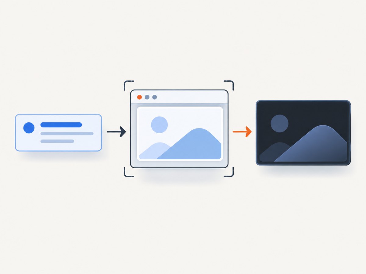
If you need screenshots of the finished themes for documentation, regression checks, or social previews, ScreenshotNeo captures a URL through one request. Its options include dark mode, custom viewport and device presets, retina scale, custom CSS and JavaScript, waiting for selectors or network idle, and full-page capture with lazy images loaded. Read the ScreenshotNeo API documentation for the complete option list.

curl -G "https://api.screenshotneo.com/v1/shot" \
  -d access_key=YOUR_API_KEY \
  --data-urlencode url=https://example.com \
  -d dark_mode=true \
  -o dark-mode.webp
import requests
r = requests.get(
"https://api.screenshotneo.com/v1/shot",
params={
"access_key": "YOUR_API_KEY",
"url": "https://example.com",
"dark_mode": "true",
},
timeout=90,
)
r.raise_for_status()
open("dark-mode.webp", "wb").write(r.content)const q = new URLSearchParams({
access_key: 'YOUR_API_KEY',
url: 'https://example.com',
dark_mode: 'true'
});
const res = await fetch(`https://api.screenshotneo.com/v1/shot?${q}`);
if (!res.ok) throw new Error(`Screenshot failed: ${res.status}`);
const image = Buffer.from(await res.arrayBuffer());
require('node:fs').writeFileSync('dark-mode.webp', image);Cookie banners, newsletter popups, and chat widgets are removed before the shot. Bot checks, blank pages, timeouts, failed loads, and cache hits cost nothing, and each response reports its verdict and billing status in X-Page-Verdict and X-Billed headers. ScreenshotNeo also provides an MCP server so Claude, Cursor, and other MCP clients can call take_screenshot, get_page_info, and capture_pdf. The Free plan includes 1,000 screenshots per month with no card; paid plans start at $5 for 3,000. Create a free ScreenshotNeo account.
11. FAQ
Does dark mode require JavaScript?
No. The automatic prefers-color-scheme approach is CSS-only. JavaScript is needed for a persistent per-site override.
Should I store “system” in localStorage?
You can, but removing the attribute and stored override is simpler and guarantees that the media query controls the page.
Can CSS change a user’s operating-system theme?
No. CSS reads the preference and styles your page; it does not change the operating-system setting.
Why include the meta color-scheme tag?
It gives the browser an early hint about supported schemes, helping browser-controlled surfaces use the correct theme during initial loading.
How do I support a page with no theme toggle?
Use the root tokens and the dark media query only. Visitors’ system preferences will determine the result automatically.


