How to Add a Hero Image in HTML
Learn how to build an accessible, responsive HTML hero image with text overlays, responsive sources, correct loading, and production-ready CSS.
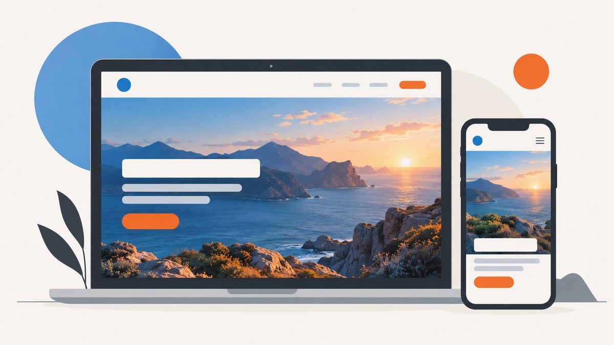
A hero image is the prominent visual near the top of a page. Use an HTML <img> when the image communicates information, then use CSS to size, crop and position it. Use background-image when the image is purely decorative. Keep the heading, supporting copy and call to action as real HTML so they remain accessible, selectable and responsive.
1. Build a basic hero with an HTML image
This complete example places a meaningful image behind readable HTML content. The intrinsic dimensions reserve space while the CSS makes the image fill the hero box.
<section class="hero" aria-labelledby="hero-title">
  <img
    class="hero__image"
    src="hero.jpg"
    alt="A team reviewing a product roadmap around a table"
    width="1600"
    height="900"
    fetchpriority="high"
  >
  <div class="hero__overlay"></div>
  <div class="hero__content">
    <p class="hero__eyebrow">Product planning</p>
    <h1 id="hero-title">Plan the next release with confidence</h1>
    <p>Bring research, tasks and decisions into one clear workflow.</p>
    <a class="button" href="/signup">Start planning</a>
  </div>
</section>
.hero {
position: relative;
min-height: 28rem;
display: grid;
place-items: center;
overflow: hidden;
isolation: isolate;
color: #fff;
background: #172033;
}
.hero__image {
position: absolute;
inset: 0;
z-index: -2;
width: 100%;
height: 100%;
object-fit: cover;
object-position: center;
}
.hero__overlay {
position: absolute;
inset: 0;
z-index: -1;
background: linear-gradient(90deg, rgb(0 0 0 / .72), rgb(0 0 0 / .18));
}
.hero__content {
width: min(100% - 2rem, 65ch);
padding: 4rem 0;
}
.hero h1 {
max-width: 13ch;
margin: 0;
font-size: clamp(2.25rem, 6vw, 5rem);
line-height: 1.05;
}
.hero p {
max-width: 55ch;
font-size: clamp(1rem, 2vw, 1.25rem);
}
.button {
display: inline-block;
padding: .8rem 1.1rem;
border-radius: .4rem;
background: #fff;
color: #172033;
font-weight: 700;
text-decoration: none;
}
@media (max-width: fortyrem) {
.hero { min-height: 34rem; }
.hero__image { object-position: 65% center; }
}Replace the sample alt text with a concise description of the information the image adds. If the image contributes no information beyond the adjacent copy, use alt="".
2. Make the hero responsive
Use srcset and sizes for the same composition
When you have several resolutions of the same image, let the browser choose the smallest suitable file. The sizes value should describe the rendered width of the image at each viewport range.

<img
  class="hero__image"
  src="hero-1600.jpg"
  srcset="
    hero-640.jpg 640w,
    hero-960.jpg 960w,
    hero-1280.jpg 1280w,
    hero-1600.jpg 1600w,
    hero-2400.jpg 2400w
  "
  sizes="100vw"
  alt="A team reviewing a product roadmap around a table"
  width="1600"
  height="900"
  fetchpriority="high"
>
Keep the width and height ratio consistent across these files. A fixed hero box with object-fit: cover may crop the edges, so keep the focal subject away from areas likely to be removed.
Use <picture> for art direction
Use <picture> when mobile needs a different crop or composition, rather than merely a smaller copy.
<picture>
  <source media="(max-width:  fortyrem)" srcset="hero-mobile.jpg">
  <source media="(min-width: 41rem)" srcset="hero-wide.jpg">
  <img
    class="hero__image"
    src="hero-wide.jpg"
    alt="A designer presenting a prototype to a small team"
    width="2000"
    height="1125"
    fetchpriority="high"
  >
</picture>
The fallback <img> remains required. Keep the same meaningful alternative text unless the image’s purpose changes at a breakpoint.
3. Put text and buttons over the image
Use a positioned parent and a content layer. Do not bake headings or buttons into the bitmap: HTML text can be translated, resized, focused and read by assistive technology.
.hero {
  position: relative;
  display: grid;
  align-items: end;
}

.hero__content {
  position: relative;
  z-index: 2;
  padding: clamp(1.5rem, 5vw, 5rem);
}

.hero__overlay {
  position: absolute;
  inset: 0;
  z-index: 1;
  background: linear-gradient(
    to top,
    rgb(0 0 0 / .78),
    rgb(0 0 0 / .12) 75%
  );
}

.hero a:focus-visible {
  outline: 3px solid #fff;
  outline-offset: 4px;
}
Choose an overlay that keeps the foreground readable over every part of the source image. Check the actual image, not only a flat color sample, at desktop and mobile widths.
4. Choose between <img> and a CSS background
| Situation | Recommended implementation | Reason |
|---|---|---|
| The image conveys a person, product, place or event | <img> |
It has an alternative-text requirement and is part of the document’s content. |
| The image is texture, decoration or atmosphere | background-image |
Decorative backgrounds do not need a text alternative. |
| Several resolutions share one composition | srcset and sizes |
The browser can select an appropriate resource. |
| The crop changes at a breakpoint | <picture> |
Art direction belongs in HTML source selection. |
Decorative background example
<section class="hero hero--decorative" aria-labelledby="decorative-title">
  <div class="hero__content">
    <h1 id="decorative-title">A quiet place to focus</h1>
    <p>The background supplies atmosphere only.</p>
  </div>
</section>
.hero--decorative {
background:
linear-gradient(rgb(0 0 0 / .45), rgb(0 0 0 / .45)),
url("hero-decorative.webp") center / cover no-repeat;
}Because this background is decorative, there is no missing image description to add. If the visual communicates information, switch back to an <img>.
5. Accessibility checklist
- Include an
altattribute on every<img>, including decorative images. - Describe the image’s purpose, not its file name, colors or styling.
- Use
alt=""when nearby text already covers the image’s information. - Keep the primary heading in an actual heading element and preserve a logical heading order.
- Keep links and buttons as HTML controls with visible keyboard focus.
- Test the overlay with the real image, zoom and high-contrast settings.
- Respect
prefers-reduced-motionif the hero includes animated transitions.
@media (prefers-reduced-motion: reduce) {
  .hero * {
    animation-duration: 0.01ms;
    animation-iteration-count: 1;
    transition-duration: 0.01ms;
    scroll-behavior: auto;
  }
}
6. Loading and performance
A visible hero image can become the page’s Largest Contentful Paint candidate. Let the browser discover it in the initial HTML and do not add loading="lazy" to an image that is immediately visible. Use fetchpriority="high" only when this image is genuinely the critical above-the-fold image, because priority is shared with other resources.
- Include intrinsic
widthandheightto reserve layout space. - Use
loading="lazy"for below-the-fold images, not the initial hero. - Prefer appropriately sized WebP or AVIF files when your delivery pipeline supports them.
- Use
srcsetandsizesso a phone does not download a desktop-sized file. - Preload only when markup discovery is delayed, such as a CSS background or JavaScript-inserted image. Match the preload’s responsive candidate to the rendered image.
- Do not claim a fixed speed improvement without measuring your own page and network conditions.
<link
  rel="preload"
  as="image"
  href="hero-1600.webp"
  imagesrcset="hero-640.webp 640w, hero-1600.webp 1600w"
  imagesizes="100vw"
>
Most heroes do not need this preload when the <img> is present in the initial response. Duplicate downloads can occur when preload and markup candidates do not match.
7. Common layouts and edge cases
Keep the focal subject visible
Adjust object-position for the subject rather than stretching the image.
.hero__image { object-fit: cover; object-position: 50% 35%; }
@media (max-width: 40rem) {
  .hero__image { object-position: 72% 35%; }
}
Preserve the natural ratio instead of cropping
.hero--natural {
  display: grid;
  grid-template-columns: minmax(0, 1fr) minmax(16rem, 28rem);
  align-items: center;
}
.hero--natural .hero__image {
  position: static;
  width: 100%;
  height: auto;
  object-fit: initial;
}
Handle a failed image
Use a useful background color and an adjacent textual message when the image is essential. Never rely on an image alone to communicate the call to action.
.hero { background: #24324a; }
.hero__image { background: #24324a; }
Avoid overflow from long copy
.hero__content { overflow-wrap: anywhere; }
.hero h1 { max-width: 16ch; }
@media (max-width: 40rem) {
  .hero__content { padding: 2rem 1rem; }
}
8. Troubleshooting
| Symptom | Likely cause | Fix |
|---|---|---|
| The image is stretched | Only one dimension is constrained or object-fit is missing. |
Set both width and height for a hero box and use object-fit: cover, or let height remain auto for natural-ratio display. |
| Text is unreadable | The photograph has bright or busy areas behind the copy. | Add a gradient overlay, move the focal point with object-position, or select a better crop. |
| The mobile subject is cut off | A desktop crop is being forced into a narrow box. | Use object-position or provide a mobile art-directed source with <picture>. |
| Layout jumps while loading | Intrinsic dimensions are absent. | Add accurate width and height attributes or reserve space with aspect-ratio. |
| The hero loads slowly | The source is larger than the rendered slot, or the image is discovered late. | Use responsive candidates, keep the image in initial HTML, and consider fetchpriority="high" only for the true critical image. |
| Screen readers announce a useless filename | The alt attribute is missing. |
Add meaningful alt text or alt="" for decoration. |
| The CSS background is not visible | The URL is relative to the CSS file, or another background declaration overrides it. | Check the resolved URL in developer tools and combine layers in one background declaration. |
| The button is hidden behind the image | Stacking contexts or z-index values are wrong. | Set position: relative on the content and give the content and overlay explicit, ordered z-index values. |
| Preload downloads the wrong file | Preload candidates do not match srcset/sizes. |
Align imagesrcset and imagesizes with the rendered image, or remove the preload. |
9. Test the finished hero
- Resize from a narrow phone width through a large desktop width.
- Confirm the subject stays visible and the heading does not overlap controls.
- Disable images and verify that the page still explains its purpose.
- Navigate with a keyboard and check focus visibility.
- Use a screen reader to confirm the heading, image alternative and call to action make sense in sequence.
- Inspect the network panel to verify the selected responsive file and absence of duplicate downloads.
- Check the hero with slow network throttling and a failed image request.
10. Or skip the browser setup
If you need rendered hero images for previews, documentation, regression checks or social cards, ScreenshotNeo returns a clean screenshot or PDF from one GET request. It accepts cookie and consent banners before capture and removes more than 60 known consent platforms, newsletter popups and chat widgets. Bot checks, blank pages, timeouts, failed loads and cache hits are not billed, and response headers identify the page verdict and billing status. Its MCP server exposes take_screenshot, get_page_info and capture_pdf for Claude, Cursor and other MCP clients.

See the ScreenshotNeo API documentation for the complete option list, including full-page capture, element selectors, dark mode, device presets, custom CSS and JavaScript, waits, request blocking, headers, cookies, geolocation, caching, signed links, asynchronous jobs, bulk capture and usage data.
curl -G "https://api.screenshotneo.com/v1/shot" -d access_key=YOUR_API_KEY --data-urlencode url=https://example.com -o hero.webpimport requests
r = requests.get("https://api.screenshotneo.com/v1/shot", params={"access_key": "YOUR_API_KEY", "url": "https://example.com"}, timeout=90)
open("hero.webp", "wb").write(r.content)const q = new URLSearchParams({ access_key: 'YOUR_API_KEY', url: 'https://example.com' });
const res = await fetch(`https://api.screenshotneo.com/v1/shot?${q}`);Every plan includes every feature. The free plan includes 1,000 screenshots each month with no card; paid plans start at $5 for 3,000 shots. Create a free ScreenshotNeo account.
11. FAQ
Should a hero image be an <img> or a background?
Use <img> when it conveys content or needs alternative text. Use a CSS background for decoration.
Can I put the heading inside the image file?
Keep it in HTML so it remains accessible, searchable, translatable and responsive.
Do I need both srcset and <picture>?
No. Use srcset/sizes for resolution choices and <picture> when the composition or crop changes.
Should the hero use lazy loading?
Do not lazy-load an image visible at the top of the page. Lazy-load images below the fold.
What should decorative image alt text be?
Use an empty attribute: alt="". Do not omit the attribute.
12. Primary references
- web.dev: Responsive images covers dimensions, alternative text, hero loading, priority and lazy loading.
- MDN: Using responsive images in HTML explains responsive source selection.
- W3C WAI: Images provides alternative-text guidance.


