10 Angular UI Libraries for a Better User Experience
Compare 10 Angular UI libraries by design fit, components, compatibility, accessibility, customization, licensing, and maintenance.

Short answer: there is no single best Angular UI library for every application. Choose from this shortlist by matching your required controls, visual language, Angular version, accessibility and localization needs, customization model, license, and the cost of future upgrades. Angular Material is a sensible first candidate for a general-purpose Angular application; commercial suites such as Kendo UI can fit teams that need vendor support and advanced controls; Ant Design users should investigate NG-ZORRO; and Ionic serves a different mobile-focused role from desktop component suites.
This is a practical shortlist, not an independent ranking. The ten names come from a May 2026 Syncfusion comparison, which is vendor-authored discovery evidence rather than proof that one library outperforms another. Specific versions, licenses, component coverage, and maintenance status change, so verify official documentation before committing.
How Angular UI libraries fit into an application
Angular describes a library as an Angular project that cannot run on its own. Libraries are normally published as npm packages, imported into an application, and sometimes installed with Angular CLI schematics that add dependencies and configure the project. In practice, adopting a UI library affects your package graph, templates, styles, accessibility behavior, test selectors, and upgrade process.
Before comparing products, write down the controls your application actually needs:
- Forms: inputs, validation, date and time controls, file upload, autocomplete.
- Data-heavy views: tables, sorting, filtering, pagination, virtual scrolling, export.
- Navigation: menus, tabs, breadcrumbs, drawers, dialogs, command surfaces.
- Feedback: alerts, toasts, progress indicators, skeletons, empty states.
- Visualization and editing: charts, rich text, code editors, calendars, maps.
- Cross-cutting needs: keyboard behavior, screen-reader semantics, localization, right-to-left layout, theming, and server-side rendering.
The 10-library shortlist
1. Angular Material
Angular Material is the first library to evaluate when you want a general-purpose component system aligned with the Angular ecosystem. Angular’s own library overview uses Material as an example. Its design language is recognizable and documented, which can shorten decisions for forms, dialogs, navigation, and common data-entry screens.
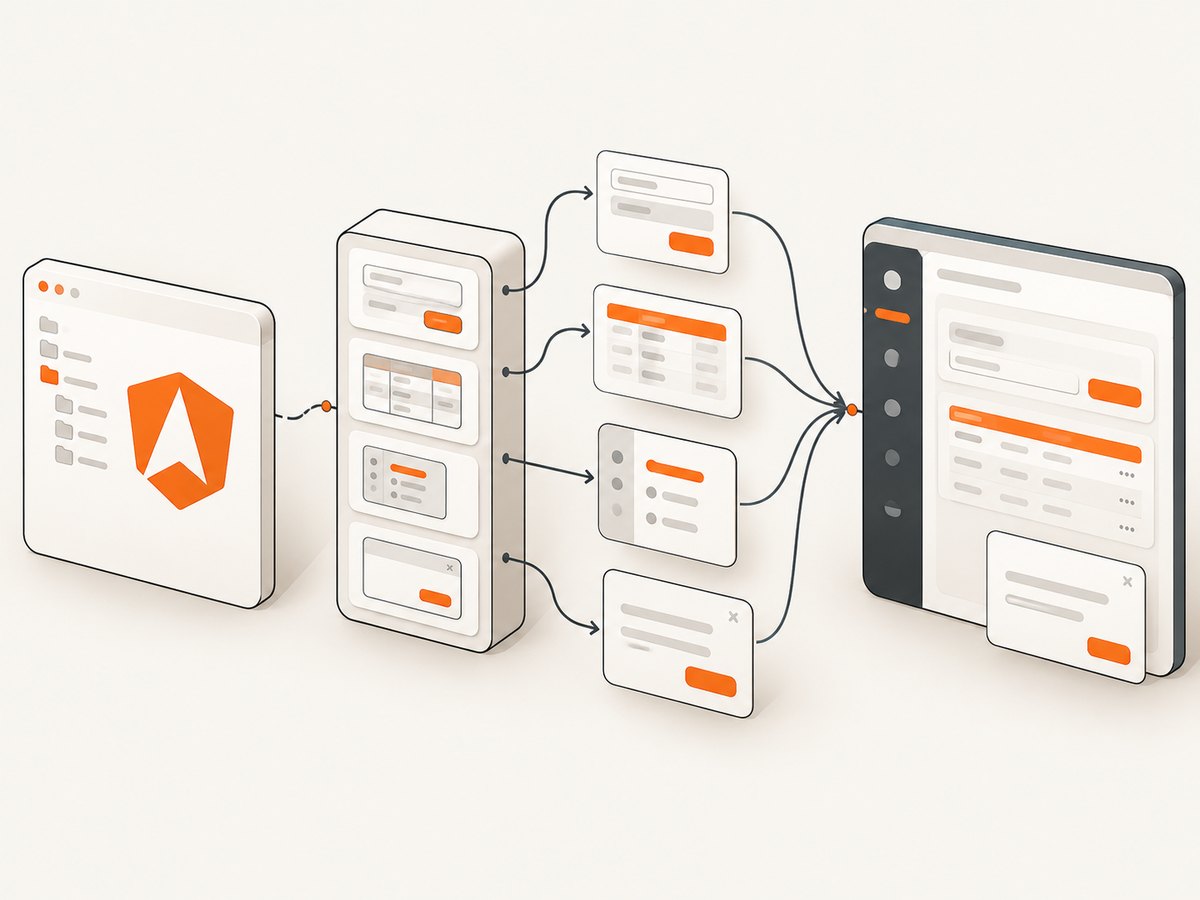
Choose it when the Material visual system is close to your product or can be themed without fighting the design. Check the current component documentation, accessibility behavior, and Angular peer-dependency range for your exact release. If your product needs highly specialized grids, editors, or charts, confirm those controls before standardizing on Material.
2. PrimeNG
PrimeNG is a named Angular option in the 2026 comparison and is often considered by teams seeking a broad component catalog. Treat the catalog as a starting point: inventory the exact table, tree, editor, date, chart, and overlay behaviors your application needs. Review the current official license, accessibility documentation, theme approach, and supported Angular versions before adoption.
3. Kendo UI for Angular
Kendo UI for Angular is a commercial suite. Telerik’s licensing documentation says it is distributed under a commercial license and requires an active trial or commercial license key for use and activation. That makes purchasing terms, renewal policy, support scope, and the specific components included in your plan part of the engineering decision.
Kendo can be a good fit when a team values a vendor-supported suite and wants advanced controls maintained behind a consistent API. Compare the total cost with the time your team would otherwise spend building, testing, and upgrading those controls.
4. NG-ZORRO
NG-ZORRO is based on Ant Design. Its official overview describes an MIT license, “70+ high-quality Angular components out of the box,” internationalization support, and Angular ^22.0.0 support in the retrieved version of the page. These are time-sensitive details; recheck them when publishing and when upgrading.
Choose it when Ant Design’s information-dense visual language suits your product. Validate keyboard behavior, localization, theme customization, and the exact Angular version range in your project rather than assuming every Ant Design example maps directly to your requirements.
5. Clarity
Clarity appears in the comparison shortlist. Its current maintenance cadence, component coverage, license, and Angular support were not independently verified in the research used for this article. If you shortlist it, inspect the official repository and documentation for recent releases, migration notes, accessibility guidance, and the controls your application requires.
6. DevExtreme
DevExtreme is another named option. Verify current Angular compatibility, licensing, support arrangements, and feature claims on the official product documentation. Pay particular attention to data-grid behavior, bundle impact, theming, and whether the license covers the deployment model you operate.
7. Ionic
Ionic has a different center of gravity from a desktop-oriented component suite. It is designed for applications that may target mobile platforms and web, with touch-friendly controls and a mobile application workflow. Do not treat it as interchangeable with every enterprise desktop library. Decide first whether your product is primarily mobile, responsive web, or desktop business software, then assess Ionic’s navigation, gestures, native integration, and visual conventions against that goal.
8. Taiga UI
Taiga UI provides an Angular-specific installation path through ng add taiga-ui for Angular CLI and Nx projects. That command is useful evidence of integration with common Angular workflows, but installation guidance alone does not establish current support ranges or component quality. Confirm the release matrix, theming model, accessibility documentation, and required controls.
ng add taiga-ui9. Nebular
Nebular is included in the source comparison. Before choosing it, validate current maintenance, Angular support, design approach, license, and component scope. A polished demo is not enough: build a small spike with your real form validation, table density, navigation, and branding requirements.
10. Syncfusion
Syncfusion is included in a comparison published by Syncfusion itself. Use that inclusion as a discovery lead, not independent evidence of superiority. Verify current license eligibility, component requirements, support terms, and activation rules on the official product pages. If a commercial suite is attractive, compare its total cost and support model directly with Kendo UI and any other paid option under consideration.
Comparison framework: how to choose objectively
| Decision axis | Questions to answer | Evidence to collect |
|---|---|---|
| Design fit | Does the default visual language match the product? How much theme work is needed? | Figma or coded prototypes using real screens, not only marketing demos. |
| Required controls | Are your exact grid, editor, date, chart, upload, and navigation behaviors covered? | Component documentation, API examples, and a proof-of-concept. |
| Angular compatibility | Does the package support your Angular version and peer dependencies? | Angular’s release policy plus each library’s compatibility matrix. |
| Accessibility | Can keyboard and screen-reader users complete every workflow? | Component-specific accessibility docs and manual checks with your templates. |
| Localization | Are translations, date formats, number formats, and right-to-left layouts supported? | Internationalization guides and a test locale. |
| Customization | Can you apply tokens, density, typography, states, and brand colors without brittle overrides? | Theming APIs, generated CSS, and a branded prototype. |
| License and support | Is the license compatible with your company, distribution, and budget? | Current license text, activation rules, support SLA, and renewal terms. |
| Maintenance | How difficult is an Angular major upgrade or a future replacement? | Release history, migration guides, issue response, and abstraction boundaries. |
A repeatable evaluation process
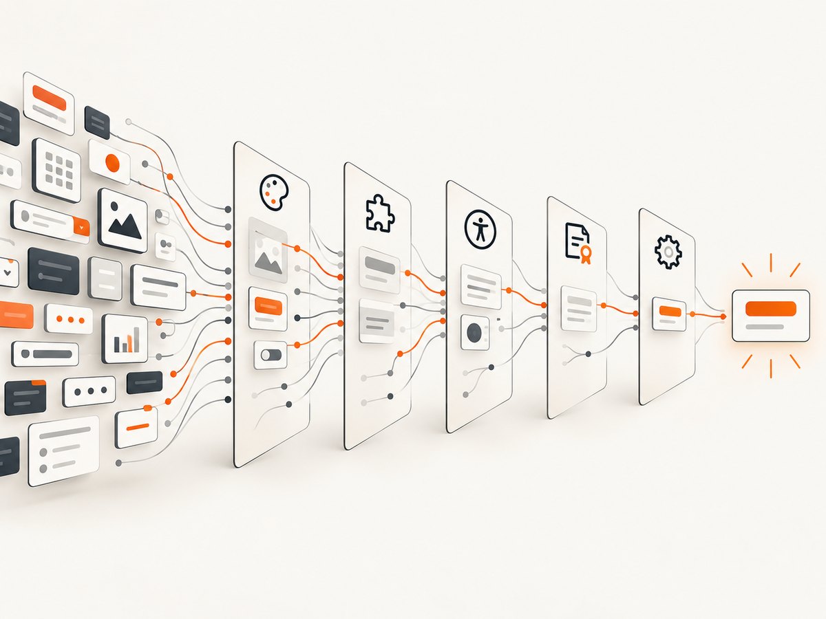
- Freeze the context. Record your Angular version, rendering mode, browser support, build system, and whether you use Nx or Angular CLI.
- Create a control inventory. Mark each control as required, optional, or build-yourself. Include behavior such as virtual scrolling and keyboard shortcuts.
- Build one representative screen. Use a form, a dense table, navigation, validation errors, loading states, and an empty state. This exposes integration problems earlier than a component gallery.
- Measure upgrade effort. Read the migration guide for your next Angular major release and inspect peer dependencies in a clean branch.
- Review accessibility and localization. Test keyboard-only completion, focus order, announcements, long labels, translated strings, and right-to-left layout where relevant.
- Model cost. Include license fees, support, developer time, design work, bundle and performance work, and the cost of replacing library-specific components.
- Set an exit boundary. Wrap library components behind your own feature components where practical. Keep domain logic independent from vendor APIs.
Angular implementation example
The following standalone component shows the shape of a library-backed form. Replace the imports with the modules or standalone components required by the library you select. The application logic remains ordinary Angular code.
import { Component } from '@angular/core';
import { FormControl, ReactiveFormsModule, Validators } from '@angular/forms';

@Component({
  selector: 'app-profile-form',
  standalone: true,
  imports: [ReactiveFormsModule],
  template: `
    <form (ngSubmit)="save()">
      <label>Display name
        <input [formControl]="displayName" autocomplete="name" />
      </label>
      @if (displayName.invalid && displayName.touched) {
        <p role="alert">Enter at least two characters.</p>
      }
      <button type="submit" [disabled]="displayName.invalid">Save</button>
    </form>
  `
})
export class ProfileFormComponent {
  displayName = new FormControl('', {
    nonNullable: true,
    validators: [Validators.required, Validators.minLength(2)]
  });

  save() {
    if (this.displayName.valid) {
      console.log({ displayName: this.displayName.value });
    }
  }
}
When you substitute a UI library control, preserve the label association, visible validation, focus behavior, and semantic button type. A component that looks polished but drops these fundamentals creates a worse user experience.
Performance, reliability, and upgrade notes
- Bundle size: import only the components you use where the library supports tree-shaking. Inspect production build output rather than relying on a package’s headline size.
- Change detection: large tables and lists need stable identities, pagination or virtualization, and careful handling of observable emissions.
- Styles: global themes can affect lazy-loaded routes. Define ownership for tokens, typography, and overlay containers.
- SSR and hydration: verify that components do not assume
windowor browser-only APIs during server rendering. - Upgrade planning: Angular publishes a release and compatibility policy, but third-party libraries follow their own schedules. Test Angular and library upgrades together in a branch.
- Failure isolation: wrap expensive or vendor-specific controls so a library update does not spread through business logic and domain models.
Common selection mistakes and fixes
| Problem | Cause | Fix |
|---|---|---|
| Choosing by component count | A headline count does not prove that your required control behaves correctly. | Prototype the exact workflows, including keyboard and error states. |
| Ignoring peer dependencies | The library targets a different Angular major version. | Check the compatibility matrix before installation and pin compatible versions. |
| Theme overrides become brittle | Internal CSS selectors were customized directly. | Use documented tokens and theming APIs; isolate unavoidable overrides. |
| Paid-license surprise | Trial activation or commercial terms were reviewed late. | Read current license and activation documentation before the proof of concept. |
| Accessibility regressions | Defaults were assumed to cover application-specific composition. | Test the composed screen with keyboard navigation and assistive technology. |
| Migration becomes expensive | Business logic depends directly on vendor types. | Keep domain models and feature APIs independent of UI-library internals. |
Or skip the browser setup
If you are documenting your Angular interface, generating visual regression assets, or capturing library demos, ScreenshotNeo can take the screenshot through one HTTP request. It accepts a URL and returns PNG, JPEG, WebP, or PDF. Cookie and consent banners, newsletter popups, and chat widgets are removed before the shot; bot checks, blank pages, timeouts, failed loads, and cache hits are not billed, and response headers identify the page verdict and billing result. Its MCP server provides take_screenshot, get_page_info, and capture_pdf tools for Claude, Cursor, and other MCP clients.
See the ScreenshotNeo API documentation for all options, including full-page and element capture, device presets, custom CSS and JavaScript, waits, request blocking, headers, cookies, geolocation, PDF settings, caching, signed links, async jobs, bulk capture, and usage reporting.
curl -G "https://api.screenshotneo.com/v1/shot" -d access_key=YOUR_API_KEY --data-urlencode url=https://angular.dev -o shot.webpimport requests
r = requests.get("https://api.screenshotneo.com/v1/shot", params={"access_key": "YOUR_API_KEY", "url": "https://angular.dev"}, timeout=90)
open("shot.webp", "wb").write(r.content)const q = new URLSearchParams({ access_key: 'YOUR_API_KEY', url: 'https://angular.dev' });
const res = await fetch(`https://api.screenshotneo.com/v1/shot?${q}`);There are 1,000 screenshots a month free with no card. Paid plans start at $5 for 3,000 shots, and every feature is on every plan. Create a free ScreenshotNeo account.
FAQ
What is the best UI library for Angular?
Use the library that best matches your controls, design system, Angular version, accessibility requirements, and license. Angular Material is a reasonable first evaluation for general-purpose applications, but it is not a universal winner.
Are Angular UI libraries physical products?
No. They are software dependencies, generally installed as npm packages and integrated into an Angular project.
Should I choose a commercial suite?
Choose one when its controls, support, and upgrade assistance justify the license cost for your team. Confirm current activation and renewal terms before purchase.
Is Ionic interchangeable with desktop component suites?
No. Ionic has a mobile-oriented application role and should be evaluated against your target platforms and interaction model.
How often should I re-evaluate the library?
Review it before Angular major upgrades, major design-system changes, or when a required control becomes a recurring custom-maintenance burden.