Applitools Eyes vs Percy for Testing Responsive Websites
Compare how Applitools Eyes and Percy capture responsive states, review visual changes, integrate with CI, and count usage. Use a practical checklist to choose.
Short answer: both Applitools Eyes and Percy support visual regression testing at responsive widths. The main difference is how they capture and operate on those widths. Applitools describes capturing mobile, tablet, and desktop breakpoints in one test and using Visual AI to help identify layout changes. Percy stores a DOM snapshot and page assets, then renders them at configured widths; each browser-and-width rendering counts toward screenshot usage. If your page changes its DOM or content between breakpoints, validate that behavior explicitly in either tool. There is no independent head-to-head benchmark here establishing a universal winner for accuracy or speed.
Choose based on your test runner and language, viewport-dependent page behavior, required browsers, review workflow, and the plan units your test matrix consumes. Pilot both on the same representative pages before committing.
At a glance
| Decision point | Applitools Eyes | Percy |
|---|---|---|
| Responsive capture model | Applitools describes capturing multiple breakpoints within one test. | Stores DOM and assets, then renders at configured widths. |
| DOM changes by viewport | Test the actual app behavior at every target breakpoint. | Responsive DOM capture has specific setup guidance; validate SDK and version requirements. |
| Comparison and review | Vendor describes Visual AI, match options, and grouped baseline updates. | Screenshot diffs and a build approval workflow. |
| Usage model | Pricing page describes component checkpoints or page checkpoints, depending on plan. | Each browser-width combination is a screenshot toward usage. |
| Best first question | Does the Eyes SDK fit your runner, and do its review controls suit the team? | Does Percy capture your responsive DOM correctly, and does the matrix fit quota? |
These are product descriptions from vendor documentation, not independently measured performance results. See Applitools’ responsive testing overview and BrowserStack’s Percy responsive testing documentation.
How the responsive capture models differ
Applitools Eyes: breakpoints in a test
Applitools says a test can capture mobile, tablet, and desktop breakpoints and use Visual AI and layout matching to focus attention on meaningful layout changes. It also describes rendering browser and viewport combinations in parallel with Ultrafast Grid and updating baselines across affected viewports together. Treat these as Applitools’ descriptions of its product capabilities, not a guarantee of speed or fewer review errors for a particular application.
Eyes SDKs are documented for Cypress, Playwright, Selenium, WebdriverIO, TestCafe, Puppeteer, and additional frameworks. Confirm language, runner, SDK version, and plan fit before choosing an implementation. The Eyes SDK documentation is the starting point.
Percy: stored snapshots rendered at widths
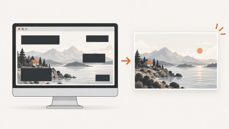
Percy documents a flow in which it stores the original DOM snapshot and page assets, then renders the snapshot at configured widths. That is useful for checking a fluid layout across a width matrix, but it makes viewport-dependent application state a key proof-of-concept case. If JavaScript changes the DOM, content, or navigation when the browser is resized, check Percy’s responsive DOM capture guidance and verify the exact SDK and configuration your project uses.
Percy documents up to ten widths per snapshot, from 120 to 2,000 pixels, for listed browser configurations, as well as maximum page dimensions. Check the current browser compatibility and page dimension limits against your pages; do not assume all combinations are available on every plan.
What to compare in a proof of concept
- Choose representative pages. Include a conventional fluid page and one with viewport-specific behavior such as a mobile menu, reordered content, or conditional components.
- Fix the matrix. Use the same widths, browser families, pages, and CI trigger for both products. Include your actual target devices or browsers if required.
- Introduce controlled visual changes. Try a missing menu, a wrapping issue, an overlap, and an intentional redesign. Record which diffs are useful and which create noise.
- Measure operating effort. Track setup time, capture failures, baseline approval steps, ownership, and how much maintenance each change requires.
- Check DOM fidelity. Confirm the mobile page actually contains the mobile state you intend to validate, particularly where JavaScript responds to resize or hydration.
- Calculate quota with real runs. Use expected pages, components, browser-width combinations, run frequency, retention, and any applicable limits. Do not compare checkpoint units directly with screenshot units.
- Verify current plan details. Check current usage allowances, overages, retention, browser/device entitlements, and price immediately before adopting a plan.
Usage and pricing considerations
Percy’s billing documentation says browser-width combinations count individually. Its example of two pages across two browsers and three widths totals twelve screenshots, even though the interface groups the results into two snapshots. Multiply out the matrix before estimating usage: pages × browsers × widths × runs. Account for branches and pull request runs if they trigger captures.
BrowserStack’s Percy documentation described a free plan with 5,000 monthly screenshots at the time covered by the research, with paid limits and overage charges depending on plan. Because allowances and prices change, verify the current plans and billing terms rather than relying on that figure.
Applitools’ pricing page displayed Starter at $667 per month, paid annually, with 100,000 component checkpoints or 1,000 page checkpoints at research time. Those are different usage units from Percy screenshots. Pricing is volatile; consult the current Applitools pricing page and establish what your expected test volume consumes before comparing costs.
Framework, browser, and review fit
Start with the exact test runner and language already used in your repository. Confirm the supported SDK and version, how tests launch in CI, how credentials are configured, and whether the product supports the browser and device coverage you need. Percy documents cross-browser project settings and plan-dependent mobile browser access; verify current eligibility in its cross-browser and visual testing documentation.
Then inspect the human workflow. Ask who approves a changed baseline, how a pull request links to the comparison, how intentional redesigns are handled, and whether related viewport changes can be reviewed together. The fastest capture is not automatically the best fit if its review process creates friction or if the team cannot maintain the baselines.
Reliability and performance notes
- Do not infer speed from vendor claims of parallel rendering. Measure end-to-end CI time on your own pages and matrix.
- Dynamic content can create noisy diffs. Stabilize data, timestamps, animation, and third-party content in the test environment where possible.
- Fonts and images must load consistently. Confirm the capture waits for the application state and assets your baseline represents.
- Viewport changes can trigger asynchronous layout or application updates. Capture after the relevant state settles, and ensure your test does not merely resize a static DOM when the real app renders a different state.
- Keep browser versions and rendering settings aligned with the visual behavior you want to protect. Record configuration changes so baseline shifts are explainable.
Common problems and fixes
| Symptom | Likely cause | What to check |
|---|---|---|
| Mobile screenshot shows desktop navigation | The captured DOM does not represent the application’s mobile state. | Verify responsive DOM capture or run the app at the target viewport before capture; check the SDK’s responsive setup. |
| Many diffs appear without a code change | Unstable content, animation, fonts, image loading, or environment variation. | Stabilize the test data and assets, wait for the intended state, and review the comparison settings. |
| Usage is higher than expected | Every configured browser-width rendering adds usage in Percy. | Recalculate pages × browsers × widths × runs and remove combinations that do not serve a coverage goal. |
| A browser or viewport cannot be selected | The requested combination may not be supported or included in the project’s plan. | Check current compatibility, project settings, and plan entitlements. |
| Baseline updates are hard to review | Changes across many pages or viewports are being approved without clear ownership. | Define baseline approvers, link changes to the intended redesign, and pilot the grouped review flow. |
| CI captures fail intermittently | The page may not be ready, the runner may be misconfigured, or the SDK setup may not match the framework. | Check SDK/version support, CI credentials, navigation readiness, network dependencies, and vendor error details. |
Which one should you choose?
- Lean toward Applitools Eyes if its SDK matches your test stack and its documented Visual AI, breakpoint workflow, and baseline handling fit the way your team reviews visual changes. Validate the benefits on your app rather than assuming vendor descriptions predict your results.
- Lean toward Percy if its snapshot-and-render model, SDK setup, browser coverage, and review flow work for your project, and the width/browser matrix fits your screenshot allowance. Give viewport-dependent DOM behavior special attention.
- Choose after a pilot if you have complex responsive states, strict browser requirements, or substantial CI volume. Run the same cases through both and compare useful diffs, noise, reliability, review effort, and actual plan cost.
The available official documentation does not establish an independent winner for visual accuracy or speed. The strongest decision is the one supported by your own representative pages and current plan terms.
Or skip the browser setup
If your immediate need is to capture responsive screenshots for documentation or inspection rather than run visual regression baselines, ScreenshotNeo is a website screenshot API and MCP server from Yorker Media. It is a practical alternative to try first when you want a screenshot without building and maintaining browser capture infrastructure: one GET request returns PNG, JPEG, WebP, or PDF, and it offers viewport and device presets. It is not a replacement for the baseline comparison and approval workflows described above.
Use the API with the viewport you want to inspect; see the ScreenshotNeo API documentation for options.
curl -G "https://api.screenshotneo.com/v1/shot" -d access_key=YOUR_API_KEY --data-urlencode url=https://stripe.com -o shot.webpimport requests
r = requests.get(
"https://api.screenshotneo.com/v1/shot",
params={"access_key": "YOUR_API_KEY", "url": "https://stripe.com"},
timeout=90,
)
open("shot.webp", "wb").write(r.content)const q = new URLSearchParams({ access_key: 'YOUR_API_KEY', url: 'https://stripe.com' });
const res = await fetch(`https://api.screenshotneo.com/v1/shot?${q}`);
if (!res.ok) throw new Error(`Screenshot request failed: ${res.status}`);
await Bun.write('shot.webp', res);With ScreenshotNeo, cookie banners, popups, and chat widgets are removed before the shot; bot checks, blank pages, and failed loads are never billed. Its MCP server lets AI agents take screenshots. The free plan includes 1,000 screenshots a month with no card, and paid plans start at $5 for 3,000. Sign up for 1,000 free screenshots a month.
FAQ
Does Percy test responsive breakpoints?
Yes. You can configure widths, and Percy renders snapshots at those widths. Check responsive DOM capture guidance when the application structure changes across viewports.
How many Percy screenshots do multiple browsers and widths use?
Each browser-width combination is counted separately for each page rendering. Two pages, two browsers, and three widths make twelve screenshot units for a run.
Can one of these tools prove a layout works on every real device?
A configured viewport or browser matrix only covers the combinations you run. Select widths and browsers based on your users and verify any device-specific behavior your product depends on.
Is one tool independently proven more accurate?
No independent head-to-head benchmark was identified in the research for this comparison. Test both against the same controlled changes and inspect the review results.
Sources
- Applitools: Responsive Design Testing with Visual AI
- Applitools: Choosing an SDK
- Applitools: Platform Pricing
- BrowserStack: Responsive Visual Testing
- BrowserStack: Capture responsive DOM snapshots
- BrowserStack: Browser compatibility and maximum page dimensions with Percy
- BrowserStack: Plans and billing
- BrowserStack: Cross-browser visual testing
- BrowserStack: Visual Testing with Percy