14 Best JavaScript UI Libraries to Build Modern Applications
Compare 14 React and Vue UI libraries by styling model, scope, components, accessibility, and project fit so you can choose with confidence.

There is no universal “best” JavaScript UI library. The right choice depends first on your framework, then on how much visual design and component behavior you want to own. This guide compares 14 practical options for React and Vue applications, explains the trade-offs, and gives a decision process you can use before committing to a dependency.
Quick answer: which library should you choose?
| Need | Shortlist |
|---|---|
| Comprehensive React system with a ready visual language | Material UI (MUI), Ant Design, Mantine |
| Enterprise forms, tables, internationalization, and themes | Ant Design |
| Components plus reusable React hooks | Mantine |
| Maximum control over markup and styling | Radix UI, Headless UI, shadcn/ui |
| Bootstrap conventions in a React codebase | React Bootstrap |
| Material-oriented Vue application | Vuetify |
| Vue application with a broader framework ecosystem | Quasar |
| Rich Vue component collection | Element Plus, Ant Design Vue, PrimeVue |
Start with the framework your application already uses. React and Vue libraries are not interchangeable, and migration costs usually outweigh small differences in component catalogs. Next decide whether you want a complete visual system, a headless primitive, or a wider application framework.
How to evaluate a JavaScript UI library
- Framework and version: confirm the library supports your exact React or Vue version and your build tool.
- Styling model: choose a predesigned system (Material, Ant, Bootstrap), a themeable component set, or unstyled primitives.
- Scope: distinguish a component collection from a framework that also handles routing, build conventions, or deployment.
- Product requirements: list forms, validation, dialogs, menus, data tables, date pickers, internationalization, charts, and mobile behavior before comparing demos.
- Accessibility ownership: read the project’s accessibility guidance and test the exact components you will ship. A library cannot make custom composition accessible automatically.
- Maintenance and licensing: review release activity, upgrade notes, supported browsers, license terms, and the cost of replacing components later.
The available evidence does not provide a neutral benchmark or independent ranking of these projects. Component counts, repository stars, or a single demo are not proof that one library is faster or more accessible for your application.

React UI libraries
1. Material UI (MUI)
Material UI is a comprehensive React component library implementing Google’s Material Design. Its documentation describes it as an open-source library that can be used in production out of the box. Choose it when you want common components, a coherent baseline, and customization options for a product design system. Material Design conventions can accelerate delivery, while heavily bespoke products may need more theme work. The official site also links to templates and design kits.
npm install @mui/material @emotion/react @emotion/styled2. Ant Design
Ant Design fits enterprise-style React applications that need a broad component set, TypeScript types, internationalization, and detailed theme customization. Its documentation recommends installing through a package manager and importing components through a build tool rather than loading the entire browser bundle. Check its current version and migration notes before upgrading a production application.
npm install antd3. Mantine
Mantine combines React components with hooks for inputs, overlays, navigation, date pickers, notifications, and related behavior. Mantine currently reports more than 120 customizable components and more than 70 hooks; those are vendor-published counts, not an independent comparison. It is a practical fit when you want useful behavior utilities alongside presentational components and still need theme control.
npm install @mantine/core @mantine/hooks4. Chakra UI
Chakra UI is identified in the community-maintained index as a modular and accessible React component library. It suits teams that want composable components and a theme-driven styling approach. Verify the current Chakra documentation for package names, version-specific APIs, server-rendering behavior, and accessibility guidance before standardizing on it.
5. shadcn/ui
shadcn/ui is described by the community index as copy-paste components built with Radix UI and Tailwind. Its source-in-project approach gives your team direct ownership of component code and styling. That ownership also means upgrades, bug fixes, and consistency are your responsibility. Confirm the current official documentation before assuming it behaves like a centrally installed component package.
6. Radix UI
Radix UI provides lower-level React primitives for accessibility-focused behavior. It is appropriate when you want to build a distinctive visual system while relying on primitives for interactions such as menus, dialogs, and popovers. Expect to write more CSS and composition code than you would with a fully styled library, and verify the exact primitive coverage you need.
7. Headless UI
Headless UI supplies unstyled components for projects that value complete control over appearance and already have a styling approach. It can work well with a bespoke design system, but you must provide layout, visual states, responsive behavior, and final polish. Confirm current framework support and component coverage in the official documentation before selecting it.
8. React Bootstrap
React Bootstrap is a React implementation of Bootstrap components. It is a sensible choice when your team already understands Bootstrap conventions, has existing Bootstrap styles, or needs to incrementally move a Bootstrap application to React. Check the supported Bootstrap and React versions together, and account for any global CSS assumptions in your application.
9. PrimeReact
PrimeReact is described by the community index as a rich set of open-source native React components. It is worth evaluating for applications that need many ready-made controls and data-oriented screens. Confirm the current theme system, component coverage, licensing, and version support on the project documentation for your specific release.
Vue UI libraries
10. Element Plus
Element Plus is a Vue 3 UI library listed in the community index. It is a candidate for teams that want a conventional, ready-made component collection for Vue. Before adoption, verify the supported Vue version, theming model, build integration, accessibility documentation, and the components required by your product.
11. Vuetify
Vuetify is a Vue component framework with a Material Design orientation. Its official landing page presents it as a complete Vue ecosystem for content-rich web applications. Select it when Material-inspired patterns and an integrated Vue experience match your product. If your brand requires a fully bespoke visual language, evaluate the amount of theme customization first.
12. Ant Design Vue
Ant Design Vue is the Vue counterpart in the Ant Design family. The community index lists it as Ant Design for Vue. It is a candidate for teams that want Ant-style enterprise patterns in a Vue application, but verify current Vue compatibility, component parity, theme APIs, and upgrade guidance in its own documentation.
13. Quasar
Quasar is listed as a Vue-based framework option. Compare its broader framework scope with a component-only library before choosing it. A wider ecosystem can reduce setup work when its conventions fit, while introducing framework-specific decisions that may be unnecessary for a smaller application.
14. PrimeVue
PrimeVue is described by the community index as a rich set of open-source Vue components. It belongs on the shortlist when you need many ready-made controls and want to compare Prime’s Vue offering with PrimeReact. Confirm current themes, component coverage, Vue compatibility, and licensing before committing.
Decision matrix by project situation
| Situation | First options to investigate | Question to answer |
|---|---|---|
| New React product with a standard design language | MUI or Mantine | Does the default visual system need light or heavy customization? |
| Operations dashboard with complex business workflows | Ant Design, Mantine, PrimeReact | Which library covers your tables, forms, date controls, and localization? |
| Design-led React product | Radix UI, Headless UI, shadcn/ui | Can your team maintain primitives, styles, and interaction states? |
| Existing Bootstrap application | React Bootstrap | Can you preserve current CSS and migration conventions? |
| Vue product centered on Material patterns | Vuetify | Does its ecosystem and theme model fit your application? |
| Vue product needing a wider framework | Quasar | Will the broader framework reduce setup enough to justify its conventions? |
| Vue product needing a large component catalog | Element Plus, Ant Design Vue, PrimeVue | Which project supports your exact Vue version and required components? |
Installation and a small component example
Install only the library you have selected, then build one representative screen before adopting it across the application. A representative screen should include your hardest form, an overlay, responsive layout, validation states, and loading or error states.
import React from 'react';
import Button from '@mui/material/Button';
import TextField from '@mui/material/TextField';

export default function SignupForm() {
  return (
    <form>
      <TextField label="Email" type="email" required fullWidth />
      <Button type="submit" variant="contained">Create account</Button>
    </form>
  );
}
For a Vue library, create the equivalent screen with the project’s documented component imports and confirm server-side rendering, CSS extraction, and tree-shaking behavior in your build. Keep application logic separate from library-specific wrappers so a future migration affects fewer files.
Performance, reliability, and cost considerations
- Bundle size: import components through the documented build path and inspect your production bundle. Avoid loading an entire browser bundle when selective imports are supported.
- Runtime work: large tables, menus, and date controls can add interaction and rendering cost. Measure your real screen, not an isolated component demo.
- CSS strategy: CSS-in-JS, global styles, utility classes, and generated CSS have different server-rendering and caching behavior. Match the library to your deployment model.
- Reliability: pin versions, read upgrade notes, and keep a small visual regression suite for the components that matter most.
- Engineering cost: a free library can still be expensive if it forces extensive overrides or makes upgrades difficult. Estimate maintenance time alongside license terms.
Common problems and fixes
| Problem | Likely cause | Fix |
|---|---|---|
| Styles are missing in production | Provider, CSS import, or build integration is incomplete | Follow the library’s installation guide, inspect generated CSS, and test a production build. |
| Hydration mismatch | Server and client render different generated IDs, styles, or browser-only values | Use the library’s SSR setup, stable rendering inputs, and documented style cache configuration. |
| Bundle is unexpectedly large | Whole-package imports or duplicated dependencies | Use documented component imports and inspect the dependency graph. |
| Keyboard interaction fails | Headless primitives were composed incorrectly or custom markup removed semantics | Restore required roles, labels, focus handling, and keyboard tests. |
| Upgrade breaks layout | Major-version changes or undocumented overrides | Read migration notes, remove brittle selectors, and upgrade one major version at a time. |
| Theme changes do not apply | Provider scope, CSS order, or token naming is wrong | Check provider placement and generated style order, then test one token in isolation. |
Or skip the browser setup: ScreenshotNeo
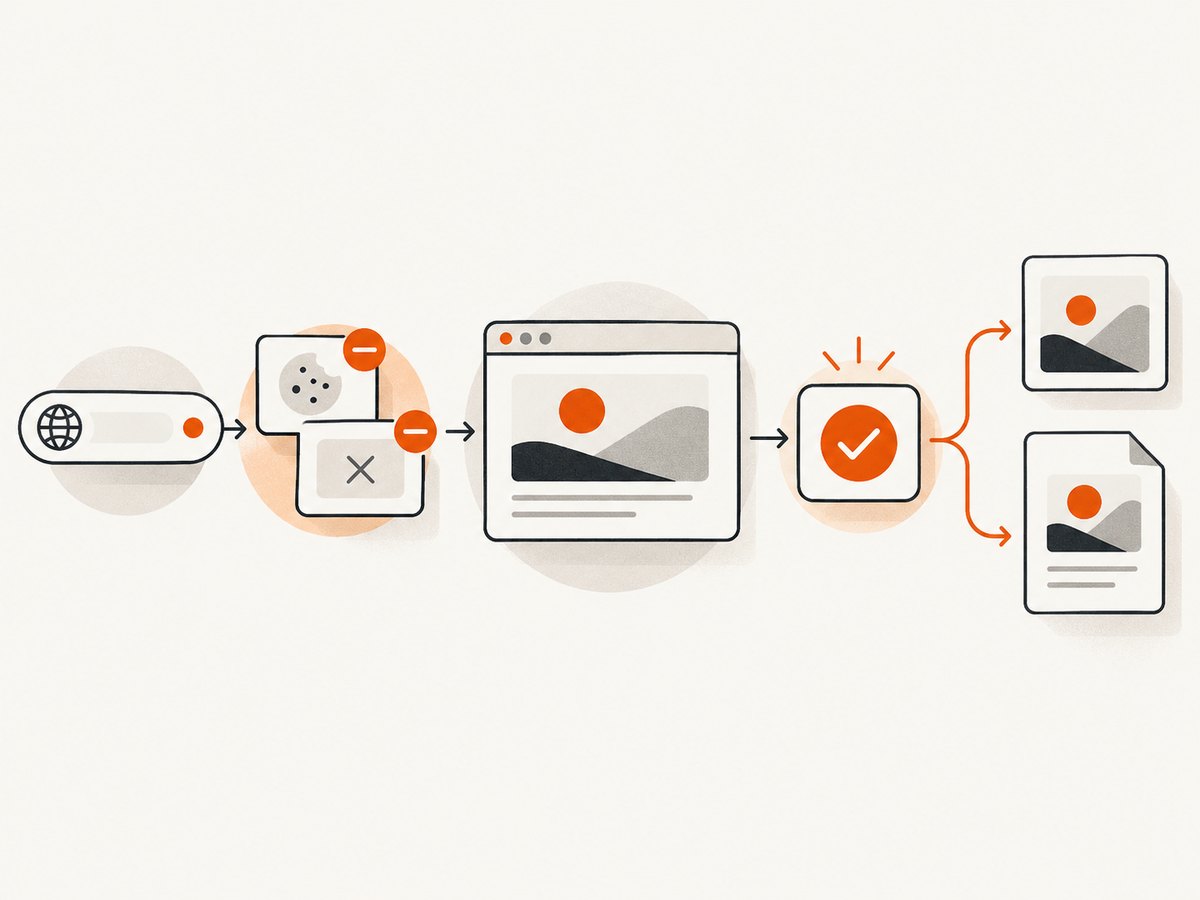
If your application documentation, visual tests, or release workflow needs website screenshots, ScreenshotNeo provides a single API call instead of maintaining browser automation. It accepts a URL and returns PNG, JPEG, WebP, or PDF output.
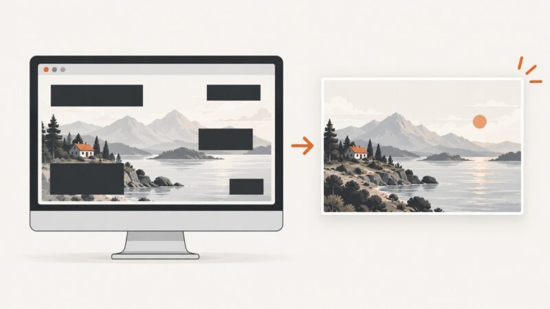
ScreenshotNeo accepts cookie and consent banners as a visitor and removes more than 60 known consent platforms, newsletter popups, and chat widgets before capture. Each cleanup step can be disabled. Bot checks and CAPTCHAs, blank pages, timeouts, failed loads, and cache hits are not billed; response headers identify the page verdict and whether the request was billed.
curl -G "https://api.screenshotneo.com/v1/shot" -d access_key=YOUR_API_KEY --data-urlencode url=https://stripe.com -o shot.webpSee the ScreenshotNeo API documentation for all options.
import requests
r = requests.get("https://api.screenshotneo.com/v1/shot", params={"access_key": "YOUR_API_KEY", "url": "https://stripe.com"}, timeout=90)
open("shot.webp", "wb").write(r.content)
const q = new URLSearchParams({ access_key: 'YOUR_API_KEY', url: 'https://stripe.com' });
const res = await fetch(`https://api.screenshotneo.com/v1/shot?${q}`);It also supports full-page capture with lazy images, CSS-element capture, dark mode, device presets and custom viewports, retina scale, PDF paper and page controls, custom CSS and JavaScript, clicks, waits, request blocking, headers, cookies, user agents, authorization, timezone, geolocation, transparent backgrounds, resizing, selectable cache TTLs, signed image links, asynchronous jobs with signed webhooks, bulk capture for 100 URLs per call, a usage API, and an OpenAPI specification. An MCP server exposes take_screenshot, get_page_info, and capture_pdf to Claude, Cursor, and other MCP clients.
The Free plan includes 1,000 screenshots each month with no card. Paid plans start at $5 for 3,000 screenshots; yearly billing gives two months free, and every feature is available on every plan. Create a free ScreenshotNeo account.
FAQ
Should I choose a React or Vue library first?
Choose the library family that matches the framework already used by your application. Re-platforming to use a component library usually creates more work than it saves.
Is a headless library better than a styled library?
Headless libraries give you more visual control and more implementation responsibility. Styled libraries reduce setup work and impose more design decisions.
Are component counts a reliable comparison?
No. Counts vary by definition and version. Mantine’s 120-plus components and 70-plus hooks are vendor-published figures, not a neutral quality score.
How should I validate a final choice?
Build one representative screen, run an accessibility check, inspect the production bundle, test server rendering if applicable, and review upgrade and license terms.