Best Screenshot API for Capturing Websites at iPhone and Android Sizes
Compare mobile screenshot APIs by viewport, device emulation, capture options, and workflow. Learn what presets can—and cannot—tell you about real phones.
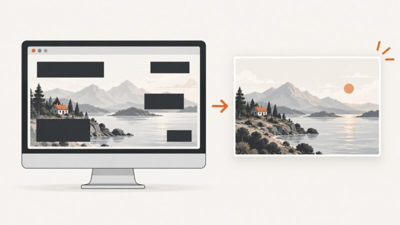
Short answer: Choose a screenshot API by the capture contract it actually provides: iPhone and Android viewport presets or custom dimensions, device scale factor, mobile mode, touch and user-agent settings, full-page or element capture, output formats, and request and billing behavior. A device preset is browser emulation, not a screenshot from a physical phone. ScreenshotNeo is the first API to try if you want a simple request, clean screenshots, and billing tied to successful clean captures: ScreenshotNeo.
1. What “iPhone and Android sizes” means
A mobile screenshot starts with a browser viewport measured in CSS pixels. Some APIs let you choose width and height directly; others provide named device presets that bundle dimensions with additional emulation settings. A screenshot taken at a mobile viewport is useful for checking responsive layouts, but it does not prove that a physical phone, operating system, browser version, or network will behave identically.
Vendors use “device” and “preset” differently. ScreenshotOne says its device option configures width, height, scale factor, mobile mode, touch, and orientation, while explicitly stating that its API does not use an actual device. ScreenshotEngine says its viewport presets do not emulate a physical device’s browser, touch input, user agent, or pixel density. Ask what a preset changes before comparing device names. ScreenshotOne device documentation; ScreenshotEngine parameter reference.
ScreenshotCore documents named iPhone and Android examples alongside custom width and height, device pixel ratio, touch, and user-agent controls. This illustrates why a preset label alone is not enough to understand the capture. ScreenshotCore mobile screenshot API.
2. How to choose an API
There is no independently established winner across providers in the available evidence. Make a shortlist from your requirements, then compare the actual output and workflow on representative pages from your own site.
| Requirement | What to check | Why it matters |
|---|---|---|
| iPhone and Android coverage | Named presets for both, or custom viewport width and height | Device labels can refer to different dimensions and settings. |
| Emulation fidelity | Whether the preset also sets device pixel ratio, mobile mode, touch, orientation, and user agent | Some presets specify dimensions only; others bundle more browser emulation settings. |
| Capture shape | Viewport, full page, or a selected element | Use viewport captures for a screen-sized view, full-page captures for a long layout, and element captures for a component. |
| Rendering controls | Wait conditions, delay, custom CSS or JavaScript, cookies, headers, and authentication | Dynamic content and gated pages may need controlled setup before capture. |
| Output and integration | PNG, JPEG, WebP or PDF; direct response or asynchronous job; storage and webhook behavior | Choose a response shape that fits your pipeline and the artifact you need. |
| Cost and reliability | Quota, overage rules, treatment of failed captures, latency, and failure reporting | These depend on provider and workload; measure them with your own pages instead of assuming a device label predicts them. |
For reference, APIScreenshot describes PNG, JPEG, and WebP outputs and a direct response workflow; check its current documentation and terms for details relevant to your implementation. APIScreenshot. The available sources do not establish comparable current pricing, latency, quotas, or failure rates across providers, so this guide does not rank them on those measures.
3. Capture a mobile-sized screenshot with an API
For a custom viewport, send the target URL and the width and height required by your responsive layout. If the API offers named presets, confirm which extra emulation settings they apply. The exact parameter names vary by provider; consult that provider’s current documentation rather than assuming all APIs use the same names.
cURL pattern
curl -G "YOUR_SCREENSHOT_API_ENDPOINT" \\
  --data-urlencode "url=https://example.com" \\
  --data-urlencode "width=390" \\
  --data-urlencode "height=844" \\
  -o mobile.png
Python pattern
import requests

response = requests.get(
    "YOUR_SCREENSHOT_API_ENDPOINT",
    params={
        "url": "https://example.com",
        "width": 390,
        "height": 844,
    },
    timeout=90,
)
response.raise_for_status()
with open("mobile.png", "wb") as image_file:
    image_file.write(response.content)
Node.js pattern
const endpoint = new URL("YOUR_SCREENSHOT_API_ENDPOINT");
endpoint.search = new URLSearchParams({
  url: "https://example.com",
  width: "390",
  height: "844",
}).toString();

const response = await fetch(endpoint);
if (!response.ok) {
  throw new Error(`Screenshot request failed: ${response.status}`);
}
const image = Buffer.from(await response.arrayBuffer());
await import("node:fs/promises").then(({ writeFile }) =>
  writeFile("mobile.png", image)
);
These are integration patterns, not a claim that every provider accepts the same endpoint or parameter names. Replace the endpoint and options with the provider’s documented values. Keep API keys out of source control and avoid logging signed URLs or credentials.
4. Build a useful iPhone and Android test matrix
- Choose representative page types: home, product or article page, form, and any screen with a menu, modal, or long content.
- Select the iPhone and Android viewport presets or dimensions your audience and responsive breakpoints require. Record dimensions and all bundled emulation settings.
- Capture both orientations if landscape matters. Treat orientation as its own configuration, not an assumed property of the device name.
- For each case, decide whether you need the initial viewport, a full-page capture, or a specific element.
- Set a deliberate readiness condition: wait for a selector that indicates content is ready, a documented delay, or network idle if supported and appropriate.
- Compare screenshots across the same URL, locale, account state, and content state. Repeat captures when content is inherently variable.
- Validate important interactions on real devices and browsers. Emulation screenshots cannot establish physical-device behavior.
Keep a small, stable matrix for routine checks and expand it when a change affects breakpoints, navigation, typography, forms, or dynamic content. This avoids treating a large pile of screenshots as coverage when many captures exercise the same conditions.
5. Options that affect mobile captures
Viewport and device scale
CSS viewport dimensions determine responsive layout breakpoints. Device pixel ratio affects the relationship between CSS pixels and output pixels when the service supports it. Verify the resulting image dimensions rather than inferring them from a preset name.
Mobile mode, touch, and user agent
These are separate emulation controls where available. A mobile user agent can change server responses; touch emulation can affect scripts that branch on input capability. Neither turns a desktop browser renderer into a physical phone. Decide which settings are needed for the behavior you are checking.
Viewport, full page, and element
A viewport screenshot captures the visible browser area. A full-page option attempts to capture beyond the initial viewport and may need to load lazy images as it scrolls. Element capture targets a selector and is useful for component reviews. Check how the provider handles missing selectors, sticky elements, and elements outside the viewport.
Readiness, authentication, and page state
Waiting for a selector is often more reliable than a fixed sleep when the page exposes a stable ready marker. Network-idle waits can stall on analytics or other persistent requests. For protected pages, check support for cookies, custom headers, or authorization, and use test credentials with least privilege. Avoid capturing personal or sensitive data unless your handling and retention requirements allow it.
Formats and downstream use
PNG is often useful when exact pixel detail matters; JPEG and WebP can reduce image size depending on content and quality settings. Choose based on your comparison or delivery pipeline, and verify transparency and resizing behavior if those matter. PDF is a document output, not a substitute for an image comparison artifact.
6. Troubleshooting
| Symptom | Likely cause | What to try |
|---|---|---|
| Desktop layout appears in a mobile capture | Only a device label or width was set; mobile mode or user agent may be separate. | Inspect the provider’s preset definition and explicitly set supported mobile emulation options. |
| Output dimensions differ from the requested CSS size | Device pixel ratio or output scaling changes raster dimensions. | Check both viewport dimensions and scale factor in the response or provider settings. |
| Screenshot is blank or content is missing | Capture occurred before client-rendered content was ready, or the site failed to load. | Wait for a stable selector or appropriate readiness condition; inspect the provider’s error and page status. |
| Images are absent in full-page output | Lazy-loaded content may not have been requested before capture. | Use a documented full-page mode that loads lazy images if available, or wait for the relevant images and scroll behavior. |
| Capture hangs or times out | Slow resources, persistent network requests, or an overly broad idle condition. | Use a bounded wait, a specific selector, or a documented timeout; block unnecessary resource types only if safe for the page. |
| Element capture returns an error | Selector does not match, appears late, or identifies a hidden element. | Confirm the selector on the target page and wait for it to become visible before capture. |
| Protected page redirects to login | Authentication cookie or header was not supplied, or expired. | Use documented cookie or authorization support and a valid test account; do not expose secrets in URLs or logs. |
| Repeated screenshots differ | Dynamic content, animation, ads, timestamps, locale, or personalization changed. | Stabilize test data and locale; disable animation or hide volatile selectors when the API supports it. |
7. Performance, reliability, and cost
Capture time depends on the target site, page readiness, resources, and provider settings. Full-page screenshots and waits for network idle can take longer than a viewport capture with a specific ready selector. For batch work, bound concurrency, set request timeouts, retry transient failures with backoff, and avoid retrying permanent errors such as invalid parameters or denied authentication.
Track success and failure separately from HTTP transport success: a request can return an error image, incomplete page, or provider-specific verdict. Preserve status and diagnostic headers where available. Cache captures when freshness requirements allow, and avoid paying to recapture unchanged pages if the provider supports a chosen cache TTL.
Do not compare providers on price alone. Include successful capture volume, retries, failed-render billing, output storage, and any plan limits. The research gathered here does not verify current competitor quotas or prices, so check their official pricing and terms before choosing.
8. ScreenshotNeo: a clean capture API and MCP server
ScreenshotNeo provides a GET screenshot API that returns PNG, JPEG, WebP, or PDF, and an MCP server for AI agents including Claude, Cursor, and other MCP clients. Its capture options include device presets and custom viewports, full-page and element capture, wait conditions, custom headers and cookies, and output controls. See the ScreenshotNeo API documentation for parameter details.
For mobile-sized captures, set the viewport options documented by the API. The call below shows the basic request pattern; adapt the URL and add the documented viewport parameters needed for your target. Check the API docs for current option names.
curl -G "https://api.screenshotneo.com/v1/shot" -d access_key=YOUR_API_KEY --data-urlencode url=https://stripe.com -o shot.webpimport requests
r = requests.get("https://api.screenshotneo.com/v1/shot", params={"access_key": "YOUR_API_KEY", "url": "https://stripe.com"}, timeout=90)
open("shot.webp", "wb").write(r.content)const q = new URLSearchParams({ access_key: 'YOUR_API_KEY', url: 'https://stripe.com' });
const res = await fetch(`https://api.screenshotneo.com/v1/shot?${q}`);ScreenshotNeo accepts cookie and consent banners as a visitor and removes more than 60 known consent platforms, newsletter popups, and chat widgets before capture; each cleanup step can be turned off. Only clean shots are billed: bot checks or CAPTCHAs, blank pages, timeouts, failed loads, and cache hits cost nothing, and responses indicate the page verdict and billing status. An MCP server lets AI agents take screenshots. The free plan includes 1,000 screenshots a month with no card; paid plans start at $5 for 3,000. Sign up for 1,000 free screenshots a month, with no card.
9. Website screenshots are not app-store screenshots
This guide is about rendering a website at mobile browser dimensions. Apple’s App Store Connect API manages app screenshots for locales and display targets; it is a different workflow from taking a website screenshot with a rendering API. Apple App Screenshots documentation.
10. FAQ
Can an API screenshot prove my site works on every iPhone and Android phone?
No. It shows a browser render under the API’s emulation settings. Test critical behavior on the real devices and browsers you support.
Should I use a named preset or custom dimensions?
Use a preset when its documented settings match your target; use custom dimensions when you need a specific breakpoint or controlled viewport. In both cases, record scale factor and other emulation settings.
Do I need a physical device to automate responsive screenshots?
Not for routine viewport rendering and visual checks. Physical-device testing remains useful for validating device-specific browser behavior, touch interactions, and rendering differences.
Can I use these screenshots for App Store listings?
Website screenshot APIs capture web pages. App Store listing screenshots are app assets managed through Apple’s app distribution workflow.