Best Screenshot API for Responsive Desktop and Mobile Viewports
Compare screenshot APIs for responsive layouts, learn which viewport settings affect captures, and use runnable code to capture desktop and mobile views.
Short answer: ScreenshotNeo is the first API to try for responsive desktop and mobile screenshots if you want explicit viewport controls alongside clean captures, billing only for clean shots, and a free plan. For a self-managed browser, Playwright gives you direct control of viewport and device emulation. ScreenshotOne and Browserless document hosted options with viewport and mobile-related settings. The cited documentation describes capabilities; it does not establish a tested winner for fidelity, speed, reliability, or price.
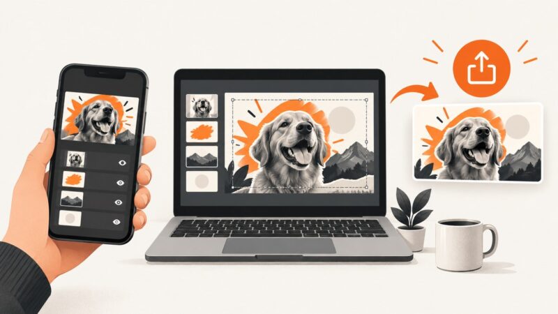
Responsive screenshots are only comparable when the browser conditions are comparable. Width and height determine the CSS viewport and can trigger different breakpoints. For mobile-like rendering, you may also need mobile emulation, device scale factor, touch, orientation, and a consistent user agent. A device preset bundles some of those values, but browser emulation is not a screenshot from a physical phone.
1. What to compare before choosing
| Need | What to verify | Why it matters |
|---|---|---|
| Responsive breakpoint | Exact CSS viewport width and height | Width commonly changes navigation, columns, and visible content. |
| Mobile behavior | Mobile mode, user agent, touch support, and meta viewport behavior | Changing only dimensions may leave browser behavior in desktop mode. |
| High-DPI output | Device scale factor (DSF) and resulting pixel dimensions | A higher DSF can make sharper, larger files; it does not change CSS layout width. |
| Orientation | Portrait/landscape and whether the setting works with device presets | Some emulators derive orientation from the preset dimensions. |
| Long pages | Viewport image versus full-page capture, lazy-load behavior, and full-page algorithm | Full-page capture may scroll, resize, or stitch; those methods can produce different results. |
| Production use | Selector capture, waiting, authentication, output formats, errors, limits, and current price | A feature list does not tell you whether a service meets your own latency, fidelity, or budget needs. |
For a fair evaluation, send the same URLs and settings to each candidate. Record CSS viewport dimensions, mobile mode, user agent, DSF, touch, orientation, output dimensions, full-page behavior, selector support, setup effort, current quotas and prices, and error handling. Treat speed, reliability, fidelity, and cost as questions for your own trial; the sources cited here do not provide comparable benchmarks.
2. Recommended options
1. ScreenshotNeo: hosted API with clean captures
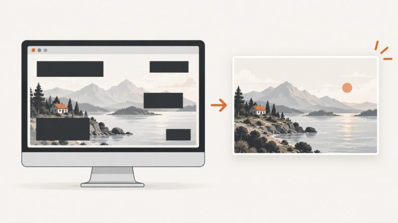
ScreenshotNeo is a website screenshot API and MCP server. It supports custom viewport sizes, 12 device presets, retina scale, full-page capture with lazy images loaded, and the other settings needed to tailor a capture. Its clean-capture workflow accepts consent banners like a visitor and removes more than 60 known consent platforms, newsletter popups, and chat widgets; each step can be turned off. Bot checks/CAPTCHAs, blank pages, timeouts, failed loads, and cache hits cost nothing, and responses identify page verdict and billing status in headers.
It is the first service to try here because its product facts combine responsive capture controls with clean shots, billing only for clean shots, and a paid plan starting at $5 for 3,000 screenshots. Every feature is on every plan. The free tier includes 1,000 screenshots each month with no card; yearly billing gives two months free. This is a product-fit recommendation, not a comparative benchmark.
2. ScreenshotOne: hosted presets and overrideable settings
ScreenshotOne documents device presets that set viewport dimensions, DSF, mobile emulation, touch, landscape, and user agent. You can override the settings populated by a preset. Its documentation explicitly says the API does not use an actual device; it emulates one. Its full-page guide also explains that width affects responsive layout and that viewport-height behavior depends on the full-page algorithm. Device preset documentation · Full-page capture guide
3. Browserless: hosted browser API
Browserless documents a REST screenshot endpoint that accepts viewport and Puppeteer-style screenshot options, including full-page mode and output type. Its viewport controls include width, height, mobile mode, touch, orientation, and DSF. Verify the behavior you need on your target pages. Screenshot API documentation · Viewport documentation
4. Playwright: self-managed browser automation
Playwright is useful when you want to run a browser yourself and control the capture lifecycle directly. Its device presets simulate properties such as user agent, screen size, viewport, and touch. This is a browser automation route rather than a hosted screenshot API. Playwright emulation documentation
3. Set the viewport correctly
- Pick the CSS viewport. Use the width and height of the layout you want to inspect. A 390-pixel-wide mobile viewport and a 1440-pixel-wide desktop viewport usually exercise different CSS rules. Choose dimensions based on your target breakpoints, not on the final image’s pixel dimensions.
- Choose the browser mode. For a responsive CSS check, dimensions may be enough. For mobile behavior, also set mobile emulation, touch, and a suitable user agent or device preset. These settings can affect meta viewport handling and site-side behavior.
- Set DSF deliberately. DSF controls output pixel density. A viewport of 390 CSS pixels at DSF 2 may produce roughly twice as many image pixels across, while the page still lays out at 390 CSS pixels. Provider implementations can differ, so inspect the actual returned image dimensions.
- Set orientation consistently. Landscape often means swapping the device’s width and height, but a preset can determine orientation itself. Check whether explicit orientation overrides or is ignored by the selected profile.
- Decide whether you need a viewport or a full page. For a first-screen visual check, capture the viewport. For a long-page audit, capture the full page and confirm how scrolling, lazy loading, sticky elements, and fixed headers are handled.
- Stabilize the page. Wait for a meaningful selector or a known readiness condition. A fixed delay is easy but can be wasteful or too short. Disable or reduce animations when repeatable images matter, if the chosen tool supports it.
4. DIY method: capture with Playwright
This runnable Node.js example uses Playwright’s Chromium browser to save desktop and mobile-emulated viewport screenshots. It uses explicit settings so the capture is easy to reproduce. It assumes Node.js is installed and can download/run Playwright Chromium.
npm init -y
npm install playwright
npx playwright install chromium
// save as capture.mjs
import { chromium, devices } from 'playwright';
const url = process.argv[2] ?? 'https://example.com';
const browser = await chromium.launch({ headless: true });
try {
// Desktop: CSS viewport 1440 × 900 at 1 device pixel per CSS pixel.
const desktop = await browser.newPage({
viewport: { width: 1440, height: 900 },
deviceScaleFactor: 1,
});
await desktop.goto(url, { waitUntil: 'domcontentloaded', timeout: 60_000 });
await desktop.screenshot({ path: 'desktop.png', fullPage: false });
await desktop.close();
// Mobile preset supplies a coherent emulation profile; override its viewport
// after spreading it when you need a specific breakpoint.
const mobile = await browser.newPage({
...devices['iPhone 13'],
viewport: { width: 390, height: 844 },
deviceScaleFactor: 2,
});
await mobile.goto(url, { waitUntil: 'domcontentloaded', timeout: 60_000 });
await mobile.screenshot({ path: 'mobile.png', fullPage: false });
await mobile.close();
} finally {
await browser.close();
}node capture.mjs https://example.comTo capture the full document instead, change fullPage: false to fullPage: true. For a stable page-specific capture, wait for a selector after navigation:
await page.goto(url, { waitUntil: 'domcontentloaded', timeout: 60_000 });
await page.locator('main').waitFor({ state: 'visible', timeout: 15_000 });
await page.screenshot({ path: 'capture.png', fullPage: true });
For repeatable runs, use the same browser version, fonts, viewport, DSF, locale, timezone, user agent, and page state. A device preset represents emulation; it cannot guarantee the same result as a physical handset or every browser version.
5. Hosted API settings and practical trade-offs
Across services, look for the following controls. Exact parameter names and semantics vary; check the provider’s current documentation rather than copying an option name between APIs.
- Viewport width/height: CSS pixels used to lay out the page.
- Device preset: a bundle that may set viewport, DSF, mobile mode, touch, orientation, and user agent. Confirm which properties it sets and which can be overridden.
- Mobile mode and touch: relevant when the site uses meta viewport behavior or pointer/touch feature detection.
- User agent: some sites return different markup based on it. Changing only the user agent does not necessarily emulate all browser/device properties.
- DSF: affects output image density and file size.
- Full-page options: scrolling/stitching, lazy-load triggering, maximum page height, and sticky-element behavior.
- Wait options: selector, delay, network idle, or other page readiness signal.
- Output: PNG for lossless comparisons, JPEG or WebP when smaller output is preferred and supported.
ScreenshotOne’s documented default viewport is 1280 × 1024; its full-page guide describes how width changes breakpoints and how height can behave differently across algorithms. Browserless documents a separate viewport operation with mobile, touch, landscape, and DSF parameters. Neither documentation set constitutes a comparative fidelity test. ScreenshotOne options · Browserless REST screenshot options
6. Or skip the browser setup
One GET request returns the screenshot. The following examples save a WebP image of the target URL. See the ScreenshotNeo API documentation for viewport and other options.
curl -G "https://api.screenshotneo.com/v1/shot" -d access_key=YOUR_API_KEY --data-urlencode url=https://stripe.com -o shot.webpimport requests
r = requests.get(
"https://api.screenshotneo.com/v1/shot",
params={"access_key": "YOUR_API_KEY", "url": "https://stripe.com"},
timeout=90,
)
r.raise_for_status()
open("shot.webp", "wb").write(r.content)const q = new URLSearchParams({ access_key: 'YOUR_API_KEY', url: 'https://stripe.com' });
const res = await fetch(`https://api.screenshotneo.com/v1/shot?${q}`);
if (!res.ok) throw new Error(`Screenshot request failed: ${res.status}`);
await import('node:fs/promises').then(fs => fs.writeFile('shot.webp', Buffer.from(await res.arrayBuffer())));For mobile or desktop output, add the documented viewport or device settings to the request; use the docs for exact parameter names. ScreenshotNeo removes cookie banners, popups, and chat widgets before the shot; bot checks, blank pages, and failed loads are never billed; its MCP server lets AI agents take screenshots; and 1,000 screenshots per month are free with no card, with paid plans starting at $5 for 3,000. Sign up free for 1,000 screenshots a month, no card required.
7. Performance, reliability, and cost
- Image size and rendering time: Larger viewports, higher DSF, and very long full-page captures increase the amount of image data and may take longer to render. Use DSF 1 when standard-density output is enough; check that image quality meets your use case.
- Full-page work: Scrolling to trigger lazy content or capturing section by section can take longer than a viewport capture. A very long or infinite-scroll page needs a maximum height or a deliberate stopping rule where available.
- Reliability: Third-party pages can delay assets, animate, require authentication, block automation, or return different content by location or identity. Wait for a page-specific condition, set timeouts, inspect response status and output, and retry only transient failures with a bounded policy.
- Repeatability: Pin browser versions for self-managed capture and record viewport, DSF, user agent, locale, timezone, and wait conditions. Remote pages may still change between runs.
- Cost: Hosted APIs charge according to their own plans and counting rules; compare current quotas and overage terms directly before production. Playwright avoids a per-capture hosted API charge but requires compute, browser maintenance, storage, and operational work. ScreenshotNeo’s published options are Free: 1,000/month; Starter: $5 for 3,000; Growth: $15 for 15,000; Pro: $39 for 60,000; Scale: $99 for 250,000; Business: $249 for 1,000,000. Yearly billing gives two months free; all features are on all plans.
8. Troubleshooting
| Symptom | Likely cause | Fix |
|---|---|---|
| Mobile image shows desktop navigation | Only width changed; mobile mode, user agent, or meta viewport behavior differs. | Use a mobile preset or configure mobile mode and user agent as needed; verify the site has a viewport meta tag. |
| Layout breakpoint is off by a few pixels | Viewport dimensions are not the CSS dimensions you intended, or a preset overrode them. | Set width/height explicitly after applying a preset and inspect the browser’s reported viewport. |
| Output is blurry or unexpectedly large | DSF is too low or high for the target; a device preset may set a high DSF. | Set DSF explicitly and inspect returned pixel dimensions and file size. |
| Portrait image appears in landscape | Preset orientation takes precedence over a separate orientation option, or width/height were not swapped. | Use a matching landscape preset or explicit landscape dimensions; verify documented precedence. |
| Full-page capture omits images | Images load only after scrolling or the capture did not wait long enough. | Enable the provider’s scroll/lazy-load behavior, wait for images or a selector, and adjust scroll delay if supported. |
| Sticky header repeats or overlaps in full-page output | Full-page implementation resizes, scrolls, or stitches the document. | Try another full-page algorithm or viewport capture; inspect provider options for fixed-element handling. |
| Screenshot contains a CAPTCHA or access-denied page | The target site is challenging automated browsing. | Check whether the page is accessible in the intended context and whether the service supports the required access workflow. Do not treat a challenge screen as the target page. |
| Capture times out or is blank | Slow navigation, a page error, or waiting for an event that never occurs. | Use a bounded timeout, wait for a specific visible element, check the URL and response, and capture a diagnostic viewport before retrying. |
| Playwright cannot find Chromium | The browser binary was not installed for the current environment. | Run npx playwright install chromium in the project environment and check system dependencies. |
| Mobile dimensions look correct but tap UI differs | Touch support is off or the page responds to pointer type. | Enable touch in the device context and test the page’s touch-specific behavior. |
9. FAQ
Does a mobile preset mean the screenshot comes from a real phone?
No. Presets configure emulated browser properties. They are useful for responsive checks but do not reproduce every physical device, browser, font, or operating-system detail.
Should desktop and mobile captures use the same DSF?
Use the same DSF when you want output pixel dimensions to differ only because of viewport size. Use device-appropriate DSF when matching a high-density target matters, and document it so comparisons remain meaningful.
Is full-page capture always better for responsive testing?
No. A viewport capture is usually the clearer check for above-the-fold layout and breakpoint behavior. Full-page output is useful for page-wide review but introduces scrolling and lazy-loading variables.
Which API has the most accurate mobile rendering?
The available documentation supports a feature comparison, not a measured accuracy ranking. Test your own URLs against the same expected browser conditions, and use real-device testing when physical-device behavior is a release requirement.
Can I compare screenshots pixel by pixel?
Yes, but first hold the browser version, fonts, viewport, DSF, page state, animation state, and capture timing constant. Otherwise, rendering differences may reflect the setup rather than a code change.