Best Screenshot APIs for Capturing Responsive Website Layouts
Compare screenshot APIs and browser automation for responsive layouts, with a practical checklist for viewports, full pages, elements, and operations.
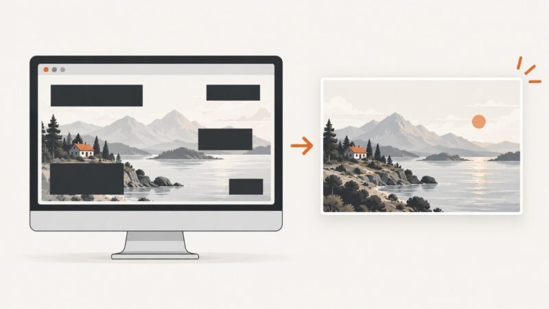
For responsive website layouts, choose a screenshot tool that lets you set exact viewport dimensions and capture the scope you need: the visible viewport, a full page, a selected element, or a fixed region. Then validate it against representative pages at the widths where your CSS changes. A device preset is browser emulation, not a screenshot from a physical phone. Hosted APIs and browser automation can both support this work; the right fit depends on your capture workflow and operational requirements.
ScreenshotNeo is the first API to try if you want a hosted capture endpoint with responsive viewports, device presets, full-page capture, element selection, and explicit billing verdicts. Cookie and consent banners, newsletter popups, and chat widgets can be removed before capture, and only clean shots are billed. See ScreenshotNeo and its API documentation.
1. Decide what “responsive screenshot” means for your task
A screenshot records the page as it rendered at a particular viewport and browser configuration. Width matters because CSS breakpoints can change navigation, columns, sidebars, and content visibility. One desktop capture cannot stand in for every responsive layout.
Start with the page states your team needs to inspect, then choose widths that exercise those states. Do not assume a preset called “mobile” matches the exact viewport or browser conditions in your production QA matrix. For more on how width affects capture and full-page output, see ScreenshotOne’s options documentation and its full-page screenshots guide.
| Need | Capture scope or setting | What to verify |
|---|---|---|
| Check breakpoint changes | Several explicit viewport widths | Navigation, column count, overflow, and hidden or rearranged content |
| Check a visible state | Viewport screenshot | Viewport height, scroll position, and any required wait condition |
| Review a long page | Full-page screenshot | Lazy loading, sticky elements, page length, and capture method |
| Inspect one component | Element screenshot by selector | Selector readiness, bounding box, and clipping |
| Compare a fixed area | Clip rectangle or fixed region | Coordinates, dimensions, and how they relate to the viewport |
2. Comparison: choose by capability and workflow
The provider documentation establishes capabilities, not a universal quality ranking. The available research does not establish comparative prices, quotas, reliability, concurrency, regional coverage, privacy terms, or service quality through independent testing. Treat those as questions to verify for your own workload.
| Option | What the documentation supports | Best evaluation question |
|---|---|---|
| ScreenshotNeo | Hosted API with responsive viewport controls, device presets, full-page and element capture, multiple output formats, request customization, and billing verdict headers. Consent UI, newsletters, and chat widgets can be removed before capture. | Do you want a managed endpoint, clean captures, and billing visibility for failed or cache-hit requests? |
| ScreenshotOne | Hosted API options include viewport dimensions, scale factor, mobile viewport behavior, touch, orientation, and device presets. Full-page capture has a default method and a section-based method. | Do its viewport and long-page options match your target pages and layout checks? |
| Browserless | Hosted POST screenshot endpoint supports PNG, JPEG, or WebP, full-page capture, viewport and scale controls, selector capture, fixed clipping, and scrolling to trigger lazy content. | Do its endpoint and capture controls fit your integration and required output? |
| Playwright | Browser automation documentation covers viewport, selected-element, and full-page screenshot capture. | Do you want to run screenshot capture as part of a browser automation workflow you operate? |
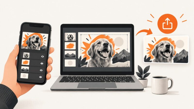
For ScreenshotOne, a device option sets viewport dimensions and related emulation properties such as scale factor, mobile mode, touch support, orientation, and user agent. Its documentation is explicit: “API does not use an actual device to take a screenshot. It is emulation that works in most cases.” See ScreenshotOne’s device documentation. This distinction matters when you need physical-device QA rather than a browser configured to emulate device properties.
3. Build a responsive capture matrix
A small, intentional matrix is easier to interpret than a large set of arbitrary widths. Include at least one width for each layout state you need to check, plus page-specific states such as an open navigation menu or a consent dialog if those are part of the test.
- List the layouts that matter. Identify breakpoint-driven states such as collapsed navigation, a single-column article, a sidebar layout, or a multi-column grid.
- Choose explicit widths and heights. Set the viewport directly where possible. Use a height that makes the visible viewport useful for the task; height also affects how a section-based full-page capture divides the page.
- Decide whether emulation is needed. Set mobile behavior, touch, orientation, scale factor, and user agent only when those properties are relevant. A preset may be convenient, but inspect or override its values when exact dimensions matter.
- Choose capture scope. Use viewport capture for above-the-fold checks, full page for page-wide review, a selector for a component, or a clip region for a fixed area.
- Control page readiness. Wait for a selector, a known delay, or network idle if the page needs time to render. For interactive pages, perform the required action before capture.
- Repeat on representative pages. Include long pages, pages with lazy images, and pages with dynamic content. Record the exact inputs with each image so comparisons are reproducible.
There is no evidence here for one universally correct set of breakpoint widths. Use the breakpoints and layouts your site actually needs to validate rather than treating a provider’s default viewport as a recommendation.
4. Compare full-page and element capture behavior
Full-page capture
Full-page methods can produce different results. ScreenshotOne documents a default method that asks the browser to render the page at full length and a by_sections option that scrolls through the page and stitches successive captures. Scrolling can trigger lazy-loaded content; the section method also does more capture work. Its guide notes that viewport height influences section size and opportunities to trigger lazy loading, and that rendering settings can affect performance. It does not provide a general performance figure.
Browserless also documents scrolling before capture as a way to trigger lazy-loaded content. If images or content are missing, check the provider’s documented full-page mode and whether the page needs scrolling or additional readiness conditions.
Element and fixed-region capture
Element capture is useful for a responsive component such as a navigation bar, pricing card, or product panel. Browserless documents selector capture that waits for an element and crops to its bounding box, alongside fixed-region clipping. These scopes are not interchangeable: selector capture follows the rendered element’s bounds, while a fixed clip describes a region to capture.
For a selector-based workflow, verify that the selector is unique, that the element exists at each viewport, and that its final dimensions are stable before capture. A component may be hidden or replaced at a breakpoint, so a selector that works on desktop may not exist in the mobile state.
5. Runnable do-it-yourself example with Playwright
Playwright is a browser automation option for capturing a viewport, element, or full scrollable page. The following runnable Node.js example captures three explicit widths and writes a viewport screenshot for each. It uses Chromium and opens a page at a fixed URL.
npm install playwright
npx playwright install chromium
// responsive-shots.mjs
import { chromium } from 'playwright';
const target = process.env.TARGET_URL ?? 'https://example.com';
const viewports = [
{ name: 'narrow', width: 390, height: 844 },
{ name: 'medium', width: 768, height: 1024 },
{ name: 'wide', width: 1440, height: 1000 },
];
const browser = await chromium.launch({ headless: true });
try {
for (const viewport of viewports) {
const page = await browser.newPage({ viewport: { width: viewport.width, height: viewport.height } });
await page.goto(target, { waitUntil: 'networkidle', timeout: 60_000 });
await page.screenshot({ path: `shot-${viewport.name}.png`, fullPage: false });
await page.close();
}
} finally {
await browser.close();
}Run it with TARGET_URL=https://your-site.example node responsive-shots.mjs. The code uses a network-idle wait as a simple default. Some sites keep requests open or update continuously; in those cases, wait for a page-specific selector or use an explicit delay instead. Consult the Playwright screenshot documentation for the documented screenshot scope options.
To capture a selected element in Playwright, obtain a locator and call its screenshot method after the page has reached the needed state. To capture the full scrollable page, use the full-page screenshot option. Keep the viewport matrix and readiness rule consistent between runs so the resulting images can be compared meaningfully.
6. Or skip the browser setup
ScreenshotNeo takes a URL and returns an image or PDF from one API request. The example below saves a WebP screenshot of a page. Use your own API key and target URL. See the ScreenshotNeo API docs for the supported parameters and configuration.
cURL
curl -G "https://api.screenshotneo.com/v1/shot" \
  -d access_key=YOUR_API_KEY \
  --data-urlencode url=https://stripe.com \
  -o shot.webp
Python
import requests

r = requests.get(
    "https://api.screenshotneo.com/v1/shot",
    params={"access_key": "YOUR_API_KEY", "url": "https://stripe.com"},
    timeout=90,
)
r.raise_for_status()
open("shot.webp", "wb").write(r.content)
Node.js
const q = new URLSearchParams({
  access_key: 'YOUR_API_KEY',
  url: 'https://stripe.com',
});
const res = await fetch(`https://api.screenshotneo.com/v1/shot?${q}`);
if (!res.ok) throw new Error(`Screenshot request failed: ${res.status}`);
const bytes = new Uint8Array(await res.arrayBuffer());
await import('node:fs/promises').then(({ writeFile }) => writeFile('shot.webp', bytes));
For a responsive matrix, make one request per viewport configuration. ScreenshotNeo supports full-page capture with lazy images loaded, element capture by CSS selector, dark mode, 12 device presets or custom viewports, and retina scale. It also supports PDF options, HTML or CSS input, custom CSS and JavaScript, clicking an element before capture, hiding selectors, waiting for a selector, delay or network idle, blocking ads, trackers, requests or resource types, custom headers, cookies, user agent and Authorization, timezone and geolocation, transparent backgrounds, resizing, configurable cache TTL, signed links for public image tags, asynchronous jobs with signed webhooks, bulk capture of up to 100 URLs per call, a usage API, an OpenAPI specification, and familiar parameter names used by other screenshot APIs.
Cookie and consent banners, newsletter popups, and chat widgets are removed before the shot, and each cleanup step can be turned off. Bot checks and CAPTCHAs, blank pages, timeouts, failed loads, and cache hits cost nothing; response headers identify the page verdict and billing status. An MCP server provides take_screenshot, get_page_info, and capture_pdf tools for Claude, Cursor, and other MCP clients. The Free plan includes 1,000 shots a month with no card; paid plans start at $5 for 3,000 shots. Every feature is on every plan, and yearly billing gives two months free.
Sign up for 1,000 free screenshots a month, with no card required.
7. Evaluation checklist for a hosted screenshot API
- Responsive controls: Can you set width and height directly? Can you set mobile viewport behavior, touch, orientation, device scale factor, and user agent where needed?
- Capture scope: Does it support viewport, full page, selected element, and fixed clipping if your workflow needs them?
- Long-page behavior: Does the full-page mode scroll, stitch sections, or use another method? Can it trigger lazy-loaded resources?
- Output: Confirm image formats and any PDF needs in current provider documentation. Browserless documents PNG, JPEG, and WebP; verify current output support for each candidate.
- Readiness controls: Check support for selector waits, delays, network idle, custom scripts, or pre-capture interactions relevant to your pages.
- Operations: Verify current pricing, quotas, concurrency, regions, retention and privacy terms, authentication, timeout behavior, and service commitments directly with each provider.
- Failure accounting: Understand whether failed, blank, blocked, and cached requests count toward usage. Do not infer billing rules from successful screenshot behavior.
- Migration: Compare parameter names and output handling against your current integration. ScreenshotNeo states that parameter names used by other screenshot APIs also work, which can make switching easier.
8. Performance, reliability, and cost
Capture work depends on the page and requested options. Full-page captures, scrolling through sections, higher scale factors, waits for dynamic content, and multiple viewport requests all affect the amount of work. The documentation reviewed does not establish comparative speed or a universal cost-per-layout for these providers.
To estimate your own workload, count the URLs, viewport states per URL, and capture scopes you need, then check provider pricing and quotas for that request pattern. Include retries and any asynchronous or bulk workflow in the calculation. For reliability, define what counts as a valid page for your use case, track response status and page content, and distinguish a successful image response from a useful rendering. ScreenshotNeo’s response includes X-Page-Verdict and X-Billed headers; use these to understand whether a response was clean and billable.
For a fair evaluation, run the same representative URLs and viewport matrix through candidate tools. Include a short page, a long lazy-loaded page, a responsive navigation change, and any authenticated or interactive state the product must capture. This is a suggested evaluation method, not a report of tests performed for this article.
9. Troubleshooting responsive captures
| Symptom | Likely cause | Fix |
|---|---|---|
| Desktop and mobile images look identical | The viewport width was not changed, a preset was misunderstood, or the target has no different layout at the chosen widths. | Set explicit width and height values, confirm the effective viewport settings, and choose widths that cross the site’s actual layout breakpoints. |
| Screenshot is blank or incomplete | The page did not finish loading, navigation failed, or a required state was not reached. | Check the URL and response, increase or adjust the wait condition, and wait for a page-specific element before capture. |
| Lazy images are missing in a full-page image | The page loads images only after scrolling, and the capture method did not trigger that behavior. | Use a documented scrolling or section-based capture mode when available, or perform a controlled scroll before capture. |
| Selector capture fails at one viewport | The element is hidden, renamed, or absent in that responsive state. | Inspect the page at that width, use a selector present in that layout, and wait for the visible element rather than only DOM existence. |
| Content shifts between captures | Fonts, images, animations, ads, or asynchronous data settled at different times. | Wait for a stable page-specific condition, hide irrelevant animated or dynamic elements where supported, and keep timing options consistent. |
| Full-page output has unexpected seams or sticky elements | The capture strategy may resize the page or stitch sections, while sticky elements react to scroll position. | Compare the provider’s available full-page methods and inspect a viewport capture or section captures to isolate the behavior. |
| Request times out | The page is slow, keeps network activity open, or the configured timeout is too short. | Use a more specific readiness condition instead of waiting for every request to stop, and check supported timeout settings and limits. |
| Image dimensions or sharpness differ | Viewport size, device scale factor, or output resizing differs. | Record and set the viewport and scale factor explicitly; compare the returned image dimensions as well as its appearance. |
10. Frequently asked questions
Are device presets the same as testing on a real phone?
No. The cited device preset documentation describes emulation. Use physical-device testing separately when actual hardware behavior is required.
Should every responsive check use a full-page screenshot?
No. A viewport capture is usually sufficient for visible-state checks. Full-page capture is useful for page-wide review, but can involve different loading and stitching behavior.
Can I use a screenshot API for visual regression?
Yes, if you keep the URL state, viewport, browser settings, readiness conditions, and capture scope consistent. The documentation cited here establishes capture capabilities, not a specific visual-regression system.
Which provider is cheapest or most reliable?
The available research does not establish a cross-provider comparison of current cost or reliability. Verify provider terms and evaluate representative pages for your own workload.
Do screenshots show content behind a login?
That depends on whether the capture workflow can provide the required authentication state. Check the candidate’s documentation for supported cookies, headers, or session handling before relying on it.