How to Take Better Website Screenshots
Create clearer website screenshots by choosing the right capture scope, viewport, scale and validation method for each job.
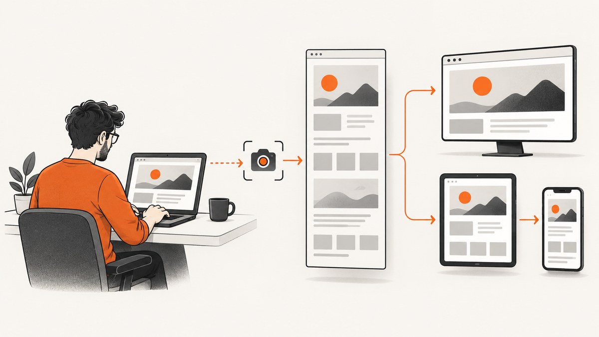
Better website screenshots come from deliberate choices: decide whether you need the viewport or the full page, set an intentional viewport or device profile, choose CSS-pixel or device-pixel output, wait for the page to settle, and validate the result at its intended display size.
1. Choose the capture scope first
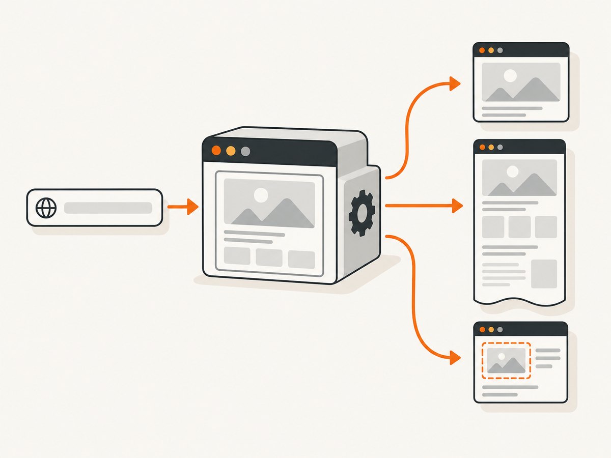
A viewport screenshot records what is visible in the browser window. Use it for a UI state, bug report, modal, navigation menu or above-the-fold example. A full-page screenshot captures the entire scrollable document, which is better for landing pages, documentation and visual regression evidence.
| Need | Capture | Reason |
|---|---|---|
| Show one visible state | Viewport | Keeps attention on the current screen. |
| Show content below the fold | Full page | Includes the document’s scrollable height. |
| Show one component | Element | Removes unrelated page content. |
| Compare responsive layouts | Several fixed viewports | Makes breakpoints and wrapping differences explicit. |
Chrome DevTools provides commands for viewport and full-size captures in Device Mode. Chrome’s Device Mode guide documents both workflows.
2. Set an intentional viewport
- Open DevTools and enable Device Mode.
- Choose Responsive and enter an exact width and height, or select a device profile.
- Check the media-query breakpoints shown by the toolbar.
- Resize until the layout matches the state you need to document.
Do not rely on the size of an arbitrary browser window. A fixed viewport makes screenshots comparable across machines and across time. For responsive examples, capture the same page at named widths such as a desktop, tablet and mobile layout.
Device Mode is a desktop-based approximation of a mobile device. It does not reproduce every physical-device behavior, so verify touch, sensors, font rendering and other hardware-dependent behavior on an actual phone when those details matter. See Chrome’s device emulation notes.
3. Capture manually with Chrome DevTools
Viewport screenshot
- Set the viewport dimensions.
- Open the DevTools command menu.
- Run the screenshot command for the visible area.
- Inspect the saved image at its intended display size.
Full-page screenshot
- Set the viewport width and an appropriate viewport height.
- Run DevTools’ full-size screenshot command.
- Review the long image for lazy-loaded sections, sticky headers and repeated backgrounds.
Manual capture is fastest for a one-off image. It is less suitable when you need the same URL, dimensions and timing repeatedly.
4. Automate repeatable captures with Playwright
Playwright can capture the viewport, a selected element or the full scrollable page. Install it, then save this runnable example as screenshot.mjs:
import { chromium } from 'playwright';

const browser = await chromium.launch();
const page = await browser.newPage({
  viewport: { width: 1440, height: 900 },
  deviceScaleFactor: 1
});

await page.goto('https://example.com', { waitUntil: 'networkidle' });
await page.screenshot({ path: 'viewport.png', fullPage: false, scale: 'css' });
await page.screenshot({ path: 'full-page.png', fullPage: true, scale: 'css' });
await page.locator('main').screenshot({ path: 'main-element.png', scale: 'css' });

await browser.close();
Playwright’s scale controls output density. scale: "css" produces one output pixel per CSS pixel. scale: "device" produces one output pixel per device pixel and can create substantially larger files on high-DPI settings. Choose CSS scale for predictable dimensions and device scale when physical-pixel detail is required. The Playwright Page API documents screenshot scope and scale parameters.
Wait for the visual state you need
await page.goto('https://example.com/dashboard', { waitUntil: 'domcontentloaded' });
await page.locator('[data-ready="true"]').waitFor();
await page.waitForTimeout(500);
await page.screenshot({ path: 'ready.png', fullPage: true, scale: 'css' });
Prefer a meaningful selector or application-ready signal over an arbitrary long delay. Use a short delay only for animations or fonts that need a moment after the ready state.
Hide unstable or irrelevant regions
await page.addStyleTag({ content: `
  .cookie-banner, .chat-widget, .animated-cursor { display: none !important; }
` });
await page.screenshot({ path: 'stable.png', fullPage: true, scale: 'css' });
Freeze animations when visual consistency matters, and mask dynamic timestamps or rotating content before comparison.
5. Make responsive screenshots useful
- Record the exact viewport width and height with each image.
- Use the same browser, font availability and zoom level for every comparison.
- Capture a breakpoint just below and just above an observed layout change.
- Compare viewport dimensions and layout separately from actual-device behavior.
A responsive screenshot demonstrates appearance at one emulated size. It does not prove that the page behaves correctly on a physical phone. Test hardware-specific interactions separately.
6. Improve clarity before you capture
Wait for content and lazy images
Scroll through a long page or use an automation service that loads lazy images before a full-page capture. Otherwise, below-the-fold areas may appear blank.
Control theme and locale
Set the intended color scheme, timezone, locale and geolocation when those values change rendered content. Keep them constant across a screenshot set.
Choose an output format
- PNG: lossless detail for UI text and diagrams.
- JPEG: smaller files for photographic pages.
- WebP: compact files when your delivery pipeline supports it.
- PDF: useful when the result must remain paginated or printable.
Inspect at the destination size
A high-resolution image can look sharp while being too large for a document, issue tracker or web page. Check both readable detail and final pixel dimensions before publishing.
7. Screenshots are not accessibility evidence
A screenshot records appearance only. It cannot establish keyboard navigation, screen-reader behavior, semantic markup or focus order. Review those separately with keyboard testing, screen-reader checks and accessibility tooling. Chrome’s accessibility reference covers questions about keyboard and screen-reader access, markup and contrast.
8. Troubleshooting
| Symptom | Likely cause | Fix |
|---|---|---|
| Bottom sections are blank | Lazy loading has not been triggered. | Scroll before capture, wait for images, or use full-page capture that loads lazy content. |
| Screenshot has the wrong layout | Viewport or device profile was not fixed. | Set explicit width and height and record them with the image. |
| Mobile result looks right but the phone behaves differently | Desktop emulation is only an approximation. | Validate hardware-dependent behavior on an actual device. |
| Text looks too large or too small | CSS and device-pixel scales were mixed. | Choose scale: "css" for CSS-sized output or scale: "device" for device pixels. |
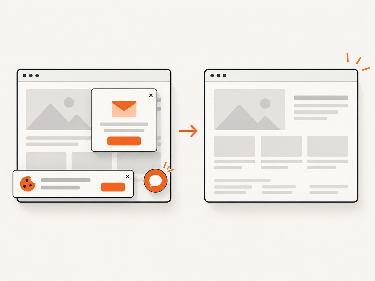
| Cookie notice or chat bubble obscures content | Overlays appeared before capture. | Accept or remove them before capture, or hide their selectors in automation. |
| Two captures differ without a code change | Animation, rotating content, ads or timestamps changed. | Freeze animations, mask dynamic regions and use a stable test account or fixture. |
| Full-page image is unexpectedly huge | Device-pixel scale or an unusually tall document. | Use CSS scale, capture an element, or split the document into purposeful sections. |
| Automation times out | Network requests or a page-ready condition never completes. | Use a realistic timeout, wait for a specific selector and diagnose blocked requests separately. |
9. Performance, reliability and cost
- Performance: viewport and element captures are usually smaller and faster than full-page captures. Large device-pixel images increase memory and transfer time.
- Reliability: pin viewport, browser, fonts, theme, locale and wait conditions. Remove animation and other nondeterministic content for visual comparisons.
- Cost: manual DevTools capture has no service charge but requires a person and local setup. Browser automation consumes compute and maintenance time. A managed API can reduce setup when captures are frequent or distributed.
- Review: keep the URL, viewport, scale, timestamp and relevant state next to each image so another developer can reproduce it.
10. Or skip the browser setup
ScreenshotNeo is a website screenshot API and MCP server. It accepts one GET request and returns a PNG, JPEG, WebP or PDF. It removes cookie and consent banners, newsletter popups and chat widgets before capture; bot checks, blank pages, timeouts, failed loads and cache hits are not billed, and response headers identify the page verdict and billing result.
See the ScreenshotNeo API documentation for the complete parameter list. The same service supports full-page captures with lazy images loaded, CSS-selector element captures, dark mode, 12 device presets or custom viewports, retina scale, PDF paper sizes and margins, custom CSS and JavaScript, clicks, selector or network-idle waits, request and resource blocking, headers, cookies, user agents, Authorization, timezone, geolocation, transparent backgrounds, resizing, configurable caching, signed links, asynchronous jobs with signed webhooks, bulk capture for up to 100 URLs per call, usage reporting and an OpenAPI specification.
cURL
curl -G "https://api.screenshotneo.com/v1/shot" \
  -d access_key=YOUR_API_KEY \
  --data-urlencode url=https://stripe.com \
  -o shot.webp
Python
import requests

r = requests.get(
    "https://api.screenshotneo.com/v1/shot",
    params={"access_key": "YOUR_API_KEY", "url": "https://stripe.com"},
    timeout=90,
)
r.raise_for_status()
open("shot.webp", "wb").write(r.content)
Node.js
const q = new URLSearchParams({ access_key: 'YOUR_API_KEY', url: 'https://stripe.com' });
const res = await fetch(`https://api.screenshotneo.com/v1/shot?${q}`);
if (!res.ok) throw new Error(`HTTP ${res.status}`);
const data = Buffer.from(await res.arrayBuffer());
require('node:fs').writeFileSync('shot.webp', data);
An MCP server lets Claude, Cursor and other MCP clients call take_screenshot, get_page_info and capture_pdf. The Free plan includes 1,000 screenshots per month without a card; paid plans start at $5 for 3,000 shots, and every feature is available on every plan.
Create a free ScreenshotNeo account to get 1,000 screenshots a month with no card.
FAQ
Should I use a viewport or full-page screenshot?
Use viewport capture for the visible UI state and full-page capture when content below the fold is part of the evidence.
Is a device profile the same as testing on a phone?
No. Device Mode approximates mobile behavior from a desktop. Use physical-device testing for hardware-dependent behavior.
Which Playwright scale should I choose?
Choose CSS scale for predictable CSS-sized output. Choose device scale when you need device-pixel detail and can accept larger files.
Can a screenshot prove accessibility?
No. Check keyboard access, screen-reader output, focus order, semantic markup and contrast separately.
How do I keep visual regression screenshots stable?
Fix the viewport and environment, wait for a deterministic ready state, disable animation and mask changing content.


