How to Build a Mobile-Friendly Website
Build a responsive website that reads well on phones, supports touch and keyboard use, and stays usable when visitors zoom or resize the page.
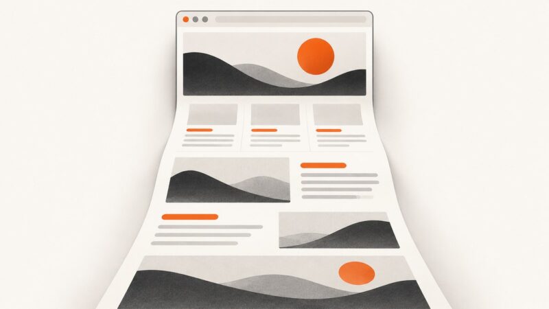
A mobile-friendly website adapts its layout to the available screen width. Start with a readable single-column layout, let content and images shrink or reflow, then add columns at the widths where your content has room for them. Set the viewport metadata, preserve zoom, make controls comfortable to use, and check the result at narrow, intermediate, and wide widths.
Responsive design is a way to build layouts that respond to their viewing environment. It is not a separate mobile version of your site. [MDN’s responsive design guide](https://developer.mozilla.org/en-US/docs/Learn_web_development/Core/CSS_layout/Responsive_Design) explains the approach.
1. Start with a flexible page
Here is a complete, dependency-free example. Save it as index.html and open it in a browser. It uses a narrow-screen-first layout, a content-based breakpoint, flexible images, and a simple navigation menu that wraps when space is limited.
<!doctype html>
<html lang="en">
<head>
  <meta charset="utf-8">
  <meta name="viewport" content="width=device-width">
  <meta name="description" content="A sample responsive article page.">
  <title>A Responsive Page</title>
  <style>
    :root {
      color-scheme: light;
      font-family: system-ui, sans-serif;
      line-height: 1.6;
      color: #18212b;
      background: #f5f7fa;
    }

    * { box-sizing: border-box; }

    body { margin: 0; }

    a { color: #0759b5; }

    a:focus-visible, button:focus-visible {
      outline: 3px solid #e48b00;
      outline-offset: 3px;
    }

    .site-header, main, .site-footer {
      width: min(100% - 2rem, 70rem);
      margin-inline: auto;
    }

    .site-header {
      display: flex;
      flex-wrap: wrap;
      align-items: center;
      justify-content: space-between;
      gap: 0.75rem 1.5rem;
      padding-block: 1rem;
    }

    .brand { margin: 0; font-size: 1.25rem; }

    nav ul {
      display: flex;
      flex-wrap: wrap;
      gap: 0.5rem 1rem;
      margin: 0;
      padding: 0;
      list-style: none;
    }

    nav a {
      display: inline-block;
      padding: 0.5rem 0;
    }

    main { padding-block: 1rem 3rem; }

    .layout {
      display: grid;
      grid-template-columns: minmax(0, 1fr);
      gap: 1.25rem;
    }

    .card {
      min-width: 0;
      padding: 1.25rem;
      border: 1px solid #d8dee7;
      border-radius: 0.75rem;
      background: white;
    }

    h1, h2 { line-height: 1.2; }
    h1 { font-size: clamp(1.8rem, 6vw, 3rem); }

    img, video, svg { max-width: 100%; height: auto; }

    .site-footer { padding-block: 1rem 2rem; }

    /* Add columns only when the content has enough room. */
    @media (min-width: 48rem) {
      .layout { grid-template-columns: minmax(0, 2fr) minmax(14rem, 1fr); }
      .site-header { padding-block: 1.5rem; }
    }

    @media (prefers-reduced-motion: reduce) {
      *, *::before, *::after {
        scroll-behavior: auto !important;
        animation-duration: 0.01ms !important;
        animation-iteration-count: 1 !important;
        transition-duration: 0.01ms !important;
      }
    }
  </style>
</head>
<body>
  <header class="site-header">
    <p class="brand"><a href="#home">Field Notes</a></p>
    <nav aria-label="Main navigation">
      <ul>
        <li><a href="#articles">Articles</a></li>
        <li><a href="#about">About</a></li>
        <li><a href="#contact">Contact</a></li>
      </ul>
    </nav>
  </header>

  <main id="home">
    <h1>A page that fits the content</h1>
    <div class="layout" id="articles">
      <article class="card">
        <h2>Make the narrow layout the starting point</h2>
        <p>This article occupies the main column when there is room, and the full width on a narrow screen. Text wraps naturally without a fixed page width.</p>
        <p>Use meaningful headings, links, and controls so that the page works with a keyboard and assistive technology as well as a pointer.</p>
      </article>
      <aside class="card" id="about" aria-labelledby="about-heading">
        <h2 id="about-heading">About this page</h2>
        <p>This sidebar joins the layout only when the viewport can accommodate both columns.</p>
        <p><a href="#contact">Get in touch</a></p>
      </aside>
    </div>
  </main>

  <footer class="site-footer" id="contact">
    <p>Contact: <a href="mailto:hello@example.com">hello@example.com</a></p>
  </footer>
</body>
</html>
What the example does
<meta name="viewport" content="width=device-width">makes the CSS viewport match the device width. Without it, some mobile browsers use a wider virtual layout viewport and scale the page down, making text and controls appear too small. See the [MDN viewport reference](https://developer.mozilla.org/en-US/docs/Web/HTML/Reference/Elements/meta/name/viewport).width: min(100% - 2rem, 70rem)lets the page use narrow screens while keeping a comfortable maximum width on larger screens.minmax(0, 1fr)lets grid content shrink instead of forcing a column wider than its container.min-width: 0serves the same purpose for the card.- The grid begins as one column. Its second column appears at
48rem, a starting point to adjust based on the content—not a guarantee that every device belongs at that width. clamp()scales the heading within a defined range. The document’s text remains resizable because the example does not disable zoom.- Images, video, and SVG are constrained to their container so they do not create page-wide horizontal overflow.
2. Choose layout rules that follow the content
Build the narrow layout first, then widen it when the content benefits from another column or a different arrangement. Test the transitions between layouts; a page can look fine at the smallest and largest widths but fail in between.
| Need | Useful starting point | Check |
|---|---|---|
| Page width | A flexible width with a maximum, such as width: min(100% - 2rem, 70rem) |
No horizontal page scrolling at narrow widths; lines do not become uncomfortably long on wide screens. |
| Columns | One column by default, then a grid or flex layout at a content-driven breakpoint | Each column has enough room for its contents at the breakpoint and just above it. |
| Images and media | max-width: 100%; height: auto |
Large intrinsic dimensions do not overflow their container or become distorted. |
| Navigation | Allow items to wrap, or use a clearly labeled, keyboard-operable menu control | Links remain reachable without clipping, tiny text, or unexplained horizontal scrolling. |
| Long values | Wrap long URLs or use a component-specific overflow strategy | Code, tables, and unbroken strings do not widen the whole page. |
Use media queries for changes that improve the layout at a particular range of viewport conditions. The [MDN media query guide](https://developer.mozilla.org/en-US/docs/Learn_web_development/Core/CSS_layout/Media_queries) covers the syntax and common uses. Prefer a breakpoint that fixes a visible content problem over one chosen just because a particular device is popular.
3. Keep content readable when users zoom or reflow
Do not set user-scalable=no or restrictive maximum-scale values in the viewport metadata. Visitors may need zoom to read or interact with the page. Use relative sizing and let content reflow rather than pinning the page to a fixed width.
Check article-style content at 320 CSS pixels wide. The W3C uses this as a common reflow test width: content should remain available without requiring two-dimensional scrolling for ordinary reading. Some content, such as a genuinely wide data table, may need its own contained, usable scrolling treatment. Read [W3C’s guidance on reflow](https://www.w3.org/WAI/WCAG21/Understanding/reflow).
Visual rearrangement should not create a confusing keyboard order. Keep the source order meaningful, and after changing placement at a breakpoint, tab through the page to confirm that focus follows a sensible sequence. Google’s [accessible responsive design guidance](https://web.dev/articles/accessible-responsive-design?hl=en) discusses reflow, zoom, and responsive accessibility.
4. Make touch controls and keyboard use practical
Make links and buttons easy to activate without accidentally pressing a neighbor. Google web.dev suggests touch targets around 48 device-independent pixels with about 8 pixels of separation as practical guidance; these figures are recommendations, not a substitute for evaluating the whole interaction. Padding can enlarge an icon’s hit area without changing its visible artwork. See [Accessible tap targets](https://web.dev/articles/accessible-tap-targets?hl=en).
- Keep visible keyboard focus indicators; do not remove outlines without providing a clear replacement.
- Use semantic links for navigation and buttons for actions.
- Give icon-only controls an accessible name.
- Test the tab order after responsive rearrangements, and ensure controls are not hidden or covered at narrow widths.
- Do not rely on hover as the only way to reveal important content or actions.
5. Test the rendered page at real breakpoints
- Open the page in a browser and inspect a narrow viewport, including 320 CSS pixels for article-style content.
- Resize slowly through the widths where columns, navigation, or typography change. Look for clipping, overlap, awkward line breaks, and sudden blank space.
- Try a wide viewport and confirm that text lines and images remain within a comfortable content width.
- Zoom in and confirm the page still reflows and controls remain usable.
- Use only the keyboard: tab through links and controls, observe focus, and activate controls.
- Try the page on a touch device when available. Confirm adjacent controls are easy to distinguish and activate.
- Use browser responsive tools as a convenient viewport check. Chrome DevTools responsive mode can show behavior at selected widths, but a visual check alone does not establish accessibility or real-user performance.
Capture a screenshot to review a layout
A screenshot is useful for reviewing spacing, clipping, and responsive states at specific viewport sizes. It does not prove keyboard accessibility, touch usability, or performance; inspect those separately. For an automated capture, use a browser automation library or screenshot API and set the viewport to the width you want to review.
For a screenshot API example using ScreenshotNeo, see the ScreenshotNeo documentation. The service supports viewport settings and full-page capture; use separate captures at narrow and wide widths to compare rendered layouts.
6. Measure performance separately
A responsive layout can still load slowly, respond late to input, or shift as it renders. Core Web Vitals cover loading, interactivity, and visual stability. Google web.dev’s recommended good-experience targets are LCP within 2.5 seconds, INP at or below 200 milliseconds, and CLS at or below 0.1, assessed at the 75th percentile and segmented by mobile and desktop. See [Web Vitals](https://web.dev/articles/vitals?hl=en).
Use performance measurements in addition to layout inspection. Field data describes real-user experience, while a controlled lab run helps reproduce a page state and investigate a change. Review mobile and desktop separately. A screenshot can show a visual state, but it cannot measure input latency or establish how the page performs for visitors.
7. Troubleshooting common mobile layout problems
| Symptom | Likely cause | Fix |
|---|---|---|
| The entire page looks zoomed out on a phone | Missing or incorrect viewport metadata | Add <meta name="viewport" content="width=device-width"> in the document head. |
| The page scrolls sideways | A fixed-width element, oversized media, long unbroken text, or a grid item’s minimum width | Find the overflowing element; constrain media, allow appropriate text wrapping, use flexible widths, and let grid children shrink with min-width: 0. |
| Columns become cramped before stacking | The breakpoint arrives too late for the actual content | Move the breakpoint to the width where the columns stop being useful. Keep the one-column layout as the narrow default. |
| Navigation overlaps or clips | Items cannot wrap, have fixed widths, or the layout assumes a specific screen size | Allow wrapping or implement a labeled menu button with keyboard support. Test the intermediate widths too. |
| Text or controls become unusable when zoomed | Zoom has been disabled, or fixed dimensions prevent reflow | Remove restrictive viewport scaling and replace rigid widths with flexible sizing. |
| The visual order differs from keyboard order | CSS placement changed the layout while the HTML source order stayed unsuitable | Keep a logical source order and verify focus order after responsive changes. |
| A screenshot has a blank region or incomplete page | The page is still loading, content appears after interaction, or the capture viewport/state differs from the intended review | Wait for the relevant content, reproduce the needed state, and capture at the intended viewport. A screenshot cannot reveal interactions that were never triggered. |
Or skip the browser setup
ScreenshotNeo is a website screenshot API and MCP server. One GET request can capture a page as an image or PDF. For example, this cURL request saves a WebP screenshot of the example page; replace the URL with your deployed page and provide your API key.
curl -G "https://api.screenshotneo.com/v1/shot" -d access_key=YOUR_API_KEY --data-urlencode url=https://stripe.com -o shot.webpSee the ScreenshotNeo docs for request parameters. For responsive review, set the viewport options for the width you want to inspect and capture more than one width. Cookie banners, popups, and chat widgets are removed before the shot; bot checks, blank pages, and failed loads are never billed. Its MCP server lets AI agents take screenshots. The free plan includes 1,000 screenshots a month with no card; paid plans start at $5 for 3,000.
Sign up for free and capture your first 1,000 screenshots a month without a card.
FAQ
Is a separate mobile website required?
No. A responsive page can adapt one document and layout to different viewport widths.
Should I use a breakpoint for every phone size?
No. Add a breakpoint when the content or layout needs a change, then check the widths around that transition.
Does a good mobile screenshot mean the site is accessible?
No. A screenshot helps inspect appearance. Keyboard order, zoom, touch interaction, and assistive technology require their own checks.
Are the Core Web Vitals targets mobile-specific?
The targets apply to good user experience measurements, and the recommended assessment is segmented by mobile and desktop rather than treating them as the same result.