How to Build a Responsive Website
Build a website that adapts to phones, tablets, desktops, zoom and larger text with flexible layouts, content-led breakpoints and a repeatable test process.
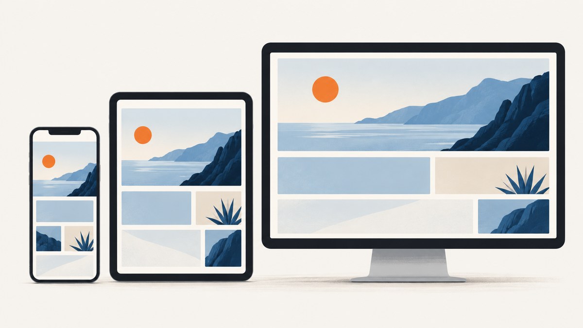
A responsive website adapts its layout, content, and media to the space and viewing conditions available. Start with content in a sensible single-column reading order, let Grid and Flexbox distribute available space, and add breakpoints only when the content needs a change. Then make images responsive and check the result at changing widths, zoom levels, and keyboard focus positions.
Responsive design is an approach, not a separate technology or a set of layouts for particular phone models. HTML text already reflows naturally; fixed-width containers and rigid columns are common causes of horizontal scrolling, cramped content, and unused space. A flexible base layout handles many widths without a breakpoint at all. MDN’s responsive design guide describes the content-first combination of flexible layouts, media, and conditional styling.
1. Put content in a usable order
Before writing responsive CSS, decide the document’s reading order. Put the heading, primary content, and actions in the order a person should encounter them. This narrow-screen baseline also gives keyboard users a natural focus sequence. Grid and Flexbox can change where items appear visually, but the HTML source and keyboard order should still make sense when someone reads and navigates the page linearly.
Use semantic HTML for the structure: headings for sections, lists for grouped items, buttons for actions, and links for navigation. Avoid making a desktop-specific visual arrangement the only version of the content. On a narrow screen, related content can stack in the same meaningful order rather than becoming hidden or reachable only through horizontal scrolling.
2. Configure the viewport and basic page styles
Add a viewport declaration to the document head so a mobile browser uses the device width as the page’s layout viewport. Without it, some browsers use a wider virtual viewport and shrink the page, which can keep narrow-screen media queries from behaving as expected. Do not disable user zoom. MDN notes that initial-scale=1 is common but usually unnecessary; consider it if overflow causes an unwanted initial shrink.
<!doctype html>
<html lang="en">
<head>
  <meta charset="utf-8">
  <meta name="viewport" content="width=device-width">
  <title>Responsive page</title>
  <link rel="stylesheet" href="styles.css">
</head>
<body>
  <header class="site-header">
    <a class="brand" href="/">Northstar</a>
    <nav aria-label="Main navigation">
      <a href="/work">Work</a>
      <a href="/about">About</a>
      <a href="/contact">Contact</a>
    </nav>
  </header>
  <main class="page">
    <article>
      <h1>A flexible page</h1>
      <p>The content comes first and flows in a useful order.</p>
    </article>
    <aside>Related information</aside>
  </main>
</body>
</html>
The example’s page title and copy are illustrative; replace them with the content your site needs. Keep the viewport declaration even if the first CSS version is only one column. It establishes the intended relationship between CSS viewport units and the device’s available width. For more detail, see MDN’s viewport meta documentation.
3. Build a flexible base layout
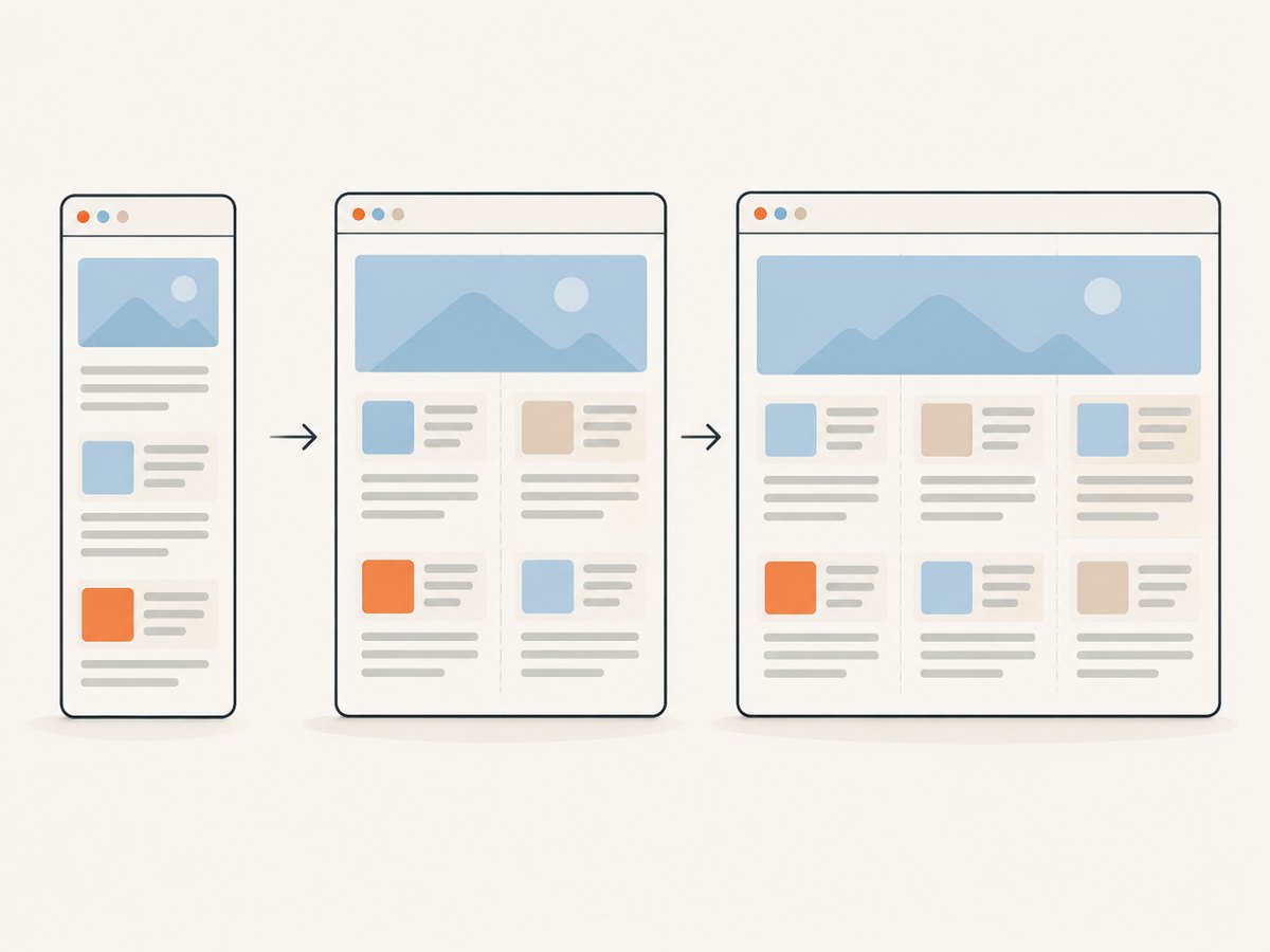
Choose Grid or Flexbox based on the relationship between items. Grid is useful for two-dimensional page areas or repeated cards; Flexbox works well for one-dimensional rows that can wrap. Both let content participate in sizing. Start with a narrow layout and allow it to expand, instead of fixing the whole page to a desktop width and trying to squeeze it down.
* {
  box-sizing: border-box;
}

body {
  margin: 0;
  color: #20252b;
  font: 1rem/1.55 system-ui, sans-serif;
}

.site-header {
  display: flex;
  flex-wrap: wrap;
  align-items: center;
  justify-content: space-between;
  gap: 1rem;
  padding: 1rem;
}

.site-header nav {
  display: flex;
  flex-wrap: wrap;
  gap: 0.75rem 1rem;
}

.page {
  width: min(100% - 2rem, 72rem);
  margin-inline: auto;
  display: grid;
  grid-template-columns: minmax(0, 1fr);
  gap: 2rem;
  padding-block: 2rem;
}

article,
aside {
  min-width: 0;
}

img,
video,
svg {
  max-width: 100%;
  height: auto;
}

h1 {
  max-width: 18ch;
  font-size: clamp(2rem, 6vw, 4rem);
  line-height: 1.1;
}

p {
  max-width: 68ch;
}

@media (min-width: 48rem) {
  .page {
    grid-template-columns: minmax(0, 2fr) minmax(14rem, 1fr);
    align-items: start;
  }
}
The minmax(0, 1fr) pattern allows a grid track to shrink below the intrinsic minimum width of its contents. min-width: 0 can similarly prevent a grid or flex child from forcing overflow. The centered container has a maximum width to keep lines from becoming excessively long, while remaining fluid on smaller screens. The breakpoint at 48rem is an example, not a universal tablet threshold: inspect the content and choose the point where the layout can comfortably support two columns.
Use relative sizing for text and spacing where it helps the page respond to user preferences. Avoid hard-coded widths on text blocks and controls. If a word, URL, table, or code sample is intrinsically wide, decide how that specific content should behave: allow wrapping where appropriate, provide a local horizontal scroller for data that must remain tabular, or present a useful compact alternative. A page-wide overflow workaround can conceal the source of the problem without making the content usable.
4. Add breakpoints for actual content needs
A breakpoint is a conditional style change, not a device label. Begin with the narrow layout, then widen the browser until a navigation row becomes crowded, a text column gets too broad, or cards have enough room for another column. Put a breakpoint where the content changes from usable to awkward. A few well-chosen breakpoints are easier to maintain than rules for every named device size.
/* One card per row until the content has room to breathe. */
.card-grid {
  display: grid;
  grid-template-columns: 1fr;
  gap: 1rem;
}

@media (min-width: 40rem) {
  .card-grid {
    grid-template-columns: repeat(2, minmax(0, 1fr));
  }
}

@media (min-width: 68rem) {
  .card-grid {
    grid-template-columns: repeat(3, minmax(0, 1fr));
  }
}

/* Respond to input capabilities, not a guessed device category. */
@media (hover: hover) and (pointer: fine) {
  .card a:hover {
    text-decoration-thickness: 0.15em;
  }
}
Media queries can inspect width, height, orientation, resolution, pointer and hover capability, and user preferences. Use the condition that expresses the need. For instance, a hover treatment should be an enhancement for a device that can hover, while the link remains usable without hover. Do not infer that a narrow viewport necessarily means a touch device. See MDN’s media query reference for available conditions.
Before adding a breakpoint, check whether a flexible primitive already solves the issue. A wrapping flex row, a fluid grid, or a bounded text column may work at intermediate widths without special cases. Breakpoints are most useful when the composition truly changes, such as moving a sidebar below an article or adding a second card column.
5. Deliver images that fit the display
Setting max-width: 100% stops media from exceeding its container, but it does not select an efficient source or a useful crop. Use srcset and sizes when the browser can choose among resolutions of the same image, and use <picture> when the crop or format should vary by condition.

<img
  src="/images/mountain-800.jpg"
  srcset="/images/mountain-480.jpg 480w,
          /images/mountain-800.jpg 800w,
          /images/mountain-1400.jpg 1400w"
  sizes="(min-width: 72rem) 48rem,
         (min-width: 48rem) 66vw,
         100vw"
  width="1400"
  height="900"
  alt="A mountain ridge above a lake">

<picture>
  <source media="(max-width: 40rem)" srcset="/images/product-square.jpg">
  <img src="/images/product-wide.jpg" alt="A product on a workbench">
</picture>
In the first example, sizes describes the rendered width that corresponds to the conditions, while srcset offers candidate widths. Adjust the candidates and size rules to match your actual layout and assets. In the second, the smaller-screen source can use a different composition. Provide meaningful alternative text when the image conveys information; use empty alternative text for purely decorative imagery. A single oversized asset merely scaled down may waste transfer bytes, and a wide crop can obscure the subject on a small screen.
6. Check zoom, keyboard use, and text size
Responsive behavior includes user adjustments. Do not add viewport settings that prevent zoom. Check that enlarged text does not overlap, clip, or hide controls. Prefer content containers that can grow and text dimensions that can respond to user settings. W3C WAI describes liquid layout as one technique for adapting to available horizontal space and text size; it is an example technique, not a requirement that every page use one particular implementation.
Tab through links, buttons, and form controls after each major layout change. Confirm visible focus, a useful focus sequence, and that visually repositioned items still follow a logical source order. The guidance in W3C WAI’s liquid layout technique and web.dev’s accessible responsive design article supports fluid layouts and checking visual order against the underlying content order.
7. Test the page at changing widths
Test content at a range of widths rather than checking one phone preset and one desktop preset. Resize the browser gradually and note where content becomes hard to read, controls crowd, or columns become too narrow. Those observations guide breakpoint placement. Then inspect zoom, keyboard traversal, portrait and landscape orientation, and relevant reduced-motion or input-preference behavior.
- Start narrow. Confirm all primary content and actions fit in normal flow and appear in a useful reading order.
- Widen gradually. Look for the point where a flexible row or grid can become multiple columns without squeezing content.
- Check intermediate widths. Catch awkward gaps and crowded navigation between the narrow and wide compositions.
- Zoom and enlarge text. Verify that content remains reachable and controls are not clipped.
- Use the keyboard. Tab through interactive items and compare focus order with visual order.
- Inspect media and preferences. Check image crops and confirm hover or motion effects are not the only way to use a feature.
Browser responsive design tools can help inspect viewport sizes and device emulation, but they do not replace checking the actual content and interaction. A screenshot can reveal visual overflow or an unexpected composition; keyboard and zoom behavior need direct interaction checks too.
8. Troubleshoot common responsive problems
| Symptom | Likely cause | What to change |
|---|---|---|
| The desktop layout appears tiny on a phone | Missing or incorrect viewport metadata | Add <meta name="viewport" content="width=device-width"> in the head. Check for a rigid wide container. |
| The page scrolls sideways | Fixed-width child, unbreakable string, wide media, or grid minimum sizing | Inspect the overflowing element. Constrain media, use minmax(0, 1fr) and min-width: 0 where suitable, and handle long text or data locally. |
| A column becomes cramped before the breakpoint | The breakpoint was chosen for a device label rather than content fit | Move the breakpoint to the width where the content becomes uncomfortable, or let the layout wrap naturally. |
| Cards overflow despite fractional grid tracks | An item’s intrinsic minimum width is forcing its track larger | Try minmax(0, 1fr) for tracks and min-width: 0 on the grid child; inspect code, tables, and long URLs inside. |
| Text or controls disappear when zooming | Fixed heights, clipped overflow, or zoom restrictions | Remove restrictive viewport settings, avoid fixed-height text containers, and let sections grow with their contents. |
| Keyboard focus jumps unexpectedly | CSS visual reordering no longer matches source order | Keep DOM order meaningful and use visual placement that preserves a logical focus sequence. |
| The image fits but looks soft or crops the subject | Only one small source is available, or the same crop is used at every width | Offer suitable srcset candidates or use <picture> for a different crop. |
9. Performance, reliability, and maintenance
Responsive CSS does not automatically make a page fast. Image source selection can avoid downloading a needlessly large source for a smaller rendered size. Keep image dimensions and crops aligned with the layout, and use meaningful width and height attributes so the browser can reserve the expected space. The examples above show the mechanisms; the right asset sizes depend on the site’s design and available files.
For reliability, make the narrow baseline useful before adding enhancements. A page that works in ordinary document flow has fewer dependencies on exact viewport conditions. Keep breakpoints tied to visible content behavior, and review them when navigation, copy, or media changes. Test with zoom and a keyboard as part of the same review, since visual appearance alone cannot establish that the page remains navigable.
For layout debugging, an image capture can preserve a visual state at a given URL and viewport for comparison or review. ScreenshotNeo is a website screenshot API and MCP server by Yorker Media; its options include viewport presets, custom viewport dimensions, full-page capture, and custom CSS or JavaScript. See the ScreenshotNeo site and API documentation for the service details and parameters.
Or skip the browser setup
For a visual capture of your page, call the ScreenshotNeo API with a URL. This runnable cURL request saves the response as a WebP image; replace the API key and target URL with your own:
curl -G "https://api.screenshotneo.com/v1/shot" \
  -d access_key=YOUR_API_KEY \
  --data-urlencode url=https://example.com \
  -o shot.webp
Python version:
import requests

r = requests.get(
    "https://api.screenshotneo.com/v1/shot",
    params={"access_key": "YOUR_API_KEY", "url": "https://example.com"},
    timeout=90,
)
r.raise_for_status()
open("shot.webp", "wb").write(r.content)
Node.js version using built-in fetch:
const q = new URLSearchParams({
  access_key: 'YOUR_API_KEY',
  url: 'https://example.com'
});
const res = await fetch(`https://api.screenshotneo.com/v1/shot?${q}`);
if (!res.ok) throw new Error(`Screenshot request failed: ${res.status}`);
const image = Buffer.from(await res.arrayBuffer());
await import('node:fs/promises').then(fs => fs.writeFile('shot.webp', image));
Replace YOUR_API_KEY with a key from your account. Keep that key on a server or in a protected environment variable rather than exposing it in public browser code. These examples capture a webpage URL; they do not replace testing zoom, keyboard navigation, or responsive behavior through interaction.
- Cookie and consent banners, newsletter popups, and chat widgets are removed before the shot; each cleanup step can be turned off.
- Bot checks, blank pages, failed loads, timeouts, and cache hits are never billed; response headers indicate the page verdict and billing status.
- An MCP server provides
take_screenshot,get_page_info, andcapture_pdffor Claude, Cursor, or another MCP client. - There are 1,000 screenshots a month free with no card; paid plans start at $5 for 3,000 screenshots.
Create a free ScreenshotNeo account to get 1,000 screenshots a month with no card.
Frequently asked questions
Do I need a media query for every screen size?
No. Flexible Grid and Flexbox layouts can cover many widths. Add a media query when a real content or environment need calls for a change.
Should I design for a particular phone first?
Use a narrow, content-first baseline, then adjust where the content needs it. A device model is not a reliable substitute for observing where the layout becomes cramped.
Can I use fixed widths anywhere?
Fixed values can be appropriate for small details, but a fixed-width page or column can overflow. Constrain overall line length while letting the page and major layout tracks adapt.
Does a screenshot prove my website is accessible?
No. A screenshot is useful for visual inspection, but keyboard order, zoom behavior, text enlargement, and interactive controls require direct checks.
What should I check after changing the content?
Repeat the width and interaction checks. Longer headings, new links, changed images, and wider data can alter where a layout stops fitting.


