How to Capture a Mobile Website Screenshot Online
Capture a mobile website screenshot from your computer with Chrome, Safari or a hosted service. Learn how to choose viewport or full-page output and when to check a real phone.
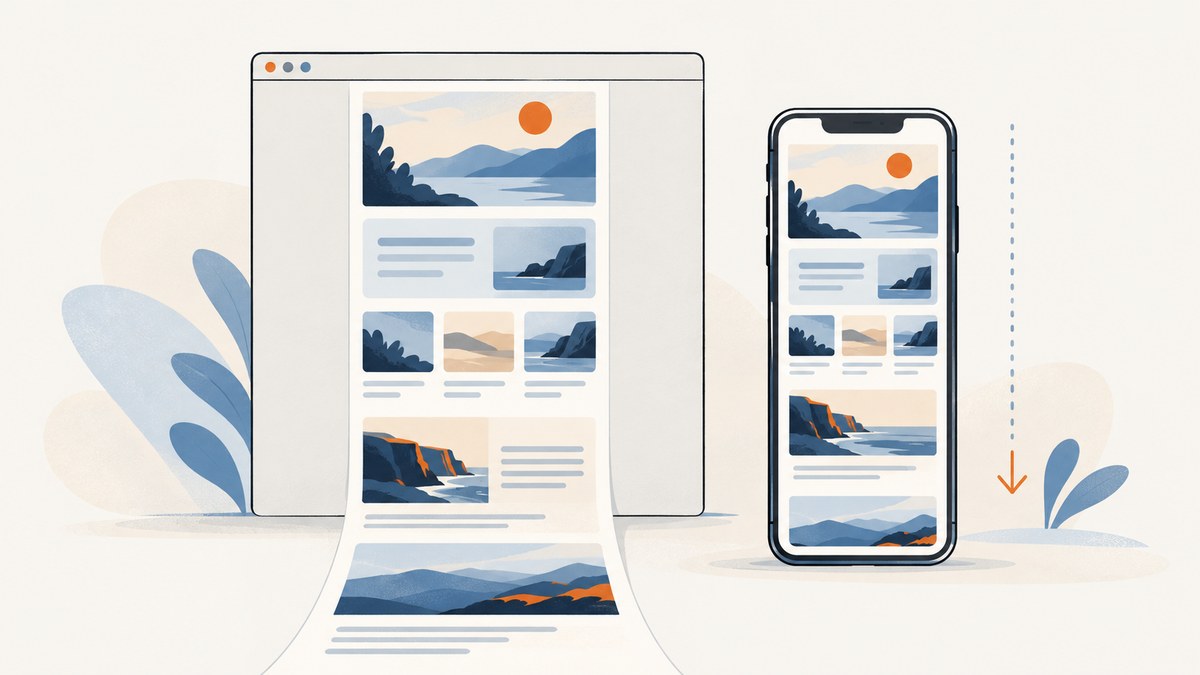
You can capture a mobile website screenshot online from a desktop in three practical ways: use Chrome DevTools Device Mode, use Safari Responsive Design Mode, or send a public URL to a hosted screenshot service. In Chrome, choose a device preset or enter responsive dimensions, then select either Capture screenshot for the visible viewport or Capture a full size screenshot for the entire page. Those are different outputs, so decide which one you need before capturing.
A simulated mobile screenshot is useful for checking responsive layout and sharing a visual snapshot. It does not prove that the site behaves the same on an actual phone. Google describes Chrome Device Mode as an approximation, and Apple says Safari’s responsive presets do not exactly reproduce device rendering and behavior. For browser-specific bugs, touch behavior, keyboard interactions, or final QA, check the page on a real device or Simulator too. Chrome Device Mode documentation · Apple Responsive Design Mode documentation.
1. Choose the kind of mobile screenshot you need
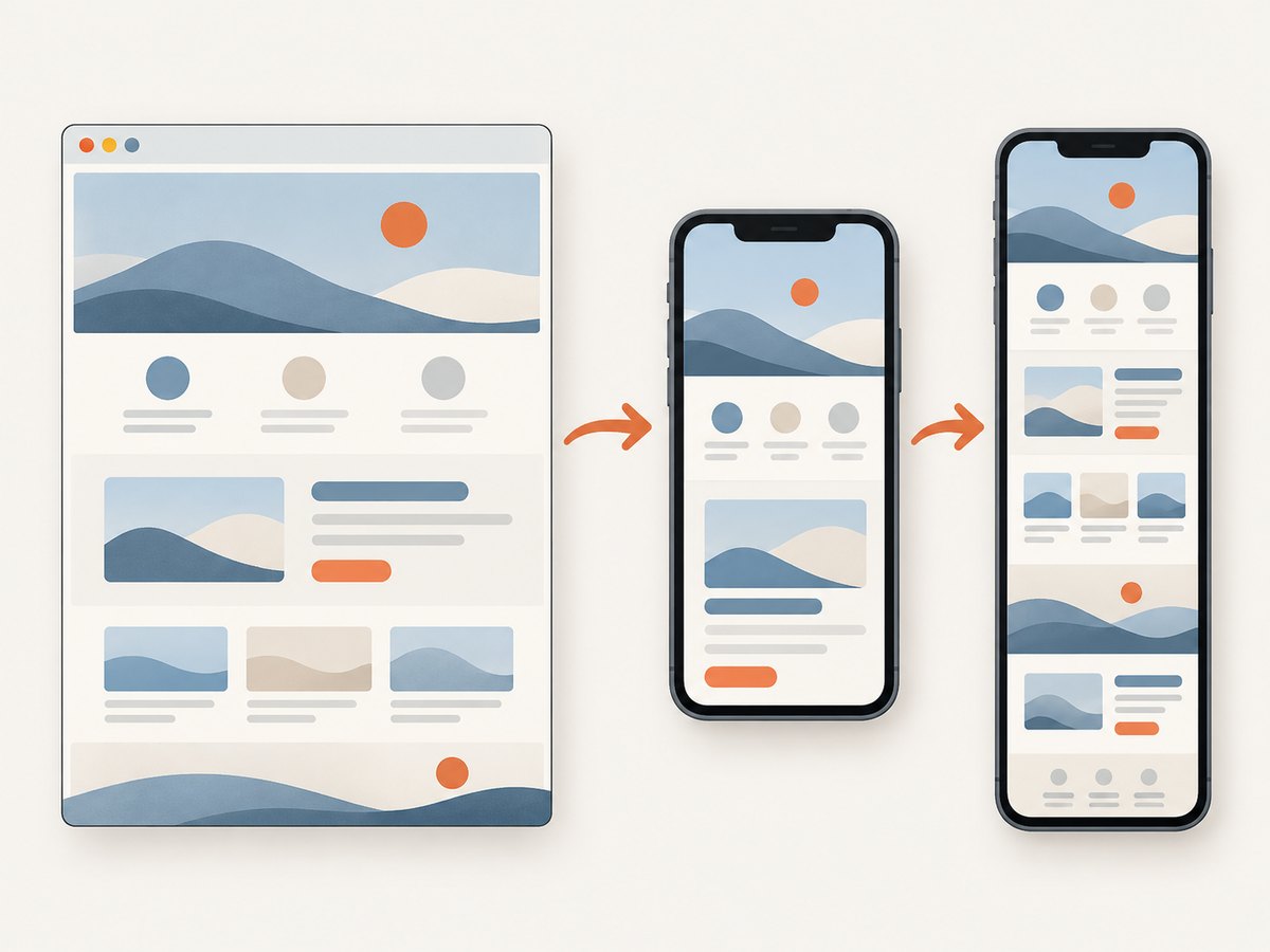
“Mobile screenshot” can refer to a picture of the screen-sized viewport or a tall image containing the page below the fold. The right choice depends on the task:
| Goal | Capture | Good for |
|---|---|---|
| Show what fits on a phone screen at one moment | Visible viewport | Layout review, bug reports, social previews |
| Show the complete page from top to bottom | Full-page capture | Long landing pages, page audits, documentation |
| Inspect a browser or device-specific issue | Real phone, Simulator, or remote debugging | Safari behavior, touch, keyboard, browser chrome |
For a viewport capture, the height you set affects the visible composition. For a full-page capture, the browser captures content beyond the initial viewport. Lazy-loaded images or sections that appear only after scrolling may need extra attention: scroll through the page first or use a capture method that loads lazy content. In either case, record the viewport width, height, and browser when the screenshot will be used as evidence; the image alone does not identify those conditions.
2. Capture a mobile website screenshot with Chrome DevTools
Chrome DevTools is the quickest do-it-yourself route if Chrome is already open. Device Mode simulates a mobile viewport on your computer; it is not a remote session on an actual phone. Google documents viewport sizing, device presets, device pixel ratio, orientation, throttling, and separate visible and full-size screenshot commands.
Step-by-step
- Open the page in Chrome and open DevTools. You can use the browser menu or right-click the page and choose Inspect.
- Click the Toggle device toolbar button in DevTools. The viewport appears in responsive mode.
- Pick a device from the Dimensions menu, or select Responsive and enter the width and height you want. You can also drag the viewport handles.
- Refresh the page if its layout or content did not update after changing the viewport. Wait for images, fonts, and any relevant dynamic content to appear.
- Open DevTools’ More options menu and select Capture screenshot for the currently visible viewport, or Capture a full size screenshot for the complete page.
The screenshot is saved by the browser. If you need a device frame for a presentation, enable Show device frame in the same menu before capturing in a device-specific mode. A frame adds a visual border; it does not make the rendered page more like the actual device.
Set dimensions and device behavior deliberately
- Responsive dimensions: enter the CSS viewport width and height that you want to inspect. Use the width that matches your layout breakpoint or design requirement.
- Device preset: useful for a repeatable preview associated with a named device profile. Chrome also allows custom device dimensions, with optional device pixel ratio, user-agent string, and device type.
- Rotate: use the rotate control to check landscape layout. A narrow DevTools toolbar may hide the control; widen the toolbar or use the menu.
- Device pixel ratio (DPR): relevant when you need a higher-density rendering approximation. DPR affects how Chrome draws physical pixels for a CSS pixel; it is separate from the CSS viewport dimensions.
- Device type and touch: Device Mode offers mobile and desktop variants, including modes with or without touch events. This can help expose code paths that depend on touch input, but still does not substitute for real-device testing.
- Media query breakpoints: the More options menu can show media queries. This helps you place the viewport just above or below a breakpoint when tracking a responsive layout change.
Do not confuse the DevTools zoom control with the CSS viewport width. Zoom changes how the preview is presented within DevTools; use the width and height controls to set the page’s responsive viewport. For a visual comparison over time, use the same dimensions, zoom setting, page state, and capture type each time.
Visible viewport versus full-size output
Capture screenshot captures what is currently in the viewport. It is usually the right option for a phone-screen mockup or for reporting an issue “above the fold.” Capture a full size screenshot includes page content that is outside the current viewport. This is the appropriate choice for a whole-page review. Long or dynamically expanding pages can make very tall files; consider whether a viewport image or several focused captures would be easier to inspect.
A page may change as it scrolls. Sticky headers, lazy images, animations, consent overlays, and infinite-loading feeds can produce different results depending on timing and scroll position. For a full-page review, wait for the page to settle and inspect whether all relevant sections loaded. If the site reveals content only after interaction or scrolling, a single automatic full-page capture may not represent every state.
3. Use Safari Responsive Design Mode
For a Safari-specific preview, open Safari’s Develop menu and choose Enter Responsive Design Mode. Select one of the viewport presets, enter or resize dimensions, and rotate the preview to inspect landscape. This is a convenient way to look at a page using Safari’s responsive preview tools.
Apple cautions that presets approximate screen sizes rather than exactly reproducing a particular device’s layout, rendering, and behavior. On a phone, the browser’s address bar, the on-screen keyboard, and device-specific form behavior can affect what a person sees. When the issue depends on those details, use Simulator or the actual device. Responsive Design Mode is best treated as an efficient preview rather than final proof.
4. Capture a URL with an online screenshot service
A hosted service can render a public URL at a chosen mobile size and return an image without requiring you to operate browser developer tools locally. This can suit a one-off capture from a computer or a repeatable workflow. Check whether the service lets you choose width and height, whether it can capture a full page, and what browser or device behavior its output represents.
One surfaced example, Tallpage’s mobile website screenshot page, describes URL-based capture and explicitly says its output does not emulate mobile Safari, a specific iPhone model, touch events, mobile user-agent behavior, or a high-density device screen. Those are the service’s stated limitations, not an independent test result. A hosted capture should therefore be understood as a rendered snapshot at selected dimensions, not proof of how every phone browser displays the page. See Tallpage’s description and stated limitations.
Before submitting a URL to any hosted service, consider what the URL exposes. This research does not establish how any particular service handles private or access-controlled URLs. Do not assume that an authenticated page or internal staging URL is safe to submit; check the provider’s documentation and use a workflow approved for that content. For pages that are public, compare the returned viewport and full-page options with your needs.
5. Or skip the browser setup
If you want to request a mobile-sized screenshot from a URL without setting up a local browser preview, ScreenshotNeo is a website screenshot API and MCP server for developers. A single GET request accepts a URL and capture options; see the ScreenshotNeo API documentation.
curl -G "https://api.screenshotneo.com/v1/shot" \
  -d access_key=YOUR_API_KEY \
  --data-urlencode url=https://stripe.com \
  -d width=390 \
  -d height=844 \
  -o mobile-shot.webp
import requests
r = requests.get(
"https://api.screenshotneo.com/v1/shot",
params={
"access_key": "YOUR_API_KEY",
"url": "https://stripe.com",
"width": 390,
"height": 844,
"format": "webp",
},
timeout=90,
)
r.raise_for_status()
with open("mobile-shot.webp", "wb") as image:
image.write(r.content)const q = new URLSearchParams({
access_key: 'YOUR_API_KEY',
url: 'https://stripe.com',
width: '390',
height: '844',
format: 'webp',
});
const res = await fetch(`https://api.screenshotneo.com/v1/shot?${q}`);
if (!res.ok) throw new Error(`Screenshot request failed: ${res.status}`);
const image = Buffer.from(await res.arrayBuffer());
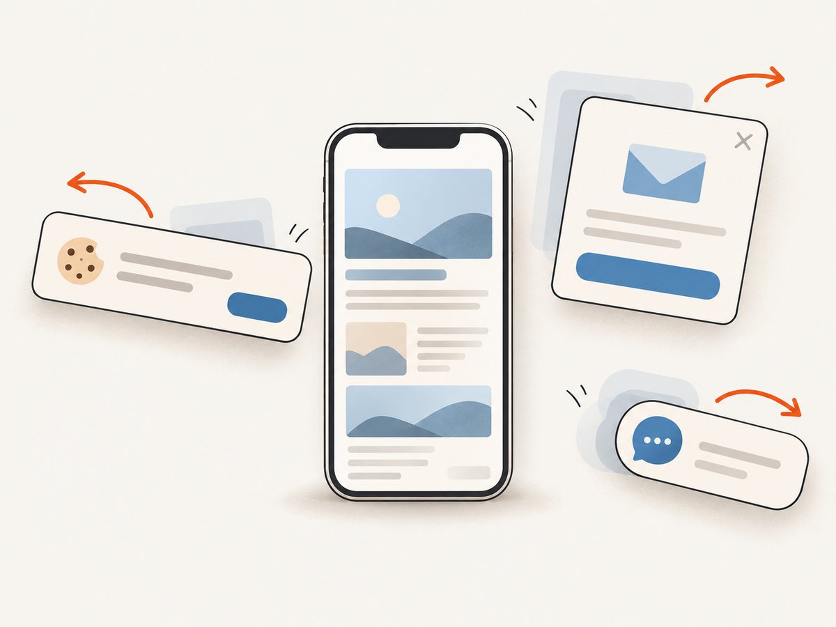
await import('node:fs/promises').then(fs => fs.writeFile('mobile-shot.webp', image));These examples request a 390 by 844 viewport; adjust the dimensions to the layout you need. ScreenshotNeo also supports full-page capture, device presets and other viewport settings. Cookie and consent banners, newsletter popups, and chat widgets are removed before capture; each cleanup step can be turned off. Bot checks, CAPTCHAs, blank pages, timeouts, failed loads, and cache hits are not billed, and the response identifies the page verdict and billing status in headers. Its MCP server provides take_screenshot, get_page_info, and capture_pdf tools for AI agents and other MCP clients. One thousand screenshots a month are free without a card; paid plans start at $5 for 3,000. Learn about ScreenshotNeo or sign up for 1,000 free screenshots a month, with no card.
6. Choose a method for the job
| Method | Setup | What it is useful for | Keep in mind |
|---|---|---|---|
| Chrome DevTools | Open DevTools and enable Device Mode | Manual viewport and full-size captures; responsive layout inspection | Desktop simulation; actual phone behavior can differ |
| Safari Responsive Design Mode | Use Safari’s Develop menu | Previewing a responsive page in Safari’s tools | Presets are approximations; use Simulator or device for fidelity |
| Hosted URL screenshot | Submit a URL to a service | Capturing a public URL without local DevTools; repeatable requests | Check dimensions, full-page support, fidelity, and URL privacy |
For a quick one-off, start with the browser you already use. For a Chrome full-page image, explicitly choose full-size capture. For Safari-specific issues, use Safari’s preview and move to Simulator or a phone when necessary. For unattended or repeatable captures, evaluate a hosted service against the required viewport, page state, privacy, and output fidelity.
7. Troubleshooting common capture problems
| Problem | Likely cause | What to do |
|---|---|---|
| The image is desktop-sized | Device toolbar was not enabled, or the page was captured before applying dimensions | Enable Device Mode, set the dimensions, and capture again. Refresh if the layout did not respond. |
| The image cuts off halfway down | You captured the visible viewport | Use Chrome’s Capture a full size screenshot command for content beyond the viewport. |
| Full-page image is missing a lazy-loaded section | The section or its images load only after scrolling or interaction | Scroll through the page first, wait for content, and recapture. If it is stateful, capture the relevant state separately. |
| Text or layout differs from a phone | Desktop simulation does not reproduce every device, browser, font, or system UI detail | Use a real phone or Simulator for behavior-specific verification. Record viewport and browser when sharing the screenshot. |
| Screenshot is blurry or has unexpected dimensions | CSS viewport and device pixel ratio are being conflated, or preview zoom is mistaken for viewport size | Check width and height in the device toolbar; set DPR separately if needed. Reopen the downloaded file to inspect its actual pixels. |
| Capture includes a popup or consent overlay | The page state includes an overlay, or the capture method preserves site UI | Dismiss it manually in DevTools before capture if appropriate. With ScreenshotNeo, banner and popup cleanup is available and can be disabled per need. |
| Hosted capture cannot load the target | The URL may be unreachable to the service, access-controlled, or dependent on a local session | Check the URL and service requirements. Do not assume a hosted service can access your authenticated browser session or private page. |
8. Performance, repeatability, and cost
Local DevTools has no screenshot-service request step and works well for interactive inspection, but the browser’s simulated CPU and network settings are relative to the computer and remain approximations. Google documents CPU and network throttling in Device Mode; use them when you are reviewing loading behavior, and do not treat them as a precise measurement from a specific handset.
For consistent comparisons, keep viewport width and height, device type, DPR, orientation, zoom, page state, and capture area constant. Dynamic content can still vary because of network timing, animations, experiments, consent state, and personalized content. Wait for the page to settle and note any interactions needed to reach the state shown.
Browser-based captures use the software already available on your computer. A hosted service may have usage limits or a paid plan, so check current terms before adopting it for a recurring job. ScreenshotNeo’s stated plans are Free with 1,000 shots per month and no card, Starter $5 for 3,000, Growth $15 for 15,000, Pro $39 for 60,000, Scale $99 for 250,000, and Business $249 for 1,000,000; yearly billing gives two months free. Every feature is on every plan. Its billing rule excludes bot checks, CAPTCHAs, blank pages, timeouts, failed loads, and cache hits; use the response’s X-Page-Verdict and X-Billed headers to determine the outcome for a request.
FAQ
Can I take an iPhone-sized website screenshot online from a computer?
Yes. Set a mobile viewport in Chrome Device Mode or Safari Responsive Design Mode, or use a URL-based screenshot service that accepts viewport dimensions. The result is a preview at those settings, not necessarily a reproduction of a particular iPhone browser.
How do I screenshot a whole mobile webpage?
In Chrome Device Mode, open More options and choose Capture a full size screenshot. This captures content outside the visible viewport. Wait for lazy-loaded content and check whether the page changes as it scrolls.
Will a desktop preview prove that the mobile site works?
No. It can reveal responsive layout issues, but it does not prove touch, keyboard, browser chrome, or device-specific rendering behavior. Verify those concerns on the relevant real device or Simulator.
Should I include the phone frame?
Use a frame when the image is intended to look like a device mockup. Leave it off when you need to inspect or compare the page content itself; the frame does not increase simulation fidelity.


