How to Capture Screenshots of Multiple Websites at Multiple Viewport Sizes
Automate responsive screenshots across a URL and viewport matrix with Playwright, consistent filenames, reproducible settings, and practical troubleshooting.

To capture screenshots of multiple websites at multiple viewport sizes, define a list of URLs and viewport dimensions, then capture every URL–viewport pair with browser automation. Playwright can set a page’s viewport before navigation, take a viewport or full-page screenshot, and choose CSS-pixel or device-pixel output. The example below creates one PNG per pair and names each file with the site key and dimensions.
This method is useful for responsive QA, design review, and documentation. It controls the browser environment more directly than a screenshot service, which helps when you need repeatable settings or device emulation. For quick captures without installing browsers or maintaining automation, see ScreenshotNeo.
1. Choose the capture matrix
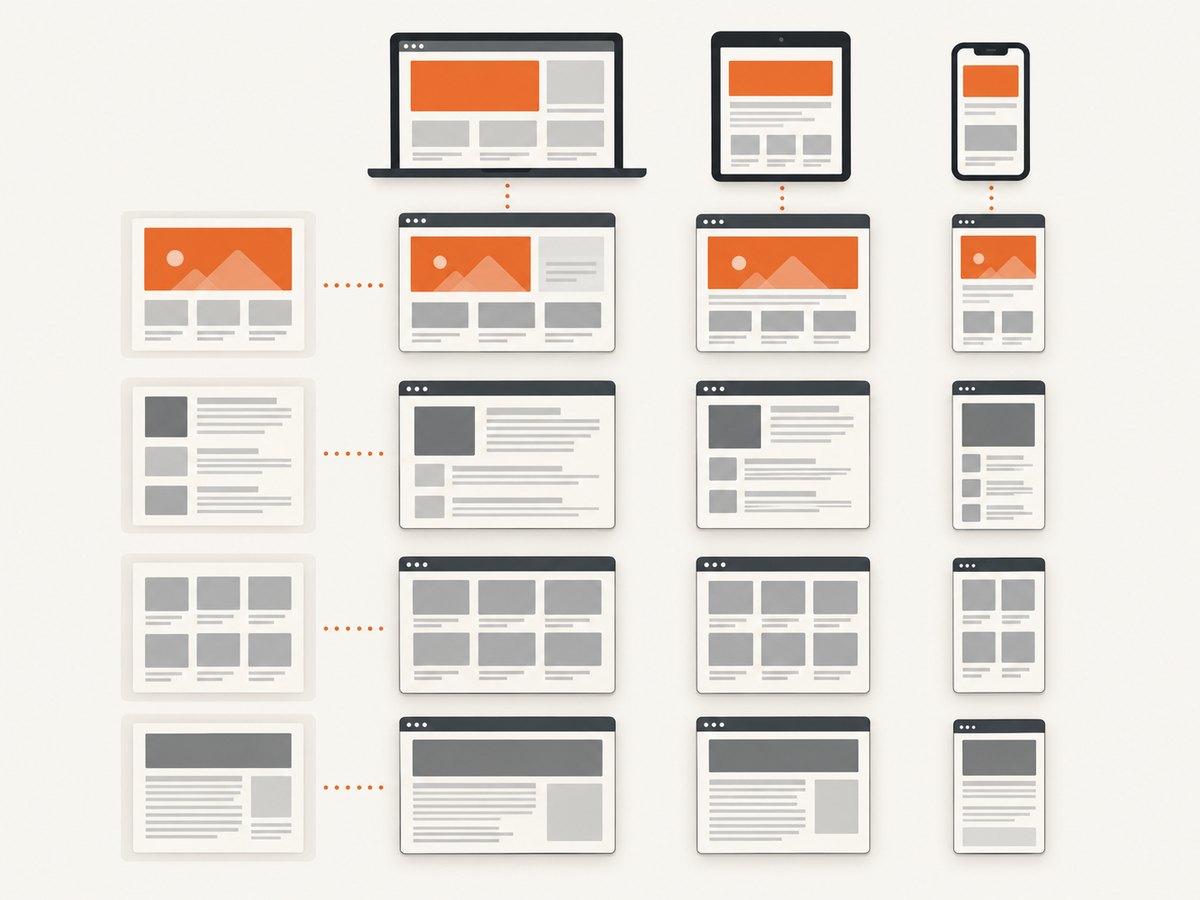
A capture matrix is the set of URLs multiplied by the set of viewport sizes you want to inspect. For example, three sites and three viewports produce nine screenshots. Decide the dimensions intentionally: use widths that correspond to the responsive states you care about, and keep height consistent if you are comparing the visible browser area.
| Question | Decision |
|---|---|
| Which pages? | Use specific URLs, including the paths and query parameters needed to reach the target state. |
| Which sizes? | List width and height in CSS pixels for each responsive layout you want to check. |
| What area? | Choose the visible viewport for fixed-height comparisons or full page for long-page documentation. |
| Which scale? | Use CSS scale for one image pixel per CSS pixel, or device scale for higher-resolution output. |
| What state? | Decide how to handle cookie dialogs, login, animation, loading, and other changing content. |
A viewport screenshot and a full-page screenshot answer different questions. The first captures what is visible in the browser’s current viewport. Playwright’s fullPage option captures the full scrollable page. See the official Page API.
2. Install Playwright
The following runnable example uses Node.js and Playwright. Create a project, install the package, and install its Chromium browser:
mkdir site-captures
cd site-captures
npm init -y
npm install playwright
npx playwright install chromium
Save the script below as capture.mjs. It makes an output directory, launches one browser, and creates a fresh page with the requested viewport for each matrix entry. The viewport is set before navigation, so responsive scripts and CSS see the intended dimensions when the page loads.
3. Capture every URL and viewport pair
import { chromium } from 'playwright';
import { mkdir } from 'node:fs/promises';

const targets = [
  { key: 'example', url: 'https://example.com' },
  { key: 'stripe', url: 'https://stripe.com' },
];

const viewports = [
  { width: 390, height: 844, name: 'mobile' },
  { width: 768, height: 1024, name: 'tablet' },
  { width: 1440, height: 900, name: 'desktop' },
];

const outputDir = 'screenshots';
const fullPage = false;
const scale = 'css'; // Use 'device' for device-pixel output.
const timeoutMs = 45_000;

await mkdir(outputDir, { recursive: true });
const browser = await chromium.launch({ headless: true });

try {
  for (const target of targets) {
    for (const viewport of viewports) {
      const page = await browser.newPage({
        viewport: { width: viewport.width, height: viewport.height },
        deviceScaleFactor: 1,
      });
      const filename = `${target.key}__${viewport.width}x${viewport.height}__${scale}.png`;
      const path = `${outputDir}/${filename}`;

      try {
        await page.goto(target.url, {
          waitUntil: 'load',
          timeout: timeoutMs,
        });
        await page.screenshot({ path, fullPage, scale });
        console.log(`Saved ${path}`);
      } catch (error) {
        console.error(`Failed ${target.url} at ${viewport.width}x${viewport.height}:`, error);
      } finally {
        await page.close();
      }
    }
  }
} finally {
  await browser.close();
}
Run it with node capture.mjs. A generated filename such as stripe__390x844__css.png identifies the target and the capture dimensions. Including a stable site key avoids unwieldy filenames when URLs contain paths or query strings.
Why create a fresh page for each pair?
It gives each capture a clean navigation and prevents state from one URL or viewport carrying over accidentally. A browser context can also provide shared settings for its pages, while each page can be configured for its own viewport. For a simple batch, opening and closing pages in a loop is easy to understand. For large batches, you can reuse a bounded pool of pages or contexts to manage resource use, while still setting the viewport and state explicitly for every capture.
4. Configure dimensions, scale, and device emulation
Viewport dimensions
Playwright’s viewport uses CSS pixels. Set width and height before navigation when a page’s responsive behavior may depend on them. Do not assume that one viewport width reproduces a physical phone: viewport settings alone do not reproduce every device property.
CSS-pixel or device-pixel output
The screenshot scale option controls output resolution. With css, the image uses one pixel per CSS pixel. With device, output follows the device scale factor and can have more pixels. Keep scale consistent across a comparison set; otherwise, images may differ in pixel dimensions even when the CSS layout is the same. The Playwright emulation guide describes viewport and device emulation settings.
Emulating a device
For realistic device-oriented testing, Playwright device emulation can configure properties such as viewport, screen size, user agent, and touch behavior. This is useful when the page changes based on more than width, such as code that checks for touch input. Choose a device configuration deliberately and record it with the resulting images. A manually assigned viewport is a responsive-width check, not a claim that a real device was reproduced.
Viewport versus full page
Set fullPage: true when the deliverable should include the entire scrollable page. Use false for a fixed-height responsive comparison. Full-page captures can be much taller, use more memory, and make side-by-side layout comparison harder. For particularly long or dynamically expanding pages, try the capture on a representative URL first.
5. Make captures reproducible
Visual comparison is useful only when you know what changed. Record the URL, viewport width and height, browser engine and version, scale, date, and any state setup or waiting rule used. Keep the browser and host environment stable for comparisons. Playwright notes that rendering can vary with the operating system, browser version, settings, hardware, and headless mode; a pixel difference alone does not prove the site layout changed. See the official visual comparisons guidance.
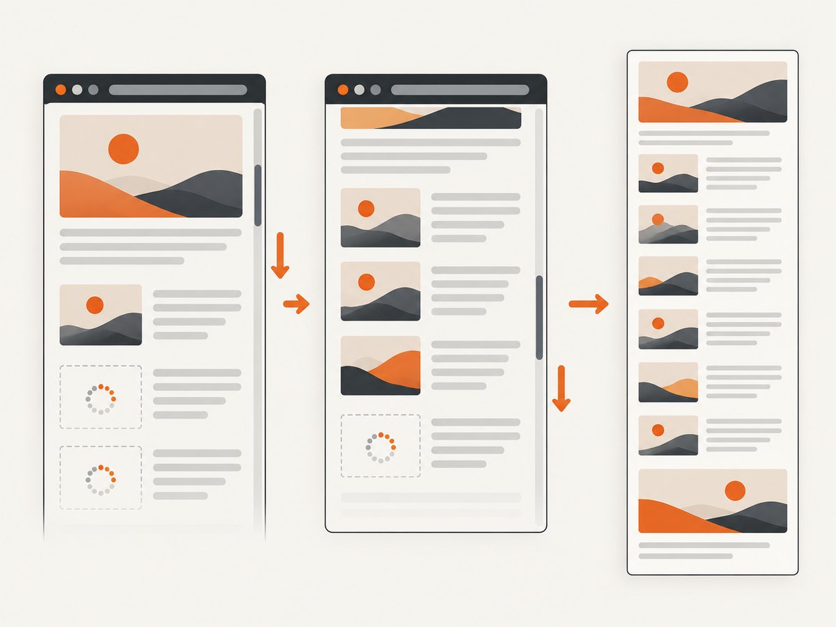
Dynamic pages need a deliberate ready condition. The sample waits for the page’s load event, but that is not a universal signal that every application has finished rendering or fetching data. For a page with a known content marker, wait for that selector:
await page.goto(target.url, { waitUntil: 'domcontentloaded', timeout: timeoutMs });
await page.locator('[data-testid="main-content"]').waitFor({ state: 'visible', timeout: 15_000 });
await page.screenshot({ path, fullPage, scale });
Replace the selector with one that exists on your target pages. If there is no reliable marker, use a documented delay as a pragmatic fallback, but keep it consistent and recognize that a fixed delay can be too short on a slow run or unnecessarily long on a fast one. Avoid waiting for network idle blindly: analytics, polling, and long-lived requests can keep a page active.
Use a manifest for larger runs
For a recurring job, save the matrix and capture settings alongside outputs. A JSON manifest makes it possible to regenerate the same set and inspect what each file represents:
{
  "capturedAt": "2026-09-30",
  "browser": "Chromium",
  "scale": "css",
  "fullPage": false,
  "targets": ["https://example.com", "https://stripe.com"],
  "viewports": [
    { "width": 390, "height": 844 },
    { "width": 1440, "height": 900 }
  ]
}
For automated visual review, keep capture settings in version control and use stable output naming. Separate expected changes such as rotating banners, timestamps, and randomized content from genuine responsive regressions.
6. Run the same idea from other languages
The Node.js script above is the complete batch implementation. These smaller examples show the essential browser setup in Python and a shell-oriented alternative. For a repeatable multi-site job, put the same nested URL and viewport loops around the capture step.
Python with Playwright
from pathlib import Path
from playwright.sync_api import sync_playwright

sites = [
    ("example", "https://example.com"),
    ("stripe", "https://stripe.com"),
]
viewports = [(390, 844), (768, 1024), (1440, 900)]
out = Path("screenshots")
out.mkdir(exist_ok=True)

with sync_playwright() as p:
    browser = p.chromium.launch(headless=True)
    try:
        for key, url in sites:
            for width, height in viewports:
                page = browser.new_page(viewport={"width": width, "height": height})
                try:
                    page.goto(url, wait_until="load", timeout=45_000)
                    path = out / f"{key}__{width}x{height}__css.png"
                    page.screenshot(path=str(path), full_page=False, scale="css")
                    print(f"Saved {path}")
                finally:
                    page.close()
    finally:
        browser.close()
Install with python -m pip install playwright, then run python -m playwright install chromium before executing the script.
cURL and HTTP screenshot APIs
cURL alone does not render a website: it downloads HTTP responses. To create an image, the remote service must run a browser or another rendering engine. For example, ScreenshotNeo accepts a URL and returns an image or PDF:
curl -G "https://api.screenshotneo.com/v1/shot" -d access_key=YOUR_API_KEY --data-urlencode url=https://stripe.com -o shot.webpFor a URL-by-viewport matrix with an API, make one request for each pair and pass that service’s documented viewport parameters. See the ScreenshotNeo API documentation for its supported parameters and response behavior.
7. Or skip the browser setup
ScreenshotNeo is a website screenshot API and MCP server from Yorker Media. One GET request captures a URL as PNG, JPEG, WebP, or PDF. Its viewport options let you request different dimensions for each URL in your matrix. Cookie banners, popups, and chat widgets are removed before the shot; bot checks, blank pages, and failed loads are never billed. An MCP server lets AI agents take screenshots. The free plan includes 1,000 screenshots a month with no card, and paid plans start at $5 for 3,000.
curl -G "https://api.screenshotneo.com/v1/shot" -d access_key=YOUR_API_KEY --data-urlencode url=https://stripe.com -o shot.webpUse the API’s documented viewport parameter when adapting the request to each size. Read the API docs, then sign up for 1,000 free screenshots a month with no card.
8. Troubleshooting
| Symptom | Likely cause | Fix |
|---|---|---|
| Navigation times out | The site is slow, blocked, or keeps connections open. | Check the URL and network access. Use an appropriate readiness condition, such as domcontentloaded followed by a selector wait, and set a considered timeout. Do not assume a longer timeout fixes an unreachable site. |
| Screenshot is blank or incomplete | The page has not rendered its client-side content, or the capture ran before a target element appeared. | Wait for a page-specific visible selector before capturing. Check browser logs and confirm the content is available in the same environment. |
| Mobile screenshot looks like desktop | The viewport was set after navigation, or the page uses device properties beyond width. | Set viewport before navigation. If needed, use Playwright device emulation and document its settings. |
| Images are missing below the fold | Lazy-loaded images may load only after scrolling into view. | For full-page documentation, scroll through the page before capture or use a service that supports loading lazy images. Verify the target page’s behavior; no single scroll strategy covers every site. |
| Output dimensions differ | Scale or device scale factor differs among captures. | Use the same scale and device scale factor throughout the matrix. |
| Repeated runs show visual noise | Fonts, animations, timestamps, ads, or random content vary, or the host/browser changed. | Keep the environment stable, use consistent state setup, and identify dynamic regions. Compare browser and host details before treating a difference as a regression. |
| Browser launch fails | The Playwright browser binary is not installed or the runtime lacks required dependencies. | Run the Playwright browser install command for the selected engine and use an environment supported by Playwright. |
| Too many captures consume resources | The matrix is large and pages or images accumulate. | Close each page after saving, process URLs in bounded batches, and avoid launching a new browser for every screenshot. Start with a small matrix to estimate resource needs in your own environment. |
9. Performance, reliability, and cost
A matrix grows multiplicatively: the number of screenshots is the number of URLs times the number of viewport configurations. Add more dimensions only when they answer a testing question. Browser startup has overhead, so reuse a browser for a batch, but isolate each capture’s page state and close pages promptly. If you introduce concurrency, cap it: many pages at once can increase memory use, trigger rate limits, or change timing and rendering behavior.
Browser automation has no per-screenshot API charge in this workflow, but it does use compute, storage, and maintenance time. You are responsible for installing browser binaries, keeping execution environments stable, handling failures, and storing outputs. A hosted screenshot API trades some browser control for less local setup. Compare approaches based on your need for browser/device emulation, environment control, full-page capture, and effort to run the URL-by-viewport matrix. The research here does not establish benchmark results between tools.
For reliability, log failures per URL and viewport and continue with remaining pairs, as the example does. Retry only failures that may be transient, and avoid repeating non-retryable cases such as invalid URLs indefinitely. Preserve partial output and record which pairs succeeded so a rerun can target missing captures.
FAQ
Should I use one browser page for every viewport?
You can resize a page between captures, but fresh pages make each pair easier to isolate and reproduce. For high-volume jobs, reuse a bounded set of pages while explicitly resetting state and viewport.
Does a viewport screenshot show the whole website?
No. It shows the visible viewport. Use Playwright’s full-page screenshot option when you need the full scrollable page.
Will the same screenshot be pixel-identical on every machine?
Not necessarily. Browser version, operating system, hardware, settings, and headless mode can affect rendering. Keep the capture environment consistent and record it.
Is a mobile viewport the same as testing on a phone?
No. A viewport checks responsive layout at specified dimensions. Device emulation can also configure properties such as user agent and touch behavior, but it still does not guarantee identical behavior to every physical device.
How many viewport sizes should I capture?
Choose the smallest set that covers the responsive states and review questions you have. There is no universal number; include dimensions that exercise meaningful layout changes.
Conclusion
Reliable multi-site screenshot capture comes from treating URLs and viewports as a deliberate matrix, setting dimensions before navigation, keeping scale and environment consistent, and recording the conditions used. Playwright provides direct control for repeatable local workflows. If you would rather send a URL to an API, explore ScreenshotNeo and its documentation.


