How to Capture a Screenshot of a Website’s Mobile Version
Capture a website at phone-sized dimensions with Chrome, Firefox, Playwright, or ScreenshotNeo, including full-page and element screenshots.
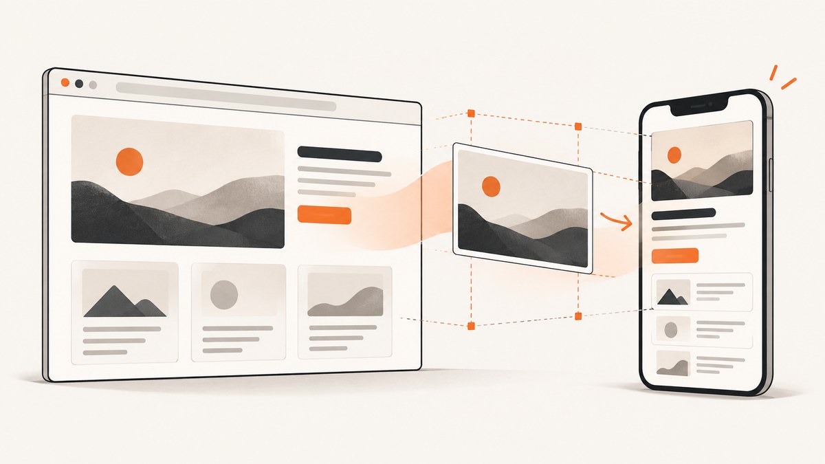
To capture a website’s mobile version, render it at a phone-sized viewport and save either the visible viewport, the full scrollable page, or a specific element. For a one-off image, Chrome DevTools Device Mode is the quickest route. Firefox has an equivalent Responsive Design Mode. For repeatable captures, use Playwright or a screenshot API such as ScreenshotNeo.
A mobile-view screenshot is usually an emulated browser view, not proof that the page ran on a physical phone. Chrome describes Device Mode as “a first-order approximation of how your page looks and feels on a mobile device.” Use a real device when you need to verify operating-system behavior, hardware sensors, mobile browser quirks, or performance.
Choose the capture you actually need
| Goal | Best method | Important setting |
|---|---|---|
| Initial phone-sized screen | Chrome or Firefox | Viewport width and height |
| Entire mobile page | Chrome, Firefox, or Playwright | Full-page capture |
| One component | Firefox Inspector or Playwright | Element selector or locator |
| Many URLs or widths | Playwright or ScreenshotNeo | Scripted viewport configuration |
| Real-device behavior | Physical phone or remote debugging | Actual browser and hardware |
Do not assume that one width represents every phone. Chrome documents width presets such as Mobile S (320 px), Mobile M (375 px), Mobile L (425 px), Tablet (768 px), Laptop (1024 px), Laptop L (1440 px), and 4K (2560 px). Select the breakpoint you need, or enter an explicit width.

Method 1: Chrome DevTools Device Mode
- Open the target page in Chrome on your desktop.
- Open DevTools with
F12,Ctrl+Shift+Ion Windows/Linux, orCmd+Option+Ion macOS. - Click Toggle device toolbar, or press
Ctrl+Shift+M/Cmd+Shift+M. - In the device toolbar, leave Dimensions on Responsive and enter a width and height, or choose a device preset.
- Reload the page after changing dimensions so responsive scripts and images recalculate.
- Open the device-toolbar menu and choose Capture screenshot for the visible viewport.
- Choose Capture a full size screenshot when you need content below the fold.
The visible screenshot has exactly the emulated viewport’s proportions. A full-size screenshot can be very tall on a mobile layout, so use it for documentation, visual regression, or a complete design review rather than for a social preview.
Device settings that matter
- Width and height: control CSS media-query breakpoints and the visible area.
- Device pixel ratio: changes the relationship between CSS pixels and output pixels. Change it when you are checking image sharpness or high-density rendering.
- Mobile device type: Chrome can simulate mobile rendering and touch events instead of desktop click behavior. Use this when a page changes interaction patterns for touch.
- Orientation: switch between portrait and landscape when testing responsive navigation or tables.
- Network throttling: useful for observing loading states, but it does not turn a desktop into a physical phone.
Chrome’s emulation runs from your desktop. If the behavior depends on a mobile operating system, browser engine, permissions, sensors, or hardware acceleration, check the page on an actual device or use remote debugging.
Method 2: Firefox Responsive Design Mode
- Open the page in Firefox.
- Open Browser Tools from the Firefox menu and select Responsive Design Mode, click the responsive toolbar button, or press
Ctrl+Shift+M(Windows/Linux) orCmd+Option+M(macOS). - Enter a width and height, drag the viewport, or select a device profile.
- Use the camera button to save a screenshot to Firefox’s download location.
Firefox can simulate screen size, pixel ratio, touch, network conditions, and user-agent behavior. These are simulated properties; they do not establish that the page rendered on a physical phone.
Firefox full-page and element captures
Firefox’s screenshot tools include a full-page option and an Inspector context-menu action named Screenshot Node for an individual element. Its Web Console also provides the Firefox-specific :screenshot helper. Documented options include:
:screenshot --fullpage --filename mobile-page.png
:screenshot --selector "main article" --filename article.png
:screenshot --delay 1500 --dpr 2 --filename delayed.png
--fullpage captures the complete page, --selector targets one element, --delay waits before capture, and --dpr sets device pixel ratio. These commands are Firefox-specific.
Method 3: Automate mobile screenshots with Playwright
Playwright is useful when you need the same capture every day, a set of known viewport sizes, visual regression checks, or a folder of URLs. The example below uses Chromium, but the same capture API can be used with other Playwright browsers.
import { chromium, devices } from 'playwright';

const browser = await chromium.launch();
const context = await browser.newContext({
  ...devices['iPhone 13'],
  locale: 'en-US'
});
const page = await context.newPage();

await page.goto('https://example.com', { waitUntil: 'networkidle' });
await page.screenshot({ path: 'mobile-viewport.png' });
await page.screenshot({ path: 'mobile-full-page.png', fullPage: true });
await page.locator('main').screenshot({ path: 'main-element.png' });

await browser.close();
Install Playwright with npm install playwright and install its browser binaries with npx playwright install. The devices entry supplies a documented mobile viewport and related emulation settings. For a precise breakpoint instead of a named device, set the viewport directly:
const context = await browser.newContext({
  viewport: { width: 375, height: 812 },
  deviceScaleFactor: 2,
  isMobile: true,
  hasTouch: true
});
Wait for the page state you want
A screenshot taken immediately after navigation can contain skeletons, unloaded images, or an open animation. Choose a wait strategy based on the page:
await page.goto(url, { waitUntil: 'domcontentloaded' });
await page.locator('[data-ready="true"]').waitFor();
await page.waitForTimeout(500);
await page.screenshot({ path: 'ready.png', fullPage: true });
Use a selector wait when the page exposes a reliable readiness marker. Use a short delay for a known animation. networkidle can be unsuitable for pages with analytics, polling, or WebSockets because the network may never become idle.
Control output size and format
await page.screenshot({
  path: 'mobile.webp',
  type: 'webp',
  quality: 85,
  fullPage: false,
  clip: { x: 0, y: 0, width: 375, height: 812 }
});
Use PNG for pixel-accurate comparisons and transparency, JPEG for photographs, and WebP when smaller files are preferred. A full-page mobile image may exceed downstream limits; capture a viewport or an element when the consumer expects a bounded image.
Or skip the browser setup
ScreenshotNeo provides a website screenshot API at https://api.screenshotneo.com/v1/shot. Set the URL and mobile viewport parameters, then save the response as an image. See the ScreenshotNeo API documentation for all options.
cURL
curl -G "https://api.screenshotneo.com/v1/shot" \
  -d access_key=YOUR_API_KEY \
  --data-urlencode url=https://stripe.com \
  -d width=375 \
  -d height=812 \
  -d full_page=true \
  -o shot.webp
Python
import requests

r = requests.get(
    "https://api.screenshotneo.com/v1/shot",
    params={
        "access_key": "YOUR_API_KEY",
        "url": "https://stripe.com",
        "width": 375,
        "height": 812,
        "full_page": "true",
    },
    timeout=90,
)
r.raise_for_status()
open("shot.webp", "wb").write(r.content)
Node.js
const q = new URLSearchParams({
  access_key: 'YOUR_API_KEY',
  url: 'https://stripe.com',
  width: '375',
  height: '812',
  full_page: 'true'
});
const res = await fetch(`https://api.screenshotneo.com/v1/shot?${q}`);
if (!res.ok) throw new Error(`Screenshot failed: ${res.status}`);
const image = Buffer.from(await res.arrayBuffer());
await import('node:fs/promises').then(fs => fs.writeFile('shot.webp', image));
ScreenshotNeo supports full-page captures with lazy images loaded, CSS-selector element captures, dark mode, device presets or any viewport, retina scale, PDF output, custom CSS and JavaScript, clicks before capture, selector waits, delays, network-idle waits, hidden selectors, blocked ads and trackers, custom headers and cookies, user agents, authorization, timezone, geolocation, transparent backgrounds, resizing, caching with a chosen TTL, signed public image links, asynchronous jobs with signed webhooks, bulk capture for up to 100 URLs per call, usage reporting, and an OpenAPI specification. The parameter names used by other screenshot APIs also work, which can simplify migration.
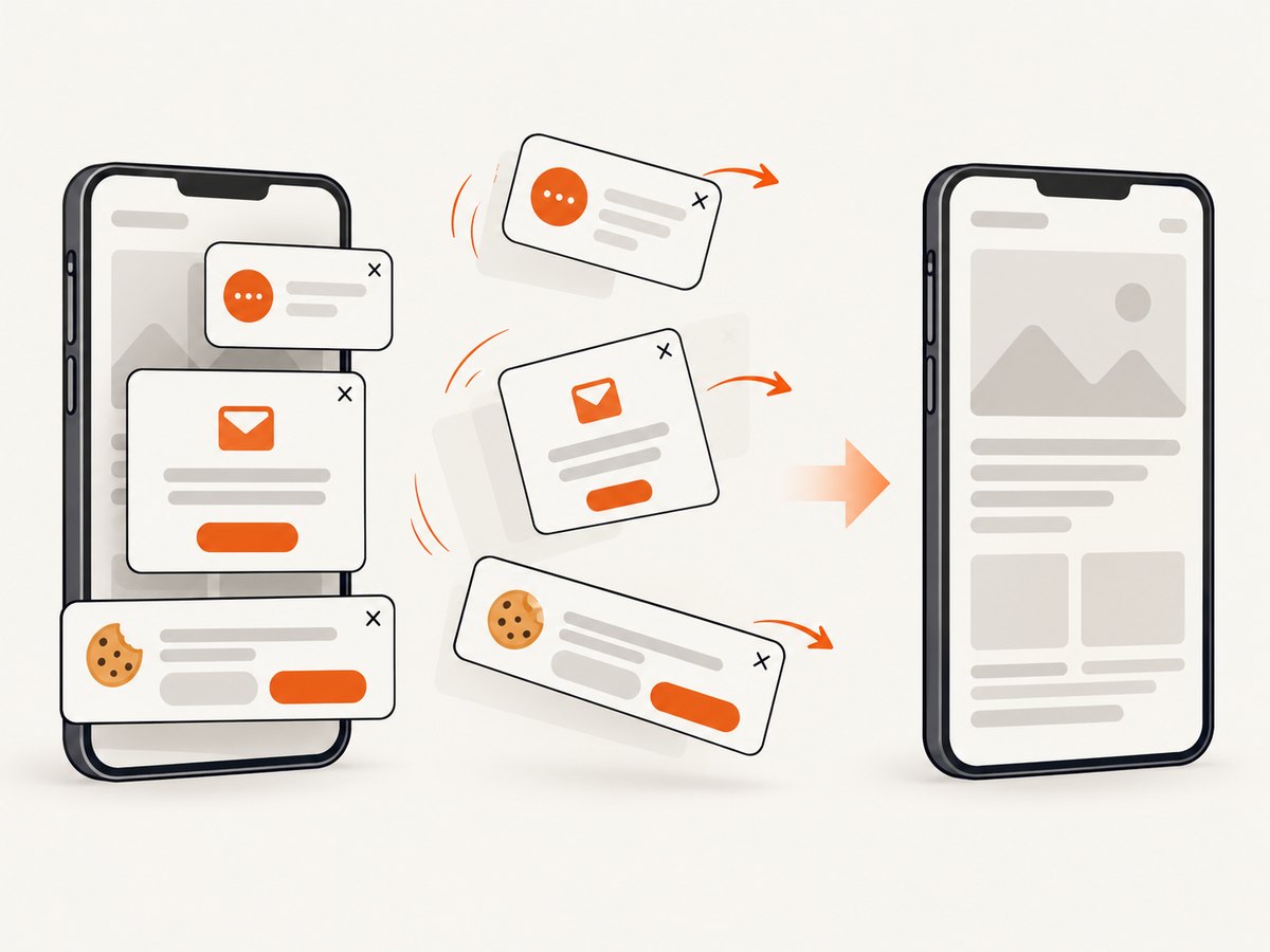
Before each capture, ScreenshotNeo accepts cookie and consent banners like a visitor and removes more than 60 known consent platforms, newsletter popups, and chat widgets. Each step can be disabled. Bot checks and CAPTCHAs, blank pages, timeouts, failed loads, and cache hits are not billed; response headers identify the page verdict and whether the request was billed.
An MCP server provides take_screenshot, get_page_info, and capture_pdf tools for Claude, Cursor, and other MCP clients. The Free plan includes 1,000 shots per month without a card. Paid plans start at $5 for 3,000 shots; yearly billing gives two months free.
Create a free ScreenshotNeo account and get 1,000 screenshots each month with no card required.
Viewport, full-page, and element screenshots
Viewport screenshot
Choose this for a hero section, above-the-fold review, bug report, or social preview. Set both width and height so every run has the same composition.
Full-page screenshot
Choose this for documentation and complete page reviews. Long mobile pages can be thousands of pixels tall. Sticky headers may repeat or overlap content during stitching, and lazy-loaded sections may require scrolling or an explicit wait.
Element screenshot
Choose this for a product card, checkout form, article body, or component. A selector must identify the intended element after the page has rendered. Prefer a stable data attribute such as [data-testid="pricing"] over a fragile chain of CSS classes.
Emulation limits and real-device checks
Desktop emulation changes the viewport and can simulate some device properties, but it does not reproduce every physical-phone condition. Verify on hardware when the result depends on mobile Safari or Chrome versions, OS font rendering, camera or microphone permissions, sensors, safe-area insets, keyboard behavior, memory pressure, or touch hardware.
For layout work, test at several explicit widths, such as 320, 375, 390, and 425 CSS pixels, then test the breakpoint transitions between them. Also check landscape orientation and a slow connection if the page has loading-dependent UI.
Troubleshooting mobile screenshots
| Symptom | Likely cause | Fix |
|---|---|---|
| Desktop layout appears | Viewport was not changed or the page was not reloaded | Set width explicitly, reload, and check the viewport meta tag. |
| Screenshot is blank | Capture ran before navigation or rendering completed | Wait for a readiness selector, DOM content, or a short delay. |
| Images are missing | Lazy loading has not been triggered | Use full-page capture that scrolls, wait for image selectors, or scroll before capture. |
| Cookie banner covers content | Consent state is new in the browser context | Accept or dismiss it in the script, persist storage state, or use ScreenshotNeo’s consent handling. |
| Full-page image is enormous | The mobile document is very tall | Capture the viewport or a key element, or split the page into sections. |
| Element selector fails | Selector is unstable or element appears later | Use a stable data attribute and wait for the locator. |
| Animations differ between runs | Capture timing is inconsistent | Disable animations with CSS or wait for a deterministic state. |
| Network idle never occurs | Analytics, polling, or WebSockets stay active | Wait for a specific selector instead of network idle. |
| API response is not an image | Invalid key, URL, or capture error | Inspect the HTTP status and response headers/body before writing the file. |
Performance, reliability, and cost
- Reuse a browser: in Playwright, launch once and create contexts for multiple viewport runs. Browser startup is expensive compared with another page.
- Use deterministic waits: selector-based readiness is usually faster and more reliable than a long fixed delay.
- Control output dimensions: smaller viewports and element captures reduce image size and downstream processing.
- Cache stable pages: ScreenshotNeo lets you choose a cache TTL. This avoids repeated work when the source has not changed; cache hits are not billed.
- Retry selectively: retry transient navigation failures with a limit and backoff, but record the URL and error so a persistent failure is visible.
- Track verdict headers: ScreenshotNeo reports whether a page was clean and whether it was billed, which helps reconcile usage.
- Estimate volume: Free includes 1,000 shots monthly; Starter is $5 for 3,000, Growth $15 for 15,000, Pro $39 for 60,000, Scale $99 for 250,000, and Business $249 for 1,000,000. Every feature is available on every plan.
Practical checklist
- Define the target width and height in CSS pixels.
- Decide whether you need viewport, full-page, or element output.
- Choose a device pixel ratio only when output resolution matters.
- Wait for a reliable page-ready condition.
- Dismiss consent, newsletter, and chat overlays.
- Check lazy images and sticky elements in full-page captures.
- Save PNG, JPEG, or WebP according to the next system’s needs.
- Validate critical behavior on a real phone.
- For recurring work, automate the settings and record failures.
FAQ
How do I take a screenshot of a website in mobile view?
Open Chrome DevTools, enable Device Mode, enter a phone-sized width, and choose Capture screenshot. Use Capture a full size screenshot for the entire page.
How do I take a full-page screenshot in mobile view?
In Chrome, use Capture a full size screenshot. In Playwright, pass fullPage: true. In Firefox, use its full-page screenshot command or toolbox control.
Does mobile emulation prove the page works on a phone?
No. It approximates mobile rendering. Test on actual hardware for operating-system, browser-engine, sensor, permission, and touch-specific behavior.
What width should I use?
Use the breakpoint or device width relevant to your review. Common documented Chrome presets include 320, 375, and 425 pixels, but no single width represents every phone.
Can I capture many mobile URLs automatically?
Yes. Use a Playwright loop with fixed viewport settings, or ScreenshotNeo bulk capture for up to 100 URLs per call.