How to Change PhantomJS Screen Resolution
Set PhantomJS’s viewport before opening a page to control layout. Learn how viewport size, screenshot cropping, and PDF page dimensions differ.
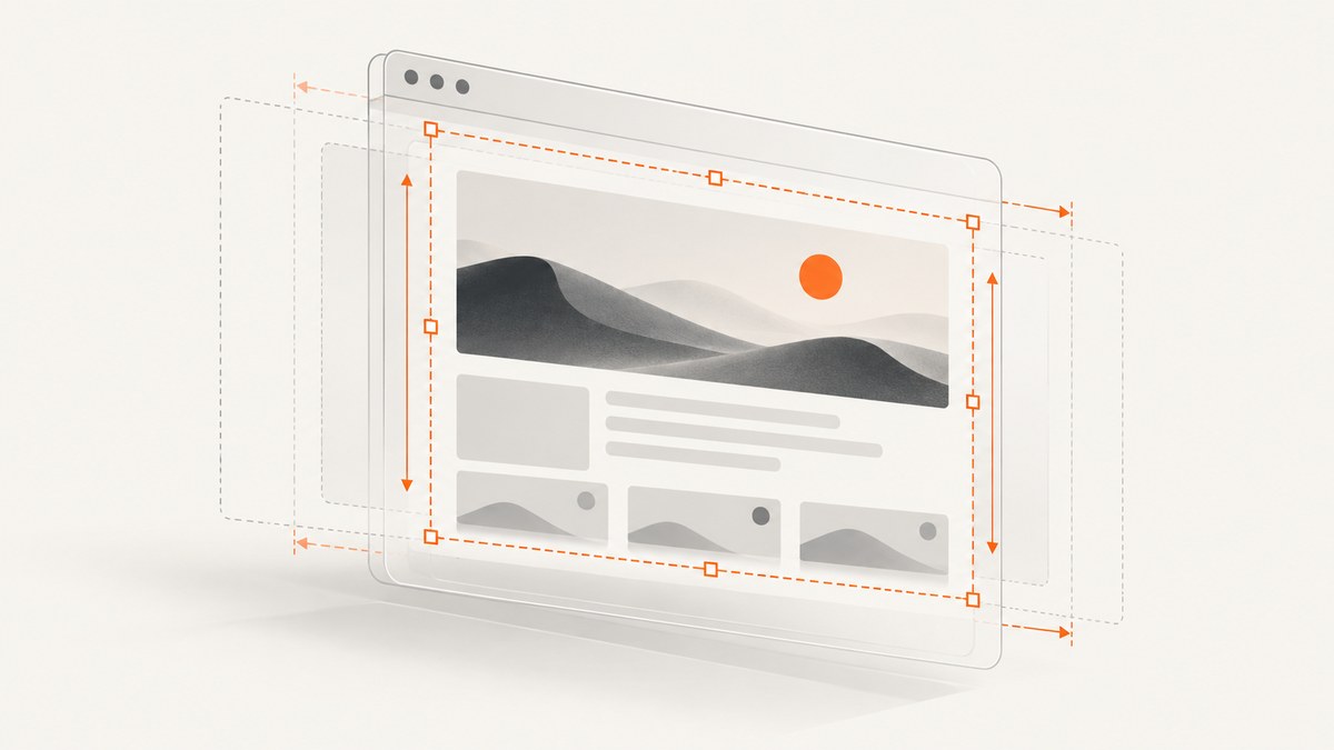
To change the screen resolution used for page layout in PhantomJS, set page.viewportSize to an object containing both width and height, and do it before calling page.open. For example, a 1280 × 720 viewport is set with page.viewportSize = { width: 1280, height: 720 }. This controls the browser viewport; it does not by itself crop the screenshot or set PDF paper dimensions.
For a basic screenshot, create a page, set the viewport, open the URL, and render the page from the successful open callback:
var page = require('webpage').create();
page.viewportSize = { width: 1280, height: 720 };

page.open('https://example.com/', function (status) {
  if (status !== 'success') {
    console.log('Unable to load the address!');
    phantom.exit();
    return;
  }

  page.render('page.png');
  phantom.exit();
});
The key distinction is the output you want: viewportSize sets the layout viewport, clipRect selects a screenshot region, and paperSize sets PDF page dimensions. The [PhantomJS page API](https://phantomjs.org/api/webpage/property/viewport-size.html) documents viewport sizing; the [webpage guide](https://phantomjs.org/page.html) shows it used before navigation.
1. What PhantomJS screen resolution means
“Screen resolution” is often used informally to mean the width and height at which a browser displays a page. In a PhantomJS script, the relevant setting for that job is page.viewportSize. It is the viewport used for page layout. A responsive site may choose different CSS breakpoints, navigation, column widths, or image sizes depending on these dimensions.
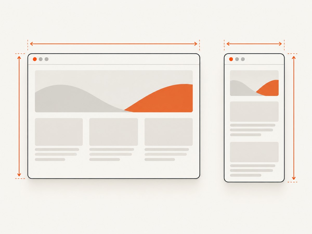
For instance, changing the viewport from 1280 × 720 to 390 × 844 can cause a responsive page to render its mobile layout. That is a change to the browser’s layout conditions. It is separate from changing the dimensions of the output file by cropping, resizing, or choosing PDF paper.
| Goal | Setting | What it controls |
|---|---|---|
| Change page layout and responsive behavior | page.viewportSize |
Width and height of the layout viewport |
| Capture a specific rectangle | page.clipRect |
Top, left, width, and height of the screenshot region |
| Set the dimensions of PDF pages | page.paperSize |
PDF format or dimensions, orientation, and margins |
These settings solve different problems. A clip rectangle does not make the page lay out at its own width. A PDF paper size does not substitute for the browser viewport. Choose the setting based on whether you mean layout, image crop, or document page size.
2. Set the viewport before opening the page
Assign both dimensions on the page object before navigation. This lets the initial page layout use the intended viewport rather than opening at a different size and changing it afterward.
var page = require('webpage').create();
page.viewportSize = {
  width: 1024,
  height: 768
};

page.open('https://example.com/', function (status) {
  if (status === 'success') {
    page.render('capture.png');
  } else {
    console.log('Unable to load the address!');
  }
  phantom.exit();
});
The viewport object needs both width and height. Setting only one dimension is a common mistake: the API reference says to include height for the setting to work. Use positive pixel dimensions that suit the layout you need to inspect. The official examples use pixel values such as 1920 by 1080.
Choose dimensions for the page, not just the image
Pick the viewport that matches the browser layout you want to reproduce. Desktop and mobile layouts may respond to width, while the height determines how much of the page is initially visible. If you are comparing screenshots over time, keep both dimensions fixed along with the URL and other page conditions. Otherwise responsive breakpoints or visible content can shift between captures.
A viewport is not necessarily a physical monitor setting. It is a page rendering configuration used by the headless browser. If you are trying to reproduce a page at a particular CSS width and height, set those values in viewportSize.
3. Render a screenshot at a chosen viewport
This complete script sets a 1280 × 720 layout viewport and writes the rendered page as a PNG. PhantomJS infers the output format from the filename extension passed to page.render. Change the filename extension to select another supported render format for your build.
var page = require('webpage').create();
page.viewportSize = { width: 1280, height: 720 };

page.open('https://example.com/', function (status) {
  if (status !== 'success') {
    console.log('Unable to load the address!');
    phantom.exit();
    return;
  }

  page.render('page.png');
  phantom.exit();
});
The capture is performed from the page-open callback so the script does not call render before the navigation result is known. A successful open indicates that navigation completed according to the API callback; it does not guarantee that every delayed image, animation, or application data request has finished. Sites that populate content after navigation need an additional readiness condition appropriate to that page.
4. Change the screenshot region with clipRect
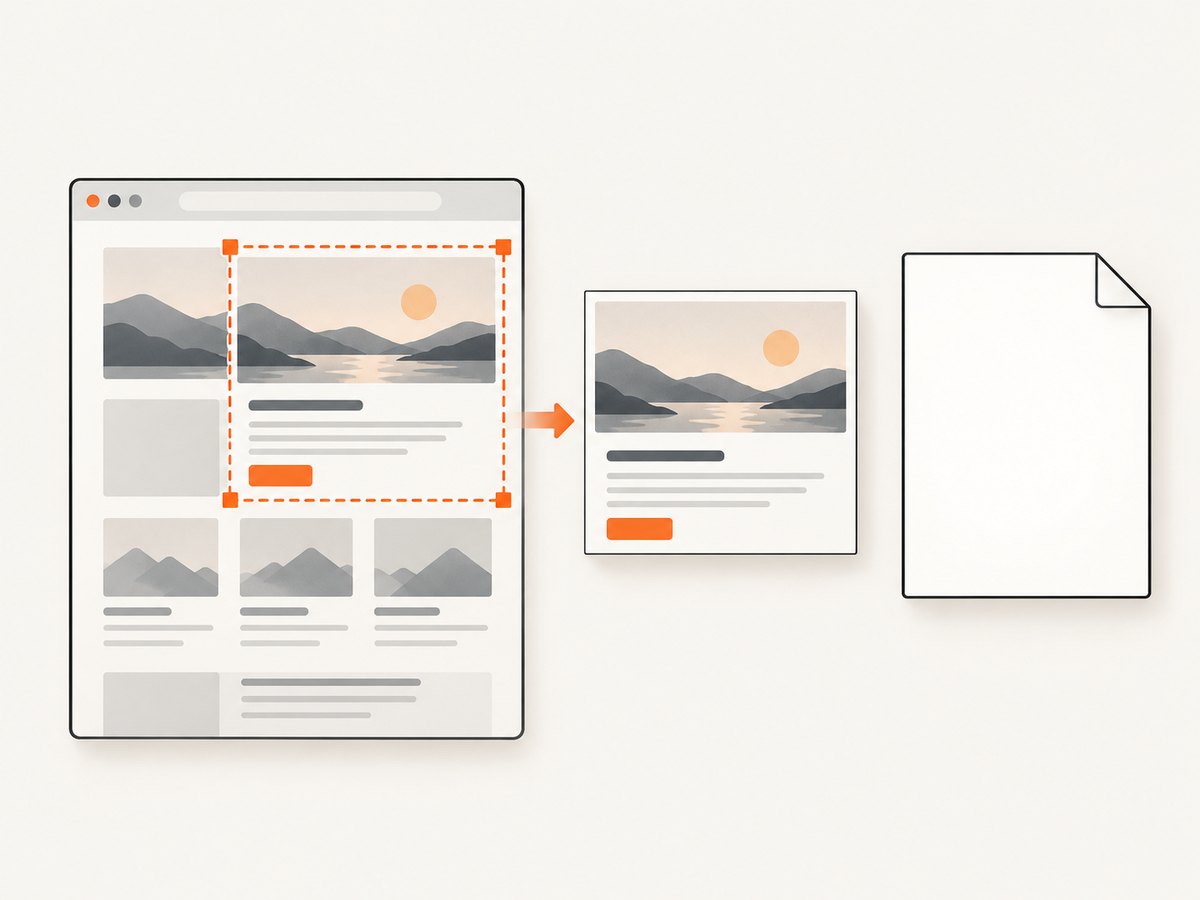
If the page should keep one layout but you want to save only a particular rectangle, configure page.clipRect separately. Its fields are top, left, width, and height. For example, this uses a 1024 × 768 viewport and captures a rectangle with the same dimensions starting at the top-left:
var page = require('webpage').create();
page.viewportSize = { width: 1024, height: 768 };
page.clipRect = {
  top: 0,
  left: 0,
  width: 1024,
  height: 768
};

page.open('https://example.com/', function (status) {
  if (status === 'success') {
    page.render('region.png');
  } else {
    console.log('Unable to load the address!');
  }
  phantom.exit();
});
Use viewportSize when the page’s responsive layout needs to change. Use clipRect when the layout is right but the saved region should be bounded. If a crop appears blank or excludes the area you wanted, check the rectangle’s origin and dimensions as well as the viewport.
5. Set PDF page dimensions with paperSize
For PDF output, use page.paperSize. It accepts explicit width and height or a named format, and supports orientation and optional margins. Dimensions can use mm, cm, in, or px; values without a unit are interpreted as pixels. The [paperSize API reference](https://phantomjs.org/api/webpage/property/paper-size.html) describes these options.
var page = require('webpage').create();
page.viewportSize = { width: 1280, height: 720 };
page.paperSize = {
  width: '8.5in',
  height: '11in',
  margin: '0.5in'
};

page.open('https://example.com/', function (status) {
  if (status === 'success') {
    page.render('page.pdf');
  } else {
    console.log('Unable to load the address!');
  }
  phantom.exit();
});
You can also use a named paper format and set orientation:
page.paperSize = {
  format: 'A4',
  orientation: 'landscape',
  margin: '1cm'
};
Keep the responsibilities clear: viewportSize affects how the web page lays out, while paperSize governs the PDF pages. A PDF’s printed or paginated content may therefore differ from the visible viewport screenshot.
6. Wait for content that appears after navigation
PhantomJS examples render after the page-open callback, but some sites continue drawing or loading content after that point. This can happen with delayed client-side rendering, late image loads, or application data fetched after the document opens. The API guidance does not define one universal delay that works for every site, so avoid assuming a fixed wait guarantees completeness.
Instead, identify a condition that signals readiness for the particular page: for example, a known element appearing, an application-specific state becoming available, or a reasonable delay when there is no observable condition. If the screenshot is intermittently missing content, inspect the page’s loading sequence and wait for the relevant content rather than increasing the viewport. Viewport dimensions do not make asynchronous content arrive sooner.
7. Troubleshooting common viewport problems
| Symptom | Likely cause | What to check |
|---|---|---|
| The requested layout does not appear | The viewport was set after navigation, or one dimension was omitted | Assign both width and height before page.open |
| The image is cropped unexpectedly | The capture region differs from the layout viewport | Review clipRect origin and dimensions; use viewportSize to change layout |
| The PDF page has the wrong dimensions | Viewport dimensions were used where PDF paper settings were needed | Configure paperSize, including format or width/height, orientation, and margins |
| The screenshot is blank or incomplete | Navigation failed or content had not finished drawing | Check status; render only after success and wait for the page’s relevant readiness condition |
| The output is not the expected file type | The render filename extension does not match the requested format | Check the extension supplied to page.render; format is inferred from it |
| A responsive menu or column layout is unexpected | The chosen viewport crosses a site breakpoint | Set the width and height to the intended layout dimensions, and check the site’s responsive behavior |
For further reference, see the PhantomJS [viewportSize API](https://phantomjs.org/api/webpage/property/viewport-size.html), [clipRect guide example](https://phantomjs.org/page.html), [paperSize API](https://phantomjs.org/api/webpage/property/paper-size.html), and [render API](https://phantomjs.org/api/webpage/method/render.html).
8. Reliability, performance, and cost considerations
Viewport size changes layout and the amount of content visible in the first screen. It is not a fix for slow page loading, and increasing width or height should not be treated as a readiness strategy. For repeatable output, make the viewport explicit in the script and render only after the navigation succeeds and the page-specific content is ready.
For larger capture dimensions, the rendered image necessarily has more pixels to encode and store. Choose dimensions that answer the task: a mobile viewport for mobile layout checks, a desktop viewport for desktop rendering, or a clip rectangle for a bounded region. For PDF, choose paper dimensions and margins based on the document’s intended output.
PhantomJS API examples establish the configuration sequence, but they do not establish current compatibility with every modern operating system, website, or deployment environment. If a specific deployment fails, verify the PhantomJS build and runtime environment there. No universal performance figure or compatibility guarantee follows from the viewport documentation.
9. Or skip the browser setup
If your goal is simply to capture a URL at a chosen size, ScreenshotNeo is a website screenshot API and MCP server for developers. Its one GET request accepts a URL and returns a PNG, JPEG, WebP, or PDF. The ScreenshotNeo API documentation covers the available parameters.
curl -G "https://api.screenshotneo.com/v1/shot" \
  -d access_key=YOUR_API_KEY \
  --data-urlencode url=https://example.com \
  --data-urlencode width=1280 \
  --data-urlencode height=720 \
  -o shot.webp
import requests
r = requests.get(
"https://api.screenshotneo.com/v1/shot",
params={
"access_key": "YOUR_API_KEY",
"url": "https://example.com",
"width": 1280,
"height": 720,
},
timeout=90,
)
open("shot.webp", "wb").write(r.content)const q = new URLSearchParams({
access_key: 'YOUR_API_KEY',
url: 'https://example.com',
width: '1280',
height: '720'
});
const res = await fetch(`https://api.screenshotneo.com/v1/shot?${q}`);
if (!res.ok) throw new Error(`Screenshot request failed: ${res.status}`);
const bytes = new Uint8Array(await res.arrayBuffer());
await import('node:fs/promises').then(fs => fs.writeFile('shot.webp', bytes));With ScreenshotNeo, cookie banners and consent overlays, newsletter popups, and chat widgets are removed before the shot, and each step can be turned off. Bot checks and CAPTCHAs, blank pages, timeouts, failed loads, and cache hits are not billed; response headers say which outcome occurred. An MCP server provides take_screenshot, get_page_info, and capture_pdf tools for Claude, Cursor, and other MCP clients. The Free plan includes 1,000 screenshots a month with no card; paid plans start at $5 for 3,000 shots. All features are on every plan.
Create a free ScreenshotNeo account to get 1,000 screenshots a month with no card.
10. Frequently asked questions
How do I change PhantomJS screen resolution?
Set page.viewportSize = { width: desiredWidth, height: desiredHeight } before opening the URL.
Does changing viewport size change the screenshot crop?
It changes the page’s layout viewport. Use page.clipRect when you need to select a capture rectangle.
Can I use paperSize to set screenshot dimensions?
paperSize configures PDF output. For screenshot layout, use viewportSize; for a bounded screenshot region, use clipRect.
Why is content missing even with the right dimensions?
Dimensions do not ensure delayed content has loaded. Check navigation status and wait for the page-specific content to be ready before rendering.


