How to Change Screen Size in Cypress
Use cy.viewport() to change Cypress’s application viewport, or configure defaults for a suite, project, or CI run. Learn how to test responsive layouts and distinguish app size from browser display size.
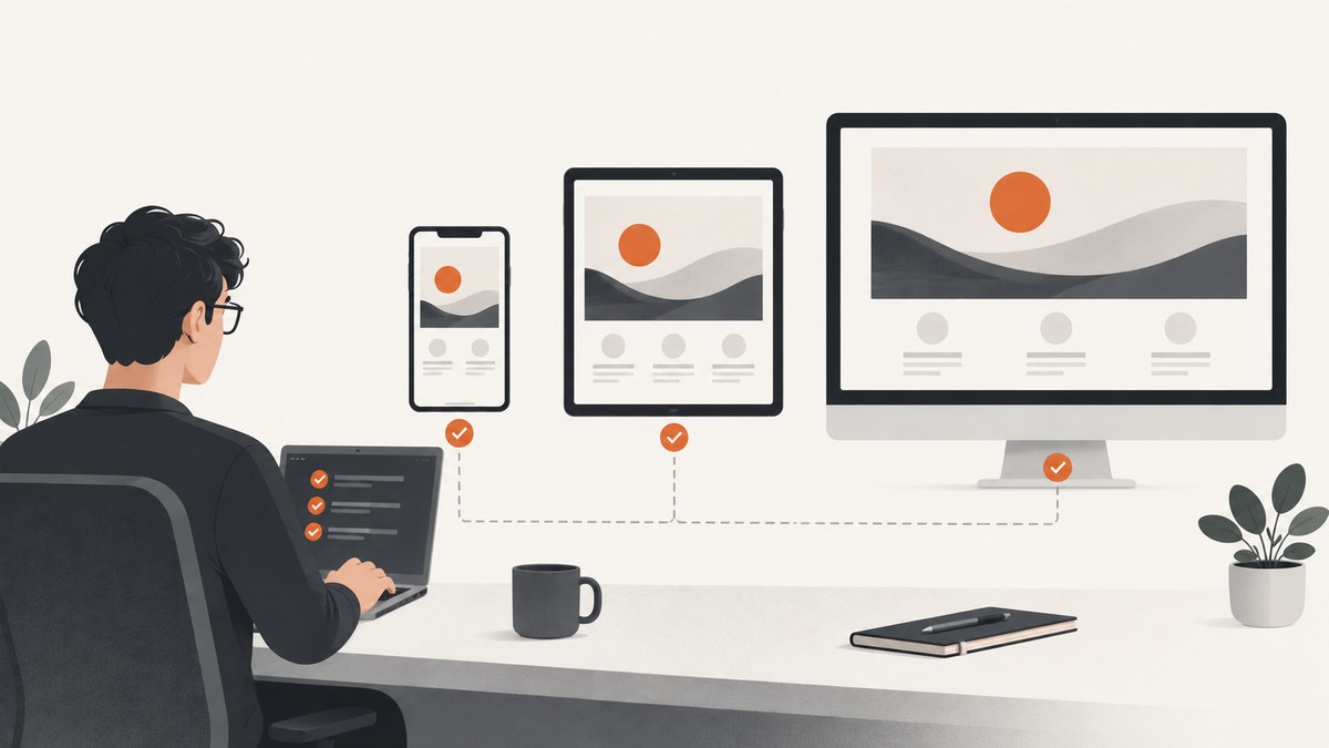
To change the size of the application viewport during a Cypress test, call cy.viewport(width, height), with dimensions in pixels. For example, cy.viewport(1280, 800) sets a 1280-by-800 CSS-pixel viewport. To establish a default for a project, set viewportWidth and viewportHeight in Cypress configuration. Cypress documents 1000 × 660 as the defaults.
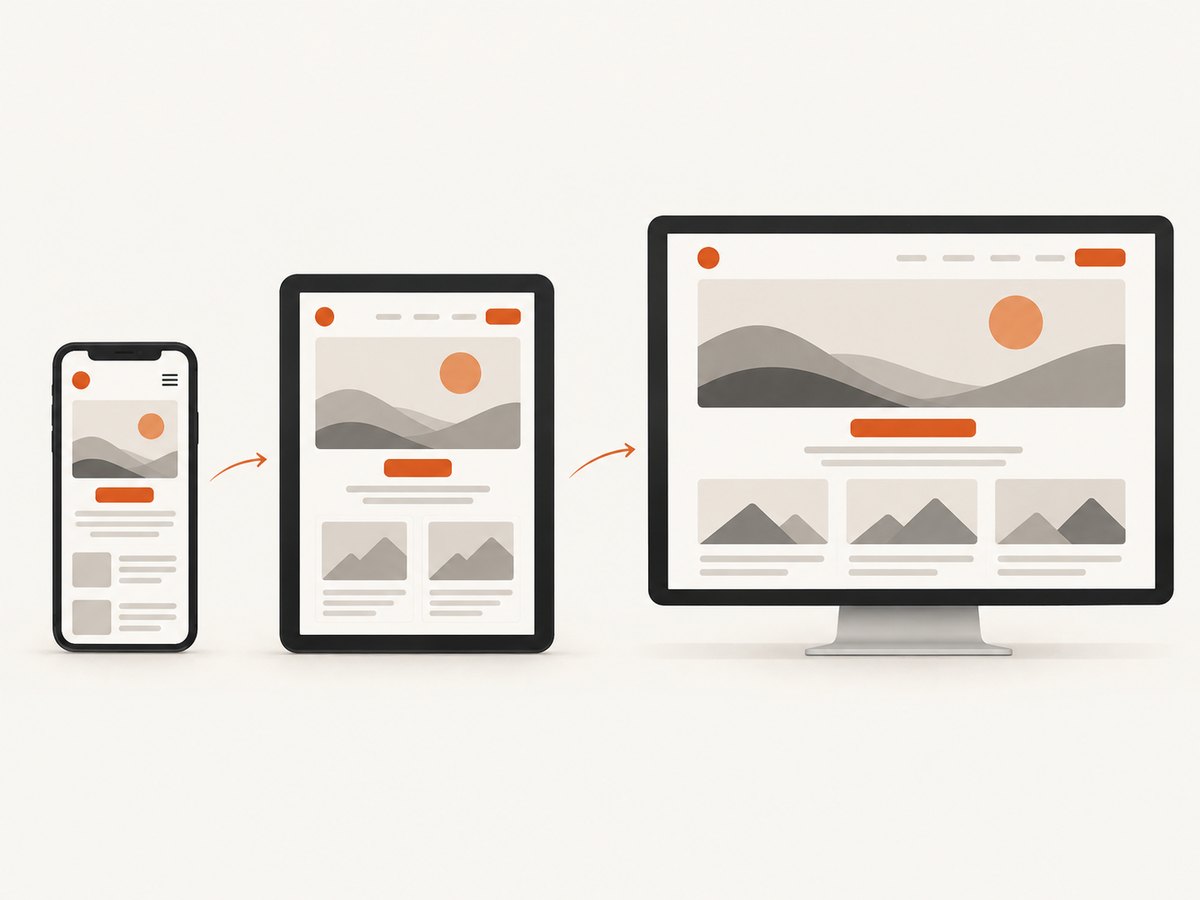
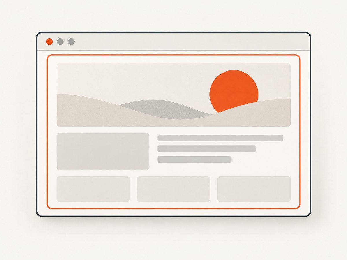
These settings control the page’s application viewport: the area the browser uses to lay out the page. They do not set the headless browser’s overall display size, and a named device preset does not emulate every property of a physical device. This distinction matters when you are testing responsive breakpoints, interpreting a runner preview, or creating screenshots and videos.
1. Change the viewport inside a test
Use cy.viewport() in the test before visiting the page or before making assertions about its responsive layout. The command accepts a width and height:
describe('responsive navigation', () => {
  it('shows the mobile menu at a narrow viewport', () => {
    cy.viewport(390, 844)
    cy.visit('https://example.cypress.io')

    cy.get('[data-cy=mobile-menu]').should('be.visible')
    cy.get('[data-cy=desktop-nav]').should('not.be.visible')
  })
})
Replace the example URL and selectors with your application’s URL and stable test selectors. Set the viewport before visiting when you want the page’s initial load and layout to happen at the target size. If your test changes the viewport after visiting, Cypress changes the application viewport at that point, which is useful for checking how an already loaded page responds to resizing.
The command takes pixel dimensions, not a device name disguised as dimensions. Pick values that correspond to the CSS breakpoints and layouts your application actually supports. A width close to a breakpoint can reveal off-by-one behavior, so consider testing just below, at, and just above a breakpoint when that boundary matters.
2. Use a named device preset or orientation
Cypress also accepts named presets. You can provide a preset name alone, or add portrait or landscape as the second argument:
cy.viewport('iphone-6')
cy.viewport('iphone-6', 'landscape')
The Cypress API documentation lists these preset dimensions. The list may vary with Cypress versions, so check the live cy.viewport() API reference if your tests depend on a particular preset.
| Preset | Documented portrait dimensions |
|---|---|
ipad-2, ipad-mini |
768 × 1024 |
iphone-3, iphone-4 |
320 × 480 |
iphone-5 |
320 × 568 |
iphone-6, iphone-7, iphone-8, iphone-se2 |
375 × 667 |
iphone-6+ |
414 × 736 |
iphone-x |
375 × 812 |
iphone-xr |
414 × 896 |
macbook-11 |
1366 × 768 |
macbook-13 |
1280 × 800 |
macbook-15 |
1440 × 900 |
macbook-16 |
1536 × 960 |
samsung-note9 |
414 × 846 |
samsung-s10 |
360 × 760 |
For landscape orientation Cypress reverses the width and height. Presets are convenient dimension shorthands. They do not, through cy.viewport(), reproduce a physical phone’s device pixel ratio or every hardware and browser behavior. If your test depends on device-specific behavior beyond CSS layout dimensions, make that a separate testing requirement rather than assuming the preset provides it.
3. Set a project default
Put viewportWidth and viewportHeight in cypress.config.js or cypress.config.ts to use the same baseline throughout a project. This CommonJS example works in a JavaScript config file:
const { defineConfig } = require('cypress')

module.exports = defineConfig({
  viewportWidth: 1280,
  viewportHeight: 800,
})
For a TypeScript config, use the corresponding import and export syntax:
import { defineConfig } from 'cypress'

export default defineConfig({
  viewportWidth: 1280,
  viewportHeight: 800,
})
Project defaults are useful when most tests should start at the same desktop or mobile size. Individual tests can still call cy.viewport() when they need another size. Keep the project baseline meaningful to the application; it does not need to be a label for a particular computer.
4. Set a size for a suite or test
If all tests in a suite share a viewport, configure that suite instead of repeating a command in each test. Cypress supports viewport values in test configuration. They apply to the configured scope and Cypress restores the previous values afterward:
describe('mobile account pages', {
  viewportWidth: 390,
  viewportHeight: 844,
}, () => {
  it('shows the compact navigation', () => {
    cy.visit('/account')
    cy.get('[data-cy=mobile-menu]').should('be.visible')
  })
})

describe('desktop account pages', {
  viewportWidth: 1440,
  viewportHeight: 900,
}, () => {
  it('shows the full navigation', () => {
    cy.visit('/account')
    cy.get('[data-cy=desktop-nav]').should('be.visible')
  })
})
Use suite or test configuration for a stable size that applies to one scope. Use cy.viewport() when a test intentionally changes sizes during its steps or loops over several dimensions. For the full supported configuration shape and behavior, refer to Cypress configuration.
5. Override the default from a command or environment
To run a suite with different project defaults without editing the config file, pass configuration on the command line:
npx cypress run --config viewportWidth=1280,viewportHeight=720For a CI job or local shell, Cypress also documents environment variable overrides:
export CYPRESS_VIEWPORT_WIDTH=800
export CYPRESS_VIEWPORT_HEIGHT=600
npx cypress run
These are run-level defaults. Tests can still choose a different size where appropriate. When diagnosing a run, check both the config file and the command or environment that launched Cypress: an override can explain why a run differs from the dimensions written in the repository.
6. Test responsive behavior across several sizes
A responsive test should assert what the application does at a size, not just that Cypress accepted a device label. For example, you can check the mobile and desktop navigation at multiple widths:
const viewports = [
  { name: 'small phone', width: 320, height: 640 },
  { name: 'phone', width: 390, height: 844 },
  { name: 'tablet', width: 768, height: 1024 },
  { name: 'desktop', width: 1280, height: 800 },
]

describe('navigation at responsive sizes', () => {
  for (const size of viewports) {
    it(`renders correctly at ${size.name}`, () => {
      cy.viewport(size.width, size.height)
      cy.visit('/')

      if (size.width < 768) {
        cy.get('[data-cy=mobile-menu]').should('be.visible')
        cy.get('[data-cy=desktop-nav]').should('not.be.visible')
      } else {
        cy.get('[data-cy=desktop-nav]').should('be.visible')
        cy.get('[data-cy=mobile-menu]').should('not.be.visible')
      }
    })
  }
})
The width threshold above is an example; use the breakpoint your application implements. Give each size a descriptive test name so a failure tells you which layout was under test. Keep the number of sizes focused on behavior that can change across breakpoints: a large matrix of nearly identical widths increases runtime without necessarily adding coverage.
7. Application viewport versus browser display size
The word “screen” can refer to two different dimensions in Cypress:
| What you want to control | Use | What it affects |
|---|---|---|
| Page layout area and responsive CSS | cy.viewport() or viewportWidth/viewportHeight |
The application under test |
| Overall headless browser display dimensions | before:browser:launch |
Browser display, including screenshot and video dimensions |
If you need to set the headless display dimensions, configure the documented before:browser:launch event in your Cypress Node event setup. For Chromium-based browsers, Cypress’s browser launch API shows how to append a window size flag:
const { defineConfig } = require('cypress')

module.exports = defineConfig({
  e2e: {
    setupNodeEvents(on, config) {
      on('before:browser:launch', (browser, launchOptions) => {
        if (browser.family === 'chromium' && browser.isHeadless) {
          launchOptions.args.push('--window-size=1280,800')
        }

        return launchOptions
      })
    },
  },
})
This controls the browser display for the relevant headless launch. It does not change the application’s viewportWidth and viewportHeight; set both controls if your job requires a particular app layout and a particular screenshot or video canvas. Browser launch behavior can depend on the browser and mode, so follow the before:browser:launch documentation for the browser you use.
8. Capture and inspect screenshots at a chosen viewport
For a Cypress screenshot of the app at a particular viewport, set the application viewport, visit or interact with the page, then capture it:
cy.viewport(1280, 800)
cy.visit('/')
cy.get('[data-cy=dashboard]').should('be.visible')
cy.screenshot('dashboard-desktop')
Cypress’s screenshot API has its own capture options, such as capture scope and output behavior. Those options are separate from the viewport command; consult the Cypress.Screenshot API when you need to configure screenshot capture itself.
In Cypress Open Mode, the runner may scale and center the page preview so it fits the available pane. The visual preview can therefore look smaller than the configured dimensions. Cypress indicates the viewport size and scale in the interface; the runner’s display scaling does not change the app’s CSS viewport calculations. See Open mode in the Cypress app if you need details about the runner display.
Or skip the browser setup
If you need a screenshot artifact instead of a Cypress assertion, ScreenshotNeo captures a URL with one API request. Its viewport can be set through the API options; see the ScreenshotNeo docs for parameter details.
curl -G "https://api.screenshotneo.com/v1/shot" \
  -d access_key=YOUR_API_KEY \
  --data-urlencode url=https://example.com \
  -o shot.webp
ScreenshotNeo accepts cookie and consent banners like a visitor and removes more than 60 known consent platforms, newsletter popups, and chat widgets before capture; each step can be turned off. Bot checks and CAPTCHAs, blank pages, timeouts, failed loads, and cache hits cost nothing, and the response identifies the page verdict and billing status in headers. An MCP server provides take_screenshot, get_page_info, and capture_pdf tools for AI agents. The free plan includes 1,000 shots a month with no card; paid plans start at $5 for 3,000 shots.
Sign up free for 1,000 screenshots a month, no card required.
Troubleshooting
| Symptom | Likely cause | Fix |
|---|---|---|
| The page still uses the old layout | The viewport was set after an assertion, or the width does not cross the app’s actual breakpoint. | Set the viewport before visiting when you need the initial layout, then assert the behavior at an explicit width around the breakpoint. |
Cypress.config('viewportWidth', ...) throws or has no effect in the current test |
Since Cypress 16.0.0, changing these viewport config values through Cypress.config() during a running test is disallowed. |
Use cy.viewport() for an in-test change, or put the dimensions in suite or test configuration. |
| The Open Mode preview looks too small | Cypress scales the preview to fit the runner pane. | Check the displayed viewport size and scale. The preview scale does not change the application’s viewport calculations. |
| The screenshot or video canvas has unexpected dimensions | The app viewport and headless browser display size are separate controls. | Set viewportWidth/viewportHeight for page layout and use the documented browser launch configuration if you need to control the headless display. |
| A preset name is rejected | The preset may not be available in the Cypress version in use, or its spelling may be wrong. | Check the current API reference, or use numeric dimensions for a stable explicit size. |
| A device preset does not reproduce a physical phone | cy.viewport() sets the viewport dimensions; it does not simulate device pixel ratio or all hardware characteristics. |
Use the preset only as a layout-size shorthand. Test any additional device-specific behavior with the appropriate separate setup. |
| CI uses different dimensions from a local run | A CLI argument or CYPRESS_VIEWPORT_WIDTH/CYPRESS_VIEWPORT_HEIGHT environment override may be in effect. |
Inspect the CI command and environment alongside the checked-in Cypress config. |
Performance, reliability, and cost
Changing a viewport is a built-in Cypress operation; the practical runtime cost in a responsive suite usually comes from the extra page visits, application work, and assertions needed for each case. Keep the matrix aligned with distinct breakpoints and layout behaviors. When several sizes can be checked on one page, change the viewport and assert the resulting behavior deliberately; when page initialization is part of the requirement, visit at the target size so the test covers initial rendering too.
For reliability, specify numeric dimensions where the exact width matters, name cases clearly, and test the boundary around the CSS breakpoint rather than relying on a generic “mobile” label. Avoid coupling assertions to the runner’s scaled preview. A preset can make a test readable, but explicit dimensions make the tested CSS viewport unambiguous. Keep the app viewport and headless display settings aligned only when both are relevant to the output you inspect.
There is no external screenshot service cost for Cypress setting its viewport. Cypress screenshot and video capture are separate from the viewport command, so consider their configuration and storage separately if you enable them in a run. If your need is a URL screenshot outside an end-to-end browser test, compare the setup and pricing of a dedicated screenshot API; ScreenshotNeo has a free tier of 1,000 shots monthly and paid plans from $5 for 3,000.
FAQ
Does cy.viewport() change device pixel ratio?
No. It sets the application viewport dimensions. A preset name does not reproduce every property of a physical device.
Will Cypress reset a suite’s viewport configuration?
Cypress applies suite or test viewport values for that scope and restores the prior values afterward.
Can I use viewport settings to make a page screenshot full-page?
Viewport dimensions set the page’s layout area. Screenshot capture scope is a separate setting; consult Cypress’s screenshot API when you need a full-page capture.
Which viewport should I use for responsive tests?
Use widths tied to the breakpoints and layout changes in your own CSS. A device preset is a convenient shorthand when its dimensions match the behavior you intend to cover.


