How to Choose a Background Picture for a Website
Choose a website background image that supports your message, keeps text readable, survives responsive crops, loads quickly, and remains accessible.

Choose a background picture by starting with its job, then test the real image behind the real content at every viewport. The best image supports the page message, leaves calm negative space for text, keeps its focal subject visible after responsive cropping, meets contrast requirements, and does not add unnecessary load time.
1. Decide whether you need a background image
Use a CSS background when the picture is decorative or establishes mood without conveying information. W3C Technique C9 describes this use for purely decorative images and visual formatting. If visitors need the image to understand the content or complete a task, use a semantic <img> (or another meaningful image element) and provide an appropriate text alternative. MDN notes that browsers do not provide special information about CSS background images to assistive technology.
| Question | CSS background | Semantic image |
|---|---|---|
| Does the image communicate information? | No | Yes |
| Should screen readers encounter it? | Usually no | Provide useful alternative text |
| Is it part of the content, such as a product photo? | No | Yes |
| Is it a decorative hero texture or atmosphere? | Yes | Usually no |
2. Choose a picture that supports the page
Match subject and tone
List the page’s purpose in one sentence. A documentation page may need a quiet, low-detail texture; a travel page may use a location image; a security page may need a restrained, trustworthy palette. Reject images whose subject competes with the heading, navigation, form, or call to action.
Look for negative space
Negative space is an uncluttered area where content can sit. Before choosing an image, mark where the heading and buttons will appear on desktop and mobile. Prefer a composition with even tone and low texture in that region. Do not assume the left side will always remain visible: a cover crop can move or remove it.
Protect the focal point
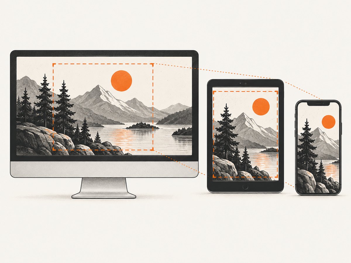
Keep the important subject near the center of the crop area, or define a deliberate background-position. Check the focal point at wide desktop, tablet, and narrow phone widths. If the subject disappears at any required width, choose a more crop-resistant image or provide a mobile-specific source.
3. Make text readable and accessible
Test the actual text over the actual image, including hover, focus, and error states. WCAG 2.1 Success Criterion 1.4.3 requires a contrast ratio of at least 4.5:1 for normal text and 3:1 for large text. The guidance also uses 3:1 for active user-interface components and graphical objects. Check your text-to-background contrast with the WebAIM Color Contrast Checker, which MDN recommends as a practical tool.
A translucent overlay is often the simplest fix. Use a color and opacity that preserve the image’s purpose while creating a stable reading surface. If an overlay cannot produce a passing ratio, change the text color or select a quieter image. Do not put essential words inside the bitmap; they cannot reflow, resize, translate, or be read reliably by assistive technology.
.hero {
  color: #fff;
  background-color: #1f2937; /* visible if the image fails */
  background-image:
    linear-gradient(rgba(0, 0, 0, .58), rgba(0, 0, 0, .58)),
    url("/images/hero-1600.webp");
  background-size: cover;
  background-position: center;
}
4. Implement a responsive background
Complete HTML and CSS example
<header class="hero">
  <div class="hero__content">
    <p class="eyebrow">Field notes</p>
    <h1>Plan your next route</h1>
    <p>A short supporting sentence remains readable over the image.</p>
    <a class="button" href="/routes">Browse routes</a>
  </div>
</header>

<style>
  .hero {
    min-height: clamp(28rem, 70vh, 48rem);
    display: grid;
    align-items: center;
    color: #fff;
    background-color: #1f2937;
    background-image:
      linear-gradient(90deg, rgba(0,0,0,.68), rgba(0,0,0,.18)),
      url("/images/hero-1600.webp");
    background-size: cover;
    background-position: 55% center;
  }
  .hero__content { width: min(42rem, calc(100% - 3rem)); }
  .hero h1 { max-width: 12ch; font-size: clamp(2.25rem, 7vw, 5rem); }
  .hero p { max-width: 42ch; }
  .button { display: inline-block; padding: .75rem 1rem; background: #fff; color: #111827; }
  @media (max-width:  fortyrem) {
    .hero { background-position: 68% center; }
    .hero__content { width: min(100% - 2rem, 34rem); }
  }
  @media (prefers-reduced-motion: reduce) {
    * { scroll-behavior: auto !important; }
  }
</style>
Replace the invalid-looking convenience breakpoint above with a real CSS length in production (for example 40rem); CSS media queries require a length unit. A corrected rule is:
@media (max-width: 40rem) {
  .hero { background-position: 68% center; }
  .hero__content { width: min(100% - 2rem, 34rem); }
}
Choose sizing and position deliberately
coverfills the box and crops edges. It is common for heroes but demands crop testing.containshows the complete image and may leave gaps; it suits artwork that must remain intact.background-positionaccepts keywords or percentages. Move the focal subject into the visible area on narrow screens.- Set
background-coloras a fallback even when the image is opaque, as MDN recommends.
For separate mobile art direction, use a media query with a mobile-specific background URL. Keep the same semantic content in HTML so the layout remains usable if images are disabled.
5. Optimize file size, licensing, and loading
- Export dimensions close to the largest rendered size; oversized source pixels waste bandwidth.
- Compress the image and choose a format supported by your browser strategy, such as WebP or another modern format with a fallback.
- Prefer a low-detail crop when the image sits behind text; detail increases file size without improving comprehension.
- Keep the fallback color visually compatible with the overlay and text.
- Confirm that the license permits web publication, modification, and your intended commercial use. Keep a record of the source and license terms.
- Do not lazy-load the first viewport hero if it is the largest contentful element; preload only when measurement shows it is needed.
6. Validate every viewport and state
- Open the page at desktop, tablet, and phone widths.
- Resize text or use browser zoom; headings and buttons must remain readable and reachable.
- Check keyboard focus, hover, disabled, validation, and error states over the image.
- Disable the image or simulate a failed request; the background color and content must still work.
- Check contrast at the brightest and darkest areas behind each line of text.
- Test slow connections and a cache-disabled reload to find flashes or layout shifts.
- Review with a screen reader when the image could be mistaken for meaningful content.
7. Capture and review the result automatically
ScreenshotNeo can render the page at repeatable viewports while you review responsive crops and contrast. Its API accepts a URL and returns PNG, JPEG, WebP, or PDF; see the ScreenshotNeo API documentation for options.

Or skip the browser setup
Use ScreenshotNeo for a one-call capture after you have selected the image:
curl -G "https://api.screenshotneo.com/v1/shot" -d access_key=YOUR_API_KEY --data-urlencode url=https://stripe.com -o shot.webp
import requests
r = requests.get("https://api.screenshotneo.com/v1/shot", params={"access_key": "YOUR_API_KEY", "url": "https://stripe.com"}, timeout=90)
open("shot.webp", "wb").write(r.content)
const q = new URLSearchParams({ access_key: 'YOUR_API_KEY', url: 'https://stripe.com' });
const res = await fetch(`https://api.screenshotneo.com/v1/shot?${q}`);
Cookie banners, newsletter popups, and chat widgets are removed before the shot. Bot checks, blank pages, failed loads, timeouts, and cache hits are never billed; response headers report the page verdict and whether it was billed. An MCP server provides take_screenshot, get_page_info, and capture_pdf for Claude, Cursor, and other MCP clients. The free plan includes 1,000 screenshots a month with no card; paid plans start at $5 for 3,000. Create a free ScreenshotNeo account.
8. Troubleshooting
| Symptom | Likely cause | Fix |
|---|---|---|
| Text blends into the image | Insufficient contrast or busy texture | Add or strengthen an overlay, change text color, or choose a quieter image; verify the ratio. |
| Subject is missing on phones | cover cropped the focal point |
Adjust background-position, use a mobile crop, or select a centered composition. |
| Blank color appears | Image URL, CORS, network, or server failure | Check the URL and response, retain a suitable background-color, and inspect the browser network panel. |
| Hero causes slow loading | Source dimensions or compression are excessive | Resize to the rendered maximum, compress, and use a modern format. |
| Meaning is absent for screen readers | Meaningful image was implemented only as CSS | Use a semantic image element with an appropriate text alternative. |
| Screenshot shows a popup | Capture occurred before the page settled | Use a wait condition or let ScreenshotNeo remove known consent, newsletter, and chat widgets before capture. |
9. Performance, reliability, and cost notes
Use a stable image URL, cache immutable assets, and avoid swapping the hero repeatedly after first paint. For automated visual review, wait for the relevant selector or network idle so comparisons do not capture an intermediate state. ScreenshotNeo supports selector waits, delays, network-idle waits, caching with a chosen TTL, custom headers and cookies, device presets, arbitrary viewports, retina scale, custom CSS and JavaScript, and bulk capture of up to 100 URLs per call. Only clean shots are billed, so failed loads and cache hits do not consume paid captures.
FAQ
What image works best behind website text?
A low-detail image with a broad, calm area behind the text and a focal subject outside the text block. Confirm the contrast ratio with the real overlay.
Should I use a CSS background or an HTML image?
Use a CSS background for decoration. Use a semantic image with alternative text when the picture conveys information or functionality.
Is background-size: cover always correct?
No. It fills the box by cropping. Use it only after checking focal-point visibility at every required aspect ratio.
How can I test background choices quickly?
Render the page at fixed desktop, tablet, and phone viewports and compare the same text, states, and fallback behavior. ScreenshotNeo can automate those captures through its API or MCP server.


