How to Choose High-Definition Background Images for Website Design
Choose website background images by rendered size, crop, density, format, performance, contrast, and licensing—not by a single pixel dimension.

There is no universal pixel dimension that makes a background image high-definition. Choose an image from the section’s rendered dimensions, aspect ratio, responsive crop, and target display density. Deliver alternatives when layouts differ, compress each version, and verify text contrast over the actual crop.
This guide explains how to select, prepare, serve, and test background images for responsive websites without making visitors download more data than the design needs.
1. Start with the rendered background, not a stock resolution
Measure the element that will display the image. Record its maximum CSS width and height at each supported layout, then account for the device pixel ratio (DPR).
| Use case | What to measure | Useful starting point |
|---|---|---|
| Full-width hero | Maximum content width and hero height on desktop and mobile | Prepare a landscape desktop source and a crop that survives narrow screens |
| Card or tile | Card width, height, and aspect ratio | Use an image close to the card ratio so important details are not cut off |
| Banner strip | Wide ratio and the subject’s horizontal position | Choose a composition with safe space for text |
| Retina or high-DPI display | Rendered CSS dimensions multiplied by the target DPR | Provide a density variant when the extra detail is visible and worth its byte cost |
For example, a 1,200 CSS-pixel-wide hero displayed at 2× density may need roughly 2,400 source pixels across. That is a planning value, not a rule: the browser, crop, compression, viewing distance, and subject detail all affect the result. A 4,000-pixel file can still look poor if the subject is cropped out or the image is heavily compressed.
Use the guidance from web.dev’s responsive images material: choose the image that fits the display’s screen size, resolution, and layout.
2. Plan the crop for every responsive layout
A background image is cropped according to the element and background-size. Review the image at each breakpoint before you commit to it.
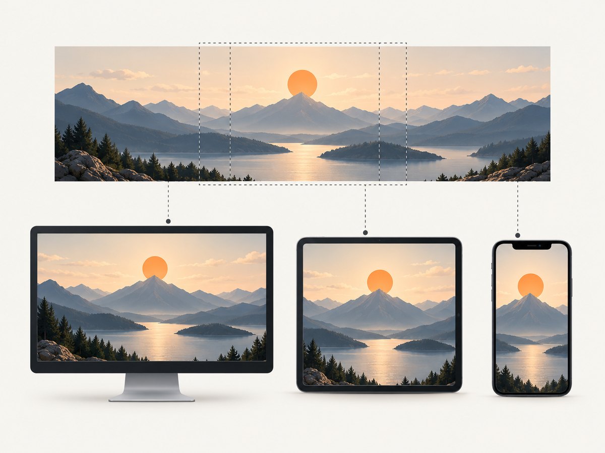
Use cover when the section must be filled
.hero {
  min-height: 32rem;
  background-image: url("/images/hero-1920.webp");
  background-size: cover;
  background-position: 50% 40%;
  background-repeat: no-repeat;
}
cover fills the box and crops whichever dimension does not fit. Adjust background-position to keep a face, product, or other focal point visible.
Use contain only when the complete image matters
contain preserves the entire image but can leave empty space. It is usually better for an illustration or diagram than for a photographic hero.
Use different crops at breakpoints
.hero {
  background-image: url("/images/hero-wide.webp");
  background-position: 65% 50%;
}

@media (max-width: 48rem) {
  .hero {
    min-height: 28rem;
    background-image: url("/images/hero-mobile.webp");
    background-position: 50% 35%;
  }
}
A dedicated mobile crop is often better than forcing a wide photograph into a narrow box. Keep the subject and any text-safe area in view at both widths.
3. Select density variants with image-set()
When the crop is the same but pixel density differs, image-set() lets the browser choose a suitable source.
.hero {
  background-image: image-set(
    url("/images/hero-1x.webp") 1x,
    url("/images/hero-2x.webp") 2x
  );
}
Provide a conventional fallback for browsers that do not support the function:
.hero {
  background-image: url("/images/hero-1x.jpg");
  background-image: image-set(
    url("/images/hero-1x.webp") 1x,
    url("/images/hero-2x.webp") 2x
  );
}
Do not automatically ship a 2× file to everyone. Compare the visible sharpness with the additional bytes, especially on mobile connections.
4. Choose a suitable image format
No format wins for every image and delivery path. Recheck current browser support and your serving pipeline. MDN’s image format guide includes modern raster options such as AVIF.
- Photographs: compare a modern compressed format with a broadly supported fallback.
- Flat illustrations: test a lossless raster or vector format when the asset is line-based and can be represented that way.
- Transparency: choose a format and fallback that preserve the transparent areas your design needs.
- Animation: treat animated backgrounds as a separate performance decision; keep motion optional and respect reduced-motion preferences.
Export at the dimensions required by the largest rendered use, remove unnecessary metadata, and compare quality at 100% display size. A smaller, well-compressed source often looks better in practice than an oversized file with excessive compression artifacts.
5. Keep foreground text readable
Check the actual text over the actual background crop. A background that looks calm in an image editor can become busy behind a heading after responsive positioning.
.hero::before {
  content: "";
  position: absolute;
  inset: 0;
  background: rgb(0 0 0 / 0.38);
  pointer-events: none;
}

.hero-content {
  position: relative;
  z-index: 1;
}
Use an overlay, move the text, change the crop, or select another image when contrast is inconsistent. The WCAG-related ratios summarized by MDN are 4.5:1 for ordinary body text and 3:1 for larger text; verify the rendered combination with an accessibility checker.
Do not put meaningful information only in a CSS background. CSS backgrounds are presentational. If the image communicates content, use an HTML image with an appropriate text alternative instead. See MDN’s background-image documentation.
6. Decide whether CSS or an HTML image is appropriate
Use a CSS background for decoration behind content, layered effects, or a section that should remain independent of the document’s meaning. Use an HTML <img> when the image is meaningful, needs an alternative text, or is a critical content image whose loading behavior you need to control directly.
<picture>
  <source media="(max-width: 48rem)" srcset="/images/hero-mobile.avif" type="image/avif">
  <source srcset="/images/hero-wide.avif" type="image/avif">
  <img src="/images/hero-wide.jpg" alt="Description of the meaningful scene">
</picture>
Background images referenced by CSS may not receive the same loading priority as content images. If the hero is essential to the first view, evaluate an HTML image implementation rather than assuming a CSS background is automatically optimal.
7. A repeatable selection workflow
- Measure the real component. Record width, height, aspect ratio, and supported breakpoints.
- Identify the focal point. Mark the subject and areas that must remain visible after cropping.
- Shortlist several candidates. Reject images whose composition fails at mobile width.
- Prepare responsive sources. Create alternate crops or density variants only where they improve the result.
- Export and compress. Generate files near the largest actual display use; remove metadata that is not needed.
- Compare formats. Check quality, transparency, browser support, and transfer size.
- Test contrast. Review every text block over every supported crop and add a scrim when necessary.
- Test on real conditions. Check a large desktop, a high-DPI screen, a narrow phone, and a slower connection.
- Verify licensing. Confirm that the source permits web publication, modification, and the intended commercial use.
8. Performance and transfer-size guidance
Image bytes can make up a substantial share of a page’s transfer. Right-sizing and compression usually have more impact than chasing an arbitrary “HD” label.
- Do not use a 4K source when the largest rendered box is much smaller.
- Do not send desktop dimensions to a phone when a mobile crop is available.
- Use a cacheable URL and long-lived immutable caching for versioned assets.
- Preload only a genuinely critical hero image; unnecessary preloads compete with fonts, scripts, and content.
- Keep decorative backgrounds out of the critical path when they are below the fold.
- Measure the compressed transfer size and visual result together; a tiny file with visible blocking artifacts is not an improvement.
9. Common problems and fixes
| Problem | Likely cause | Fix |
|---|---|---|
| Image looks soft on a retina display | Source is close to 1× the CSS size or was over-compressed | Try a 2× variant, compare at the rendered size, and keep compression reasonable |
| Subject disappears on mobile | cover crops the focal point |
Use a mobile crop or change background-position |
| Hero text is hard to read | Background detail changes behind the text | Add a scrim, reposition the text, or choose a quieter image |
| Page is slow despite a fast server | Source dimensions or format are unnecessarily large | Export to the real display sizes, compress, and compare formats |
| Background does not appear | Invalid URL, blocked asset, or CSS rule overridden | Inspect the request and computed styles; verify the path and response status |
| Important information is missing for screen readers | Meaningful content was placed only in CSS | Use an HTML image with useful alternative text |
| Modern format fails in an older browser | No fallback source | Provide a fallback declaration or HTML <picture> source |
| Image is legally unusable | License does not cover the intended publication or modification | Read the source’s current license and retain the required records |
10. Capture and inspect responsive backgrounds
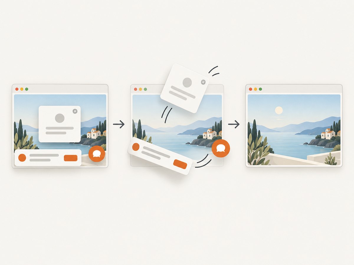
After implementing the CSS, capture representative viewport sizes and inspect the final crop. A screenshot service can make this repeatable in CI or review workflows.
Or skip the browser setup
ScreenshotNeo returns a website screenshot from one GET request, including PNG, JPEG, WebP, or PDF output. Its capture flow accepts consent banners and removes more than 60 known consent platforms, newsletter popups, and chat widgets before the shot. Bot checks, blank pages, timeouts, failed loads, and cache hits are not billed, and the response identifies the result with X-Page-Verdict and X-Billed headers.
See the ScreenshotNeo API documentation for all options, including viewport and device presets, full-page capture, CSS-selector element capture, dark mode, retina scale, custom CSS and JavaScript, click and wait actions, blocked requests, headers, cookies, geolocation, caching, signed links, asynchronous jobs, bulk capture, and usage reporting.
cURL
curl -G "https://api.screenshotneo.com/v1/shot" \
  -d access_key=YOUR_API_KEY \
  --data-urlencode url=https://stripe.com \
  -o shot.webp
Python
import requests

r = requests.get(
    "https://api.screenshotneo.com/v1/shot",
    params={"access_key": "YOUR_API_KEY", "url": "https://stripe.com"},
    timeout=90,
)
r.raise_for_status()
open("shot.webp", "wb").write(r.content)
Node.js
const q = new URLSearchParams({
  access_key: 'YOUR_API_KEY',
  url: 'https://stripe.com'
});
const res = await fetch(`https://api.screenshotneo.com/v1/shot?${q}`);
if (!res.ok) throw new Error(`Screenshot failed: ${res.status}`);
const buffer = Buffer.from(await res.arrayBuffer());
await import('node:fs/promises').then(fs => fs.writeFile('shot.webp', buffer));
An MCP server also provides take_screenshot, get_page_info, and capture_pdf tools for Claude, Cursor, and other MCP clients. The Free plan includes 1,000 screenshots each month without a card; paid plans start at $5 for 3,000 screenshots, and every feature is available on every plan.
Create a free ScreenshotNeo account to capture responsive background tests with 1,000 screenshots per month and no card.
11. Cost and reliability considerations
- Asset delivery: Smaller, correctly sized files reduce bandwidth and usually improve perceived loading time.
- Build complexity: Extra crops and variants add maintenance. Create them where the crop or density difference is visible.
- Screenshot automation: Cache repeated captures when reviewing the same URL. For automated checks, inspect verdict and billing headers so failed or blocked pages are distinguishable from successful captures.
- Licensing: A technically perfect image is still unusable if its license does not cover your site or modifications.
12. FAQ
What size should a website background image be?
Size it for the largest rendered dimensions and crop you actually support, then provide smaller or alternate sources for other layouts. There is no universal pixel threshold.
Is 1920×1080 always high-definition for a hero?
No. It may be excessive for a small component and insufficient for a larger or denser display. Rendered dimensions, crop, compression, and viewing conditions determine the result.
How do I make a background look good on mobile?
Test the narrow crop, keep the focal point visible, use a mobile-specific source when needed, and check text contrast after positioning.
Should every background use a 2× image?
No. Use a higher-density source when the visible sharpness improvement justifies the added transfer size.
Can a CSS background have alt text?
No. CSS backgrounds are not a substitute for alternative text. Use an HTML image when the image conveys information.
Which format should I choose?
Compare suitable formats for the asset, transparency needs, delivery path, and current browser support. Keep a fallback where your audience requires one.


