How to Choose Images for Your Website Banner
Choose a banner image that supports your message, crops well on mobile, keeps text readable, loads quickly, and has the right usage rights.
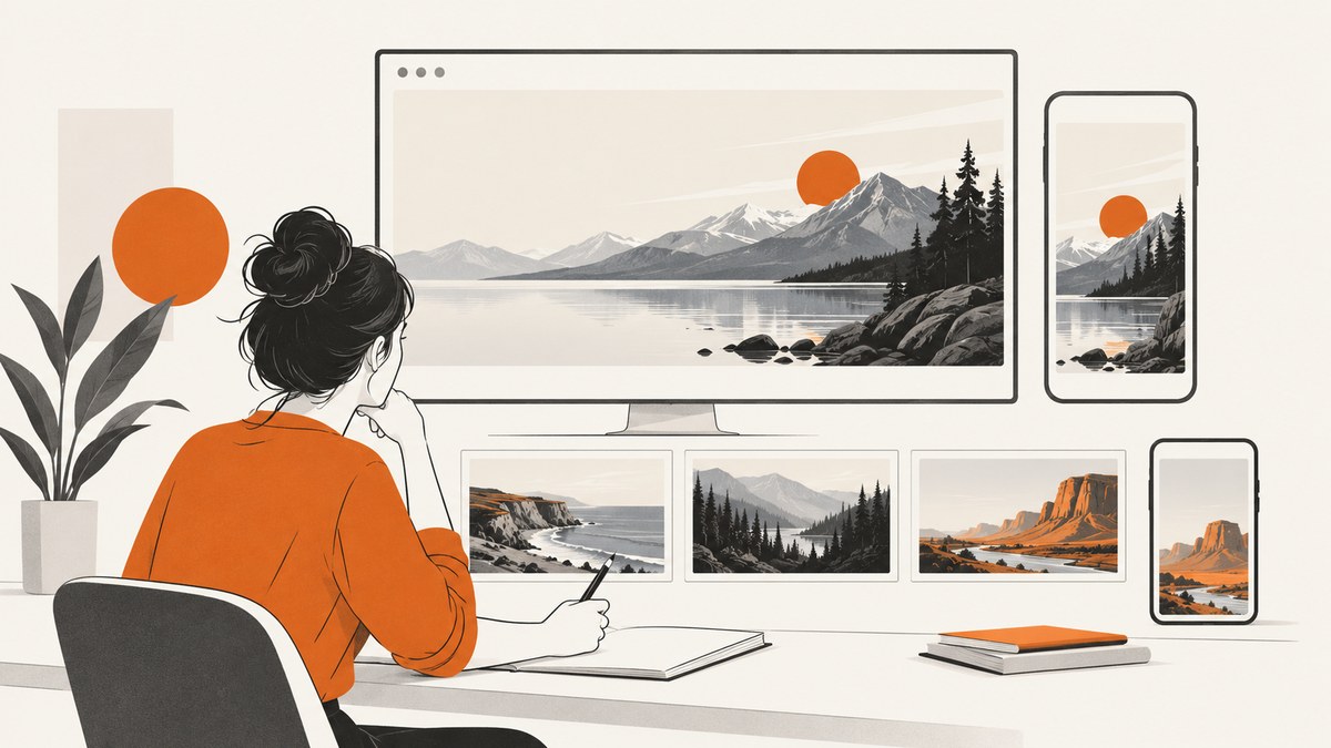
Choose the image for the message and the space it must occupy, then judge it in the real banner layout at desktop and mobile widths. The best banner image has a clear focal subject, an uncluttered area for your heading and call to action, enough contrast for readable text, a crop that survives responsive breakpoints, an appropriate file size, useful alternative text, and a license that covers your intended use.
There is no universal banner width or aspect ratio. Your layout, breakpoints, content, and crop behavior determine the right source image and delivered sizes.
1. Start with the message and the layout
Before browsing stock libraries, write down what the banner should help visitors understand or feel. A product launch, travel service, nonprofit campaign, and technical documentation site need different visual evidence. Do not choose an image only because it is attractive or popular.
- Define the job. Does the image explain the subject, establish a mood, show a product, or provide atmosphere behind a headline?
- Identify the focal subject. Look for one obvious subject that remains understandable after cropping.
- Reserve copy space. Leave relatively quiet space where the real heading, supporting text, and button will sit. A plain wall, sky, floor, or softly detailed background often works better than a busy pattern.
- Match the visual system. Consider the site’s color palette, typography, image treatment, and tone. A technically suitable image can still feel disconnected from the rest of the page.
| Criterion | Question to ask | Failure sign |
|---|---|---|
| Message fit | Does the image reinforce the page’s promise? | It could belong to any page. |
| Focal point | Is one subject easy to find? | The eye has no place to settle. |
| Copy space | Can the heading sit over a calm area? | Letters cross faces, objects, or strong detail. |
| Crop flexibility | Will the subject survive narrow and wide frames? | The subject is near an edge or depends on the full frame. |
| Contrast | Can text remain readable with the actual overlay? | Some words disappear into highlights or shadows. |
| Rights | Does the license cover this site and use? | You cannot identify the license or source. |
2. Test the crop at real breakpoints
A banner that looks perfect in an image browser can fail when the layout becomes narrow. Put the real heading, call to action, and overlay on top of the candidate before approving it. Check desktop, tablet, and mobile widths, including the narrowest supported viewport.
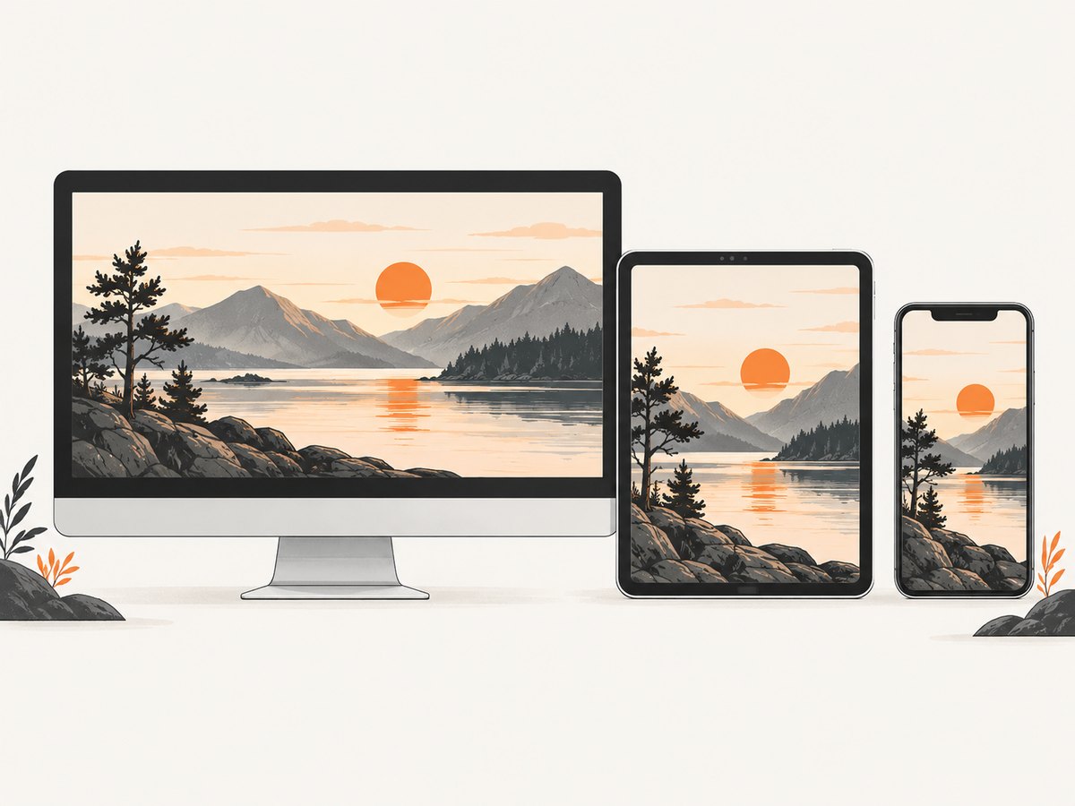
For a filled frame, object-fit: cover preserves the image’s proportions while cropping the excess. Use object-position to keep the subject visible. Use contain when showing the entire image matters more than filling the frame; expect empty space or a background around it.
<picture>
  <source
    media='(max-width: 640px)'
    srcset='/images/banner-mobile-640.webp 640w,
            /images/banner-mobile-960.webp 960w'
    sizes='100vw'>
  <img
    src='/images/banner-wide-1280.webp'
    srcset='/images/banner-wide-768.webp 768w,
            /images/banner-wide-1280.webp 1280w,
            /images/banner-wide-1920.webp 1920w'
    sizes='(max-width: 900px) 100vw, 50vw'
    width='1920'
    height='900'
    alt='A cyclist riding beside a mountain lake'
    loading='eager'
    fetchpriority='high'
    decoding='async'>
</picture>
.banner {
position: relative;
overflow: hidden;
min-height: 22rem;
}
.banner img {
display: block;
width: 100%;
height: 100%;
object-fit: cover;
object-position: 65% center;
}
@media (max-width: 640px) {
.banner { min-height: 30rem; }
.banner img { object-position: 50% center; }
}If no object-position can preserve both the subject and the copy area, use art direction: provide a separate mobile crop with a <picture> source. Do not stretch the original image to force a ratio.
3. Keep text readable over photography
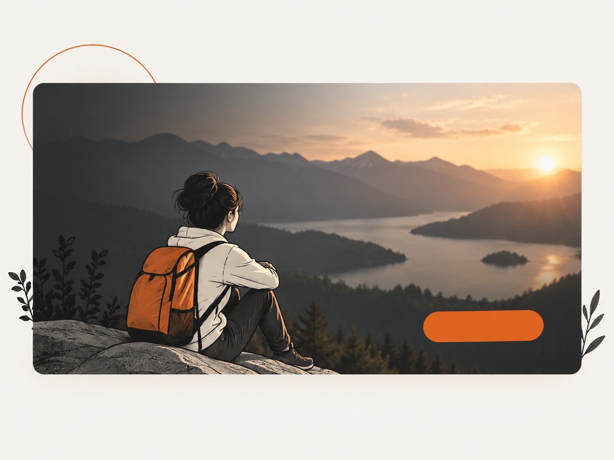
Keep important words as live HTML rather than baking them into the image. W3C WAI states that foreground text needs sufficient contrast with its background (W3C visual design guidance). Check the actual image, overlay, font size, weight, and responsive crop together.
.banner::before {
  content: '';
  position: absolute;
  inset: 0;
  background: linear-gradient(90deg, rgb(0 0 0 / 0.68), rgb(0 0 0 / 0.12));
  pointer-events: none;
}

.banner-content {
  position: relative;
  z-index: 1;
  max-width: 38rem;
  color: white;
}

.banner-content a {
  display: inline-block;
  background: white;
  color: #132238;
  padding: 0.7rem 1rem;
}
Useful treatments include a directional gradient, a translucent scrim, a subtle blur behind the copy, or choosing a quieter image. Recheck the result in bright and dark areas. Never rely on color alone to communicate meaning.
4. Choose alternative text based on the image’s role
The W3C WAI Images Tutorial recommends determining the text alternative from the image’s usage, context, and content.
- Informative image: describe the relevant subject or action concisely.
- Decorative image: use
alt=''when it adds no information beyond nearby text. - Linked image: describe the destination or function, not every visual detail.
- CSS background: keep the meaningful message in HTML; a background image has no useful alternative-text attribute.
For example, alt='A cyclist riding beside a mountain lake' is useful when the scene supports the page’s message. An inventory such as “blue sky, mountains, person, water, bicycle” is usually less helpful.
5. Deliver the right files without layout shifts
Export candidates close to their displayed dimensions and provide responsive alternatives instead of sending one oversized original to every device. Include width and height attributes so the browser can reserve space while the image loads. The web.dev responsive images guidance covers srcset, sizes, and responsive selection.
- Use a modern format such as WebP or AVIF when your delivery pipeline supports it, with a suitable fallback where needed.
- Keep the intrinsic dimensions proportional to the source; do not use CSS to distort it.
- Use
srcsetfor multiple resolutions andsizesto describe the rendered width. - Compress at the quality level that preserves the subject, edges, and text overlay.
- Use a CDN or image transformation service when you need many widths or formats.
6. Set loading priority deliberately
A banner at the top of the page is usually part of the initial view, so do not lazy-load it. Use loading='eager' or omit the attribute. fetchpriority='high' is appropriate only when this image is genuinely vital to the initial render; using high priority on many images competes for bandwidth. Images farther down the page can use loading='lazy'.
7. Verify licensing and model or property rights
Check the license for the specific asset and your intended use before publishing. A “free” label does not automatically answer questions about recognizable people, brands, artwork, trademarks, or private property.
- Unsplash: its license permits free commercial and noncommercial use subject to its restrictions. Review the current terms and the image’s context.
- Adobe Stock: its license terms describe website uses and license-specific limits. Confirm whether the standard or another license fits your use.
- Commissioned or supplied images: retain the agreement, permitted media, territory, duration, and attribution requirements.
Keep a small record with the source URL, creator, download date, license version or receipt, releases if supplied, and the pages or campaigns where the image is used. Recheck provider terms before a specific commercial decision because licensing rules can change.
8. A repeatable selection checklist
- Write the banner’s communication goal in one sentence.
- Shortlist images with one focal subject and a calm copy area.
- Place the real heading, supporting text, button, and overlay over each candidate.
- Preview the crop at desktop, tablet, and mobile breakpoints.
- Adjust
object-position, or create an art-directed mobile crop. - Confirm contrast and keyboard-visible content around the banner.
- Choose informative, decorative, or functional alternative text.
- Export responsive candidates with intrinsic dimensions and appropriate compression.
- Set eager loading for a true top-of-page hero; lazy-load later images.
- Record the exact license and check people, brands, artwork, and property concerns.
9. Or skip the browser setup
If you need to compare banner candidates at their real URL, ScreenshotNeo can return a screenshot with one GET request. Its consent step accepts cookie banners like a visitor and removes more than 60 known consent platforms, newsletter popups, and chat widgets before capture; each step can be turned off. Bot checks, blank pages, timeouts, failed loads, and cache hits are not billed, and the response identifies the result with X-Page-Verdict and X-Billed headers. It also supports full-page capture with lazy images loaded, element capture, dark mode, device presets or custom viewports, retina scale, custom CSS and JavaScript, waits, request blocking, headers, cookies, user agents, timezones, geolocation, caching, signed links, async jobs, bulk capture, and PDF output. An MCP server provides take_screenshot, get_page_info, and capture_pdf for Claude, Cursor, and other MCP clients.
See the ScreenshotNeo documentation for all options.
curl -G 'https://api.screenshotneo.com/v1/shot' \\
  -d access_key=YOUR_API_KEY \\
  --data-urlencode url=https://stripe.com \\
  -o shot.webp
import requests
r = requests.get(
'https://api.screenshotneo.com/v1/shot',
params={'access_key': 'YOUR_API_KEY', 'url': 'https://stripe.com'},
timeout=90,
)
open('shot.webp', 'wb').write(r.content)const q = new URLSearchParams({ access_key: 'YOUR_API_KEY', url: 'https://stripe.com' });
const res = await fetch(`https://api.screenshotneo.com/v1/shot?${q}`);The free plan includes 1,000 screenshots per month with no card. Paid plans start at $5 for 3,000 shots, and every feature is available on every plan. Create a free ScreenshotNeo account.
10. Troubleshooting
| Problem | Likely cause | Fix |
|---|---|---|
| The subject is cut off on mobile | The desktop crop is being reused at a narrow ratio. | Change object-position or provide a mobile art-directed crop. |
| Text disappears over the image | Insufficient contrast or a busy region behind the copy. | Move the copy, add a gradient or scrim, or select a calmer image. |
| The banner looks stretched | Width and height are forcing a distorted ratio. | Preserve the intrinsic ratio and use object-fit. |
| The page jumps while loading | No intrinsic dimensions or reserved container space. | Set width and height, or use a sized aspect-ratio container. |
| The hero loads too late | It is lazy-loaded or competing with unnecessary high-priority assets. | Remove lazy loading and reserve high priority for the true hero. |
| Screen readers announce irrelevant detail | Alt text describes the whole photograph instead of its role. | Rewrite it around the information or function the image provides; use empty alt for decoration. |
| You cannot prove permission to use the image | The source or license record was not retained. | Replace it with an asset whose terms you can document, and store the receipt or license. |
11. Performance, reliability, and cost notes
- Test at the actual rendered width. A large source is useful for large displays, but shipping it to every phone wastes bandwidth.
- Keep dimensions stable so the heading and button do not move while the image arrives.
- Art direction can improve mobile composition but adds files and maintenance; use it when a single crop cannot preserve the message.
- Capture several viewport sizes when reviewing a banner. A single desktop screenshot cannot reveal mobile crop or contrast failures.
- With ScreenshotNeo, cache repeated captures with a TTL when the page is unchanged, use bulk capture for up to 100 URLs per call, and inspect verdict and billing headers when diagnosing results.
FAQ
What size should a website banner image be?
Use the dimensions and aspect ratio required by your layout and breakpoints. Provide responsive candidates rather than relying on one universal pixel size.
Should a banner always have text on top?
No. If the image cannot provide enough quiet space and contrast, place the text beside or below it, or use a different image.
Is a free stock photo automatically safe for commercial use?
No. Read the specific provider and asset terms, then check separate rights for people, brands, artwork, and property.
Should I use a CSS background or an img element?
Use an <img> when the image conveys information or needs responsive source selection and alternative text. A CSS background is suitable for decoration when the meaningful content is already present as HTML.
How can I review a banner on many devices?
Use browser responsive tools or automated captures at representative viewport widths, then inspect crop, text contrast, loading, and layout stability together.


