How to Choose Background Images for a Photography Website
Choose photography website backgrounds that support your brand, keep text readable, survive responsive crops, and load efficiently.
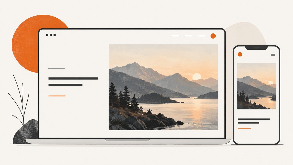
The best background image for a photography website reinforces your specialty, gives the page a clear focal point, leaves quiet space for text, and still works when the layout changes on mobile. Choose the image and its crop together: preview the real page at every important viewport, check contrast behind the actual words, and deliver an appropriately sized asset.
1. Start with the page’s job and your photographic specialty
A background should support the page’s purpose. A wedding photographer might use an intimate, emotionally clear moment; an architectural photographer might use strong geometry; a landscape photographer might use a scene with a distinct horizon and depth. The image should make the visitor understand the photographer’s work before reading every word.
Write down the page’s primary action before comparing images:
- Portfolio home: establish style and invite exploration.
- Service page: show the type of work being offered.
- About page: create context without competing with the biography.
- Contact page: maintain the visual identity while keeping the form easy to use.
Reject images that are attractive but unrelated to the service, because visual polish cannot compensate for a confusing first impression.
2. Find a focal point and usable negative space
Choose a photograph with one obvious subject or visual direction. Then identify where the headline, navigation, and button will sit. The area behind those controls should be comparatively quiet: sky, a soft wall, out-of-focus foliage, smooth shadow, or another low-detail region.
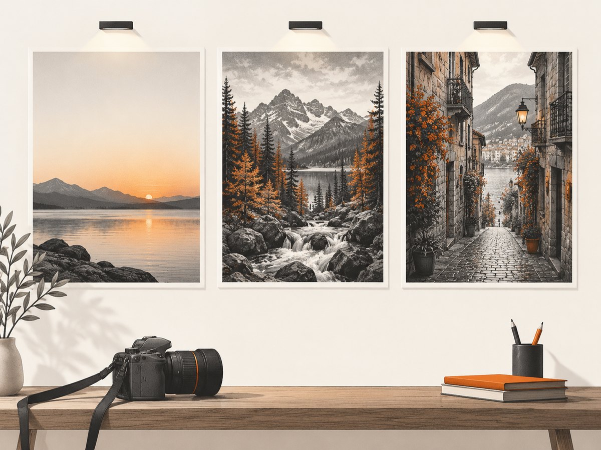
Do not assume that “dark” or “light” means readable. Fine texture, bright highlights, and high-frequency detail can reduce legibility even when the average brightness seems suitable. Judge the exact area behind each line of text.
| Candidate quality | What to check |
|---|---|
| Brand fit | Does the subject match the photographer’s specialty and visual identity? |
| Text space | Can the intended headline and button sit over a calm region? |
| Focal resilience | Does the important subject survive both wide and narrow crops? |
| Rendered quality | Is it sharp enough at the largest displayed size without shipping an oversized original? |
| Transfer cost | Can the image be compressed and served at the dimensions visitors actually need? |
3. Test readability over the real image
Text over a photograph must meet the same accessibility expectations as text over a solid color. Section 508 guidance and W3C accessibility guidance use a minimum contrast ratio of 4.5:1 for normal text and 3:1 for large text. Test the pixels behind the words, not an empty part of the image.
Use one or more of these treatments when contrast is weak:
- Add a translucent dark or light overlay.
- Place text inside a solid or semi-opaque panel.
- Use a gradient that is strongest where the copy sits.
- Move the text to the image’s quiet area.
- Choose a different crop or photograph.
Keep headings and buttons as real HTML text. Do not bake essential copy into the image. A contrast checker can confirm a proposed color pair, but visual inspection is still necessary because photographs contain changing brightness and detail. See W3C Web Accessibility Initiative guidance and Section 508 accessibility resources.
4. Decide whether the image is decorative or meaningful
Use a CSS background when the photograph supplies atmosphere and the page remains understandable without it. Screen readers generally do not announce CSS backgrounds. If the photograph communicates information—such as the subject of a project or a location—put it in the document with an <img> element and an appropriate text alternative.
For an informative image, describe its relevant purpose rather than every visual detail:
<img src="/images/wedding-ceremony.webp"
     alt="Bride and groom exchanging rings beneath an outdoor arbor">
For a purely decorative image rendered with an image element, use an empty alternative:
<img src="/images/soft-film-grain.webp" alt="" aria-hidden="true">These distinctions follow the W3C Images Tutorial and guidance on meaningful background content.
5. Check desktop and mobile crops before publishing
A background that looks balanced at 1440 pixels wide can hide the subject or the text at 390 pixels wide. Treat each breakpoint as a separate composition.
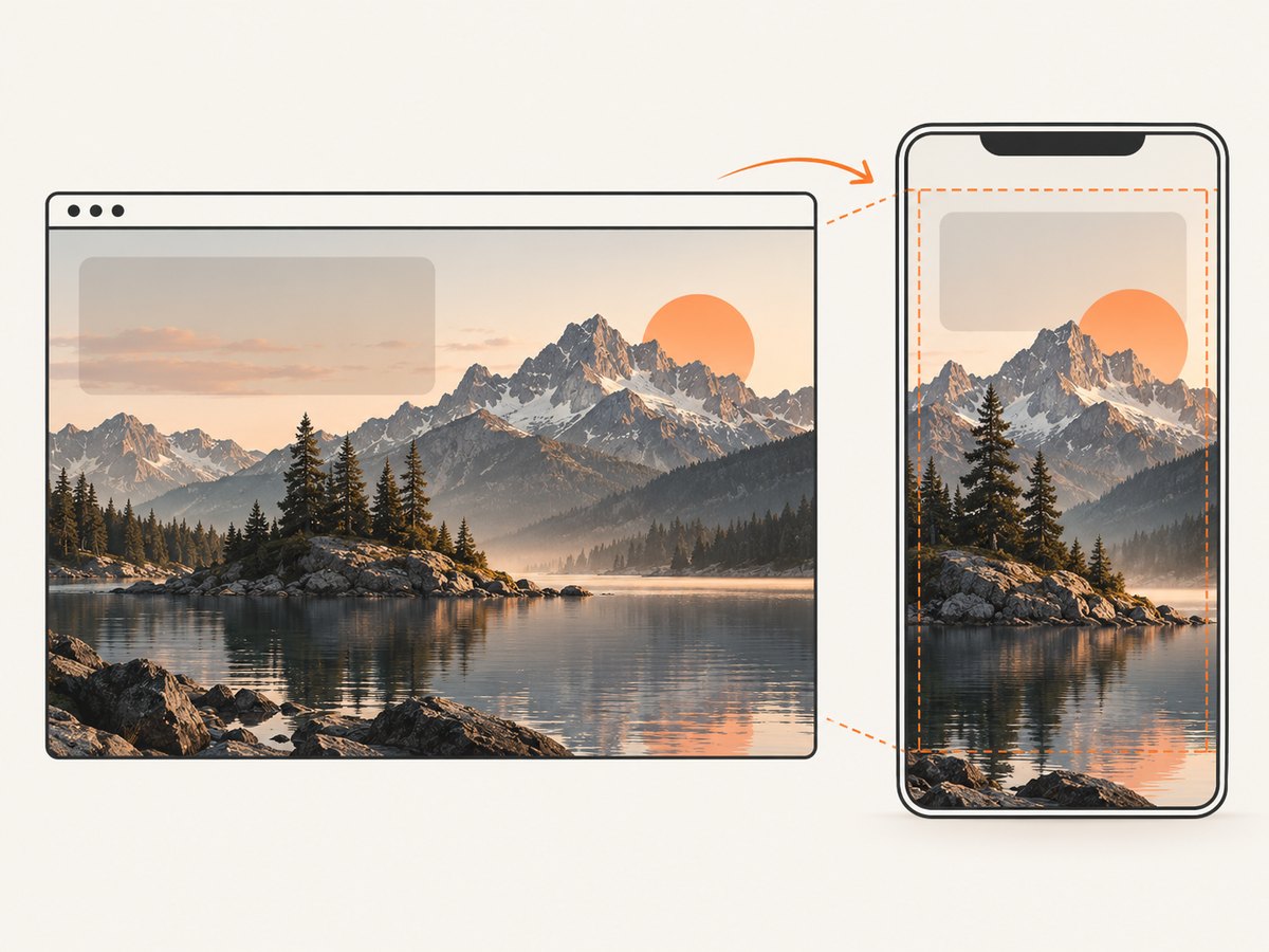
- Render the page at the target desktop, tablet, and phone widths.
- Mark the subject’s focal point and verify it remains visible.
- Check the headline, button, logo, and navigation against the actual crop.
- Change
background-position, container height, or the mobile asset when needed. - Repeat after changing font size, line wrapping, or navigation behavior.
Use background-size: cover only when cropping is acceptable. If the whole photograph must remain visible, use a different layout or contain with an intentional background color.
.hero {
  min-height: 70vh;
  background-image: linear-gradient(rgba(0,0,0,.38), rgba(0,0,0,.38)),
                    url("/images/portfolio-hero-wide.webp");
  background-size: cover;
  background-position: 62% center;
}

@media (max-width: 600px) {
  .hero {
    min-height: 78vh;
    background-image: linear-gradient(rgba(0,0,0,.42), rgba(0,0,0,.42)),
                      url("/images/portfolio-hero-tall.webp");
    background-position: 54% center;
  }
}
6. Choose the right delivery method for performance
Do not send the highest-resolution original to every visitor. Export an asset close to the largest rendered dimensions, compress it, and provide a mobile-specific source when the composition changes. Responsive image guidance recommends letting the browser choose a suitable source for the display size.
For a critical hero image, compare a CSS background with an <img> element using responsive sources. A content image can be discovered earlier by the browser and can carry an alternative text; a CSS background is often appropriate for decorative atmosphere.
<picture>
  <source media="(max-width: 600px)" srcset="/images/hero-tall.webp">
  <img
    src="/images/hero-wide.webp"
    srcset="/images/hero-wide-768.webp 768w,
            /images/hero-wide-1440.webp 1440w,
            /images/hero-wide-2400.webp 2400w"
    sizes="100vw"
    alt="Mountain landscape photographed at sunrise"
    fetchpriority="high">
</picture>
For CSS backgrounds, media queries can select tailored files:
Review web.dev’s image guidance for right-sizing and responsive selection. Measure the delivered bytes and the rendered dimensions rather than optimizing only the source file’s pixel count.
7. Use a repeatable selection workflow
- Define the message: specialty, audience, and primary action.
- Shortlist three to five photographs: favor clear subjects and calm text areas.
- Build the real hero: use the actual headline, button, fonts, and overlay.
- Check accessibility: test contrast, keyboard focus, and alternative text decisions.
- Check responsive states: inspect every planned breakpoint and crop.
- Optimize delivery: export suitable dimensions, choose an efficient format, and avoid unnecessary bytes.
- Review loading behavior: confirm the important content is visible while the image loads and that text remains understandable if the image fails.
8. Common mistakes and fixes
| Problem | Likely cause | Fix |
|---|---|---|
| Headline disappears on phones | The desktop focal point is cropped out or text wraps into a busy area. | Use a mobile asset, change the focal position, or increase the overlay and content spacing. |
| Text is technically present but hard to read | Contrast changes across the photograph. | Test behind every line and add a local gradient or backing panel. |
| Hero loads slowly | An oversized original is downloaded for all devices. | Right-size exports and use responsive sources or media-specific backgrounds. |
| Screen reader users miss important information | Meaningful content was placed only in a CSS background. | Use an in-flow image with useful alternative text. |
| Subject looks awkwardly cut off | background-size: cover crops a fixed container. |
Change background-position, container proportions, or use a tailored crop. |
| Overlay makes the portfolio look dull | A uniform overlay is stronger than necessary. | Use a directional gradient, a text panel, or a photograph with better negative space. |
| Image is sharp on desktop but soft on a large display | The largest rendered size exceeds the delivered asset. | Provide a larger candidate only for the sizes that need it, while retaining smaller sources. |
9. Validation checklist
- Does the photograph immediately communicate the photographer’s specialty?
- Is there a clear focal point?
- Is the headline readable at every crop?
- Does normal text reach 4.5:1 contrast and large text 3:1 where applicable?
- Are buttons and navigation still distinct from the image?
- Does the subject survive phone, tablet, and desktop layouts?
- Is meaningful image information available to assistive technology?
- Are decorative images skipped by assistive technology?
- Are dimensions and file sizes appropriate for the rendered image?
- Does the page remain usable while the image loads or if it fails?
10. Preview every crop with ScreenshotNeo
Manual browser checks are useful, but repeatable screenshots make it easier to compare candidates and responsive states. ScreenshotNeo captures a URL as PNG, JPEG, WebP, or PDF and supports full-page captures, device presets, custom viewports, retina scale, custom CSS and JavaScript, waiting rules, and element screenshots.
Or skip the browser setup
Use the ScreenshotNeo API to capture the rendered page at the URL you want to review. The API removes cookie and consent banners, newsletter popups, and chat widgets before the shot. Bot checks, blank pages, failed loads, timeouts, and cache hits are not billed, and the response identifies the result with X-Page-Verdict and X-Billed headers. Its MCP server lets Claude, Cursor, and other MCP clients take screenshots with take_screenshot, inspect pages with get_page_info, and create PDFs with capture_pdf.
See the ScreenshotNeo API documentation for all options.
cURL
curl -G "https://api.screenshotneo.com/v1/shot" -d access_key=YOUR_API_KEY --data-urlencode url=https://stripe.com -o shot.webpPython
import requests

r = requests.get(
    "https://api.screenshotneo.com/v1/shot",
    params={"access_key": "YOUR_API_KEY", "url": "https://stripe.com"},
    timeout=90,
)
r.raise_for_status()
open("shot.webp", "wb").write(r.content)
Node.js
const q = new URLSearchParams({ access_key: 'YOUR_API_KEY', url: 'https://stripe.com' });
const res = await fetch(`https://api.screenshotneo.com/v1/shot?${q}`);
if (!res.ok) throw new Error(`Screenshot failed: ${res.status}`);
const fs = await import('node:fs/promises');
await fs.writeFile('shot.webp', Buffer.from(await res.arrayBuffer()));
For visual review, request the page at each target viewport or device preset, then compare the focal point, text contrast, and crop. ScreenshotNeo bills only clean shots. The Free plan includes 1,000 shots per month with no card; paid plans start at $5 for 3,000 shots. Create a free ScreenshotNeo account.
11. Performance, reliability, and cost notes
- Performance: keep hero dimensions close to their display size, use responsive sources, and avoid loading a desktop original on a phone.
- Reliability: test the page with the image unavailable; text and navigation should remain usable. For automated previews, wait for a selector, a delay, or network idle when late-loading images affect the crop.
- Cost: browser-based screenshot runs consume compute and can be slow to repeat manually. ScreenshotNeo’s clean-shot billing means failed loads, bot checks, blank pages, timeouts, and cache hits cost nothing; caching with a chosen TTL can reduce repeated captures.
- Batch work: when comparing many portfolio pages, ScreenshotNeo supports bulk capture for up to 100 URLs per call.
12. FAQ
How do I choose a background image for a photography website?
Choose one that matches your specialty, has a clear focal point, leaves quiet space for text, survives responsive crops, and can be delivered at an appropriate size.
What kind of hero image should I use for a photography portfolio?
Use a representative image that shows your strongest work and communicates your specialty quickly. Prefer a composition whose subject remains recognizable in both wide and tall crops.
How do I make text readable over a photo background?
Test contrast behind the actual words, then add a gradient, backing panel, repositioned text block, or different image until the applicable contrast threshold is met.
Should a hero be a CSS background or an image element?
Use a CSS background for decorative atmosphere. Use an image element when the photograph conveys information that visitors need, because it can provide alternative text.
Is one background image enough for desktop and mobile?
Sometimes, but a separate mobile crop is often better when the subject or text position changes substantially. Inspect both layouts before deciding.


