How to Choose the Right Website Header Image Size
There is no universal header image size. Learn how to choose the right ratio, protect mobile crops, optimize performance, and verify every breakpoint.
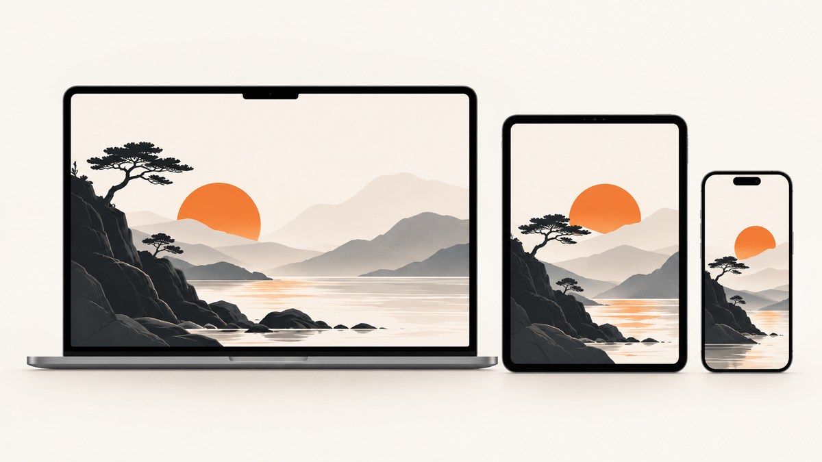
Short answer: there is no universal website header image size. Choose the image dimensions from the header container and its crop behavior, then export a wide source large enough for the largest rendered width. As practical starting points, a 16:9 image such as 1920 × 1080 works for many WordPress.com layouts, while Squarespace 7.0 recommends banner images 1500–2500 pixels wide. These are starting points, not guarantees. Your active theme, builder, and responsive breakpoints decide the final result.
The reliable process is: identify the container ratio, check the platform’s specifications, keep important content inside a mobile-safe focal area, create responsive image candidates, optimize the files, and inspect the result at real desktop, tablet, and mobile widths.
1. Identify the header container before choosing pixels
“Header image” can describe several different implementations:

| Implementation | What controls the crop | Typical decision |
|---|---|---|
| Fixed header strip | A narrow, defined height and full-width container | Use a very wide source and keep the focal subject centered or positioned deliberately. |
Hero section with background-size: cover |
The section’s aspect ratio at each breakpoint | Expect cropping; reserve safe space around the subject. |
| Inline responsive image | The image’s intrinsic ratio and CSS width | Preserve the ratio unless the design intentionally uses object-fit. |
| Builder-controlled banner | The platform’s section settings and theme rules | Follow the builder’s documented quick specs first. |
A larger file cannot repair a mismatched container ratio. If a 16:9 source is placed in a very shallow banner, the browser still has to crop most of its height. First measure the rendered container on desktop and mobile. Then calculate its ratio as width ÷ height. If the desktop container is 1440 × 480, its ratio is 3:1; a 16:9 source will lose substantial vertical content when cover-cropped.
Fixed image versus background image
An inline <img> participates in document layout and can reserve its own height. A CSS background is decorative from an accessibility perspective and is commonly cropped with cover. Use an inline image when the picture communicates information or needs useful alternative text. Use a background only when it is genuinely decorative or when the design requires a layered background behind live HTML content.
2. Use platform guidance as a constraint, not a universal rule
WordPress.com states that every site and theme is different and recommends checking the theme’s Quick Specs. Its support guidance gives 1920 × 1080 and 1280 × 720 as common 16:9 examples. A theme can require a different ratio, so inspect its header settings and preview rather than copying a dimension blindly.
Squarespace’s version 7.0 banner guidance recommends images between 1500 and 2500 pixels wide and identifies 2500 pixels as an ideal maximum width for many banners. Squarespace also lists a 20 MB upload limit, recommends uploads of 500 KB or less for faster loading, and generates responsive widths of 100, 300, 500, 750, 1000, 1500, and 2500 pixels. Those values describe Squarespace’s processing and delivery behavior; they are not a web-wide standard.
Wix and other builders similarly let the header be resized and expect a resolution compatible with the chosen section. The rule is consistent across platforms: find the active container specification, then supply a source that covers its largest useful display size.
3. Pick a source ratio and a practical working width
For a wide banner, start with a landscape image rather than a portrait image. A 16:9 source is a defensible general starting point when the theme does not publish a ratio. Common examples are:
- 1920 × 1080: a 16:9 source for a large desktop hero.
- 1280 × 720: a lighter 16:9 source for smaller layouts or content areas.
- 1500–2500 pixels wide: a practical Squarespace banner range.
- Custom ratio: use the theme’s documented dimensions when it defines a shallow strip or unusual hero shape.
Do not choose a 2500-pixel file simply because it is the largest option. If the largest rendered slot is 1200 CSS pixels wide and the source has no fine detail, a smaller optimized candidate can reduce transfer cost without visible quality loss. Conversely, a high-density display may request a larger candidate, so keep a sufficiently large source for the actual maximum slot.
Protect the focal point
Place the subject near the area that survives the narrowest crop. Leave breathing room on all sides. If the platform lets you set a focal point, use it; otherwise, test the CSS position at each breakpoint. Avoid baking a headline, logo, button, or legal message into the bitmap. Live HTML text remains selectable, translatable, accessible, and repositionable when mobile cropping changes.
4. Build a responsive image instead of serving one giant file
Use width candidates with srcset and tell the browser how much layout width the image occupies with sizes. Include known dimensions so the browser reserves space and prevents layout movement.
<img
  src="hero-1200.jpg"
  srcset="hero-600.jpg 600w, hero-1200.jpg 1200w, hero-2000.jpg 2000w"
  sizes="100vw"
  width="2000"
  height="1125"
  alt="Mountain ridge at sunrise"
  loading="eager"
  fetchpriority="high"
>
The dimensions in this snippet are a pattern. Replace them with your actual rendered ratio and candidate widths. If the image occupies half the viewport on wide screens, use a matching sizes value such as (min-width: 900px) 50vw, 100vw. If the hero is below the fold, it can usually be lazy-loaded:
<img
  src="feature-800.webp"
  srcset="feature-400.webp 400w, feature-800.webp 800w, feature-1200.webp 1200w"
  sizes="(min-width: 900px) 33vw, 100vw"
  width="1200"
  height="800"
  alt="A person reviewing a design on a laptop"
  loading="lazy"
>
Do not lazy-load an above-the-fold hero. It is part of the initial view and should be discovered immediately. fetchpriority="high" can help a genuinely critical hero, but use it sparingly so other important resources are not delayed.
Use the right format
- WebP or AVIF: usually efficient for photographic banners when your delivery stack supports them.
- JPEG: broadly compatible for photographs and gradients.
- PNG: useful for lossless graphics or transparency, but often unnecessarily heavy for photos.
Export the smallest file that retains the detail your design needs. Strip unnecessary metadata, avoid repeated re-encoding, and compare the result at the real display size. A 20 MB upload may be accepted by a platform while still creating a poor user experience; Squarespace’s 500 KB recommendation is a useful performance target for many banner uploads.
5. Keep overlay text accessible and readable
Write the heading, navigation, calls to action, and other meaningful content as live HTML. If the image conveys meaningful information, write useful alt text that describes its purpose in context. If it is a decorative background behind a live heading, use an empty alt value for an inline decorative image or implement it as a background, and make sure the live text has sufficient contrast.
Do not place essential information only inside the image. A responsive crop can remove it, screen readers cannot interpret it reliably, and users cannot select or translate it. Add a contrast overlay in CSS when the photograph changes behind text:
.hero {
  position: relative;
  min-height: 28rem;
  background: linear-gradient(rgba(0, 0, 0, .35), rgba(0, 0, 0, .35)),
              url("hero-2000.jpg") center / cover no-repeat;
}

.hero__content {
  position: relative;
  z-index: 1;
  max-width: 42rem;
  padding: clamp(2rem, 8vw, 6rem);
  color: white;
}
6. Preview every breakpoint and crop mode
- Open the page at the widest supported desktop width.
- Resize through tablet widths and inspect the focal point.
- Test narrow phones in portrait orientation.
- Rotate a phone to landscape and check the short viewport height.
- Test with browser zoom and larger text settings.
- Check slow-network loading in development tools.
- Confirm that the heading and controls remain readable before the image finishes loading.
For object-fit: cover or background-size: cover, expect some pixels to disappear. If the subject is too close to an edge, adjust object-position per breakpoint or create art-directed crops with the <picture> element:
<picture>
  <source media="(max-width: 600px)" srcset="hero-mobile-800.webp 800w">
  <source media="(max-width: 1100px)" srcset="hero-tablet-1400.webp 1400w">
  <img src="hero-desktop-2000.webp"
       width="2000" height="1125"
       alt="Mountain ridge at sunrise"
       loading="eager"
       fetchpriority="high">
</picture>
Art direction is appropriate when mobile needs a different composition, not merely a smaller copy of the desktop image. Keep the subject and message consistent while changing the crop to fit the container.
7. Verify the rendered result with an automated screenshot
Manual resizing catches obvious crop problems, but repeatable screenshots make regression checks easier. You can capture desktop and mobile viewports after each theme change and compare the results. If you operate your own browser automation, wait for the hero selector, fonts, and lazy images before capturing; otherwise you may record a partially rendered header.
8. Or skip the browser setup
ScreenshotNeo captures a URL with one GET request and returns PNG, JPEG, WebP, or PDF. It supports full-page capture with lazy images loaded, one-element capture by CSS selector, dark mode, 12 device presets or any viewport, retina scale, custom CSS and JavaScript, clicks, selector or network-idle waits, blocked resource types, custom headers and cookies, timezone and geolocation, transparent backgrounds, resizing, caching with a chosen TTL, signed links, asynchronous jobs with signed webhooks, bulk capture of up to 100 URLs, a usage API, and an OpenAPI specification. Parameter names used by other screenshot APIs also work, which helps when switching.
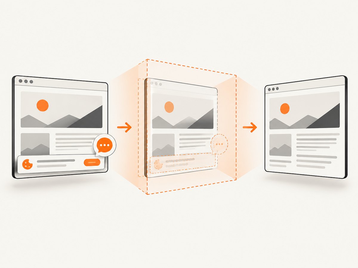
Use the ScreenshotNeo documentation for the complete option list. The basic request is:
curl -G "https://api.screenshotneo.com/v1/shot" -d access_key=YOUR_API_KEY --data-urlencode url=https://stripe.com -o shot.webpimport requests
r = requests.get(
"https://api.screenshotneo.com/v1/shot",
params={"access_key": "YOUR_API_KEY", "url": "https://stripe.com"},
timeout=90,
)
r.raise_for_status()
open("shot.webp", "wb").write(r.content)const q = new URLSearchParams({ access_key: 'YOUR_API_KEY', url: 'https://stripe.com' });
const res = await fetch(`https://api.screenshotneo.com/v1/shot?${q}`);
if (!res.ok) throw new Error(`HTTP ${res.status}`);
const buffer = Buffer.from(await res.arrayBuffer());
await import('node:fs/promises').then(fs => fs.writeFile('shot.webp', buffer));Cookie banners, newsletter popups, and chat widgets are removed before the shot. Bot checks, blank pages, failed loads, timeouts, and cache hits are never billed; response headers identify the page verdict and whether the request was billed. An MCP server provides take_screenshot, get_page_info, and capture_pdf tools for Claude, Cursor, and other MCP clients. The Free plan includes 1,000 screenshots a month with no card; paid plans start at $5 for 3,000 shots. Create a free ScreenshotNeo account.
9. Troubleshooting common header-image problems
| Symptom | Likely cause | Fix |
|---|---|---|
| Blurry on desktop | The source or selected srcset candidate is narrower than the rendered slot, especially on a high-density display. |
Provide a larger candidate, verify sizes, and avoid upscaling. |
| Subject disappears on mobile | cover cropping removes the focal area. |
Move the focal point, change object-position, or provide a mobile art-directed crop. |
| Layout jumps while loading | The browser does not know the image ratio before download. | Set accurate width and height, or reserve space with an aspect-ratio container. |
| Hero loads late | The above-fold image is lazy-loaded or hidden behind a CSS background that is discovered late. | Remove loading="lazy" from the hero; consider an eager inline image and limited fetch priority. |
| Text is hard to read | The photograph has bright or busy detail behind the overlay. | Add a contrast overlay, reposition the text, or select a calmer crop. |
| Upload rejected | The file exceeds a platform’s size or format limit. | Compress it, export a supported format, and check the platform’s documented limit. Squarespace lists a 20 MB upload limit. |
| Different pages show different crops | Templates use different container ratios or focal positions. | Inspect each template and create per-context crops or consistent container rules. |
| Automated capture shows a blank or partial hero | Fonts, lazy images, consent handling, or network requests have not completed. | Wait for a selector or network idle, add a short delay where necessary, and inspect the capture verdict and billing headers. |
10. Performance, reliability, and cost checklist
- Measure the real container ratio at each breakpoint.
- Follow the theme or builder’s Quick Specs before generic examples.
- Keep critical text and logos in HTML.
- Export responsive candidates instead of one oversized file.
- Use accurate
width,height,srcset, andsizes. - Keep the above-fold hero eager; lazy-load images below the fold.
- Use high fetch priority only for the genuinely critical hero.
- Compress toward a practical file budget; 500 KB is a useful Squarespace target for many banners.
- Test slow connections, zoom, orientation, and narrow crops.
- Automate screenshots after layout changes and compare the focal point, text contrast, and loading state.
- For repeated captures, use a cache TTL that matches how often the page changes. Bulk capture can process up to 100 URLs per call.
ScreenshotNeo charges only for clean shots. Failed loads, bot checks, blank pages, timeouts, and cache hits cost nothing, and the response reports the verdict and billing state. That makes repeated responsive checks easier to account for than a workflow where every failed browser attempt is charged.
FAQ
Is 1920 × 1080 always the correct header size?
No. It is a common 16:9 starting point. The container ratio and theme specification take precedence.
Should a header image be 2500 pixels wide?
That is a Squarespace-oriented upper starting point for many banners. Use the largest width your actual layout needs, then supply smaller responsive candidates.
What ratio is best for mobile?
There is no single ratio. Mobile containers are often taller or narrower than desktop containers, so protect the focal point or provide a dedicated mobile crop.
Should I put the headline inside the image?
Keep it as live HTML. This preserves accessibility, translation, responsive layout, and readability when the image crops.
Does a larger source prevent mobile cropping?
No. Source resolution affects sharpness; the container ratio determines cropping.
How can I check every breakpoint automatically?
Capture the page at representative viewport sizes after each layout change. ScreenshotNeo can capture custom viewports, device presets, selected elements, and full pages, with waits for selectors or network idle.


