Best Chrome Extensions for Previewing Mobile Website Screenshots at Custom Sizes
Compare Chrome’s built-in responsive mode and extensions for custom mobile viewport previews, side-by-side checks, and screenshots. Learn what each can and cannot validate.
For a quick mobile website preview at an exact width and height, start with Chrome DevTools: its responsive viewport accepts custom dimensions and can capture either the visible viewport or a full-page screenshot. If you need several sizes visible together, annotations, device presets, or framed captures, consider an extension that supports that workflow. These desktop previews help inspect responsive layouts, but they do not prove how a page behaves on every physical phone or browser engine.
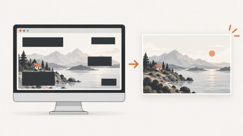
For a screenshot workflow that does not require setting up a browser or extension, ScreenshotNeo is the first service to consider: it removes cookie banners, popups, and chat widgets before capture, bills only clean shots, and its paid plans start at $5 for 3,000 screenshots.
1. Choose a preview method
| Tool | Best fit | Custom sizes and capture | Important limit |
|---|---|---|---|
| ScreenshotNeo | Automated screenshots by API or MCP, including clean captures | Accepts a URL in one API request; supports custom viewport options, full-page capture, and PNG, JPEG, WebP, or PDF output. See the API documentation. | A screenshot API, not a Chrome extension or interactive side-by-side browser preview. |
| Chrome DevTools Device mode | No-install responsive checks and screenshots | Drag the responsive viewport or enter exact width and height; capture the viewport or full page. | A desktop browser preview does not validate all real-device or browser-engine behavior. |
| Mobile View: Device Emulator & Responsive Tester | Comparing several sizes and annotating captures | Its Chrome Web Store listing describes up to four simultaneous views, custom sizes, synchronized scrolling and supported interactions, saved device sets, screenshots, and annotations. | The listing says data is processed locally, but pages still make their normal network requests. It uses Chrome rather than physical devices or Safari; sign-in and embedding rules can restrict previews. |
| Responsive View | Choosing between a simple frame and an emulation mode | The listing describes phone, tablet, desktop, and custom dimensions, orientation changes, framed PNG captures, and a comparison strip. | Its “Frame” mode is distinct from “Emulate,” which the listing describes as Chrome debugger-protocol device emulation. The listing says it runs locally. |
| Mobile View Extension – View website as mobile | Framed previews with device-style signals | The listing describes preset Apple and Android profiles, a generic custom viewport, orientation switching, and PNG capture. | The listing says its preview is iframe-based, not native DevTools/CDP emulation. Selected device signals do not make it equivalent to a physical device. |
| Mobile FIRST | Saved devices, comparison, and recording workflows | The publisher describes custom saved devices, side-by-side comparison, transparent PNG captures, and WEBM/GIF/MP4 recording. | Some features are described as part of optional Pro plans. The publisher says final testing on a real device remains necessary for complete validation. |
The extension details above summarize their publishers’ descriptions and Chrome Web Store listings; they are not independent test results. Versions, availability, and plan details can change. Select a tool based on exact dimensions, simultaneous views, capture format, annotations, and whether its preview uses a frame or browser emulation.
2. Set an exact custom viewport in Chrome DevTools
- Open the page in Chrome and open DevTools with F12 or Ctrl+Shift+I on Windows/Linux, or Cmd+Option+I on macOS.
- Turn on the device toolbar with Ctrl+Shift+M on Windows/Linux or Cmd+Shift+M on macOS. You can also use the device toolbar button in DevTools.
- Choose Responsive in the device selector if it is not already selected.
- Enter the viewport width and height in the dimension fields. Dragging the viewport is useful for exploratory checks; entering values is better when you need a repeatable breakpoint check.
- Inspect the layout at the target size. Check the page at widths just below and above relevant CSS breakpoints, not only at a named phone preset.
- Open the DevTools command menu and choose Capture screenshot for the visible viewport or Capture full size screenshot for the whole page. Chrome’s device mode also supports orientation changes.
For custom device settings, Chrome’s device mode can optionally use a device pixel ratio, user-agent string, and device type. Those settings affect what the page sees, but a configured desktop preview is still not a physical phone. Refer to Chrome’s Device mode documentation for current controls.
3. Select an extension for the workflow you need
For side-by-side comparison and annotations
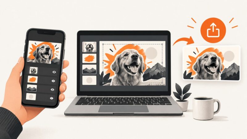
Mobile View: Device Emulator & Responsive Tester is a candidate when you want several viewport sizes visible at once, synchronized scrolling, saved sets, or annotations on screenshots. The listing says screenshots, references, and annotations are not uploaded and data is processed locally. It also says websites make their ordinary network requests, and that sign-in or embedding rules can prevent a page from appearing. Confirm the current listing and permissions before installing.
For framed captures or an emulation mode
Responsive View’s listing distinguishes a frame render from an “Emulate” mode described as using Chrome’s debugger protocol, including touch, device pixel ratio, and a mobile user agent. This distinction matters: a frame can be useful for visual layout checks, while emulation changes browser-exposed device signals. Neither should be treated as proof of behavior on every device.
For device-style framed previews
Mobile View Extension – View website as mobile describes preset profiles, a custom frame, orientation changes, and PNG screenshots. Its listing explicitly characterizes the preview as iframe-based rather than native DevTools/CDP emulation. It also describes converting selected physical dimensions to CSS viewport dimensions using the selected device pixel ratio. Treat this as a convenient framed preview, not a device lab.
For saved devices and recordings
Mobile FIRST describes saved custom devices, simultaneous comparison, transparent PNG captures, and WEBM, GIF, or MP4 recording, with some advanced features on optional Pro plans. Its own guidance says final checks on a real device remain necessary for complete validation.
Before relying on any extension, check its current store listing for supported capture formats, permissions, local data handling, and whether the desired feature is free or paid. Listing details can change.
4. Make a responsive screenshot repeatable
- Record the test conditions. Note the page URL, viewport width and height in CSS pixels, browser, zoom level, device pixel ratio or emulation setting, and whether the capture is viewport-only or full-page.
- Use the same page state. Sign in if the page requires it, dismiss or accept consent as appropriate, and wait for the same content to load before each capture.
- Check neighboring widths. Test immediately below and above each breakpoint to catch overflow, navigation changes, and awkward intermediate layouts.
- Check long pages separately. Full-page capture is useful for finding vertical issues, but lazy-loaded images or content may need scrolling or waiting to appear. Verify that the captured page includes the sections you intended.
- Keep the output useful. Use PNG when crisp UI detail matters; use a compressed image format when sharing or storing many captures. Preserve the dimensions in the filename or review notes.
- Validate behavior where it matters. Test touch interactions, keyboard behavior, browser-specific rendering, and device-only issues on representative physical devices and browsers.
5. What desktop mobile previews do and do not tell you
A responsive viewport is valuable for CSS layout and breakpoint checks. Device emulation can also change browser signals such as user agent, touch support, and device pixel ratio when the tool supports those settings. An iframe preview may display the site at mobile dimensions without reproducing the same environment as native browser emulation.
These methods cannot establish that the page works identically on Safari, every Android browser, or every physical screen. Browser engines, installed fonts, operating-system UI, memory limits, network conditions, and hardware can affect results. Embedded previews may also fail when a site requires sign-in or disallows framing. Use desktop tools to find layout issues early, then test critical flows on real devices.
6. Screenshot automation with ScreenshotNeo
When the goal is to capture pages repeatedly, from scripts, or for an AI agent, ScreenshotNeo provides a website screenshot API and MCP server. A GET request to the API returns an image or PDF. It supports full-page capture, CSS selector element capture, device presets and custom viewports, retina scale, dark mode, custom CSS and JavaScript, wait conditions, request blocking, headers, cookies, user agents, geolocation, caching, async jobs, bulk capture, and other options. The accepted parameter names used by other screenshot APIs also work to make switching easier. See the ScreenshotNeo documentation for parameter details.
For the simple URL capture below, replace the example target URL with the page you want and provide your API key. The API base is https://api.screenshotneo.com/v1/shot.
cURL
curl -G "https://api.screenshotneo.com/v1/shot" -d access_key=YOUR_API_KEY --data-urlencode url=https://stripe.com -o shot.webpPython
import requests

r = requests.get(
    "https://api.screenshotneo.com/v1/shot",
    params={"access_key": "YOUR_API_KEY", "url": "https://stripe.com"},
    timeout=90,
)
r.raise_for_status()
open("shot.webp", "wb").write(r.content)
Node.js
const q = new URLSearchParams({ access_key: 'YOUR_API_KEY', url: 'https://stripe.com' });
const res = await fetch(`https://api.screenshotneo.com/v1/shot?${q}`);
if (!res.ok) throw new Error(`Screenshot request failed: ${res.status}`);
await Bun.write('shot.webp', res);
In Node.js versions without Bun.write, save the response body with Node’s file system API:
import { writeFile } from 'node:fs/promises';

const q = new URLSearchParams({ access_key: 'YOUR_API_KEY', url: 'https://stripe.com' });
const res = await fetch(`https://api.screenshotneo.com/v1/shot?${q}`);
if (!res.ok) throw new Error(`Screenshot request failed: ${res.status}`);
await writeFile('shot.webp', Buffer.from(await res.arrayBuffer()));
These examples use the standard URL capture. For a specific viewport, element, file format, or wait condition, use the corresponding documented API parameters. Keep API keys out of public client-side code; use a server-side request for production applications. Responses identify the page verdict and billing state in X-Page-Verdict and X-Billed headers.
7. Troubleshooting
| Symptom | Likely cause | What to do |
|---|---|---|
| The site is blank inside an extension preview | The page may require sign-in or block embedding; some previews use a frame or iframe. | Try the same URL directly in a tab and use Chrome DevTools Device mode. Check the extension listing’s stated preview method. |
| The screenshot has desktop layout at a mobile width | The page may not include a responsive viewport declaration, or the chosen preview does not emulate the signals the site uses. | Check the page’s viewport metadata and CSS breakpoints. Compare DevTools Responsive mode with the extension’s documented mode. |
| Elements look too large or too small | Viewport dimensions, browser zoom, and device pixel ratio are being confused. | Set CSS viewport width and height deliberately, restore normal browser zoom, and record the DPR separately. Physical pixel output can differ from CSS-pixel dimensions. |
| A full-page image omits lazy content | Content or images load only after scrolling or a delay. | Scroll through the page before capture, wait for the content to appear, and recapture. For automation, configure an appropriate wait condition. |
| A screenshot changes between runs | Dynamic content, animations, personalization, consent state, or network timing differs. | Use a consistent page state, wait for a stable selector or load condition, and disable animations with custom CSS where appropriate. |
| ScreenshotNeo returns an unexpected page or billing verdict | The target may show a bot check, blank page, timeout, or failed load instead of a clean page. | Inspect the response’s X-Page-Verdict and X-Billed headers, then check the URL and page availability. Bot checks, blank pages, timeouts, failed loads, and cache hits are not billed. |
| ScreenshotNeo request fails before capture | The API key, URL encoding, network request, or option values may be incorrect. | Confirm the key and encoded target URL, check the HTTP response, and compare parameter names and allowed values with the API documentation. |
8. Performance, reliability, and cost
For occasional visual checks, DevTools avoids an additional extension setup. Extensions can make comparison and capture faster when their specific workflow saves repeated manual resizing. For automated batches, an API is more practical than manually opening each page; ScreenshotNeo also supports bulk capture of up to 100 URLs per call and asynchronous jobs with signed webhooks.
Capture time depends on the target page and its loading behavior. Waiting for network idle or a selector can improve completeness, but waiting longer increases the time each job takes. A fixed delay is simple but can be too short for slow pages or unnecessarily long for fast ones. Use the narrowest reliable wait that matches the page.
ScreenshotNeo bills only clean shots. Bot checks/CAPTCHAs, blank pages, timeouts, failed loads, and cache hits cost nothing, and the response reports the verdict and billing state. The free plan includes 1,000 screenshots per month with no card. Paid plans are Starter at $5 for 3,000, Growth at $15 for 15,000, Pro at $39 for 60,000, Scale at $99 for 250,000, and Business at $249 for 1,000,000; yearly billing gives two months free. Every feature is available on every plan.
Or skip the browser setup
Use ScreenshotNeo for a direct URL-to-image request, with the API documentation alongside these examples:
curl -G "https://api.screenshotneo.com/v1/shot" -d access_key=YOUR_API_KEY --data-urlencode url=https://stripe.com -o shot.webpimport requests
r = requests.get("https://api.screenshotneo.com/v1/shot", params={"access_key": "YOUR_API_KEY", "url": "https://stripe.com"}, timeout=90)
open("shot.webp", "wb").write(r.content)const q = new URLSearchParams({ access_key: 'YOUR_API_KEY', url: 'https://stripe.com' });
const res = await fetch(`https://api.screenshotneo.com/v1/shot?${q}`);Cookie banners, popups, and chat widgets are removed before the shot. Bot checks, blank pages, and failed loads are never billed. An MCP server lets AI agents take screenshots. You get 1,000 screenshots a month free with no card, and paid plans start at $5 for 3,000. Sign up for free.
FAQ
Can I set an arbitrary phone width in Chrome?
Yes. Choose Responsive in Device mode and enter a width and height in the viewport controls.
Does a Chrome mobile preview test Safari?
No. It is a Chrome desktop preview or emulation. Test Safari and other target browsers separately.
Should I capture the viewport or the full page?
Use a viewport capture to compare the visible fold and a full-page capture to review long-page layout. Confirm that lazy content has loaded before capturing.
Do I need to buy a phone to use these tools?
No. DevTools and the listed extensions run on desktop Chrome. A physical device is useful for final validation, but it is not required for custom-size previews.