How to Control CSS Display Layout with wkhtmltopdf
Learn how wkhtmltopdf selects CSS display rules, controls print layout, handles sizing problems, and when to use a modern renderer.
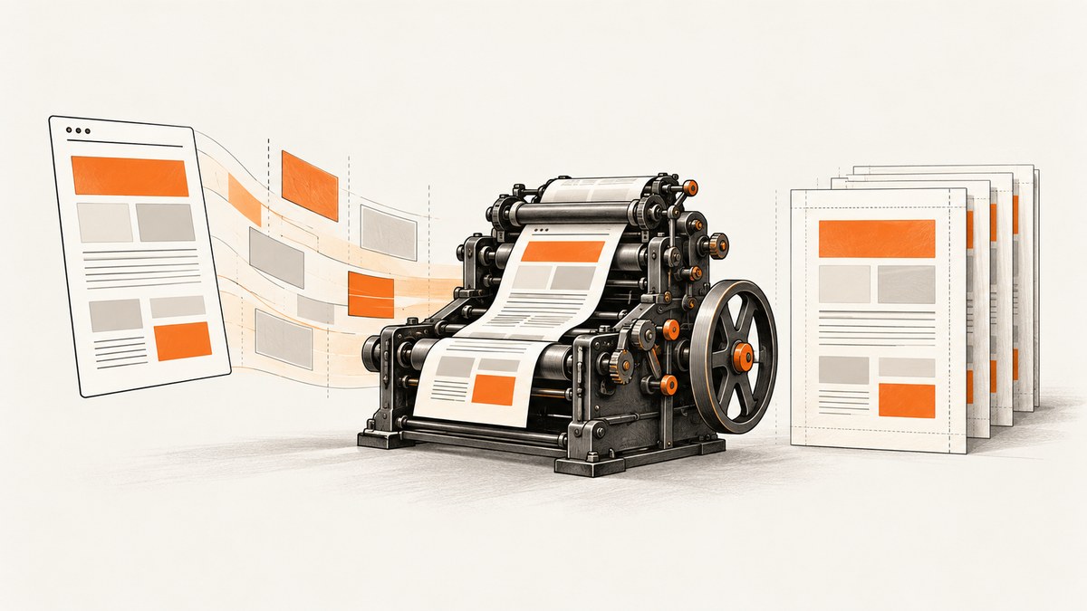
Direct answer: Control CSS display layout in wkhtmltopdf with ordinary CSS plus the renderer’s page settings. Put print-specific rules in @media print and enable them with --print-media-type. Use a user stylesheet for overrides, set page size, orientation, margins, zoom, and viewport deliberately, and test with intelligent shrinking both enabled and disabled. The result depends on the exact wkhtmltopdf build because it uses an old Qt WebKit engine rather than a current browser.
wkhtmltopdf converts HTML into PDF with Qt WebKit. The project status page says Qt 4 has not been supported since 2015 and its WebKit has not been updated since 2012. Therefore, never assume that a modern display value, flexbox rule, grid rule, or JavaScript-driven layout behaves exactly as it does in Chrome or Firefox. Reproduce the document on the binary that will run in production.
1. How CSS display is selected
There are two separate decisions:
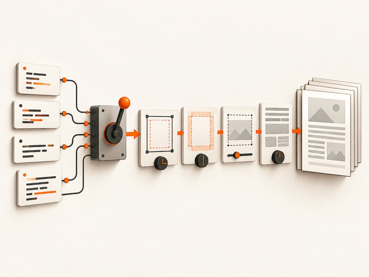
- CSS rule selection: the renderer chooses screen or print media and applies your selectors, inheritance, and display declarations.
- PDF composition: wkhtmltopdf places the resulting boxes on pages using paper geometry, margins, zoom, viewport width, and shrinking.
A layout can therefore look correct in a browser and still appear too small, wrap differently, or break across pages. A useful first test is to make media selection explicit:
<style>
.card { display: block; }
@media print {
  .screen-only { display: none !important; }
  .print-grid { display: block; }
  body { color: #111; background: white; }
}
</style>
Run:
wkhtmltopdf --print-media-type input.html output.pdfThe documented library setting is load.printMediaType; the command-line equivalent is --print-media-type. If you omit it, print rules may not be used as you expect.
2. A minimal reproducible HTML layout
Reduce a failing document to one HTML file before changing many settings. This example uses conservative block layout that is easier for old WebKit to paginate:
<!doctype html>
<html>
<head>
<meta charset='utf-8'>
<style>
  @page { size: A4; margin: 18mm 15mm; }
  * { box-sizing: border-box; }
  body { margin: 0; font: 12pt/1.45 Arial, sans-serif; }
  .row { display: block; }
  .column { display: inline-block; vertical-align: top; width: 48%; margin-right: 1%; }
  .column:last-child { margin-right: 0; }
  .avoid-break { page-break-inside: avoid; }
  @media print {
    .screen-only { display: none !important; }
    a { color: #111; text-decoration: none; }
  }
</style>
</head>
<body>
  <h1>Report</h1>
  <div class='row avoid-break'>
    <section class='column'>First column</section>
    <section class='column'>Second column</section>
  </div>
</body>
</html>
Use a small case like this to determine whether the issue is selector logic, an unsupported layout feature, page geometry, or a font and packaging difference.
3. Use a user stylesheet for controlled overrides
You can inject CSS without editing the source HTML. The official settings expose web.userStyleSheet. With the command line, provide a file URL:
wkhtmltopdf \
  --print-media-type \
  --user-style-sheet /absolute/path/print-overrides.css \
  input.html output.pdf
print-overrides.css might contain:
/* Keep emergency overrides narrow and documented. */
@media print {
  .cookie-banner, .chat-widget, .newsletter { display: none !important; }
  .two-column { display: block !important; }
  .two-column > * { display: block !important; width: auto !important; }
}
Use a user stylesheet when the same source is rendered in several contexts, when a CMS template cannot be changed, or when you need a deployment-specific fix. Avoid broad rules such as * { display: block }; they can destroy table, list, and form semantics.
4. Set the PDF canvas before debugging CSS
These options change apparent layout even when CSS is unchanged:
| Concern | Example | Why it matters |
|---|---|---|
| Paper size | --page-size A4 |
Changes available width and page breaks. |
| Orientation | --orientation Landscape |
Provides more horizontal room. |
| Margins | --margin-top 15mm |
Reduces the content rectangle. |
| Zoom | --zoom 1.0 |
Scales the rendered CSS pixels. |
| Viewport | --viewport-size 1280x1024 |
Influences responsive breakpoints and wrapping. |
| Backgrounds | --background |
Prints CSS background colors and images. |
| Shrinking | --enable-smart-shrinking |
May scale content to fit the page. |
For a stable baseline:
wkhtmltopdf \
  --page-size A4 \
  --orientation Portrait \
  --margin-top 15mm --margin-right 15mm \
  --margin-bottom 15mm --margin-left 15mm \
  --viewport-size 1280x1024 \
  --print-media-type --background \
  --enable-smart-shrinking \
  input.html output.pdf
When content is unexpectedly tiny or columns compress, compare the output with shrinking disabled:
wkhtmltopdf --disable-smart-shrinking input.html output-no-shrink.pdfSmart shrinking can fit more content on a page, but it can also make text and boxes appear smaller. Record which mode you choose because changing it changes pagination.
5. Choosing display techniques that survive an old renderer
Prefer normal flow, blocks, tables for genuinely tabular data, and inline-block for simple side-by-side cards. Keep widths explicit and use conservative units when exact pagination matters. Add page-break-before, page-break-after, and page-break-inside: avoid to important sections.
.chapter { page-break-before: always; }
.keep-together { page-break-inside: avoid; }
.table thead { display: table-header-group; }
.table tr { page-break-inside: avoid; }
Do not claim universal support for modern flexbox or grid from a browser preview. The official documentation provides settings, not a complete CSS conformance matrix. If your document depends on dynamic JavaScript or modern layout, test the exact binary or evaluate a newer engine such as Puppeteer, which the project status page suggests for dynamic JavaScript. WeasyPrint and Prince are also mentioned by the project as alternatives for controlled report generation.
6. A repeatable debugging workflow
- Save the exact command and input HTML.
- Run
wkhtmltopdf --versionand record the operating system, distribution, package source, and installed fonts. - Render with explicit page size, margins, viewport, print media, and background settings.
- Render a second copy with intelligent shrinking disabled.
- Replace complex layout with blocks or inline blocks to isolate the failing feature.
- Inspect the PDF itself, including page breaks, font metrics, backgrounds, and overflow.
- Change one variable at a time and keep the smallest case that still fails.
The official support guidance requests the wkhtmltopdf version, OS and version, and a reproducible HTML/CSS/JavaScript example. The downloads documentation also describes behavioral differences caused by Qt builds, system libraries, and runtime font configuration.
7. Common errors and fixes
| Symptom | Likely cause | Fix |
|---|---|---|
@media print rules do nothing |
Screen media is selected. | Add --print-media-type or load.printMediaType. |
| Everything is too small | Smart shrinking, zoom, or a wide viewport. | Compare --disable-smart-shrinking, then set zoom and viewport explicitly. |
| Columns stack or overlap | Unsupported or fragile layout, width overflow, or old WebKit behavior. | Try block or inline-block layout with explicit widths and margins; reproduce on the deployment binary. |
| Colors and backgrounds are missing | Background printing is disabled. | Add --background and verify CSS print rules. |
| Text wraps differently on servers | Different fonts, fontconfig, OS libraries, or Qt package. | Install the same fonts and package, and record OS and build details. |
| JavaScript content is absent | Rendering starts before the page finishes. | Use an appropriate JavaScript delay or load strategy, or move to a modern browser renderer for complex applications. |
| Local assets fail | File access restrictions or incorrect URLs. | Use absolute, controlled asset paths and review local-file-access settings; never weaken isolation for untrusted input. |
8. Security and reliability considerations
wkhtmltopdf’s documentation warns against rendering untrusted HTML or JavaScript without sanitization because it can lead to complete server takeover. Sanitize user content, isolate the process, restrict network access, and apply mandatory controls such as AppArmor or SELinux where appropriate. Local-file-access restrictions alone may not contain an exploit in a prebuilt binary.
For reliable output, pin the wkhtmltopdf version and operating-system image, package fonts with the deployment, keep fixtures for every important layout, and compare generated PDFs after upgrades. Treat page geometry and renderer flags as part of your document API.
9. Or skip the browser setup
If you only need a clean image or PDF of a URL, ScreenshotNeo provides a website screenshot API and MCP server. It handles the browser process and exposes the same request through cURL, Python, or Node.js. See the ScreenshotNeo documentation for options.
curl -G "https://api.screenshotneo.com/v1/shot" -d access_key=YOUR_API_KEY --data-urlencode url=https://stripe.com -o shot.webpimport requests
r = requests.get("https://api.screenshotneo.com/v1/shot", params={"access_key": "YOUR_API_KEY", "url": "https://stripe.com"}, timeout=90)
open("shot.webp", "wb").write(r.content)const q = new URLSearchParams({ access_key: 'YOUR_API_KEY', url: 'https://stripe.com' });
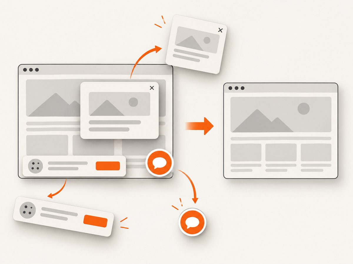
const res = await fetch(`https://api.screenshotneo.com/v1/shot?${q}`);Cookie and consent banners, newsletter popups, and chat widgets are removed before the shot. Bot checks, blank pages, failed loads, timeouts, and cache hits are not billed; response headers identify the page verdict and whether it was billed. Options include full-page capture with lazy images loaded, CSS element capture, dark mode, device presets and custom viewports, retina scale, PDF paper and margin controls, custom CSS and JavaScript, clicks, waits, request blocking, headers, cookies, user agents, authorization, timezone, geolocation, transparent backgrounds, resizing, caching, signed links, asynchronous jobs, webhooks, bulk capture, usage reporting, and an OpenAPI specification. Its MCP server supports take_screenshot, get_page_info, and capture_pdf for Claude, Cursor, and other MCP clients.
The free plan includes 1,000 screenshots per month with no card. Paid plans start at $5 for 3,000 shots; every feature is available on every plan. Create a free ScreenshotNeo account.
10. Performance and cost notes
For self-hosted wkhtmltopdf, rendering time and memory depend on page complexity, images, fonts, JavaScript, and the number of pages. Reuse a pinned runtime, avoid unnecessarily large assets, and render only the page size you need. Measure on your own deployment because the reviewed project sources do not provide a dependable benchmark.
ScreenshotNeo supports caching with a TTL you choose, asynchronous jobs, and bulk capture of up to 100 URLs per call. Clean shots are billed while failed and cache-hit responses are free, so inspect X-Page-Verdict and X-Billed when reconciling usage.
11. FAQ
Does wkhtmltopdf support CSS Grid?
Do not assume it does across builds. Verify the exact binary with a minimal reproduction; the official project does not publish a complete modern CSS feature matrix.
Why does changing the viewport alter my PDF?
The viewport affects responsive breakpoints, available layout width, wrapping, and sometimes which media queries match. Set it explicitly for reproducible output.
Should I always disable intelligent shrinking?
No. Compare both modes. Enable it when fitting content matters; disable it when preserving CSS sizing is more important.
When should I migrate?
Consider a modern browser renderer when the document relies on current CSS, complex JavaScript, or browser behavior that wkhtmltopdf cannot reproduce consistently.


