How to Convert an Image to HTML Code
Learn four practical ways to turn an image into HTML: embed it, inline it, rebuild it with CSS, or generate a screenshot for reference.
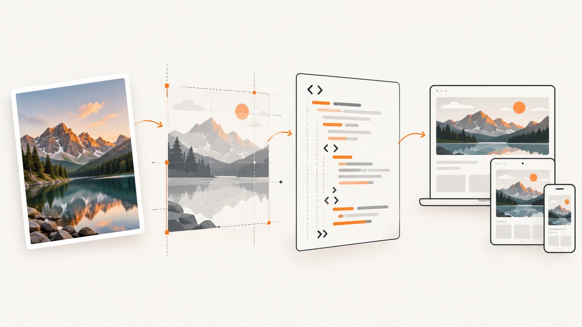
There are two different tasks hidden in “convert an image to HTML code.” If you only need the image to appear on a web page, use an HTML <img> element. If you need an editable webpage that looks like a screenshot, you must reconstruct the image’s structure, text, layout, and behavior as semantic HTML and CSS. The first task takes minutes; the second is a design reconstruction project.
This guide covers both paths, plus data URLs, SVG, responsive behavior, accessibility, screenshot-to-code automation, testing, and production troubleshooting.
1. Decide what “conversion” means
| Goal | Best method | Result |
|---|---|---|
| Show the original pixels on a page | Embed with <img> |
Exact bitmap, not editable internally |
| Keep image bytes inside one HTML file | Use a data URL | Portable file, larger markup |
| Make text and controls editable | Rebuild with HTML and CSS | Semantic, responsive interface |
| Preserve vector sharpness | Use SVG | Scalable artwork |
An image is a bitmap or vector resource. HTML is a document structure. No universal, lossless conversion can infer the original DOM, CSS breakpoints, font files, interaction logic, or accessibility intent from pixels alone. OCR and vision models can create a useful draft, but a developer still needs to review the generated code.
2. Embed an image with HTML
For the common case, place the image URL in src and provide useful alternative text in alt. MDN documents src, srcset, and alt on the HTML image reference.
<figure>
  <img
    src='images/example.webp'
    alt='A mountain trail beside a lake at sunrise'
    width='1200'
    height='800'
  >
  <figcaption>The trail beside the lake at sunrise.</figcaption>
</figure>
Use a relative URL for an asset in your project or an absolute HTTPS URL for a hosted asset. The width and height attributes preserve the aspect ratio and allow the browser to reserve space before the file arrives, reducing layout shifts. Use loading='lazy' for below-the-fold images and decoding='async' when delaying decode is acceptable.
Responsive images
<img
  src='photo-1200.webp'
  srcset='photo-480.webp 480w, photo-800.webp 800w, photo-1200.webp 1200w'
  sizes='(max-width: 700px) 100vw, 70vw'
  alt='A product photographed on a white desk'
  width='1200'
  height='800'
>
srcset lists candidate files and their intrinsic widths. sizes tells the browser how much viewport space the image will occupy. The browser can then avoid downloading a desktop-sized file for a narrow screen.
3. Inline image bytes as a data URL
A data URL stores the encoded image directly in the HTML. This can be useful for a small, self-contained demo, an email fragment, or a generated document that must have no external dependencies.
<img src='data:image/png;base64,BASE64_DATA' alt='Generated chart'>In browser JavaScript, a canvas can produce a data URL. The HTML standard defines toDataURL(); PNG is the default and JPEG accepts a quality value between 0 and 1.
const canvas = document.querySelector('canvas');
const pngDataUrl = canvas.toDataURL('image/png');
const jpegDataUrl = canvas.toDataURL('image/jpeg', 0.85);
Data URLs increase HTML size by roughly the encoding overhead and prevent independent browser caching. They can also be restricted by a Content Security Policy. Use normal image files for large or repeated assets.
4. Rebuild a screenshot as editable HTML and CSS
When the source is a screenshot or mockup, use this repeatable workflow.
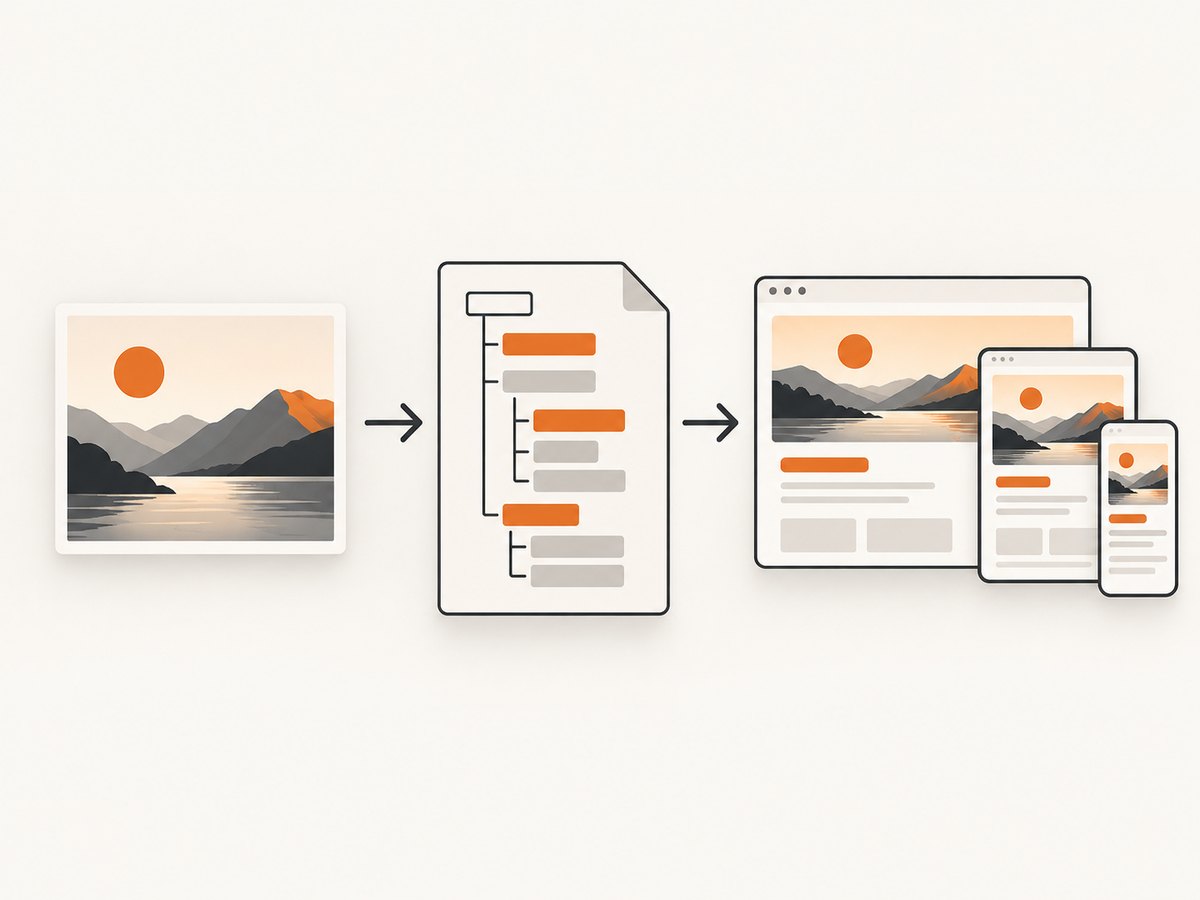
- Measure the reference. Record viewport width and height, major regions, columns, spacing, colors, type sizes, and image aspect ratios.
- Inventory content. Transcribe visible text, identify links and buttons, and separate informative imagery from decoration.
- Choose semantic elements. Use
header,nav,main,section,article,footer, headings, lists, buttons, and links. - Build layout first. Use CSS Grid for page regions and Flexbox for one-dimensional groups. Match container width, gaps, and alignment before fine typography.
- Add real content. Put text in HTML rather than leaving it baked into a screenshot. Replace image fragments with licensed image or SVG assets.
- Implement states. Add hover, focus, disabled, expanded, validation, and loading states where the design implies them.
- Test multiple widths. Compare the result at the reference viewport, then test narrow phones, tablets, and wide displays.
<!doctype html>
<html lang='en'>
<head>
  <meta charset='utf-8'>
  <meta name='viewport' content='width=device-width, initial-scale=1'>
  <title>Product landing page</title>
  <style>
    :root { color-scheme: light; font-family: system-ui, sans-serif; }
    * { box-sizing: border-box; }
    body { margin: 0; color: #172033; background: #f6f8fb; }
    .shell { max-width: 1120px; margin: auto; padding: 24px; }
    header { display: flex; justify-content: space-between; align-items: center; gap: 24px; }
    nav { display: flex; gap: 16px; }
    .hero { display: grid; grid-template-columns: 1fr 1fr; gap: 48px; align-items: center; padding: 80px 0; }
    .hero img { width: 100%; height: auto; border-radius: 16px; }
    .button { display: inline-block; padding: 12px 18px; border-radius: 8px; background: #2457d6; color: white; text-decoration: none; }
    @media (max-width: 720px) {
      .hero { grid-template-columns: 1fr; padding: 48px 0; }
      header { align-items: flex-start; flex-direction: column; }
    }
  </style>
</head>
<body>
  <div class='shell'>
    <header>
      <a href='/' aria-label='Acme home'>Acme</a>
      <nav aria-label='Primary'><a href='#features'>Features</a><a href='#pricing'>Pricing</a></nav>
    </header>
    <main>
      <section class='hero' aria-labelledby='hero-title'>
        <div>
          <p>A short eyebrow</p>
          <h1 id='hero-title'>A headline you can edit</h1>
          <p>This paragraph is real HTML, so it can be searched, translated, resized, and read by assistive technology.</p>
          <a class='button' href='/signup'>Start now</a>
        </div>
        <img src='hero.webp' alt='Dashboard showing a weekly project summary' width='900' height='700'>
      </section>
    </main>
  </div>
</body>
</html>
5. Accessibility, SEO, and content checks
Google calls alt text the most important image metadata and says it also improves accessibility. Write concise text that communicates the image’s purpose; do not stuff keywords. Use alt='' for decorative images, but never omit the attribute. A web.dev image guide explains when contextual images belong in HTML and when decorative imagery belongs in CSS.
- Use
figureandfigcaptionwhen a caption is part of the content. - Keep headings in logical order and make controls actual links or buttons.
- Check keyboard focus, color contrast, zoom to 200%, and reduced-motion preferences.
- Give informative SVGs an accessible name; decorative SVGs can be hidden from assistive technology.
- Keep important words out of the bitmap so search engines and users can access them.
Google’s image documentation covers supported formats and image discovery. SVG can be embedded as an image, inline markup, CSS imagery, or canvas. MDN describes important capability and security differences between image-context and inline SVG.
6. SVG versus raster images
Choose SVG for logos, icons, diagrams, and other artwork that must stay sharp at any size. Choose PNG, JPEG, WebP, or AVIF for photographs and complex raster imagery. An SVG loaded through <img> is isolated from the surrounding document; inline SVG can interact with the DOM and may load external resources, so review untrusted SVG files before embedding them.
7. Using screenshot-to-code tools responsibly
Vision-language systems can infer a page draft from a screenshot. The 2024 WebSight research describes screenshot or sketch to HTML as a research task, not a guarantee of production-ready code. Treat generated output as scaffolding.
- Replace guessed text with the source copy.
- Remove inline scripts you did not request and audit all URLs.
- Fix missing labels, heading order, focus behavior, and keyboard interaction.
- Check responsive breakpoints instead of trusting one viewport.
- Confirm that fonts, images, and icons are licensed and available in production.
8. Capture a reference image for comparison
If you are rebuilding a live page, capture the reference at a known viewport and compare your HTML render against it. You can use a browser locally, or call ScreenshotNeo, a website screenshot API and MCP server. The API returns PNG, JPEG, WebP, or PDF from one GET request and supports full-page and element capture, device presets, custom CSS and JavaScript, waits, headers, cookies, blocking rules, caching, and more.
9. Or skip the browser setup
ScreenshotNeo handles the capture before you start rebuilding:
curl -G 'https://api.screenshotneo.com/v1/shot' -d access_key=YOUR_API_KEY --data-urlencode url=https://stripe.com -o shot.webpSee the ScreenshotNeo API documentation for all options. The same request in Python:
import requests
r = requests.get('https://api.screenshotneo.com/v1/shot', params={'access_key': 'YOUR_API_KEY', 'url': 'https://stripe.com'}, timeout=90)
open('shot.webp', 'wb').write(r.content)
And Node.js:
const q = new URLSearchParams({ access_key: 'YOUR_API_KEY', url: 'https://stripe.com' });
const res = await fetch(`https://api.screenshotneo.com/v1/shot?${q}`);
if (!res.ok) throw new Error(`HTTP ${res.status}`);
const fs = await import('node:fs/promises');
await fs.writeFile('shot.webp', Buffer.from(await res.arrayBuffer()));
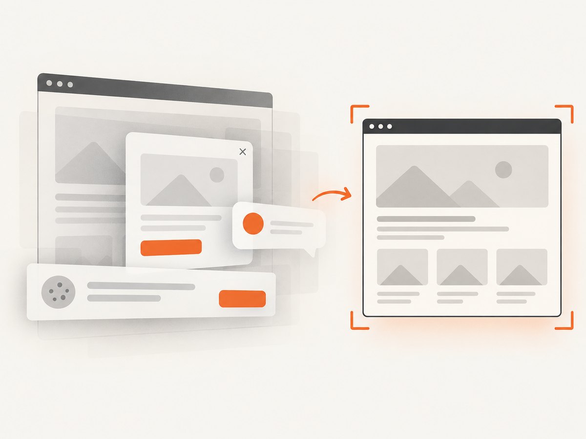
Cookie and consent banners, newsletter popups, and chat widgets are removed before the shot. Bot checks, blank pages, failed loads, timeouts, and cache hits are not billed; response headers such as X-Page-Verdict and X-Billed tell you what happened. An MCP server provides take_screenshot, get_page_info, and capture_pdf for Claude, Cursor, and other MCP clients. The free plan includes 1,000 screenshots per month with no card; paid plans start at $5 for 3,000.
Create a free ScreenshotNeo account and use the captured reference while you turn the design into semantic HTML.
10. Relevant capture options
| Need | Option to use |
|---|---|
| Entire document | Full-page capture with lazy images loaded |
| One component | Capture an element by CSS selector |
| Visual variants | Dark mode, device presets, custom viewport, retina scale |
| Stable test state | Wait for selector, delay, or network idle; click an element first |
| Privacy or noise control | Hide selectors; block ads, trackers, requests, or resource types |
| Authenticated pages | Custom headers, cookies, user agent, and Authorization |
| Location-sensitive pages | Timezone and geolocation |
| Output control | PNG, JPEG, WebP, transparent background, resizing, or PDF with paper size, margins, landscape, and page ranges |
| Repeated references | Choose a cache TTL; use signed links for public image tags |
| Large batches | Async jobs with signed webhooks or bulk capture of up to 100 URLs per call |
11. Troubleshooting
The image is broken
Check the URL, filename case, server response, and browser network panel. A relative path is resolved from the document URL, not your source file’s directory in an editor. Serve the project over HTTP when testing modules or local assets.
The page jumps while loading
Add known width and height, or use CSS aspect-ratio. Reserve space for ads and lazy content.
The screenshot does not match
Fix the viewport, device scale, fonts, timezone, and data state first. Then compare container width, grid gaps, line height, and image cropping. Wait for a selector or network idle when client-side rendering is still in progress.
Text in the screenshot is unreadable to search or assistive technology
Recreate it as HTML text. Alt text describes an image; it does not turn every word printed inside a screenshot into semantic page content.
A capture shows a cookie banner or chat bubble
Remove the element in your local browser with a selector or custom script. With ScreenshotNeo, consent handling and removal of more than 60 known consent platforms, newsletter popups, and chat widgets happen before capture, and each step can be disabled when needed.
A ScreenshotNeo request is not billed or returns an unexpected verdict
Read X-Page-Verdict and X-Billed. Bot checks, blank pages, failed loads, timeouts, and cache hits are free. Verify the target URL, authentication headers, wait condition, and resource blocks before retrying.
12. Performance, reliability, and cost
For your HTML, serve appropriately sized responsive images, prefer modern formats when supported, reserve dimensions, and avoid embedding large data URLs. Cache immutable assets with long cache headers. For visual comparisons, keep capture settings identical and cache references with a deliberate TTL.
For automated captures, set a finite client timeout, retry only transient failures, and record the verdict headers. Use async jobs and signed webhooks for long or high-volume work; bulk capture supports up to 100 URLs per call. Do not assume a screenshot proves that every script or interaction works: test the rebuilt page itself.
ScreenshotNeo plans are Free (1,000 shots/month), Starter ($5 for 3,000), Growth ($15 for 15,000), Pro ($39 for 60,000), Scale ($99 for 250,000), and Business ($249 for 1,000,000). Yearly billing gives two months free, and every feature is available on every plan.
13. Conversion checklist
- Did you choose embedding, data URL, SVG, or reconstruction?
- Does every image have useful
alttext or intentionalalt=''? - Are important words and controls real HTML?
- Are width, height, and responsive sources set?
- Does the layout work on narrow and wide screens?
- Can a keyboard user reach and operate every control?
- Did you audit generated code, scripts, URLs, and asset licenses?
- Did you compare against a reference at the same viewport and state?
FAQ
Can HTML be generated perfectly from one image?
No. A screenshot does not contain the original DOM, CSS rules, breakpoints, or behavior. It can produce a close visual draft that needs review.
Should I use a background image or an img element?
Use <img> for meaningful content and CSS backgrounds for decoration, as recommended by web.dev.
Is Base64 better than a normal image URL?
Only when a small self-contained artifact matters. Normal files cache better and keep HTML smaller.
How do I make a screenshot-derived page responsive?
Infer layout rules rather than copying pixel coordinates: use Grid or Flexbox, fluid widths, sensible breakpoints, and content that can wrap.
Can I use a screenshot as the final website?
You can, but it loses selectable text, accessibility, responsive reflow, and interactive behavior. Rebuild the meaningful content when those qualities matter.


