How to Convert a Screenshot into HTML and CSS
Turn a screenshot into a responsive HTML and CSS page with a practical inspect, build, render, compare, and refine workflow.
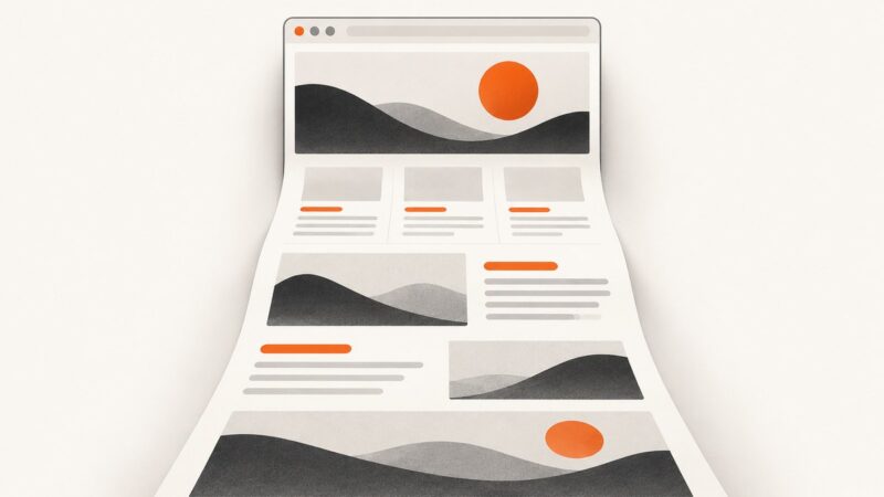
A screenshot gives you pixels, not the original layout rules. The reliable way to convert it into HTML and CSS is to inspect the image, write semantic structure, establish the page geometry, style the visual details, render at the reference viewport, compare the largest mismatches, and repeat. Then test widths and states that the single screenshot cannot show.
1. What a screenshot can—and cannot—tell you
Record what is visible before writing code:
- Page regions and their order: header, navigation, hero, content sections, cards, footer.
- Alignment: centered container, edge-to-edge sections, columns, gutters, and repeated baselines.
- Approximate dimensions: container width, header height, card size, gaps, and padding.
- Visual rules: type hierarchy, colors, border radius, borders, shadows, gradients, and image crops.
- Repeated patterns: buttons, cards, badges, form fields, icons, and navigation links.
Separate observations from guesses. A flattened image does not reveal the exact font file, design-token names, hover and focus states, hidden content, interaction behavior, or responsive breakpoints. It shows one state at one viewport. Treat unknowns as decisions you will document and revise.
2. Gather better source material when possible
If the screenshot came from an existing design, ask for the original Figma frame, asset files, font files, tokens, and component library. Real layers expose spacing, components, and names that a bitmap cannot. If you only have an image, crop the target component and annotate the area that matters. A full-page screenshot is appropriate for page layout; a detail crop is better for a single control or card.
3. Inventory the screenshot
Create a short implementation brief before coding:
| Question | Example note |
|---|---|
| Reference viewport | 1440 × 900 pixels |
| Content width | Centered column, roughly 1120 pixels |
| Layout | Two columns above 900 pixels; stacked below |
| Typography | Large sans-serif heading, compact body text, medium button labels |
| Color system | Dark text, pale page background, one accent color |
| Unknowns | Exact font, mobile navigation behavior, hover states |
Use the inventory to choose sensible variables. Do not chase one-pixel values before the main geometry is correct.
4. Build semantic HTML first
Use elements that describe purpose: header, nav, main, section, article, headings, real links, and real buttons. A semantic tree improves keyboard navigation and gives assistive technology useful structure. Use ARIA only when a native element does not express the behavior.
<!doctype html>
<html lang="en">
<head>
<meta charset="utf-8">
<meta name="viewport" content="width=device-width, initial-scale=1">
<title>Northstar — Product planning</title>
<link rel="stylesheet" href="styles.css">
</head>
<body>
<header class="site-header">
<a class="brand" href="/" aria-label="Northstar home">Northstar</a>
<nav aria-label="Primary navigation">
<a href="#features">Features</a>
<a href="#pricing">Pricing</a>
<a href="#contact">Contact</a>
</nav>
<a class="button button-small" href="#signup">Get started</a>
</header>
<main>
<section class="hero" aria-labelledby="hero-title">
<div class="hero-copy">
<p class="eyebrow">Plan with confidence</p>
<h1 id="hero-title">Make complex work feel simple.</h1>
<p class="lede">A focused workspace for turning ideas into an executable plan.</p>
<div class="hero-actions">
<a class="button" href="#signup">Start free</a>
<a class="text-link" href="#features">Explore features →</a>
</div>
</div>
<div class="hero-art" aria-hidden="true">
<div class="window-card"><span>Next milestone</span><strong>Launch v2.4</strong></div>
</div>
</section>
<section id="features" class="feature-grid" aria-labelledby="features-title">
<h2 id="features-title">Everything in one view</h2>
<article class="feature-card"><h3>Clear priorities</h3><p>Keep the important work visible.</p></article>
<article class="feature-card"><h3>Shared context</h3><p>Give every decision a home.</p></article>
<article class="feature-card"><h3>Useful momentum</h3><p>Turn plans into next actions.</p></article>
</section>
</main>
<footer id="contact" class="site-footer">
<p>© 2026 Northstar</p>
</footer>
</body>
</html>5. Establish layout and design tokens in CSS
Start with page width, columns, and section spacing. Then add typography, colors, borders, and effects. CSS Grid and Flexbox usually survive content changes better than absolute coordinates copied from a single image.
:root {
  --page: #f5f6f8;
  --surface: #ffffff;
  --ink: #17202a;
  --muted: #667085;
  --accent: #635bff;
  --line: #e5e7eb;
  --radius: 18px;
  --content: 1120px;
}

* { box-sizing: border-box; }
html { scroll-behavior: smooth; }
body {
  margin: 0;
  background: var(--page);
  color: var(--ink);
  font-family: Inter, ui-sans-serif, system-ui, -apple-system, sans-serif;
  line-height: 1.5;
}
a { color: inherit; }
.site-header, .hero, .feature-grid, .site-footer {
  width: min(100% - 48px, var(--content));
  margin-inline: auto;
}
.site-header {
  min-height: 76px;
  display: flex;
  align-items: center;
  justify-content: space-between;
  gap: 24px;
}
.brand { font-weight: 750; text-decoration: none; letter-spacing: -.03em; }
nav { display: flex; gap: 24px; font-size: .95rem; }
nav a, .text-link { text-decoration: none; }
.button {
  display: inline-flex;
  align-items: center;
  justify-content: center;
  min-height: 48px;
  padding: 0 20px;
  border-radius: 999px;
  background: var(--accent);
  color: white;
  font-weight: 650;
  text-decoration: none;
}
.button-small { min-height: 40px; padding-inline: 16px; font-size: .9rem; }
.hero {
  display: grid;
  grid-template-columns: minmax(0, 1fr) minmax(320px, .85fr);
  align-items: center;
  gap: 64px;
  padding-block: 96px 112px;
}
.eyebrow { color: var(--accent); font-size: .8rem; font-weight: 750; letter-spacing: .1em; text-transform: uppercase; }
h1 { max-width: 10ch; margin: 0; font-size: clamp(3rem, 8vw, 6.5rem); line-height: .95; letter-spacing: -.07em; }
.lede { max-width: 48ch; margin: 28px 0; color: var(--muted); font-size: 1.2rem; }
.hero-actions { display: flex; align-items: center; gap: 24px; flex-wrap: wrap; }
.hero-art { min-height: 360px; display: grid; place-items: center; border-radius: 32px; background: linear-gradient(145deg, #d9d7ff, #b8f0e1); }
.window-card { width: min(76%, 340px); padding: 28px; border-radius: var(--radius); background: var(--surface); box-shadow: 0 24px 70px rgb(23 32 42 / 18%); }
.window-card span { display: block; color: var(--muted); font-size: .85rem; }
.window-card strong { display: block; margin-top: 8px; font-size: 1.5rem; }
.feature-grid { display: grid; grid-template-columns: repeat(3, 1fr); gap: 20px; padding-block: 0 96px; }
.feature-grid h2 { grid-column: 1 / -1; margin: 0 0 12px; font-size: 2rem; }
.feature-card { padding: 28px; border: 1px solid var(--line); border-radius: var(--radius); background: var(--surface); }
.feature-card h3 { margin-top: 0; }
.feature-card p { margin-bottom: 0; color: var(--muted); }
.site-footer { padding-block: 28px; border-top: 1px solid var(--line); color: var(--muted); }
@media (max-width: 800px) {
  .site-header, .hero, .feature-grid, .site-footer { width: min(100% - 32px, var(--content)); }
  nav { display: none; }
  .hero { grid-template-columns: 1fr; gap: 40px; padding-block: 64px 80px; }
  .hero-art { min-height: 260px; }
  .feature-grid { grid-template-columns: 1fr; padding-bottom: 64px; }
}
@media (prefers-reduced-motion: reduce) { html { scroll-behavior: auto; } }
6. Render at the exact reference viewport
Open the page at the screenshot’s width and height. If the original viewport is unknown, start with the image dimensions and record that assumption. Capture your implementation, place it beside the reference, and compare in this order:
- Outer geometry: page width, header height, section positions, and column proportions.
- Component geometry: card dimensions, button sizes, image crops, and gaps.
- Typography: font family, size, weight, line height, and wrapping.
- Surface details: colors, borders, radii, shadows, gradients, and icons.
Fix one large mismatch at a time. Changing several variables at once makes it difficult to know which adjustment helped.
7. Test widths and states the screenshot does not show
A screenshot cannot establish the original responsive behavior. Resize to narrow and wide viewports and decide what should happen when text wraps, cards multiply, or navigation no longer fits. Check:
- Mobile overflow and horizontal scrolling.
- Heading and button wrapping.
- Grid-to-stack transitions.
- Keyboard focus visibility and tab order.
- Hover, focus, disabled, loading, and error states.
- Images with missing or slow-loading assets.
Use content-driven breakpoints rather than copying a breakpoint value without understanding the layout. If a navigation row stops fitting at 860 pixels, that is evidence for a breakpoint near that width.
8. Accessibility review
- Keep one meaningful
h1and an ordered heading hierarchy. - Use links for navigation and buttons for actions.
- Give icon-only controls an accessible name.
- Provide concise alt text for informative images; mark decorative images with empty alt text.
- Keep visible focus styles.
- Check text and control contrast against their backgrounds.
- Do not rely on color alone to communicate status.
Accessibility guidance helps you find defects, but you still need to check the requirements that apply to your product and audience.
9. When AI can help—and where it cannot
AI can produce a useful first draft from a clear screenshot when you provide the viewport, target framework, file structure, marked regions, and behavior requirements. Ask for semantic HTML, responsive CSS, named variables, and a short list of assumptions. Then review every generated value.
Screenshot-to-editable-design and design-file-to-code are different workflows. A design tool may infer editable layers from a screenshot; a code tool that starts from a structured design frame can read actual components, spacing, and tokens. Neither removes the need to validate custom or ambiguous elements. A screenshot alone cannot supply original token names or hidden states.
10. Troubleshooting common mismatches
| Symptom | Likely cause | Fix |
|---|---|---|
| Everything is slightly too wide | Wrong container width or box sizing | Set box-sizing: border-box globally and constrain the outer container. |
| Text wraps differently | Different font, weight, width, or letter spacing | Load the intended font if available, then tune width, size, weight, and line height in that order. |
| Cards drift vertically | Fixed heights or inconsistent content | Use grid or flex alignment and allow content-driven height. |
| Mobile view clips | Hard-coded widths or absolute positioning | Replace fixed widths with minmax(), percentages, and a deliberate stack breakpoint. |
| Images look wrong | Incorrect crop or intrinsic dimensions | Set an explicit aspect ratio and choose object-fit: cover or contain based on the reference. |
| Shadow feels heavier | Opacity, blur, or spread is too large | Reduce opacity first, then blur and spread; compare against the surrounding background. |
| Buttons are not keyboard usable | Clickable div or missing focus style |
Use a native button or a and add a visible :focus-visible rule. |
| Layout matches only one width | Coordinates copied from the image | Rebuild the relationship with Grid/Flexbox and test intermediate widths. |
11. Performance and reliability notes
- Prefer system fonts or preload only the font files you need.
- Serve appropriately sized images and reserve their dimensions to prevent layout shift.
- Keep decorative effects inexpensive; large shadows and filters can cost more on low-power devices.
- Use CSS variables for repeated values so iteration does not create conflicting declarations.
- Keep layout decisions in CSS instead of measuring the screenshot at runtime.
- Test with slow network conditions and disabled JavaScript when the page should still present its core content.
Visual fidelity is a balance. A perfect match at one viewport is not reliable if a longer heading, translated label, or smaller screen breaks the page.
12. Or skip the browser setup
If you need reference screenshots while implementing or reviewing pages, ScreenshotNeo returns a PNG, JPEG, WebP, or PDF from one GET request. Its capture can accept consent banners before the shot and remove more than 60 known consent platforms, newsletter popups, and chat widgets; each step can be disabled.
Only clean shots are billed. Bot checks or CAPTCHAs, blank pages, timeouts, failed loads, and cache hits cost nothing, and the response identifies the result with X-Page-Verdict and X-Billed headers. ScreenshotNeo also provides an MCP server with take_screenshot, get_page_info, and capture_pdf for Claude, Cursor, and other MCP clients.
See the ScreenshotNeo API documentation for all options.
cURL
curl -G "https://api.screenshotneo.com/v1/shot" -d access_key=YOUR_API_KEY --data-urlencode url=https://stripe.com -o shot.webpPython
import requests

r = requests.get(
    "https://api.screenshotneo.com/v1/shot",
    params={"access_key": "YOUR_API_KEY", "url": "https://stripe.com"},
    timeout=90,
)
r.raise_for_status()
open("shot.webp", "wb").write(r.content)
Node.js
const q = new URLSearchParams({
  access_key: 'YOUR_API_KEY',
  url: 'https://stripe.com'
});
const res = await fetch(`https://api.screenshotneo.com/v1/shot?${q}`);
if (!res.ok) throw new Error(`Screenshot failed: ${res.status}`);
const data = Buffer.from(await res.arrayBuffer());
await import('node:fs/promises').then(fs => fs.writeFile('shot.webp', data));
ScreenshotNeo supports full-page capture with lazy images loaded, CSS-selector element capture, dark mode, device presets and custom viewports, retina scale, PDF paper sizes and page ranges, custom CSS and JavaScript, clicks, selector or network-idle waits, request blocking, headers, cookies, user agents, authorization, timezone, geolocation, transparent backgrounds, resizing, caching with a chosen TTL, signed image links, asynchronous jobs with signed webhooks, bulk capture of up to 100 URLs per call, a usage API, and an OpenAPI specification. Parameter names used by other screenshot APIs also work to ease migration.
Plans include 1,000 screenshots per month free with no card; paid plans start at $5 for 3,000. Yearly billing gives two months free, and every feature is available on every plan. Create a free ScreenshotNeo account to get started.
13. FAQ
Can I recover the exact original CSS from a screenshot?
No. You can reproduce the visible result, but the original tokens, DOM, fonts, hidden states, and responsive rules are not encoded in pixels.
Should I use absolute positioning?
Use it for genuinely positioned decoration or overlays. Build the main page with normal flow, Grid, and Flexbox so content changes and resizing remain stable.
What should I do when the font is unknown?
Choose a metrically similar fallback, record the assumption, and tune width, size, weight, and line height after the main geometry is correct.
Is generated screenshot-to-code production ready?
Treat it as a draft. Review semantics, responsive behavior, keyboard use, asset licensing, loading performance, and every ambiguous element before shipping.
How many reference sizes should I capture?
At minimum, capture the reference viewport plus a narrow phone width, a typical tablet width, and a wider desktop width. Add states that matter to your product.