How to Create Border Gradients in CSS
Learn three reliable CSS techniques for gradient borders, including rounded corners, fallbacks, debugging tips, and browser compatibility.

A CSS gradient border is easiest to create with border-image:
.gradient-border {
  border: 4px solid;
  border-image: linear-gradient(90deg, #7c3aed, #06b6d4) 1;
}
The linear-gradient() function produces a CSS image, and border-image can use that image as the border source. Give the element a nonzero border width and a border style. For rounded corners, use two background layers clipped to padding-box and border-box, because border-image does not follow border-radius.
1. The basic gradient border with border-image
Use this method for a simple border, especially when square corners are acceptable.
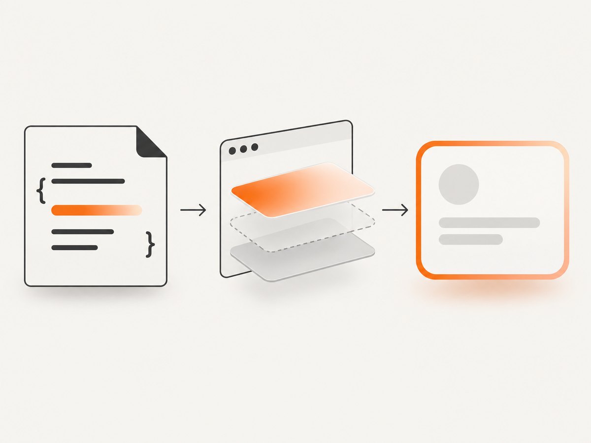
.gradient-border {
  border: 4px solid;
  border-image: linear-gradient(90deg, #7c3aed, #06b6d4) 1;
  padding: 1rem;
}
The final 1 is the slice value. It tells the browser how to divide the gradient image for the border. A value of 1 is a compact choice for a uniform border, while larger slice values can be useful when your source image has a more complex design.
You can change the direction and add as many color stops as needed:
.sunset-border {
  border: 6px solid;
  border-image: linear-gradient(to right, #f97316, #db2777, #7c3aed) 1;
}

.diagonal-border {
  border: 3px solid;
  border-image: linear-gradient(135deg, #22c55e, #06b6d4, #3b82f6) 1;
}
CSS gradients are generated by the browser and scale with the element, so you do not need to create or ship a raster border image. The MDN border-image reference documents gradient sources and the required border dimensions.
Why the border may not appear
A border image is painted only when there is a border to paint. Set both a visible width and a style:
/* Reliable */
.card {
  border-width: 4px;
  border-style: solid;
  border-image: linear-gradient(90deg, #7c3aed, #06b6d4) 1;
}

/* Common mistake: width is zero */
.card {
  border: 0;
  border-image: linear-gradient(90deg, #7c3aed, #06b6d4) 1;
}
Some browsers will not render a border image when the style is none or the width is zero. Setting border: 4px solid avoids that class of problem.
2. Rounded gradient borders with layered backgrounds
border-image does not shape itself around border-radius. For a rounded card with an opaque interior, layer an inner fill above a gradient background:
.rounded-gradient-border {
  border: 3px solid transparent;
  border-radius: 16px;
  background:
    linear-gradient(#fff, #fff) padding-box,
    linear-gradient(135deg, #7c3aed, #06b6d4) border-box;
  padding: 1.25rem;
}
The first background is painted on top and is clipped to the padding box, so it fills the content area without covering the border. The second layer is clipped to the border box and supplies the gradient underneath the transparent border. The transparent border creates the space in which the gradient is visible.
For a dark card, change the inner fill:
.dark-card {
  border: 3px solid transparent;
  border-radius: 16px;
  background:
    linear-gradient(#111827, #111827) padding-box,
    linear-gradient(135deg, #f97316, #ec4899, #8b5cf6) border-box;
  color: white;
  padding: 1.25rem;
}
If the component already has a background, include that color or image as the top layer and preserve the clipping order. Replacing the existing background declaration can remove a texture, image, or state color unintentionally.
Transparent interiors need another construction
The layered example intentionally paints an opaque interior. It is not a transparent-center solution. If the area inside the border must reveal content behind the element, use a pseudo-element or a masking construction with carefully sized insets. A common pseudo-element approach is:
.transparent-gradient-border {
  position: relative;
  border: 0;
  border-radius: 16px;
  padding: 3px;
  isolation: isolate;
}

.transparent-gradient-border::before {
  content: '';
  position: absolute;
  inset: 0;
  z-index: -2;
  border-radius: inherit;
  background: linear-gradient(135deg, #7c3aed, #06b6d4);
}

.transparent-gradient-border::after {
  content: '';
  position: absolute;
  inset: 3px;
  z-index: -1;
  border-radius: 13px;
  background: transparent;
}
Use this pattern only when you understand the stacking context and the element behind the card. The inner pseudo-element must not paint an opaque color if the center is meant to stay transparent. Adjust the inner radius when the border is thick so the curves remain visually aligned.
3. The newer background-clip: border-area option
Newer CSS provides a direct way to clip a background to the area painted by the border:
.modern-gradient-border {
  border: 3px solid transparent;
  background-image: linear-gradient(135deg, #7c3aed, #06b6d4);
  background-origin: border-box;
  background-clip: border-area;
}

@supports not (background-clip: border-area) {
  .modern-gradient-border {
    border-color: #7c3aed;
  }
}
This syntax accounts for the border width and style, but support is not universal. WebKit’s background-clip: border-area article demonstrates the technique with a feature query and identifies its demo as running in Safari Technology Preview. The MDN background-clip documentation also cautions that parts of the latest syntax may not be implemented everywhere.
Keep a fallback outside or inside the feature query. If your target browsers are unknown, the layered-background method is a safer rounded-corner default.
4. Choosing the right method
| Method | Best use | Tradeoff |
|---|---|---|
border-image: linear-gradient(...) 1 |
Fast implementation with square corners | border-radius does not shape the border image |
Layered backgrounds with padding-box and border-box |
Rounded border around an opaque card | The inner layer supplies an opaque fill |
background-clip: border-area |
Modern direct clipping | Use a feature query because support varies |
| Pseudo-element or masking construction | Rounded border with a transparent center | More stacking and sizing details to maintain |
In practice, start with border-image when corners do not matter. Use layered backgrounds for the common rounded-card design. Add border-area as an enhancement after checking the browsers your project supports.

5. Gradient controls and reusable components
Custom properties make the same component adaptable across themes and states:
.gradient-card {
  --border-start: #7c3aed;
  --border-end: #06b6d4;
  --radius: 16px;
  --border-width: 3px;

  border: var(--border-width) solid transparent;
  border-radius: var(--radius);
  background:
    var(--card-background, #fff) padding-box,
    linear-gradient(135deg, var(--border-start), var(--border-end)) border-box;
}

.gradient-card.is-warning {
  --border-start: #f97316;
  --border-end: #ef4444;
}
Color stops can be positioned explicitly:
.stops {
  border: 4px solid;
  border-image: linear-gradient(
    90deg,
    #7c3aed 0%,
    #06b6d4 45%,
    #22c55e 100%
  ) 1;
}
linear-gradient() is broadly available, and its angle, colors, and stop positions can be changed without a separate asset. See the MDN linear-gradient reference and CSS backgrounds and borders guide for the underlying image and painting model.
6. Common errors and fixes
Rounded corners look square
Cause: border-image does not honor border-radius for shaping the image.
Fix: switch to the two-background method, or test background-clip: border-area with a fallback.
The gradient covers the whole card
Cause: the gradient is clipped to the border box without an inner layer.
Fix: add an opaque first layer clipped to padding-box:
background:
  linear-gradient(#fff, #fff) padding-box,
  linear-gradient(135deg, #7c3aed, #06b6d4) border-box;
The border is invisible
Cause: border width is zero, style is none, or the gradient is too close in color to the page.
Fix: use a visible width and solid style, then inspect the computed styles in developer tools.
The center is not transparent
Cause: the standard rounded pattern deliberately paints an inner fill.
Fix: use a pseudo-element or mask construction and verify that no inner layer has an opaque background.
The fallback is missing in an older browser
Cause: background-clip: border-area was used without a feature query.
Fix: keep the dependable declaration first, then enhance it in @supports, or provide a solid border fallback.
The border changes size when content changes
Cause: the border width is part of the element’s box model.
Fix: use box-sizing: border-box when the component must stay within a fixed width:
.gradient-card {
  box-sizing: border-box;
}
7. Performance, accessibility, and maintenance
Gradients are painted by the browser and usually avoid an additional network request. A very large number of animated gradient borders can still increase paint work, especially on low-power devices. Keep animations subtle, avoid animating many large cards at once, and respect reduced-motion preferences:
@media (prefers-reduced-motion: reduce) {
  .animated-border {
    animation: none;
  }
}
Do not use a gradient border as the only indication of focus, error, or success. Pair it with text, an icon, or another contrast-safe state. Check the contrast of the content inside the card, not just the colors of the border. Centralize colors and widths in custom properties so a design-system change does not require editing every selector.
8. Test checklist
- Confirm the element has a nonzero border width and a non-
nonestyle. - Check square and rounded variants separately.
- Test the actual browser range for
background-clip: border-area. - Verify the first background layer is the inner fill and the second is the gradient.
- Test long content, empty content, and unusually narrow widths.
- Check focus, hover, disabled, error, and high-contrast states.
- Inspect transparent-center variants against light and dark backgrounds.
Or skip the browser setup
If you are creating screenshots of gradient-border examples, ScreenshotNeo can capture the rendered page through one API request. It accepts the cookie or consent banner like a visitor and removes more than 60 known consent platforms, newsletter popups, and chat widgets before the capture; each step can be turned off. Bot checks, CAPTCHAs, blank pages, timeouts, failed loads, and cache hits are not billed, and response headers identify the page verdict and whether the request was billed.
See the ScreenshotNeo API documentation for the complete option list, including full-page capture with lazy images loaded, CSS selector element capture, dark mode, device presets, custom viewports, retina scale, custom CSS and JavaScript, click and wait actions, request blocking, headers, cookies, user agents, authorization, timezone, geolocation, transparent backgrounds, resizing, caching, signed links, asynchronous jobs, bulk capture, usage data, and the OpenAPI specification.
cURL
curl -G 'https://api.screenshotneo.com/v1/shot' \
  -d access_key=YOUR_API_KEY \
  --data-urlencode url=https://stripe.com \
  -o shot.webp
Python
import requests

r = requests.get(
    'https://api.screenshotneo.com/v1/shot',
    params={'access_key': 'YOUR_API_KEY', 'url': 'https://stripe.com'},
    timeout=90,
)
r.raise_for_status()
open('shot.webp', 'wb').write(r.content)
Node.js
const q = new URLSearchParams({
  access_key: 'YOUR_API_KEY',
  url: 'https://stripe.com'
});
const res = await fetch(`https://api.screenshotneo.com/v1/shot?${q}`);
if (!res.ok) throw new Error(`Screenshot failed: ${res.status}`);
const buffer = Buffer.from(await res.arrayBuffer());
require('fs').writeFileSync('shot.webp', buffer);
ScreenshotNeo also provides an MCP server with take_screenshot, get_page_info, and capture_pdf tools for Claude, Cursor, and other MCP clients. The Free plan includes 1,000 screenshots each month with no card; paid plans start at $5 for 3,000 screenshots, and every feature is available on every plan. Create a free ScreenshotNeo account.
FAQ
Can I use a gradient as a normal CSS border?
CSS does not accept a gradient directly in border-color. Use border-image, layered backgrounds, or a pseudo-element.
Does border-radius work with border-image?
No. Use the layered-background pattern for rounded corners.
What does the final 1 mean?
It is the border-image-slice value. It defines how the source image is divided to paint the border.
Is background-clip: border-area safe everywhere?
No. Treat it as an enhancement and provide a fallback or use the established layered method.
Can the inside of a rounded gradient border be transparent?
Not with the standard opaque-fill snippet. Use a pseudo-element or masking approach and test the stacking behavior.