How to Create Optimized Images for Websites
A practical guide to choosing formats, resizing, compressing, and serving responsive website images without slowing the page.
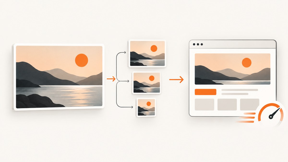
Optimized website images come from four decisions made together: choose a format that fits the content, resize to the rendered slot, compress while checking the visual result, and deliver only the right candidate at the right time.
1. Classify the image before optimizing
Start with the role of the asset because format and compression depend on what the pixels contain.
| Asset | Good starting point | Check before publishing |
|---|---|---|
| Photograph or detailed raster | WebP or AVIF where your audience supports it; JPEG can remain a fallback. | Fine detail, gradients, blocking, and text in the image. |
| Logo or simple illustration | SVG when the artwork is vector. | Dimensions, accessibility text, and safe SVG handling. |
| Transparent graphic | WebP, AVIF, PNG, or SVG depending on support and whether it is vector. | Edges against light and dark backgrounds. |
| Animation | A format that supports animation and matches browser requirements. | First-frame usefulness, file size, and reduced-motion behavior. |
There is no universal best format or quality number. Match the choice to compression, quality, browser support, transparency, and animation needs. MDN image file type guidance
2. Resize to the display slot
Find the largest CSS slot in which the image appears, then account for the device pixel ratio you intend to support. A 320px card should not download a 4,000px camera original.
- Measure rendered width for mobile, tablet, and desktop layouts.
- Multiply the largest important slot by the pixel-density range you support, then cap it at a sensible maximum.
- Keep intrinsic
widthandheightvalues so the browser can reserve space. - Retain the original only as an archival source; publish derivatives with predictable names.
Properly sizing images for the user’s device is a central way to reduce transferred bytes. web.dev image performance guidance
3. Compress and inspect the result
Use lossy compression for many photographs when the visual trade-off is acceptable. Use lossless compression when exact pixel data matters, but expect a larger file. Inspect at the actual display size and at a close zoom.
- Export a source derivative at target pixel dimensions.
- Encode lossy and lossless candidates in the selected format.
- Compare byte size and visual quality at each display size.
- Choose the smallest candidate that preserves the subject, edges, and legibility.
- Record format, dimensions, and quality in your build pipeline.
Squoosh and ImageOptim are named options for this step. Inspect every output. web.dev compression guidance
magick input.jpg -resize "1200x1200>" -strip -quality 82 public/images/photo-1200.jpg
magick input.jpg -resize "800x800>" -strip -quality 82 public/images/photo-800.jpg
magick input.jpg -resize "400x400>" -strip -quality 82 public/images/photo-400.jpg
This is an example pipeline, not a universal quality recommendation.
4. Serve responsive candidates
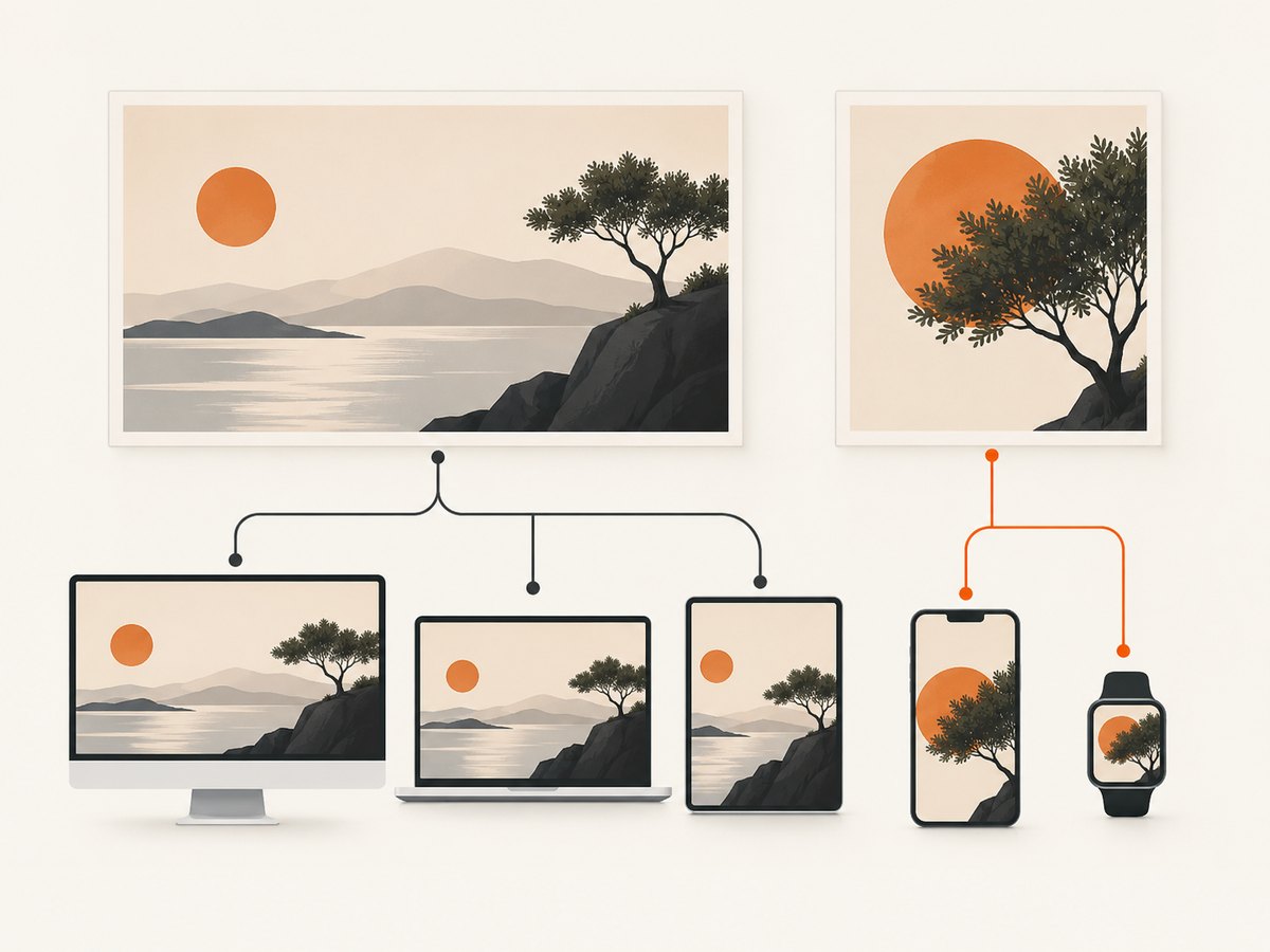
Use srcset for width candidates and sizes to describe the rendered slot. Use <picture> for explicit format selection or art direction.
<img
  src="/images/photo-800.jpg"
  srcset="/images/photo-400.jpg 400w,
          /images/photo-800.jpg 800w,
          /images/photo-1200.jpg 1200w"
  sizes="(max-width: 600px) 100vw, 800px"
  width="1200"
  height="800"
  alt="A cyclist crossing a bridge at sunrise"
>
sizes must describe your real CSS layout. MDN responsive images
Format fallback
<picture>
  <source type="image/avif" srcset="/images/hero-800.avif 800w, /images/hero-1200.avif 1200w" sizes="100vw">
  <source type="image/webp" srcset="/images/hero-800.webp 800w, /images/hero-1200.webp 1200w" sizes="100vw">
  <img src="/images/hero-800.jpg" srcset="/images/hero-800.jpg 800w, /images/hero-1200.jpg 1200w" sizes="100vw" width="1200" height="675" alt="A mountain trail above the clouds">
</picture>
Art direction
Use different crops when composition must change between breakpoints. Each <source media> can point to a deliberately cropped asset; keep the fallback <img> meaningful.
5. Set loading and priority deliberately
Below-the-fold images are candidates for loading="lazy". Do not lazy-load an important hero or likely LCP image. Set dimensions on every image. fetchpriority="high" can help a truly critical image, but use it sparingly. web.dev image loading guidance
<img src="/images/hero-1200.webp" width="1200" height="675" fetchpriority="high" alt="...">
<img src="/images/gallery-800.webp" width="800" height="600" loading="lazy" decoding="async" alt="...">
6. Make the markup accessible and stable
- Write useful alt text; use
alt=""for decorative images. - Keep width and height, or an equivalent aspect-ratio rule.
- Do not put essential text only inside a raster image.
- Use captions when additional context is needed.
- Serve the correct
Content-Typeand cache policy.
7. Validate the output
- Open the page on narrow and wide viewports.
- Inspect the network panel and confirm the selected candidate is close to the rendered size.
- Check that below-the-fold files wait until needed.
- Verify hero priority and ensure it is not lazy-loaded.
- Inspect edges, gradients, and text at display size.
- Test browsers and devices that matter to your audience.
8. Generate clean source captures
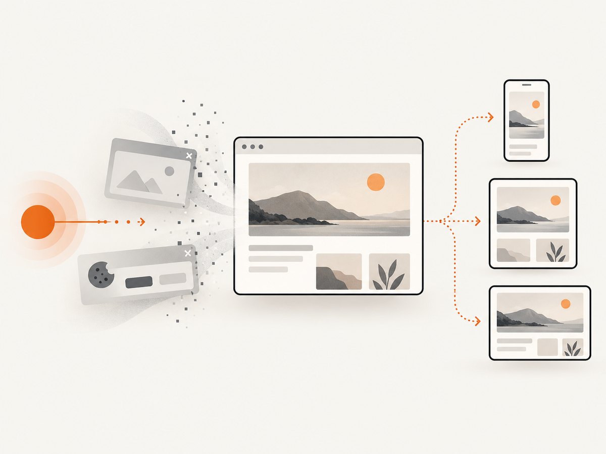
When the source is a web page, a screenshot can become an image asset or visual regression fixture. Cookie banners, newsletter popups, and chat widgets can contaminate the capture. Capture meaningful content first, then apply the resize and compression workflow above.
9. Troubleshooting
| Symptom | Cause | Fix |
|---|---|---|
| File is huge | Source dimensions exceed the display slot or metadata is bloated. | Generate a correctly sized derivative, strip metadata, and compare modern raster formats. |
| Largest candidate is downloaded | sizes is inaccurate or width descriptors are wrong. |
Measure the rendered slot and correct sizes; verify filenames match pixel widths. |
| Image looks soft | Candidate is too small or compression is aggressive. | Add a larger candidate or raise quality. |
| Layout jumps | Intrinsic dimensions are missing. | Set accurate width and height or an aspect-ratio box. |
| Hero appears late | It is lazy-loaded or discovered late. | Remove lazy loading, keep it in HTML, and reserve high priority for the actual hero. |
| Transparency or animation is lost | Replacement format lacks the required feature. | Choose a capable format and provide a fallback. |
| Text has halos | Lossy compression damaged high-contrast edges. | Use higher quality or lossless encoding. |
10. Performance, reliability, and cost notes
- Performance: reducing pixel dimensions usually removes more bytes than tuning quality on an oversized source.
- Reliability: keep deterministic filenames, retain sources, and automate derivatives in CI or your publishing pipeline.
- Browser support: choose formats from your real audience and keep fallbacks where required.
- Cost: fewer bytes reduce transfer and storage pressure, while many variants add build work. Start with actual layout slots.
11. Or skip the browser setup
ScreenshotNeo is a website screenshot API and MCP server. One GET request returns PNG, JPEG, WebP, or PDF. Cookie and consent banners are accepted and 60+ known consent platforms, newsletter popups, and chat widgets are removed before the shot; each step can be turned off. Bot checks, blank pages, timeouts, failed loads, and cache hits are not billed, and responses identify the page verdict and billing status.
See the ScreenshotNeo API documentation for full-page or selector capture, device and retina settings, custom CSS and JavaScript, waits, blocking rules, headers and cookies, geolocation, resizing, caching, signed links, async jobs, bulk capture, and the usage API.
cURL
curl -G "https://api.screenshotneo.com/v1/shot" \
  -d access_key=YOUR_API_KEY \
  --data-urlencode url=https://stripe.com \
  -o shot.webp
Python
import requests
r = requests.get("https://api.screenshotneo.com/v1/shot", params={"access_key": "YOUR_API_KEY", "url": "https://stripe.com"}, timeout=90)
r.raise_for_status()
open("shot.webp", "wb").write(r.content)
Node.js
const q = new URLSearchParams({ access_key: 'YOUR_API_KEY', url: 'https://stripe.com' });
const res = await fetch(`https://api.screenshotneo.com/v1/shot?${q}`);
if (!res.ok) throw new Error(`Screenshot failed: ${res.status}`);
const fs = await import('node:fs/promises');
await fs.writeFile('shot.webp', Buffer.from(await res.arrayBuffer()));
ScreenshotNeo includes 1,000 free shots each month with no card. Paid plans start at $5 for 3,000 shots, and every feature is included on every plan. Its MCP server exposes take_screenshot, get_page_info, and capture_pdf to Claude, Cursor, and other MCP clients. Create a free ScreenshotNeo account.
FAQ
What image format should I use?
Match format to content and requirements. WebP or AVIF suit many modern raster images; SVG suits vector artwork; transparency and animation can change the decision.
How do I reduce file size without losing quality?
Resize to the display role first, then compare lossy and lossless encodes at that rendered size.
Should every image use lazy loading?
No. Lazy loading is for images likely below the fold. Keep the important hero available early.
When do I need picture instead of srcset?
Use srcset for resolution switching. Use <picture> for explicit format alternatives or different crops.


