How to Create a Responsive Template
Build a responsive HTML template with mobile-first CSS, Flexbox or Grid, accessible reflow, testing steps, and automated screenshots.
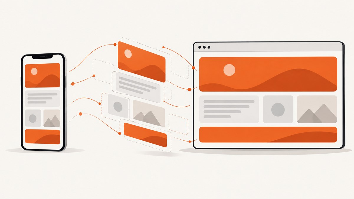
Direct answer: Create a responsive template by starting with a narrow, single-column layout, adding <meta name="viewport" content="width=device-width">, using fluid units and intrinsic sizing, and introducing content-driven breakpoints with Flexbox or CSS Grid. Keep the HTML source order logical, make media shrink inside its container, and verify the page continuously from phone width through desktop and 400% zoom.
Responsive design makes a page render well across screen sizes and resolutions while preserving usability. See MDN’s responsive design guide.
1. Start with semantic HTML and the viewport
Use meaningful regions such as header, nav, main, section, aside, and footer. Keep source order equal to the intended reading and keyboard order.

<!doctype html>
<html lang="en">
<head>
  <meta charset="utf-8">
  <meta name="viewport" content="width=device-width">
  <title>Responsive template</title>
  <link rel="stylesheet" href="styles.css">
</head>
<body>
  <header class="site-header">
    <a class="brand" href="/">Acme docs</a>
    <button class="menu-toggle" aria-expanded="false" aria-controls="site-nav">Menu</button>
    <nav id="site-nav" aria-label="Primary">
      <a href="/guide">Guide</a>
      <a href="/reference">Reference</a>
      <a href="/contact">Contact</a>
    </nav>
  </header>
  <main class="layout">
    <article class="content">
      <h1>Responsive template</h1>
      <p>Your main content goes here.</p>
    </article>
    <aside class="sidebar" aria-label="Related links">
      <h2>Related</h2>
      <ul><li><a href="/next">Next step</a></li></ul>
    </aside>
  </main>
  <footer>Copyright 2026 Acme</footer>
</body>
</html>
The viewport declaration tells mobile browsers to use the device width instead of rendering a roughly 980-pixel desktop canvas and zooming it out. Read MDN’s viewport documentation.
2. Build a fluid, mobile-first base
*, *::before, *::after { box-sizing: border-box; }
:root {
  --page-gutter: clamp(1rem, 4vw, 3rem);
  --measure: 72rem;
  --gap: clamp(1rem, 3vw, 2rem);
}
body { margin: 0; font: 1rem/1.5 system-ui, sans-serif; color: #1f2937; }
.site-header, .layout, footer {
  width: min(100% - 2 * var(--page-gutter), var(--measure));
  margin-inline: auto;
}
.site-header { display: flex; align-items: center; gap: 1rem; padding-block: 1rem; }
.menu-toggle { margin-inline-start: auto; }
nav { display: none; gap: 1rem; }
nav.is-open { display: flex; flex-direction: column; }
.layout { display: grid; gap: var(--gap); padding-block: 2rem; }
.content, .sidebar { min-width: 0; }
.content { max-width: 70ch; }
img, video, svg, canvas { display: block; max-width: 100%; height: auto; }
pre { overflow-x: auto; padding: 1rem; background: #f3f4f6; }
@media (min-width: 50rem) {
  .menu-toggle { display: none; }
  nav { display: flex; margin-inline-start: auto; }
  .layout { grid-template-columns: minmax(0, 2fr) minmax(14rem, 1fr); }
}
This starts as a single column. min(), clamp(), flexible tracks, and min-width: 0 prevent fixed-width overflow.
3. Choose Flexbox or Grid
| Need | Use | Pattern |
|---|---|---|
| One-dimensional row, column, toolbar, or wrapping cards | Flexbox | display:flex; flex-wrap:wrap; gap:1rem |
| Two-dimensional page regions | CSS Grid | grid-template-columns:minmax(0,2fr) minmax(14rem,1fr) |
.card-list { display: flex; flex-wrap: wrap; gap: 1rem; }
.card-list > * { flex: 1 1 16rem; }
.page-shell {
  display: grid;
  grid-template-columns: repeat(auto-fit, minmax(min(100%, 16rem), 1fr));
  gap: 1rem;
}
Flexbox wrapping and Grid functions such as auto-fit and minmax() often eliminate device-specific media queries.
4. Add content-driven breakpoints
Add a breakpoint when the current arrangement becomes cramped, such as when navigation wraps awkwardly or columns become too narrow. Use relative units such as rem; do not name breakpoints after devices.
@media (min-width: 50rem) { nav { display: flex; flex-direction: row; } }
.prose { width: min(100%, 70ch); }
.hero-title { font-size: clamp(2rem, 5vw, 4rem); }
.card-region { container-type: inline-size; }
@container (min-width: 36rem) {
  .card-grid { grid-template-columns: repeat(2, minmax(0, 1fr)); }
}
5. Make images, tables, and text safe
- Use
max-width:100%; height:autoon images and video. - Wrap wide tables in an element with
overflow-x:auto. - Use
overflow-wrap:anywherefor long URLs, hashes, and code. - Keep readable line lengths with
max-width:70ch. - Use
aspect-ratioto reserve media space and reduce layout shift. - Never disable user zoom.
.table-scroll { overflow-x: auto; }
figure img { aspect-ratio: 16 / 9; object-fit: cover; }
button, input, select, textarea { font: inherit; max-width: 100%; }
6. Preserve accessibility and reflow
Flexbox order and reverse properties can disconnect visual order from keyboard order. Keep the DOM logical and test at 400% zoom. The W3C reflow guidance recommends flexible regions that enlarge, shrink, or wrap with available space.
Check visible focus indicators, accessible names, contrast, touch target spacing, long translations, validation errors, and keyboard-only navigation.
7. Optional framework route: Bootstrap
Bootstrap is optional. Its official grid documentation describes a mobile-first fluid 12-column grid.
| Concern | Hand-written CSS | Bootstrap |
|---|---|---|
| Markup control | Complete | Framework classes shape markup |
| CSS shipped | Only what you author | Framework styles plus overrides |
| Breakpoints | Any content-driven values | Framework defaults unless customized |
| Onboarding | Requires CSS knowledge | Shared utility vocabulary |
8. Verify every responsive state
- Resize continuously from narrow phone width through tablet and desktop.
- Rotate to landscape.
- Use keyboard navigation and confirm source order.
- Check 200% and 400% zoom.
- Test long content, empty states, errors, translations, and unbroken URLs.
- Test slow networks and disabled JavaScript.
- Capture representative states for visual review.
9. Troubleshooting common failures
| Symptom | Cause | Fix |
|---|---|---|
| Zoomed-out page on mobile | Missing viewport tag | Add <meta name="viewport" content="width=device-width">. |
| Horizontal scrollbar | Fixed width, long token, or automatic grid minimum | Use fluid widths, minmax(0,1fr), min-width:0, and wrapping. |
| Image overflows | Intrinsic image width | Apply max-width:100%; height:auto. |
| Unreadably narrow columns | Device-based breakpoint | Use auto-fit/minmax() or move the breakpoint. |
| Keyboard order is wrong | CSS order |
Put content in logical DOM order and avoid unnecessary reordering. |
| Text clips at high zoom | Fixed heights or disabled zoom | Use auto heights, wrapping, and no user-scalable=no. |
10. Performance and reliability
- Prefer CSS layout over JavaScript resize handlers.
- Keep critical CSS small and defer nonessential scripts.
- Reserve image dimensions and use
srcset/sizesfor large images. - Test with throttled CPU and network.
- Use shared spacing and type custom properties.
- Automate captures only for representative states to control runtime and storage.
11. Or skip the browser setup
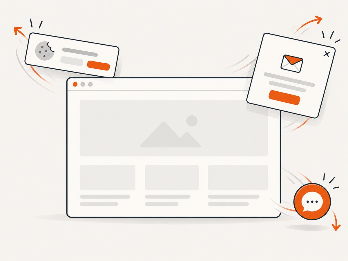
If you need screenshots of responsive states without maintaining a headless browser, ScreenshotNeo accepts one GET request and returns PNG, JPEG, WebP, or PDF. It supports any viewport, 12 device presets, retina scale, lazy-image loading, selector or network-idle waits, custom CSS and JavaScript, and element capture. Cookie banners, consent prompts, newsletter popups, and chat widgets are removed before capture. Bot checks, blank pages, timeouts, failed loads, and cache hits are never billed; responses identify the result with X-Page-Verdict and X-Billed headers. Its MCP server provides take_screenshot, get_page_info, and capture_pdf for Claude, Cursor, and other MCP clients.
See the ScreenshotNeo API docs for all options.
curl -G "https://api.screenshotneo.com/v1/shot" \
  -d access_key=YOUR_API_KEY \
  --data-urlencode url=https://example.com/responsive \
  -o responsive.webp
import requests
r = requests.get("https://api.screenshotneo.com/v1/shot", params={"access_key": "YOUR_API_KEY", "url": "https://example.com/responsive"}, timeout=90)
r.raise_for_status()
open("responsive.webp", "wb").write(r.content)const q = new URLSearchParams({ access_key: 'YOUR_API_KEY', url: 'https://example.com/responsive' });
const res = await fetch(`https://api.screenshotneo.com/v1/shot?${q}`);
if (!res.ok) throw new Error(`Screenshot failed: ${res.status}`);
const fs = await import('node:fs/promises');
await fs.writeFile('responsive.webp', Buffer.from(await res.arrayBuffer()));The Free plan includes 1,000 shots per month with no card. Paid plans start at $5 for 3,000 shots, with every feature on every plan. Create a free ScreenshotNeo account.
12. FAQ
Do I need a framework?
No. Flexbox, Grid, intrinsic sizing, and content-driven breakpoints are enough for most templates.
What is the best breakpoint?
The point where your content stops fitting comfortably. Resize until the layout fails, then change it there.
Can a responsive page have fixed widths?
Components can have maximum widths, but the page shell should remain fluid and capped.
How can I test automatically?
Capture representative viewport widths and combine visual checks with keyboard, zoom, and slow-network testing. ScreenshotNeo supports configurable viewports, waits, and device presets.


