How to Create a Thumbnail Background for a Website
Build responsive website thumbnails with the right crop, contrast, accessibility, metadata, and fallback behavior using practical HTML and CSS.
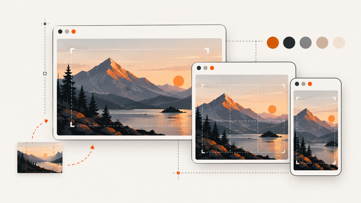
A website “thumbnail background” can mean two different things: a decorative image behind a card’s content, or an image that communicates the subject of a page. Use a CSS background-image for decoration. Use a semantic HTML image when the visual carries information, needs alternative text, or should be discoverable by search engines.
The reliable workflow is:
- Define the thumbnail container and its intended aspect ratio.
- Choose an image with a clear focal subject and enough resolution.
- Crop it with
background-size: coveror a responsive image element. - Position the focal point for the smallest important card size.
- Set a fallback color and preserve text contrast while the image loads.
- Test narrow viewports, zoom, slow loading, and missing images.
1. Decide whether the thumbnail is decorative or meaningful
Start with the purpose of the image, because the correct implementation depends on it.
| Use case | Recommended implementation | Why |
|---|---|---|
| Decorative texture, color, or atmosphere behind text | CSS background | The image supports the layout but is not required to understand the page. |
| Photo or illustration that identifies an article, product, or person | HTML img or picture |
You can provide alternative text, responsive sources, and image discovery. |
| Image shown when a URL is shared | Open Graph metadata such as og:image |
Social previews are separate from the page’s CSS background. |
MDN explains that browsers do not provide special information about CSS background images to assistive technology. If someone needs the image to understand the content, do not put that information only in CSS. Use an HTML image with useful alt text instead. See MDN’s background-image reference and Google’s image SEO guidance.
2. Build a decorative thumbnail background with CSS
This complete example creates a card with a background image, a fallback color, a dark overlay, and text that remains readable. The background is decorative, so the HTML heading supplies the meaning.
<article class="thumb-card">
  <div class="thumb-card__content">
    <p class="thumb-card__eyebrow">Guide</p>
    <h2>Create faster website previews</h2>
    <a href="/guides/previews" aria-label="Read the guide: Create faster website previews">
      Read the guide
    </a>
  </div>
</article>
.thumb-card {
/* Fallback shown before the image loads or when it fails. */
background-color: #243447;
background-image:
linear-gradient(90deg, rgba(0, 0, 0, .72), rgba(0, 0, 0, .12)),
url("/images/preview-background.webp");
background-size: cover;
background-position: 50% 40%;
background-repeat: no-repeat;
border-radius: 0.75rem;
color: #fff;
min-height: 13rem;
overflow: hidden;
position: relative;
}
.thumb-card__content {
display: flex;
flex-direction: column;
justify-content: flex-end;
min-height: inherit;
padding: clamp(1rem, 4vw, 2rem);
position: relative;
z-index: 1;
}
.thumb-card h2 {
font-size: clamp(1.25rem, 3vw, 2rem);
line-height: 1.1;
margin: 0 0 .75rem;
max-width: 18ch;
}
.thumb-card a {
color: #fff;
font-weight: 700;
}
@media (max-width: 32rem) {
.thumb-card {
min-height: 11rem;
background-position: 65% 40%;
}
}background-size: cover fills the container while preserving the source image’s proportions. It necessarily crops some edges when the container and source have different ratios. background-position controls which part remains visible; move it toward the focal subject rather than leaving every image at the default center.
Choose the crop from the real container
Do not pick a crop only by looking at the original file. Render the card at its actual desktop, tablet, and mobile widths. A face, product, or logo-like subject near an edge can disappear when a wide image is used in a tall card. Keep the subject near the safe area that survives the narrowest layout, or use separate assets when the composition changes substantially.
Avoid stretching an image to force a ratio. Distortion makes circles oval and people look unnaturally wide. Use cover for a filled card, contain when the entire artwork must remain visible, or an image editor to create a deliberate crop.
3. Use a semantic image when the thumbnail carries information
If the thumbnail identifies an article or product, use img. The following markup preserves the image’s meaning and lets the browser select an appropriate source.
<figure class="article-thumb">
  <picture>
    <source
      media="(max-width:  fortyrem)"
      srcset="/images/article-480.webp 480w, /images/article-768.webp 768w"
      sizes="100vw">
    <img
      src="/images/article-1200.webp"
      srcset="/images/article-480.webp 480w,
              /images/article-768.webp 768w,
              /images/article-1200.webp 1200w"
      sizes="(max-width: 40rem) 100vw, 33vw"
      width="1200"
      height="675"
      alt="A browser preview card showing a responsive website thumbnail"
      loading="lazy"
      decoding="async">
</picture>
</figure>
Replace the illustrative media query value with a valid CSS length such as 40rem in production. The fallback src matters for browsers that do not select a srcset candidate. The intrinsic width and height help reserve space and reduce layout movement.
.article-thumb {
  aspect-ratio: 16 / 9;
  background: #e8edf2;
  margin: 0;
  overflow: hidden;
}

.article-thumb img {
  display: block;
  height: 100%;
  max-width: 100%;
  object-fit: cover;
  object-position: 50% 50%;
  width: 100%;
}
Google says CSS images are not indexed as image content, while standard HTML image elements can be discovered. If image search or a meaningful text alternative matters, prefer this pattern. The W3C’s C37 responsive sizing technique also describes constraining images to available space while preserving proportions.
4. Set dimensions, focal position, and responsive behavior
There is no universal thumbnail pixel size. The right dimensions depend on the card, page layout, and preview surface. Define the ratio your design needs and keep it consistent across a component.
- Use
aspect-ratio: it gives the container a predictable shape before the image loads. - Use
object-positionorbackground-position: adjust the focal point instead of editing every layout. - Keep a safe area: leave visual breathing room around subjects that may be cropped.
- Test real text lengths: a two-line heading can cover the subject even when the image itself is positioned correctly.
- Check zoom and narrow widths: content should not overflow when users zoom or when the viewport is small.
For a decorative image behind text, add a gradient overlay in the same background-image declaration or with a positioned pseudo-element. Check contrast for every state. MDN references WCAG thresholds of 4.5:1 for normal body text and 3:1 for large text; verify your actual colors with a contrast checker.
5. Add a fallback color and loading strategy
Put background-color before the image declaration. Users will see that color while the image downloads and if the request fails. Choose a color that keeps the text readable without the image.
For content images, provide a useful fallback src. Use loading="lazy" for thumbnails below the fold, but let the main above-the-fold image load normally. Compress images to a practical size for their rendered dimensions, and generate only the variants your layout actually uses. WebP or another supported modern format can reduce transfer size, but retain a fallback source when your browser or delivery setup requires one.
6. Configure a thumbnail for social and page previews
An on-page background does not control the image used when a URL is shared. Add Open Graph metadata in the document head:
<meta property="og:image" content="https://example.com/images/article-preview.jpg">
<meta property="og:image:width" content="1200">
<meta property="og:image:height" content="630">
<meta property="og:image:alt" content="A responsive website thumbnail preview">
The Open Graph protocol defines these image properties. Use a representative, high-resolution image and avoid extreme aspect ratios. Metadata influences preview selection but does not guarantee that every platform will display exactly the same image.
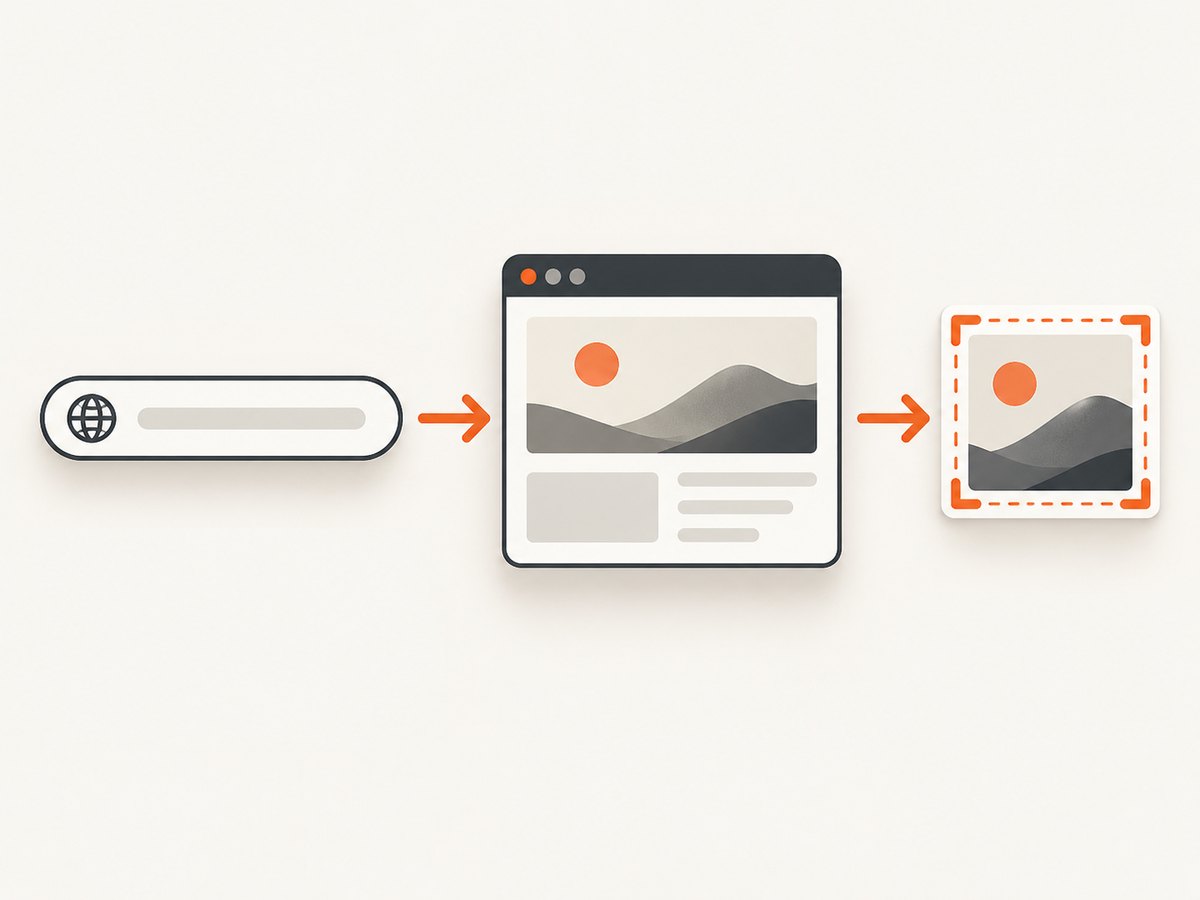
7. Capture a page thumbnail automatically
If you need thumbnails for many live pages, a screenshot service can render each URL after its CSS, fonts, and client-side scripts run. You can also capture the page yourself with a headless browser, but that requires managing browser binaries, waits, cookies, consent dialogs, failures, and image storage.

Or skip the browser setup
ScreenshotNeo returns a PNG, JPEG, WebP, or PDF from one GET request. Before capture it accepts cookie and consent banners and removes more than 60 known consent platforms, newsletter popups, and chat widgets; each step can be turned off. Bot checks and CAPTCHAs, blank pages, timeouts, failed loads, and cache hits cost nothing, and the response identifies the result with X-Page-Verdict and X-Billed headers.
See the ScreenshotNeo API documentation for all options. The basic call is:
curl -G "https://api.screenshotneo.com/v1/shot" \
  -d access_key=YOUR_API_KEY \
  --data-urlencode url=https://stripe.com \
  -o shot.webp
import requests
r = requests.get(
"https://api.screenshotneo.com/v1/shot",
params={"access_key": "YOUR_API_KEY", "url": "https://stripe.com"},
timeout=90,
)
r.raise_for_status()
open("shot.webp", "wb").write(r.content)const q = new URLSearchParams({
access_key: 'YOUR_API_KEY',
url: 'https://stripe.com'
});
const res = await fetch(`https://api.screenshotneo.com/v1/shot?${q}`);
if (!res.ok) throw new Error(`Screenshot failed: ${res.status}`);
const data = Buffer.from(await res.arrayBuffer());
await import('node:fs/promises').then(fs => fs.writeFile('shot.webp', data));For thumbnail backgrounds, relevant options include full-page capture with lazy images loaded, a CSS-selector element capture, dark mode, 12 device presets or any viewport, retina scale, custom CSS and JavaScript, click-before-capture, waits for a selector, delay, or network idle, blocked ads and trackers, custom headers, cookies, user agent and authorization, timezone and geolocation, transparent backgrounds, image resizing, and caching with a TTL you choose. You can also use signed links for public <img> tags, asynchronous jobs with signed webhooks, bulk capture for up to 100 URLs per call, a usage API, and the OpenAPI specification. Parameter names used by other screenshot APIs also work, which can simplify migration.
ScreenshotNeo also includes an MCP server with take_screenshot, get_page_info, and capture_pdf tools for Claude, Cursor, and other MCP clients. Pricing starts with 1,000 shots per month free without a card; paid plans start at $5 for 3,000 shots. Every feature is on every plan. Create a free ScreenshotNeo account to generate your first thumbnails.
8. Troubleshooting checklist
| Symptom | Likely cause | Fix |
|---|---|---|
| The subject is cut off | The container ratio differs from the source, or the focal point is off-center. | Adjust background-position/object-position, change the crop, or supply a mobile-specific source. |
| The image looks stretched | Width and height are forced independently. | Use cover, contain, or object-fit while preserving the aspect ratio. |
| Text is unreadable | The image has bright detail behind the text. | Add a gradient overlay, change the fallback color, move the text, and recheck contrast. |
| There is layout shift | The browser does not know the image’s dimensions before loading. | Set aspect-ratio or explicit width/height. |
| Screen readers miss the image | The image is a CSS background. | Use semantic img markup and meaningful alt text when the image conveys information. |
| The preview image is wrong when shared | Open Graph metadata is missing, cached, or points to another asset. | Set og:image and its optional dimensions and alt text; refresh the platform’s preview cache. |
| Screenshot capture shows a popup | The page requires consent or contains a newsletter/chat widget. | Use ScreenshotNeo’s cleanup steps, or configure a wait, click, hide selector, or custom script. |
| The API response is not an image | The URL failed, triggered a bot check, timed out, or returned an error. | Inspect the HTTP status and X-Page-Verdict/X-Billed headers, then retry with a valid URL and suitable wait settings. |
9. Performance, reliability, and cost considerations
- Keep files proportional: do not download a large source when the card renders at a small size. Use
srcsetandsizesfor HTML images. - Prevent cumulative movement: reserve the thumbnail’s space with a ratio or dimensions.
- Cache stable captures: choose a ScreenshotNeo cache TTL when a page does not change on every request.
- Batch repetitive work: use bulk capture for up to 100 URLs per call when generating a catalog.
- Separate failures from billing: ScreenshotNeo bills only clean shots; bot checks, blank pages, timeouts, failed loads, and cache hits are not billed.
- Use asynchronous jobs for large queues: signed webhooks let your worker receive completed captures without holding a request open.
- Protect credentials: keep the access key on your server. Signed links are available when a public image URL is required.
10. FAQ
Should I use a background image or an img element?
Use a background for decoration. Use img when the thumbnail communicates information, needs alternative text, or should be discoverable by search.
What ratio should a website thumbnail use?
Use the ratio required by the component or preview destination. No universal ratio fits every card; keep the focal subject visible at the smallest layout.
Can CSS backgrounds be indexed by Google?
Google says it does not index CSS images as image content. Use a standard HTML image when discovery matters.
Does og:image change the image inside my page?
No. Open Graph metadata describes the shared-page preview. Your CSS or HTML controls the image rendered on the page.
How can I generate thumbnails for pages that require JavaScript?
Use a browser-based capture service such as ScreenshotNeo, configure waits for the page state you need, and select the full page or a CSS element.


