How to Create Thumbnails for Web Apps
Learn how to generate fast, sharp web app thumbnails with responsive images, Sharp, canvas, ImageMagick, and on-demand services.
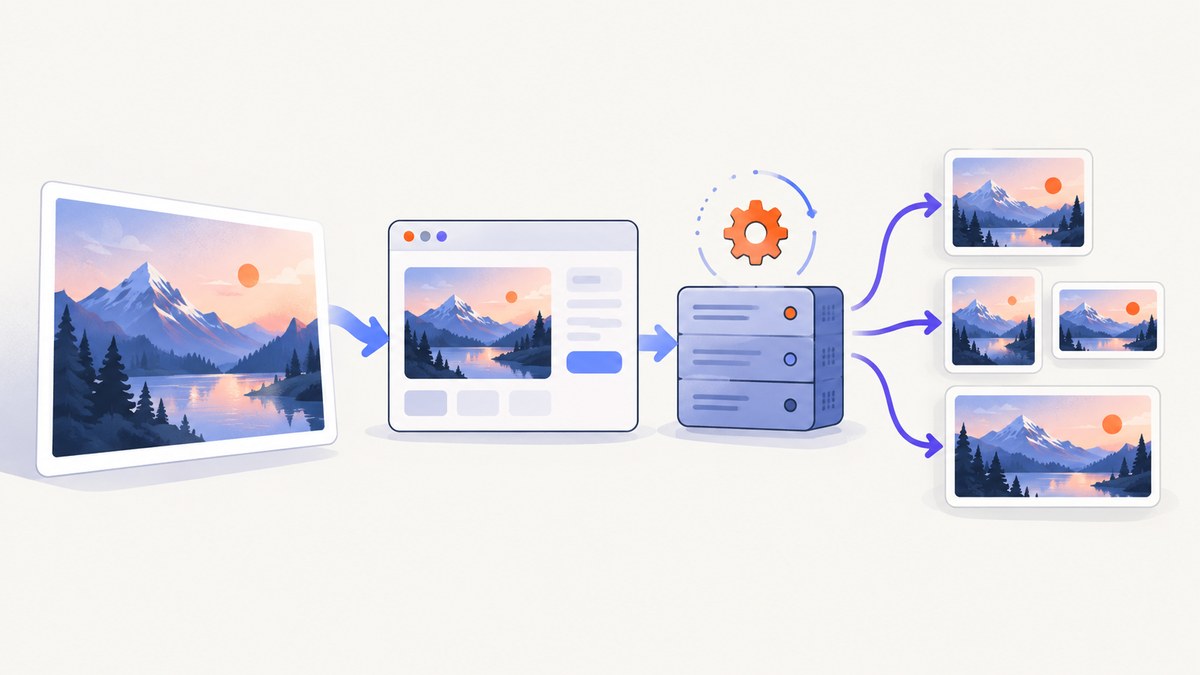
A web app thumbnail is a smaller image asset created for a specific display slot. The browser should download that smaller derivative instead of fetching a large original and shrinking it with CSS. Serving desktop-sized images to mobile devices can transfer 2–4× more data than needed, according to web.dev’s responsive image guidance.
The practical workflow is:
- Measure the display slot and decide its aspect ratio and crop.
- Keep the original image unchanged.
- Generate a few derivatives at the sizes your layouts actually use.
- Serve them with
srcsetandsizes, or request a transformed URL from an image service. - Use browser canvas only when a user needs an immediate preview or crop.
There is no universal set of dimensions. Three to five variants is common practice, but the right number depends on your slots, device pixel ratios, storage budget, and markup complexity.
1. Define the thumbnail before writing code
Start with the place where the image appears. A 160 px square avatar, a 320 px card image, and a 1,200 px social preview are different products even when they use the same source file.
| Use | Decisions to make | Typical behavior |
|---|---|---|
| List or grid card | Rendered width, aspect ratio, crop | Fixed ratio such as 4:3 or 16:9; use object-fit: cover |
| User upload preview | Immediate feedback, crop controls | Canvas preview before upload; preserve the original for final processing |
| Video poster | Frame selection, compression | Generate a predictable poster size during ingestion |
| Shared link image | Absolute URL, social platform rules | Publish og:image; this is separate from in-app thumbnails |
Record the slot width at your smallest and largest layouts. Multiply by the device pixel ratio only when sharper output is useful. Avoid generating huge files for a slot that never displays them. Decide whether cropping may remove the subject, and choose a focal point or an object-position policy for faces and products.
2. Generate variants at build time or on the server with Sharp
Build-time or server-side processing is the dependable choice for published assets. The web.dev guide identifies the sharp npm package as a good option for automating several sizes, while ImageMagick is convenient for one-off command-line work.
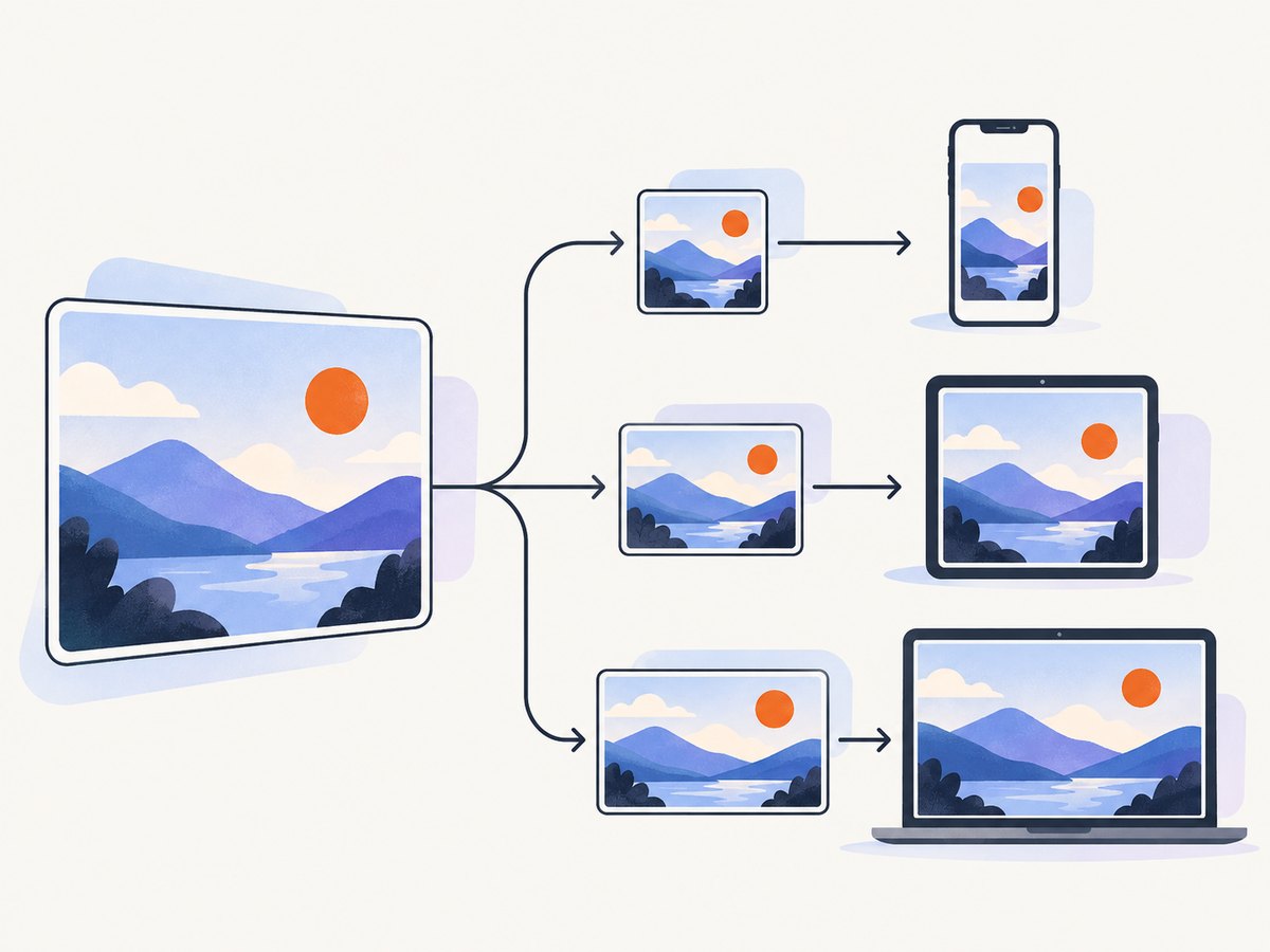
Install Sharp
npm install sharpRunnable Node.js generator
import sharp from 'sharp';
import { mkdir } from 'node:fs/promises';

const input = 'original.jpg';
const outputDir = 'public/thumbs';
const widths = [320, 640, 1024];

await mkdir(outputDir, { recursive: true });

for (const width of widths) {
  await sharp(input)
    .resize({ width, height: Math.round(width * 3 / 4), fit: 'cover', position: 'attention' })
    .webp({ quality: 82 })
    .toFile(`${outputDir}/photo-${width}.webp`);
}
fit: 'cover' fills the requested box and crops overflow. Use fit: 'inside' when the entire image must remain visible, or fit: 'contain' when letterboxing is acceptable. Do not upscale small originals unless you have a deliberate reason; enlargement can look soft.
Generate a JPEG fallback when older clients or downstream systems require it:
await sharp(input)
  .resize({ width: 640, height: 480, fit: 'cover' })
  .jpeg({ quality: 80, progressive: true })
  .toFile('public/thumbs/photo-640.jpg');
One-off ImageMagick command
magick original.jpg -resize '640x480^' -gravity center -extent 640x480 -strip -quality 82 thumb-640.jpgThe ^ makes the image cover the box; -extent crops the excess from the center. Adjust gravity for a known subject position. Keep source files and derivative filenames versioned so a changed original invalidates old output.
3. Deliver the right file with responsive HTML
Use srcset for candidate files and sizes to describe the rendered slot. The browser uses those hints, its viewport, and device density to choose a candidate; sizes does not itself set CSS display dimensions.
<img
  src="/thumbs/photo-640.webp"
  srcset="/thumbs/photo-320.webp 320w,
          /thumbs/photo-640.webp 640w,
          /thumbs/photo-1024.webp 1024w"
  sizes="(max-width: 640px) 100vw, (max-width: 1100px) 50vw, 33vw"
  width="640"
  height="480"
  alt="A red bicycle beside a brick wall"
  loading="lazy"
  decoding="async"
>
Set width and height to reserve layout space and reduce cumulative layout shift. Use a meaningful alt description. Lazy-load below-the-fold cards, but leave the primary image eager when it is part of the initial content.
Responsive markup solves delivery for page images. If the image is intended for a shared page preview, add Open Graph metadata separately:
<meta property="og:image" content="https://example.com/share-images/article-1200x630.jpg">The Open Graph protocol describes how a page becomes a rich object in a social graph. This metadata does not replace the thumbnail used inside your application. Google also recommends standard HTML image elements and discoverable URLs in its image SEO guidance.
4. Create an instant browser preview with canvas
Canvas is useful when someone selects a local file and expects an immediate preview or crop before upload. It is not a substitute for server-side validation or durable derivatives.
<input id="file" type="file" accept="image/*">
<canvas id="preview" width="320" height="240" aria-label="Image preview">
  Your browser cannot display the image preview.
</canvas>
<button id="export" type="button">Export thumbnail</button>
<script type="module">
const fileInput = document.querySelector('#file');
const canvas = document.querySelector('#preview');
const ctx = canvas.getContext('2d');

fileInput.addEventListener('change', () => {
  const file = fileInput.files?.[0];
  if (!file) return;
  const url = URL.createObjectURL(file);
  const image = new Image();
  image.onload = () => {
    const scale = Math.max(canvas.width / image.width, canvas.height / image.height);
    const width = image.width * scale;
    const height = image.height * scale;
    const x = (canvas.width - width) / 2;
    const y = (canvas.height - height) / 2;
    ctx.clearRect(0, 0, canvas.width, canvas.height);
    ctx.drawImage(image, x, y, width, height);
    URL.revokeObjectURL(url);
  };
  image.src = url;
});

document.querySelector('#export').addEventListener('click', () => {
  canvas.toBlob(blob => {
    if (!blob) return;
    const download = URL.createObjectURL(blob);
    const link = document.createElement('a');
    link.href = download;
    link.download = 'thumbnail.webp';
    link.click();
    URL.revokeObjectURL(download);
  }, 'image/webp', 0.82);
});
</script>
MDN’s canvas documentation describes drawImage() scaling from image elements, video, SVG, ImageBitmap, and other sources. Set the canvas’s intrinsic width and height attributes, as shown above; CSS-only resizing can distort the bitmap. Enlarging can blur an image, while shrinking too far can make details grainy.
Canvas is a bitmap surface and does not expose drawn objects as accessible content. Keep the original file name and an alternative text description in the surrounding HTML. For expensive operations, MDN documents OffscreenCanvas, which can move rendering to a worker so the main UI thread stays responsive.
5. Choose an on-demand image transformation service
An image service creates a derivative when a URL is requested, which is useful when you have many source images and many dimensions or crops. Cloudinary documents dynamic resizing and cropping and explains why changing CSS dimensions does not prevent the browser from downloading a full-size original. Thumbor is another open-source service named by web.dev.
| Approach | Variants created | Storage | Best fit |
|---|---|---|---|
| Sharp or ImageMagick | Build or ingestion time | You store derivatives | Predictable published sizes |
| Canvas | On demand in the browser | Optional export | Previews and user cropping |
| Managed service | On request | Provider cache or origin storage | Many transformations and teams |
Compare latency, cache behavior, transformation limits, privacy requirements, origin bandwidth, failure handling, and the cost of storing or generating each derivative. Whichever option you choose, retain the original and make transformations deterministic so cache keys remain stable.
6. Or skip the browser setup
If your “thumbnail” is a screenshot of a web app, ScreenshotNeo can return a resized image or a clean page capture through one request. See the ScreenshotNeo documentation for the complete parameter reference.

curl -G "https://api.screenshotneo.com/v1/shot" -d access_key=YOUR_API_KEY --data-urlencode url=https://stripe.com -o shot.webpimport requests
r = requests.get("https://api.screenshotneo.com/v1/shot", params={"access_key": "YOUR_API_KEY", "url": "https://stripe.com"}, timeout=90)
open("shot.webp", "wb").write(r.content)const q = new URLSearchParams({ access_key: 'YOUR_API_KEY', url: 'https://stripe.com' });
const res = await fetch(`https://api.screenshotneo.com/v1/shot?${q}`);ScreenshotNeo removes cookie banners, newsletter popups, and chat widgets before capture. Bot checks, blank pages, failed loads, timeouts, and cache hits are not billed; response headers identify the page verdict and whether the request was billed. It supports full-page or CSS-element captures, dark mode, device presets, custom viewports, retina scale, image formats, resizing, custom CSS and JavaScript, clicks, waits, blocked resources, headers, cookies, user agents, authorization, timezone, geolocation, transparent backgrounds, TTL caching, signed links, asynchronous jobs, webhooks, bulk capture, usage reporting, and PDFs. Its MCP server provides take_screenshot, get_page_info, and capture_pdf for Claude, Cursor, and other MCP clients.
The Free plan includes 1,000 screenshots each month with no card. Paid plans start at $5 for 3,000 shots; every feature is available on every plan. Create a free ScreenshotNeo account.
7. Troubleshooting checklist
The thumbnail is blurry
Check that you are not upscaling a small source, and that the selected srcset candidate is large enough for the device pixel ratio. Export at the target intrinsic dimensions, then inspect the actual downloaded file in browser developer tools.
The browser downloads the original
CSS width does not change the transfer size. Confirm that srcset and sizes are present, that candidate URLs are reachable, and that your CDN is not rewriting every URL to the original.
The crop removes the subject
Use a focal point, change Sharp’s position, or use object-position. For user content, provide a crop UI instead of assuming the center is correct.
Canvas output is stretched
Set the canvas attributes, not only CSS dimensions. Preserve the intended aspect ratio when calculating the destination rectangle.
Canvas export returns null
Wait for the image’s load event, check that the canvas is not tainted by a cross-origin image, and verify that the requested MIME type is supported.
Sharp fails on production
Install dependencies for the deployment architecture, ensure the process can read the source and write the output directory, and log the original image metadata before resizing. Regenerate derivatives when the source hash changes.
A ScreenshotNeo response is not an image
Inspect the HTTP status and response headers before writing the body to disk. Verify the access key, URL encoding, and timeout. Use the page verdict and billed headers to distinguish a clean capture from a bot check, blank page, timeout, failed load, or cache hit.
8. Performance, reliability, and cost
- Performance: deliver derivatives close to the rendered slot, use modern WebP or another format your clients support, reserve layout space, and lazy-load below-the-fold images.
- Reliability: keep originals, make jobs idempotent, use content hashes in filenames, and retry transient processing failures with a limit.
- Storage: three to five widths is a starting point, not a rule. Each additional width increases storage and invalidation work.
- Bandwidth: measure transfer size from real devices. A visually small CSS image can still be an expensive full-resolution download.
- Service cost: compare transformation requests, cache hit behavior, origin egress, and retained derivatives. ScreenshotNeo bills only clean shots and reports billing status in headers.
9. FAQ
Should thumbnails always be square?
No. Match the ratio of the component. Square crops work for avatars and dense grids; cards often need 4:3 or 16:9.
Can I use one 1,200-pixel image everywhere?
You can, but smaller devices may download substantially more data than needed. Use responsive candidates when slots vary.
Is canvas suitable for permanent storage?
It can export a file, but server-side processing should remain the authority for validation, metadata, and consistent output.
Do thumbnails replace Open Graph images?
No. A page thumbnail and a social share image serve different consumers and can use different dimensions.
When should I use a managed service?
Choose one when many dimensions, crops, or delivery paths make local generation and storage harder to operate than a transformation URL.


