How to Create a Website Banner with HTML and CSS
Build an accessible, responsive website banner with HTML and CSS. Choose normal flow, sticky, or fixed positioning and avoid covering page content.

A website banner is a short, prominent region that communicates a message or points visitors to an action. Use semantic HTML for its content and ordinary CSS for its layout. Keep it in normal document flow if it should push the page down; choose position: sticky if it should stay visible after reaching the top while scrolling; use position: fixed only when it must remain attached to the viewport and you have handled the content it can cover.
This guide builds a responsive announcement banner, then shows how to make it sticky, fixed, and dismissible. The examples use plain HTML, CSS, and a small amount of JavaScript. They avoid fixed heights so text can wrap at narrow widths and when users enlarge text.
1. Start with semantic HTML
For a site-wide banner at the page level, use a <header>. A page-level HTML header has the equivalent meaning of the ARIA banner landmark unless it is nested inside elements such as article, main, or section. Use the landmark for the site header area, not every promotional strip on a page. See MDN’s banner landmark guidance.
Keep the message and action as real text and links. Do not make the entire banner a clickable generic container when the action is a specific link: a link gives keyboard and assistive technology users a clear destination.
<header class="site-banner">
  <div class="banner__inner">
    <p class="banner__message">Free shipping this week on orders over $50.</p>
    <a class="banner__link" href="/shipping">See shipping details</a>
  </div>
</header>
2. Style a responsive banner in normal flow
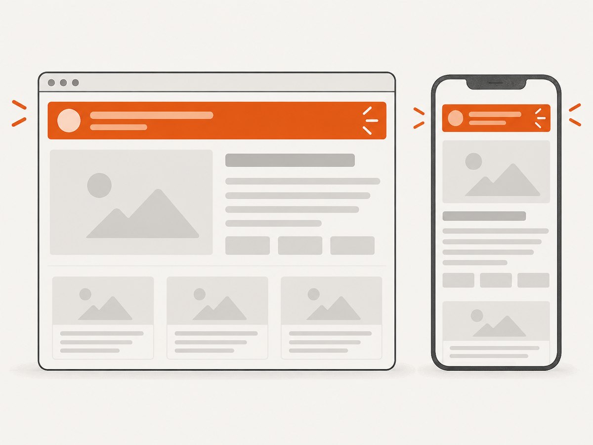
Normal flow is the simplest and safest starting point. The banner takes up space in the document, so the content after it starts below it without extra offsets or spacer elements. A constrained inner wrapper keeps text readable on wide screens, while flexible wrapping lets the message and link stack on small screens.
* {
  box-sizing: border-box;
}

.site-banner {
  background: #123047;
  color: #fff;
  font: 500 1rem/1.5 system-ui, sans-serif;
}

.banner__inner {
  width: min(100% - 2rem, 70rem);
  margin-inline: auto;
  padding-block: 0.75rem;
  display: flex;
  align-items: center;
  justify-content: space-between;
  gap: 0.5rem 1.5rem;
  flex-wrap: wrap;
}

.banner__message {
  margin: 0;
}

.banner__link {
  color: inherit;
  font-weight: 700;
  text-underline-offset: 0.2em;
}

.banner__link:focus-visible {
  outline: 3px solid currentColor;
  outline-offset: 3px;
}

@media (max-width: 40rem) {
  .banner__inner {
    align-items: flex-start;
    flex-direction: column;
  }
}
The wrapper’s width is capped, but it can shrink to the viewport with side gutters. Flexbox places the message and action in a row when there is room; flex-wrap lets them move to another line when there is not. There is no fixed height, so longer translations, zoom, and user-selected font sizes can expand the banner instead of clipping it.
Contrast and content checks
- Choose foreground and background colors with readable contrast. Do not rely on color alone to communicate urgency or status.
- Keep the message concise, but allow it to wrap. Avoid truncating important information with ellipses.
- Use a descriptive link label such as “See shipping details,” rather than an ambiguous “Click here.”
- Check the visible keyboard focus style against the banner background.
- Test at a narrow viewport and with enlarged text. A banner that works only at one fixed height is fragile.
3. Choose normal, sticky, or fixed positioning
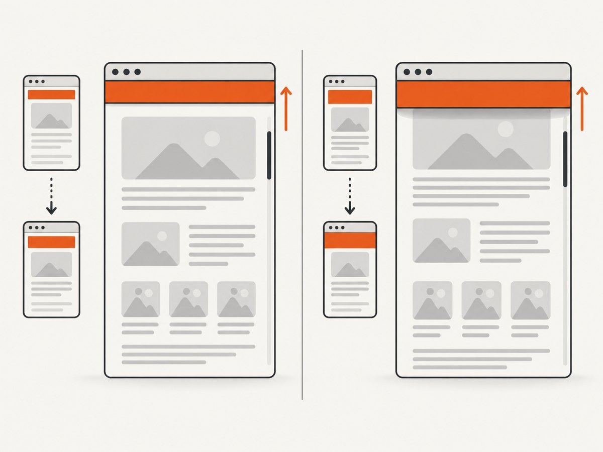
The right positioning model depends on whether the banner should participate in the page layout and whether it needs to stay visible as the visitor scrolls.
| Model | Layout behavior | Use it when | Main concern |
|---|---|---|---|
| Normal flow | Occupies space and pushes later content down | The message belongs at the top of the page and need not persist while scrolling | None specific to overlays; it scrolls away normally |
| Sticky | Starts in flow, then sticks at a threshold within its scrolling context | The banner should remain visible after reaching the top | Its nearest scrolling ancestor and containing block govern where it sticks |
| Fixed | Removed from normal flow and attached to a viewport or containing block | The banner must stay in the same viewport position, such as a persistent notice | It can obscure content, especially with zoom or on short screens |
Make the banner sticky
Add a non-auto inset such as top: 0; without an inset on the sticky axis, sticky positioning behaves like relative positioning. Sticky elements stick relative to their nearest ancestor with a scrolling mechanism, which may be an ancestor using overflow: auto, scroll, or hidden, rather than the page viewport. See MDN’s position reference.
.site-banner--sticky {
  position: sticky;
  top: 0;
  z-index: 10;
}
Apply the modifier in the markup: <header class="site-banner site-banner--sticky">. Set a stacking level only as high as needed; a large z-index does not fix a sticky element trapped inside the wrong scrolling ancestor. If the site has a separate fixed navigation bar above this banner, use its actual height for the sticky inset, for example top: var(--nav-height).
Make the banner fixed
A fixed element is taken out of normal flow. If it is pinned to the top, the page content can begin behind it. A fixed banner also needs to accommodate the height it reaches when text wraps; reserving a guessed spacer height may fail at zoom or on mobile. Prefer normal flow or sticky positioning unless viewport attachment is a real requirement.
.site-banner--fixed {
  position: fixed;
  inset: 0 0 auto;
  z-index: 20;
}
If you use fixed positioning, check the result at enlarged text and narrow widths. MDN cautions that fixed or absolutely positioned content must not obscure other content when text is enlarged. Fixed positioning can also use an ancestor with a non-none transform, perspective, or filter as its containing block rather than the viewport. Keep this in mind when a “fixed” banner unexpectedly moves with a component.
4. Account for anchors, short screens, and zoom
A persistent banner can cover a heading when a visitor follows an in-page link. Set scroll padding on the document so browser scrolling leaves room at the top. Choose an offset that reflects the persistent regions that can actually cover the target; a hard-coded value may need adjustment if your banner wraps or another header is present.
html {
  scroll-padding-top: 4rem;
}
For a short viewport or narrow layout, consider returning a sticky banner to normal flow. The W3C’s C34 technique documents using media queries to un-fix sticky headers or footers in constrained viewports. Adapt the breakpoint to the real space your design needs, rather than copying a number without checking the layout.
@media (max-width: 40rem), (max-height: 30rem) {
  .site-banner--sticky {
    position: static;
  }
}
This example makes the banner normal-flow at either a narrow width or short height. If the page also has a sticky navigation bar, review both together: multiple persistent regions consume vertical space and can crowd the content, particularly when the visitor zooms.
5. Add an accessible dismiss button
If visitors can dismiss an announcement, use a real button with an accessible name. Keep its focus indicator visible and make sure it remains reachable when text is enlarged. The following pattern hides the banner after activation for the current page view; it does not save dismissal across reloads.
<header class="site-banner" id="announcement">
  <div class="banner__inner">
    <p class="banner__message">Our support hours change on Monday.</p>
    <a class="banner__link" href="/support">View support hours</a>
    <button class="banner__close" type="button"
      aria-label="Dismiss announcement">
      <span aria-hidden="true">×</span>
    </button>
  </div>
</header>

<script>
  const banner = document.querySelector('#announcement');
  const closeButton = banner.querySelector('.banner__close');

  closeButton.addEventListener('click', () => {
    banner.remove();
  });
</script>
Add the button to the earlier CSS layout with a visible focus style. If you add persistence using storage, define how long the dismissal should last and consider whether the notice is important enough to show again. Do not hide essential service or safety information without an accessible way to find it elsewhere. If removing the focused button also removes its focus context, test keyboard navigation after dismissal and move focus to a sensible nearby element when needed.
6. Troubleshoot common banner problems
| Symptom | Likely cause | Fix |
|---|---|---|
| Sticky has no effect | No inset is set, or the banner is constrained by a scrolling ancestor | Set top: 0 (or the appropriate inset), then inspect ancestors for overflow and check the containing block |
| Sticky stops too early | The sticky element cannot extend beyond its containing block | Check its parent’s height and placement; the sticky region is bounded by its containing block |
| Fixed banner covers the page | Fixed positioning removes the banner from normal flow | Prefer flow or sticky; if fixed is required, ensure content and anchor targets remain reachable at zoom and when text wraps |
| Banner appears behind another header | Stacking contexts or competing stacking levels | Inspect positioned ancestors and stacking contexts; set an appropriate local z-index instead of escalating arbitrary values |
| Mobile text is clipped | Fixed height, white-space: nowrap, or non-wrapping flex children |
Remove the fixed height, allow wrapping, and switch to a vertical layout at a suitable breakpoint |
| Anchor target lands beneath the banner | The scroll position does not account for persistent content | Set scroll-padding-top on the scroll container and verify the offset at different widths |
| Fixed element moves with a component | An ancestor with transform, perspective, or filter establishes its containing block |
Move the banner outside that ancestor or change the ancestor styling if appropriate |
7. Performance and reliability notes
A simple banner made from text, a link, and CSS layout does not need a JavaScript positioning library. Use CSS for layout and add JavaScript only for behavior such as dismissal. Keeping the message in normal flow also avoids manually synchronizing a spacer with a height that changes as text wraps.
Sticky and fixed elements may need repainting during scrolling. Keep effects and animated content in persistent banners modest, and check scrolling on the devices and pages your audience uses. Do not add will-change by default: it is a rendering hint, not a general performance switch. If an existing page has multiple fixed elements, test their overlap, focus order, and scrolling together.
For robust behavior, test at least: a wide viewport, a narrow viewport, a short viewport, 200% text zoom, keyboard-only navigation, and a page with long content and in-page links. Include a long translated or user-generated message if your site supports one. These checks catch clipping and obstruction issues that a single desktop screenshot will miss.
8. Inspect the rendered banner with a screenshot
After implementing the banner, capture the page at desktop and mobile viewport sizes to review wrapping, contrast, and overlap in the actual page context. You can use a browser automation setup, or use a screenshot API. ScreenshotNeo is a website screenshot API and MCP server. Its clean-shot flow accepts cookie or consent banners like a visitor and removes more than 60 known consent platforms, newsletter popups, and chat widgets before capture; those steps can be turned off. Only clean shots are billed: bot checks, CAPTCHAs, blank pages, timeouts, failed loads, and cache hits cost nothing, with the result described by X-Page-Verdict and X-Billed headers. See the ScreenshotNeo API documentation for request options.
Or skip the browser setup
Make one GET request with your target URL and an API key. This cURL example saves a WebP screenshot of the page:
curl -G "https://api.screenshotneo.com/v1/shot" \
  -d access_key=YOUR_API_KEY \
  --data-urlencode url=https://example.com \
  -o shot.webp
Python:
import requests

r = requests.get(
    "https://api.screenshotneo.com/v1/shot",
    params={"access_key": "YOUR_API_KEY", "url": "https://example.com"},
    timeout=90,
)
r.raise_for_status()
open("shot.webp", "wb").write(r.content)
Node.js:
const q = new URLSearchParams({
  access_key: 'YOUR_API_KEY',
  url: 'https://example.com'
});
const res = await fetch(`https://api.screenshotneo.com/v1/shot?${q}`);
if (!res.ok) throw new Error(`Screenshot request failed: ${res.status}`);
const bytes = new Uint8Array(await res.arrayBuffer());
await import('node:fs/promises').then(fs => fs.writeFile('shot.webp', bytes));
Cookie banners, popups, and chat widgets are removed before the shot. Bot checks, blank pages, and failed loads are never billed. An MCP server lets AI agents, including Claude and Cursor, take screenshots. The free plan includes 1,000 screenshots a month with no card; paid plans start at $5 for 3,000.
Sign up for ScreenshotNeo and get 1,000 free screenshots a month, with no card.
FAQ
Should a promotional banner use the banner landmark?
Use a page-level <header> for the site-wide header region. A promotional banner inside the page can simply be a meaningful section or other suitable element; do not add landmark roles to every small notice.
Can I make only the navigation sticky?
Yes. Put the navigation in its own element and apply sticky positioning there. This lets the announcement scroll away while the navigation remains available.
Why does sticky work in one layout but not another?
Sticky positioning depends on the scrolling ancestor, the containing block, and a non-auto inset on the sticky axis. An ancestor’s overflow or a constrained parent can change the behavior.
Should I use fixed positioning for a cookie notice?
Only if the notice needs to remain attached to the viewport. Account for content obstruction, keyboard access, zoom, and small screens; otherwise, flow or sticky positioning is simpler to manage.