How to Create Website Thumbnails with HTML and CSS
Build responsive website thumbnails with HTML and CSS using aspect ratios, object-fit, intrinsic dimensions, srcset, and practical performance fixes.
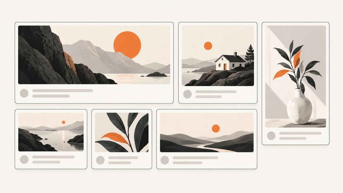
A website thumbnail is usually a small image inside a card, grid, search result, or preview. The reliable pattern is simple: put an <img> in a frame, reserve space with intrinsic dimensions, choose the frame ratio with aspect-ratio, and decide whether the image should crop with object-fit: cover or remain fully visible with object-fit: contain.
CSS changes how large an image appears; it does not automatically create a smaller image file. For a large catalogue, combine the layout below with generated image variants and responsive srcset/sizes markup.
1. The complete thumbnail card
This example is a complete, runnable card. Save it as index.html and replace the example image URLs with your own assets.
<!doctype html>
<html lang="en">
<head>
  <meta charset="utf-8">
  <meta name="viewport" content="width=device-width, initial-scale=1">
  <title>Thumbnail cards</title>
  <style>
    :root {
      color-scheme: light;
      font-family: system-ui, sans-serif;
      background: #f5f7fb;
      color: #172033;
    }

    body {
      margin: 0;
      padding: 2rem;
    }

    .grid {
      display: grid;
      grid-template-columns: repeat(auto-fit, minmax(16rem, 1fr));
      gap: 1.25rem;
      max-width: 72rem;
      margin: 0 auto;
    }

    .card {
      display: block;
      overflow: hidden;
      color: inherit;
      text-decoration: none;
      background: white;
      border: 1px solid #dfe4ee;
      border-radius: 0.75rem;
      box-shadow: 0 0.25rem 1rem rgb(23 32 51 / 8%);
    }

    .card__media {
      aspect-ratio: 8 / 5;
      overflow: hidden;
      background: #e9edf5;
    }

    .card__media img {
      display: block;
      width: 100%;
      height: 100%;
      object-fit: cover;
      object-position: center;
    }

    .card__body {
      padding: 1rem;
    }

    .card__body h2 {
      margin: 0;
      font-size: 1.1rem;
    }

    .card__body p {
      margin: 0.5rem 0 0;
      color: #526078;
    }
  </style>
</head>
<body>
  <main class="grid">
    <a class="card" href="/article">
      <div class="card__media">
        <img
          src="images/article-640.jpg"
          width="640"
          height="400"
          alt="A mountain lake at sunrise"
          loading="lazy"
          decoding="async">
      </div>
      <div class="card__body">
        <h2>Planning a weekend beside the lake</h2>
        <p>A short guide to routes, weather, and equipment.</p>
      </div>
    </a>
  </main>
</body>
</html>
The wrapper owns the visual frame. The image fills that frame, so every card has the same shape even when source files have different dimensions. The width and height attributes describe the source image’s intrinsic dimensions; they help the browser reserve the correct space before the file arrives. MDN documents this relationship and its value for reducing layout shifts, particularly with lazy-loaded images (MDN, img element).
2. Choose the thumbnail ratio and crop behavior
aspect-ratio: 8 / 5 creates a preferred width-to-height ratio. It affects sizing when at least one dimension is automatic. If you set both width and height explicitly, those dimensions take precedence over the preferred ratio (MDN, aspect ratios).
Use cover for consistent cards
.thumbnail {
  aspect-ratio: 16 / 9;
  overflow: hidden;
}

.thumbnail img {
  width: 100%;
  height: 100%;
  object-fit: cover;
}
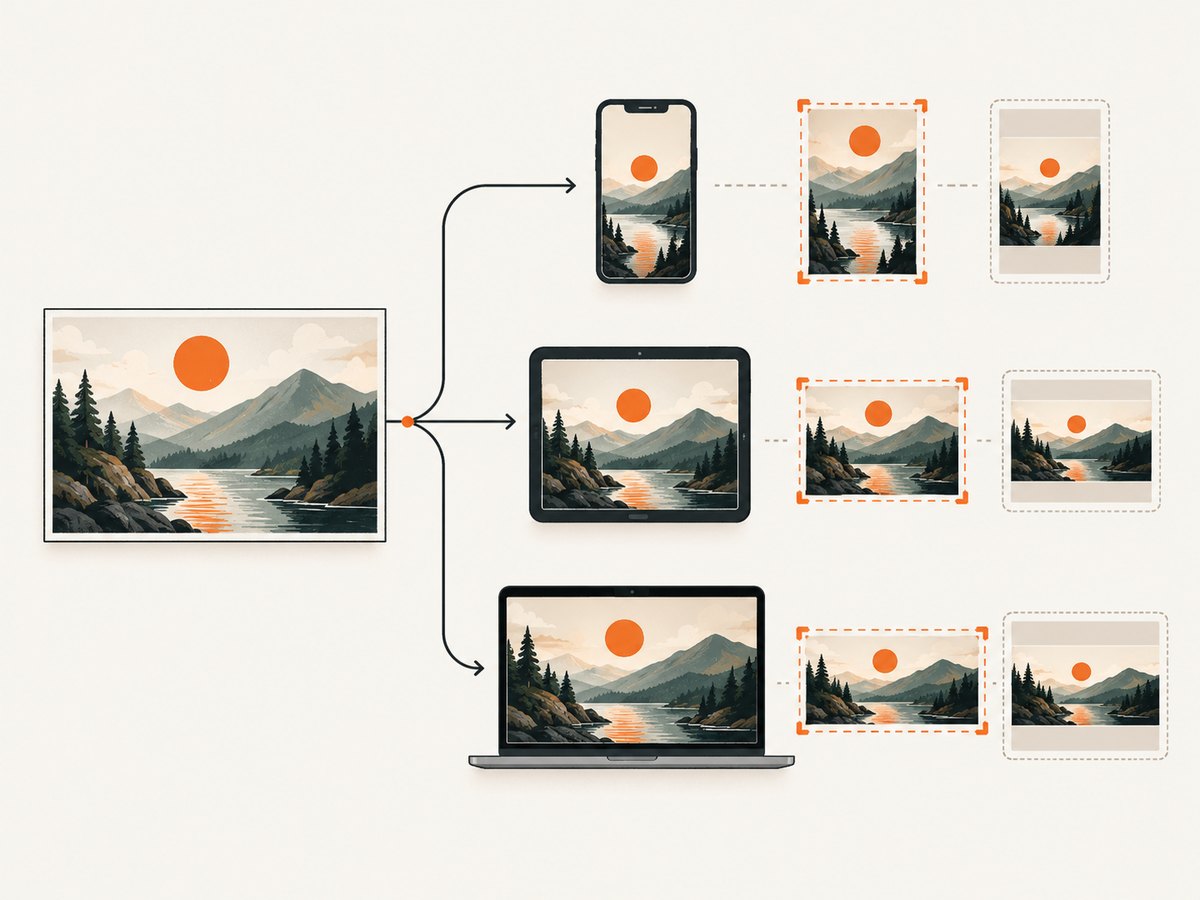
cover scales the image until the frame is completely filled. Any overflow is cropped. This is useful when a grid must align perfectly, but the crop can remove a face, product, or important edge. Adjust the focal point when needed:
.thumbnail img {
  object-position: 50% 25%; /* move the visible area upward */
}
Use contain when every pixel matters
.thumbnail img {
  width: 100%;
  height: 100%;
  object-fit: contain;
  background: #eef1f6;
}
contain scales the complete image into the frame. It can leave empty bands on two sides, but it never crops the source. Product packshots, logos, screenshots, and documents commonly need this behavior.
Do not stretch an image
Set both rendered dimensions and use object-fit. Avoid assigning a width and height that distort the source without an object-fit rule. If the image should keep its natural ratio instead of filling a fixed frame, use:
.thumbnail img {
  display: block;
  width: 100%;
  height: auto;
}
This produces a variable-height card. It is appropriate for a masonry-like layout, but it will not create a uniform grid.
3. Reserve layout space and handle accessibility
Include intrinsic dimensions that match the actual file. A source that is 1200 by 750 should be marked width="1200" height="750", even if CSS renders it at 320 pixels wide. The browser can calculate the ratio before downloading the image and reserve the box.
<img
  src="images/story-1200.jpg"
  width="1200"
  height="750"
  alt="A cyclist crossing a bridge in autumn"
  loading="lazy"
  decoding="async">
Use a useful alt description when the thumbnail conveys information. If it is purely decorative and nearby text already communicates the same thing, an empty alt="" may be appropriate. Decide this from the meaning of the particular card rather than from its visual size.
Lazy loading is suitable for cards below the initial viewport. Do not lazy-load the main image that users see immediately if doing so delays the largest visible content. decoding="async" lets the browser decode without unnecessarily blocking other work.
4. Add responsive image sources with srcset and sizes
CSS determines the rendered slot. srcset and sizes tell the browser which source candidates are appropriate for that slot and the device. They solve different parts of the problem and should be used together (MDN, responsive images).
<img
  src="images/story-640.jpg"
  srcset="
    images/story-320.jpg 320w,
    images/story-640.jpg 640w,
    images/story-960.jpg 960w,
    images/story-1280.jpg 1280w"
  sizes="(min-width: 64rem) 20rem,
         (min-width: 40rem) 30vw,
         90vw"
  width="1280"
  height="800"
  alt="A cyclist crossing a bridge in autumn"
  loading="lazy"
  decoding="async">
In this example, a card in a wide four-column grid is about 20rem wide; on a medium screen it is about 30 percent of the viewport; on a small screen it is about 90 percent. Make the sizes expression match your real CSS grid. If it claims the slot is smaller than it really is, the browser may choose a source that looks soft. If it claims the slot is larger, users may download unnecessary bytes.
Keep the plain src as a working fallback. Browsers that do not use the responsive attributes can still display the image.
5. Generate smaller files when CSS is not enough
Rendering a 2400-pixel image at 320 pixels does not reduce the downloaded file. Generate width variants during an asset build or image-upload workflow. The web.dev responsive-image guidance discusses Sharp for batch resizing and ImageMagick for one-off work, as well as hosted image services such as Thumbor and Cloudinary (web.dev, Serve responsive images).
There is no universal number of variants. Three to five sizes are common guidance, but every extra file costs storage and markup maintenance. Choose widths around the actual slots your design uses, for example 320, 640, 960, and 1280 pixels.
Example Sharp build script
import sharp from "sharp";

const widths = [320, 640, 960, 1280];

for (const width of widths) {
  await sharp("source/story.jpg")
    .resize({ width, withoutEnlargement: true })
    .webp({ quality: 82 })
    .toFile(`public/images/story-${width}.webp`);
}
Run resizing as part of publishing or upload processing, then reference the generated files from srcset. Keep the original if you need future crops or larger displays. Select a format and quality that meet your visual requirements; the research sources establish the workflow, not a universal quality setting.
6. Build a grid that stays stable at every breakpoint
.grid {
  display: grid;
  grid-template-columns: repeat(auto-fit, minmax(16rem, 1fr));
  gap: 1rem;
}

.card__media {
  aspect-ratio: 3 / 2;
  overflow: hidden;
}

.card__media img {
  width: 100%;
  height: 100%;
  display: block;
  object-fit: cover;
}
auto-fit lets the number of columns adapt to available width while the minimum card width prevents unusably narrow cards. The media frame keeps a stable shape as columns change. If your design uses a different ratio, change only aspect-ratio; for example, 1 / 1 for avatars or 4 / 3 for editorial cards.
7. Optional: create a thumbnail from a live website
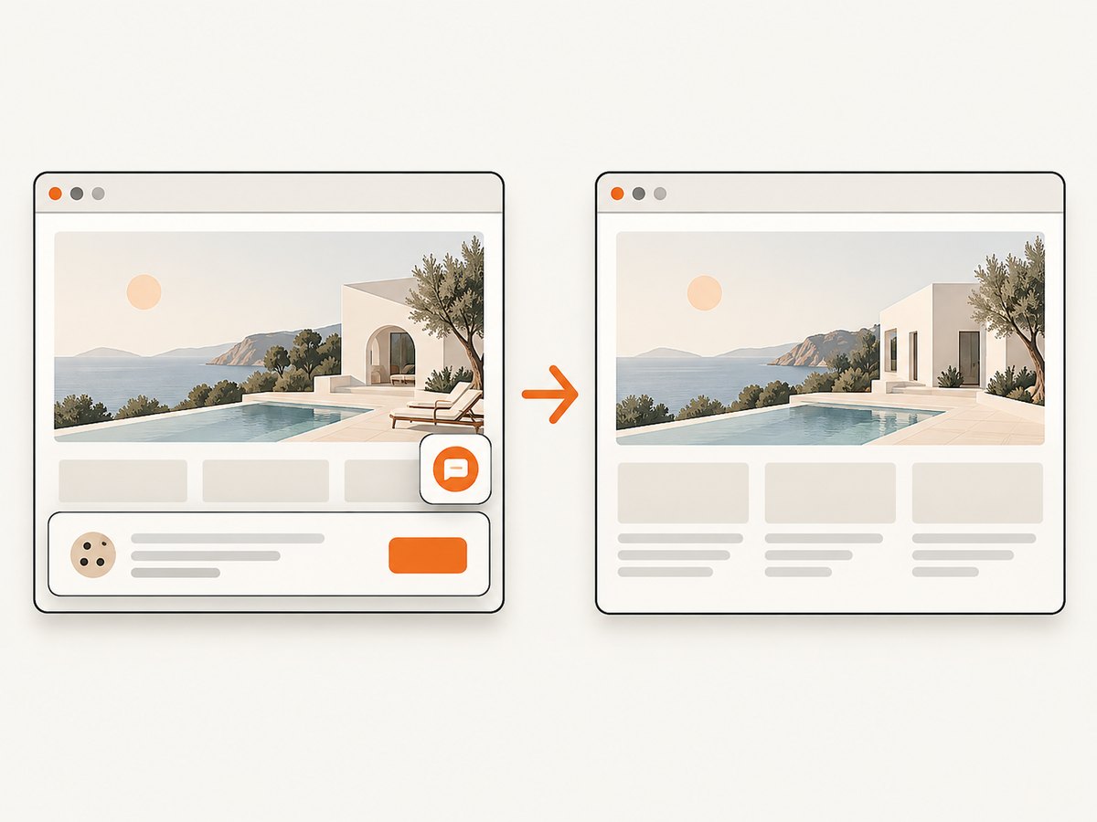
The HTML/CSS method above displays an image you already own. If the thumbnail must represent a live webpage, you need a browser capture step first, then display the resulting PNG, JPEG, or WebP with the same card CSS. A browser automation flow must wait for page loading, handle lazy content, and cope with consent banners, popups, chat widgets, bot checks, and failed pages.
DIY browser capture outline
- Launch a headless browser such as Chromium from your server.
- Navigate to the target URL and set the viewport you want represented.
- Wait for the page’s important content or network idle state.
- Dismiss consent UI and hide overlays before capturing.
- Capture the viewport or full page and save a resized derivative.
- Serve that derivative through the thumbnail markup and responsive variants.
This approach gives control, but it also means maintaining browser binaries, timeouts, navigation errors, authentication, cleanup scripts, and concurrency limits.
8. Or skip the browser setup
ScreenshotNeo provides a website screenshot API and MCP server. One GET request returns a PNG, JPEG, WebP, or PDF. It accepts the consent banner like a visitor and removes more than 60 known consent platforms, newsletter popups, and chat widgets before capture; each cleanup step can be turned off. Bot checks, CAPTCHAs, blank pages, timeouts, failed loads, and cache hits are not billed, and response headers identify the page verdict and billing result.
See the full parameter list in the ScreenshotNeo API documentation. The basic calls below are runnable after replacing the key and URL.
cURL
curl -G "https://api.screenshotneo.com/v1/shot" \
  -d access_key=YOUR_API_KEY \
  --data-urlencode url=https://stripe.com \
  -o shot.webp
Python
import requests

r = requests.get(
    "https://api.screenshotneo.com/v1/shot",
    params={"access_key": "YOUR_API_KEY", "url": "https://stripe.com"},
    timeout=90,
)
r.raise_for_status()
open("shot.webp", "wb").write(r.content)
Node.js
const q = new URLSearchParams({
  access_key: 'YOUR_API_KEY',
  url: 'https://stripe.com'
});
const res = await fetch(`https://api.screenshotneo.com/v1/shot?${q}`);
if (!res.ok) throw new Error(`HTTP ${res.status}`);
const data = Buffer.from(await res.arrayBuffer());
require('fs').writeFileSync('shot.webp', data);
Use the returned file as the src in the thumbnail card. ScreenshotNeo also supports full-page capture with lazy images loaded, CSS element selection, dark mode, device presets, arbitrary viewports, retina scale, custom CSS and JavaScript, clicks, selector or delay waits, network-idle waits, blocked ads and trackers, custom headers and cookies, user agents, authorization, timezone and geolocation, transparent backgrounds, image resizing, TTL caching, signed links, asynchronous jobs with signed webhooks, bulk capture of up to 100 URLs per call, a usage API, and an OpenAPI specification. The parameter names used by other screenshot APIs also work for easier migrations.
For AI workflows, its MCP server exposes take_screenshot, get_page_info, and capture_pdf to Claude, Cursor, and other MCP clients.
Capture options that matter for cards
| Need | Configuration direction |
|---|---|
| Uniform preview | Set a fixed viewport or use an element selector, then resize the result to your card source widths. |
| Long landing page | Use full-page capture and enable lazy-image loading before the shot. |
| Private page | Pass custom headers, cookies, or an Authorization value. |
| Stable repeated cards | Choose a cache TTL that matches how often the source changes. |
| Content behind a modal | Click or hide selectors, and turn off cleanup steps that you do not need. |
| Many URLs | Use bulk capture for up to 100 URLs per call or asynchronous jobs with signed webhooks. |
9. Troubleshooting checklist
The image looks stretched
Cause: width and height are forcing a distorted box without a fitting rule. Fix: give the frame a ratio, set the image to width: 100%; height: 100%, and choose cover or contain.
The subject is cut off
Cause: cover necessarily crops overflow. Fix: use object-position to move the focal point, change the frame ratio, or use contain when cropping is unacceptable.
Cards jump while loading
Cause: the browser did not know the image ratio before the response arrived. Fix: add accurate intrinsic width and height attributes and keep a defined aspect ratio on the media frame.
The thumbnail is blurry on a large screen
Cause: sizes understates the rendered slot or the largest candidate is too small. Fix: describe the real grid width and generate a larger source variant.
Mobile users download oversized files
Cause: only one large source is available, or sizes says the slot is wide. Fix: generate multiple widths and provide accurate srcset/sizes values.
A live-page capture shows a cookie banner or popup
Cause: the capture occurred before cleanup or the automation did not recognize the overlay. Fix: add a deterministic wait and selector action in your browser flow, or use ScreenshotNeo’s consent and overlay cleanup options.
The capture is blank, blocked, or times out
Cause: a bot check, failed navigation, slow resource, authentication requirement, or restrictive network policy. Fix: inspect the response status and page verdict, increase a bounded wait, supply required headers or cookies, and avoid treating a failed capture as a valid thumbnail. ScreenshotNeo identifies these outcomes in response headers and does not bill them.
10. Performance, reliability, and cost
- Reserve layout space with intrinsic dimensions to reduce visual movement.
- Lazy-load cards below the fold, but keep the initial visible image eager when it is a key page element.
- Use generated width variants so the network transfer matches the rendered slot.
- Cache stable thumbnails and invalidate them when source content changes.
- For capture pipelines, use bounded timeouts, retries for transient failures, and idempotent output names.
- Choose full-page capture only when the extra content is useful; viewport or element captures are smaller and faster to process.
ScreenshotNeo’s Free plan includes 1,000 shots each month without a card. Paid plans are Starter $5 for 3,000, Growth $15 for 15,000, Pro $39 for 60,000, Scale $99 for 250,000, and Business $249 for 1,000,000; yearly billing gives two months free. Every feature is available on every plan. Because cache hits and unsuccessful page outcomes are not billed, inspect the X-Page-Verdict and X-Billed headers when accounting for usage.
11. FAQ
Does aspect-ratio resize the downloaded file?
No. It controls the preferred dimensions of the rendered box. Use generated variants and responsive source selection to reduce transferred bytes.
Should every thumbnail use object-fit: cover?
No. Use cover for a filled, consistent frame and contain when the complete image must remain visible.
How many responsive image sizes should I create?
Three to five is common guidance, but there is no universal number. Base the set on your actual card widths and balance byte savings against storage and markup complexity.
Can I use a screenshot as the source for a normal HTML card?
Yes. Generate the screenshot separately, store the resulting image, then use the same intrinsic dimensions, ratio, and responsive markup described above.
Where do I start with ScreenshotNeo?
Try the free ScreenshotNeo account: 1,000 screenshots a month are included with no card. It is useful when you want cookie banners, popups, and chat widgets removed before the shot, no billing for bot checks, blank pages, and failed loads, or an MCP server that lets AI agents capture pages.


