How to Create Box and Drop Shadow Effects with CSS
Use CSS box-shadow for element boxes and text-shadow for text. Learn the syntax, layering, inset effects, common fixes, and how to preview the result.

Use box-shadow to add a shadow around an element’s box, and text-shadow to add a shadow to its text. A box shadow can sit outside the element or inside it with inset; offsets set its direction, blur softens its edge, spread changes its extent, and color sets its hue and opacity.
Here is the smallest useful example:
.card {
  box-shadow: 0 8px 20px 0 rgb(0 0 0 / 0.18);
}
The declaration gives the card a shadow 8 pixels below it, with a 20-pixel blur and no spread. The translucent black color keeps the effect subtle. Tune these values for your own element, background, and design system; no one set of shadow values suits every interface.
1. Add an outer shadow with box-shadow
The box-shadow property adds one or more shadows around an element’s frame. Its common syntax is:
box-shadow: [inset] <horizontal-offset> <vertical-offset> [<blur> [<spread>]] [<color>];For example:
.card {
  box-shadow: 5px 8px 12px 2px rgb(0 0 0 / 0.2);
}| Value | What it controls | Example |
|---|---|---|
| Horizontal offset | Moves the shadow left or right. Positive values move right; negative values move left. | 5px |
| Vertical offset | Moves the shadow up or down. Positive values move down; negative values move up. | 8px |
| Blur radius | Softens the shadow’s edge. A larger value gives a more diffuse result; zero keeps an unblurred edge. | 12px |
| Spread radius | Expands or contracts the shadow’s apparent size. Positive values expand it; negative values contract it. | 2px |
| Color | Sets the shadow’s hue and opacity. A color with transparency lets the background show through. | rgb(0 0 0 / 0.2) |
inset |
Places the shadow inside the element rather than outside it. | inset |
The first two lengths are the horizontal and vertical offsets. Blur and spread are optional, in that order, as is the color. A shadow without inset appears outside the element. The property and its syntax are documented in MDN’s box-shadow reference and MDN’s guide to adding a shadow.
A practical card example
Save this as an HTML file and open it in a browser to see a card with a soft shadow:
<!doctype html>
<html lang="en">
<head>
  <meta charset="utf-8">
  <meta name="viewport" content="width=device-width, initial-scale=1">
  <title>Box shadow example</title>
  <style>
    body {
      margin: 0;
      min-height: 100vh;
      display: grid;
      place-items: center;
      background: #f3f5f8;
      font: 16px/1.5 system-ui, sans-serif;
    }

    .card {
      width: min(24rem, calc(100% - 3rem));
      box-sizing: border-box;
      padding: 1.5rem;
      border-radius: 1rem;
      background: white;
      color: #182230;
      box-shadow: 0 8px 20px 0 rgb(0 0 0 / 0.18);
    }
  </style>
</head>
<body>
  <article class="card">
    <h1>A raised card</h1>
    <p>The shadow separates this panel from its background.</p>
  </article>
</body>
</html>
Start with a moderate vertical offset and blur, then adjust the color and opacity. If the card should feel close to the surface, reduce the offset and soften the color. For a stronger lift, increase the offset or opacity gradually. Use spread carefully: too much can make the shadow read as a second border instead of depth.
2. Create inset and pressed effects
Add the inset keyword before the lengths to draw the shadow inside the element’s padding box. The inset shadow sits above the background and below the content. It can suggest a recessed field, a pressed button, or a subtle inner edge.
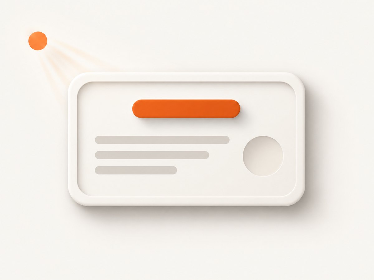
.pressed {
  box-shadow: inset 0 2px 5px rgb(0 0 0 / 0.2);
}
Here the shadow is shifted down and blurred inward from the top edge. A negative vertical offset shifts its emphasis upward. Combine an inset edge with an outer shadow when a component needs both an inner highlight and separation from the page:
.panel {
  box-shadow:
    inset 0 1px 2px rgb(255 255 255 / 0.7),
    0 8px 20px rgb(0 0 0 / 0.18);
}
When a declaration contains multiple comma-separated shadows, the first listed shadow is painted on top. This ordering matters where layers overlap. MDN documents the stacking order and inset behavior.
3. Add a shadow to text with text-shadow
Use text-shadow for text itself. It takes horizontal and vertical offsets, an optional blur radius, and a color. Unlike box-shadow, it follows the text rather than the element’s rectangular box, and it does not change the element’s box-model dimensions.
.title {
  text-shadow: 1px 2px 4px rgb(0 0 0 / 0.45);
}
Text can have several shadow layers too:
.title {
  text-shadow:
    0 1px 1px rgb(0 0 0 / 0.25),
    0 4px 12px rgb(0 0 0 / 0.2);
}
As with box shadows, the first listed text shadow appears on top. Keep the actual foreground text legible against its background; a shadow alone does not guarantee accessible contrast. See MDN’s text-shadow reference for the property’s syntax and behavior.
4. Layer shadows, round corners, and make outlines
Separate layers with commas to combine different directions, softness, or colors. For example, a card might use a faint close shadow for its edge and a broader shadow beneath it for depth:
.card {
  box-shadow:
    0 1px 2px rgb(0 0 0 / 0.08),
    0 10px 24px rgb(0 0 0 / 0.12);
}
border-radius carries through to the corners of a box shadow. The card and its shadow therefore follow the same rounded shape:
.rounded-card {
  border-radius: 1rem;
  box-shadow: 0 8px 20px rgb(0 0 0 / 0.18);
}
An all-zero offset and blur with a spread creates a solid ring-like shadow:
.outlined {
  box-shadow: 0 0 0 2px #4263eb;
}
For a persistent interface boundary, consider whether border or outline better communicates the intent. A shadow can look like depth; a border or outline more directly marks an edge. Choose based on the design and interaction behavior you need.
5. Tune a shadow without guessing
- Choose the treatment. Decide whether the element should look lifted, recessed, or outlined. Use an outer shadow,
inset, or a border-like ring accordingly. - Set direction. Adjust the x and y offsets to show where the light seems to come from. Keep the direction consistent across components that share a design system.
- Set softness. Increase blur for a softer edge and reduce it for a sharper one. Blur changes appearance, not layout size.
- Set extent. Adjust spread if the shadow needs to extend farther or stay closer to the element. A negative spread contracts it.
- Set color and transparency. Test the result on the actual page background. A translucent dark color often blends more naturally than an opaque black.
- Check neighboring content and clipping. Shadows do not take up layout space. Leave visual breathing room if a shadow overlaps nearby elements, and inspect ancestors that may clip content at their boundaries.
- Check text separately. Use
text-shadowonly when the text itself needs a shadow. Verify readability over the real background.
These properties are visual styling controls, not spacing controls. If an outer shadow appears cramped, add actual margin or padding to create room; increasing the shadow does not move neighboring elements away.
6. Preview the result on a rendered page
CSS declarations can look different against different backgrounds, content, and viewport sizes. Review the actual rendered page rather than judging a shadow from its values alone. For a local page, open the HTML file in a browser. For a published page, capture the relevant URL and inspect the image at the viewport where the component appears.

Or skip the browser setup
ScreenshotNeo is a website screenshot API and MCP server for developers. A GET request takes a URL and returns a PNG, JPEG, WebP, or PDF. Here is a one-call capture you can use to review your rendered CSS; replace the target URL with your page:
curl -G "https://api.screenshotneo.com/v1/shot" -d access_key=YOUR_API_KEY --data-urlencode url=https://stripe.com -o shot.webpSee the ScreenshotNeo API documentation for request options. Cookie banners, newsletter popups, and chat widgets are removed before the shot, and you can turn each cleanup step off. Bot checks and CAPTCHAs, blank pages, timeouts, failed loads, and cache hits cost nothing; response headers say which page verdict applied and whether the request was billed. An MCP server provides take_screenshot, get_page_info, and capture_pdf tools for Claude, Cursor, and other MCP clients. The free plan includes 1,000 screenshots a month with no card; paid plans start at $5 for 3,000 shots. Sign up free for 1,000 screenshots a month, with no card.
7. Compatibility, performance, and practical limits
MDN describes box-shadow as widely available and well established, with browser availability dating to July 2015. Prefer unprefixed syntax in contemporary projects. If your support matrix includes a specific legacy browser or you use newer syntax, check a current compatibility table for that feature rather than assuming every part of a reference’s syntax works everywhere. See MDN’s compatibility notes.
Do not treat a shadow as an extra layout boundary. It does not increase the element’s dimensions or reserve room around it. The shadow can overlap adjacent content or be clipped by a containing boundary or the viewport. Add spacing where needed and inspect the result in context.
For reliable visual review, use the same viewport, page state, and background when comparing adjustments. If the shadow is on an interactive component, inspect the relevant states separately; changing the shadow does not itself implement the component’s behavior. Text shadows also need to be checked against the actual underlying colors, especially when text crosses a varied background.
8. Troubleshooting common shadow problems
| Symptom | Likely cause | What to check |
|---|---|---|
| No shadow appears | The declaration may be invalid, overridden, or attached to the wrong selector. | Confirm the selector matches, inspect computed styles, and check that the value order and units are valid. |
| The shadow appears inside | The declaration includes inset. |
Remove inset for an outer shadow. |
| The shadow is on the wrong side | The x or y offset has the opposite sign from the intended direction. | Positive x shifts right and positive y shifts down; reverse the sign to shift the other way. |
| The edge looks hard | Blur is zero or very small. | Increase the blur radius modestly. If the hard edge is intentional, keep the smaller blur. |
| The shadow looks like a border | Spread is too large, or the offset and blur are zero. | Reduce spread or use a border or outline if the goal is a crisp edge. |
| The shadow is cut off | A containing boundary or viewport clips the visible area. | Inspect the layout around the element and the boundaries that contain it; allow room for the shadow. |
| Nearby items overlap the shadow | Shadows do not reserve layout space. | Add real margin or padding where the design needs separation. |
| Rounded card has square-looking corners | The element may lack a matching border-radius, or the shadow is being applied to a different box. |
Apply the radius and shadow to the intended element and inspect which element owns the visible background. |
| Text is harder to read | The shadow may compete with the glyphs or background. | Reduce its opacity or blur, or remove it; judge contrast on the real background rather than relying on the shadow. |
9. FAQ
Does box-shadow affect page layout?
No. The shadow is painted around the element and does not change its box-model dimensions. Add spacing separately when nearby content needs more room.
Can an element have more than one box shadow?
Yes. Separate layers with commas. The first listed shadow is painted on top.
Should I use box-shadow or text-shadow?
Use box-shadow for the element’s frame and text-shadow for text glyphs. They affect different visual targets.
Do I need a vendor prefix?
For contemporary projects, use the unprefixed property. Check compatibility for a specific legacy browser or newer syntax feature if your support requirements call for it.
Can a shadow replace a visible focus indicator?
A shadow can be part of a visual treatment, but this article does not establish that a particular shadow is an adequate focus indicator. Evaluate the actual interface state and its legibility in context.
For broader CSS study beyond this technique, Manning lists Keith J. Grant’s CSS in Depth, Second Edition, whose topics include gradients, shadows, and blend modes: publisher information. It is an optional resource; the examples above use standard CSS properties directly.