What Is Cypress’s Default Screen Size?
Cypress’s default application viewport is 1000 × 660 pixels. Its separate headless browser screen defaults to 1280 × 720, which is why both answers appear in the docs.

The direct answer: Cypress’s default viewport for the application under test is 1000 × 660 pixels. In headless mode, Cypress separately uses a default browser screen size of 1280 × 720 pixels and forces device pixel ratio (DPR) to 1. Those values describe different things, so the answer depends on whether you mean the page’s layout viewport or the browser’s display surface.
For responsive behavior, set or inspect the viewport. For the outer screen used by headless rendering, screenshots, and videos, look at the browser launch settings. Cypress documents both the viewport API and headless rendering defaults.
1. The two sizes, side by side
| Setting | Default | What it affects |
|---|---|---|
| Application viewport | 1000 × 660 px | The size of the application under test (AUT), including responsive layout and media-query behavior. |
| Headless browser screen | 1280 × 720 px, DPR 1 | The browser’s display surface when Cypress launches it headlessly; affects screenshot and video rendering. |
The Cypress viewportWidth and viewportHeight configuration keys control the first row. The browser-launch API controls the second. Cypress explicitly says changing the headless screen does not change the configured viewport. An app can therefore have a 1000 × 660 CSS-pixel viewport inside a 1280 × 720 browser screen.
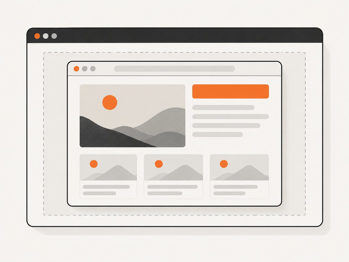
When the Test Runner window is too small to show the AUT at its configured size, Cypress scales and centers the preview to fit. That visual scaling is not a change to the app’s viewport: the app’s layout calculations continue to use the configured dimensions. A scaled preview should not be mistaken for a different viewport.
2. Set a project-wide default viewport
Configure viewportWidth and viewportHeight in cypress.config.js or cypress.config.ts. Cypress’s defaults are already 1000 and 660. Set explicit values when your application’s primary layout target is different, or when making the project’s assumptions easy to see.
TypeScript configuration
import { defineConfig } from 'cypress'

export default defineConfig({
  viewportWidth: 1280,
  viewportHeight: 720,
})
JavaScript configuration
const { defineConfig } = require('cypress')

module.exports = defineConfig({
  viewportWidth: 1280,
  viewportHeight: 720,
})
These values become the default for tests unless a test changes the viewport. Choose dimensions that represent the actual CSS viewport you intend to exercise; do not set them to the outer headless screen size just because both are described as screen dimensions.
3. Change size for one test or responsive scenario
Use cy.viewport() inside a test when only one scenario needs a different size. It accepts a numeric width and height, or one of Cypress’s named dimension presets. Cypress resets the viewport to its default between tests.
describe('responsive navigation', () => {
  it('shows the mobile menu at a narrow width', () => {
    cy.viewport(375, 667)
    cy.visit('/')
    cy.get('[data-cy=mobile-menu]').should('be.visible')
  })

  it('shows the desktop navigation at a wider width', () => {
    cy.viewport(1280, 800)
    cy.visit('/')
    cy.get('[data-cy=desktop-nav]').should('be.visible')
  })
})
A preset is convenient when its dimensions fit the scenario:
cy.viewport('iphone-6')
cy.viewport('ipad-2', 'landscape')
The API includes presets such as iphone-5 (320 × 568), iphone-6 (375 × 667), iphone-x (375 × 812), ipad-2 (768 × 1024), and macbook-13 (1280 × 800). See the current Cypress preset table for the complete list. A preset sets dimensions and orientation; it does not turn the browser into a physical device or simulate its device pixel ratio.
Use a suite-level configuration when all tests in that suite should run at the same dimensions:
describe('tablet layout', {
  viewportWidth: 768,
  viewportHeight: 1024,
}, () => {
  it('keeps the sidebar visible', () => {
    cy.visit('/')
    cy.get('[data-cy=sidebar]').should('be.visible')
  })
})
This keeps the choice close to the tests that need it. For a single action within an existing test, call cy.viewport(width, height) at the point where the layout scenario changes.
4. Override the headless browser screen
If your concern is screenshot or video output in a headless run, change the browser window in the before:browser:launch event. This is separate from the AUT viewport configuration. Cypress’s browser-launch reference documents this distinction and the default headless dimensions.
import { defineConfig } from 'cypress'

export default defineConfig({
  e2e: {
    setupNodeEvents(on) {
      on('before:browser:launch', (browser, launchOptions) => {
        if (browser.isHeadless) {
          launchOptions.args.push('--window-size=1440,900')
        }
        return launchOptions
      })
    },
  },
})
Browser flags and launch behavior can vary by browser. Follow Cypress’s browser launch API for the browser you use. Changing a window-size flag is not a substitute for setting viewportWidth and viewportHeight. To get a larger page layout, set the viewport; to alter the outer headless display surface, adjust browser launch settings.
5. Pick the right setting for the job
| Goal | Use | Example |
|---|---|---|
| Set a consistent project default | viewportWidth and viewportHeight |
1000 × 660 default, or an explicit project target |
| Test a breakpoint or device-sized layout | cy.viewport() |
cy.viewport(375, 667) |
| Apply dimensions to a suite or test | Test configuration object | { viewportWidth: 768, viewportHeight: 1024 } |
| Change headless browser display surface | before:browser:launch |
Browser-specific launch arguments |
| Understand a smaller-looking preview | Runner scaling | Check the displayed AUT dimensions and scale |
For responsive tests, do not test only named device presets. Real breakpoints are often between common preset widths. Include widths around each breakpoint—for example, one pixel below, at, and one pixel above—if the distinction matters to your CSS. Use the viewport dimensions as the test input and assert the behavior that matters, such as navigation visibility, column count, or overflow.
6. Common mistakes and fixes
| Symptom | Likely cause | Fix |
|---|---|---|
| The app still lays out at 1000 × 660 after changing the headless window. | The outer browser screen and AUT viewport are separate settings. | Set viewportWidth/viewportHeight, or call cy.viewport(). |
| The preview looks smaller than the configured size. | The Test Runner scaled the preview to fit its available pane. | Check the AUT dimension indicator; enlarge the Runner if needed. Scaling alone does not change the app’s layout calculations. |
| A test passes at one size but fails at another. | The UI has a breakpoint, overflow, or size-dependent behavior. | Set the size explicitly in the test and assert the expected behavior at each relevant width. |
| A preset does not create a fully accurate phone simulation. | cy.viewport() changes dimensions and orientation, not physical-device traits such as DPR. |
Use it for responsive layout checks; use the appropriate browser or device testing setup for traits it does not simulate. |
| Changing Cypress config inside a test throws or has no immediate effect. | Viewport dimensions are test-run settings; changing Cypress.config() during execution is not the way to resize the current test. In Cypress 16+, changing these keys during execution throws. |
Use cy.viewport(), or configure viewport dimensions on a suite or test. |
| Screenshot output differs between environments. | Headed and headless rendering surfaces, browser versions, fonts, or page loading can differ. | Compare with a reproducible browser and explicit viewport. For headless-specific differences, reproduce locally with a headed run and inspect the captured output. |
Also check for accidental global overrides: command-line --config values, alternate config files, and suite-level viewport configuration can change the effective dimensions. Cypress documents the CLI override form as cypress run --config viewportWidth=1280,viewportHeight=720; verify which config file and command your CI actually runs.
7. Capture a page outside Cypress
Cypress is a browser testing framework, and its viewport settings help test application layouts. If the practical goal is to save a website screenshot rather than run an application test, you can use a screenshot API instead. ScreenshotNeo is a website screenshot API and MCP server from Yorker Media. It accepts a URL in one GET request and can return an image or PDF. Its product page describes the service; the API documentation lists its parameters.
Or skip the browser setup
One call captures the requested URL. Replace the target URL as needed:
curl -G "https://api.screenshotneo.com/v1/shot" \
  -d access_key=YOUR_API_KEY \
  --data-urlencode url=https://stripe.com \
  -o shot.webp
import requests
r = requests.get(
"https://api.screenshotneo.com/v1/shot",
params={"access_key": "YOUR_API_KEY", "url": "https://stripe.com"},
timeout=90,
)
r.raise_for_status()
open("shot.webp", "wb").write(r.content)const q = new URLSearchParams({
access_key: 'YOUR_API_KEY',
url: 'https://stripe.com',
})
const res = await fetch(`https://api.screenshotneo.com/v1/shot?${q}`)
if (!res.ok) throw new Error(`Screenshot request failed: ${res.status}`)
const image = Buffer.from(await res.arrayBuffer())
await import('node:fs/promises').then(fs => fs.writeFile('shot.webp', image))ScreenshotNeo removes cookie and consent banners, newsletter popups, and chat widgets before capture; each of those steps can be turned off. Bot checks and CAPTCHAs, blank pages, timeouts, failed loads, and cache hits are not billed, and response headers report the page verdict and billing status. Its MCP server gives Claude, Cursor, and other MCP clients screenshot, page-info, and PDF tools. The free plan includes 1,000 shots per month without a card; paid plans start at $5 for 3,000. See the docs for request options and sign up for 1,000 free screenshots a month, with no card.
8. Performance, repeatability, and cost
Viewport dimensions are a test input, so keep them explicit wherever layout behavior is under test. This makes local and CI runs easier to compare and helps avoid relying on whichever size a previous command or configuration happened to leave behind. Cypress restores the viewport to its default between tests; still, setting the intended size in each scenario makes the test’s purpose clear.
A larger viewport does not inherently make a test faster or slower in a predictable way. The main practical effect is that it can expose different content, breakpoints, and page geometry. Test the sizes that correspond to actual layout decisions rather than every possible pixel width. For screenshot comparisons, keep the viewport and browser setup consistent to reduce unrelated visual changes.
There is no separate Cypress charge for choosing 1000 × 660 versus another viewport in the configuration described here. CI runtime and any infrastructure costs depend on how and where you run your test suite. For standalone screenshot capture, ScreenshotNeo’s published plans provide a separate usage model: Free 1,000 per month, Starter $5 for 3,000, Growth $15 for 15,000, Pro $39 for 60,000, Scale $99 for 250,000, and Business $249 for 1,000,000. Yearly billing gives two months free, and all features are on every plan. Check the current ScreenshotNeo site before choosing a plan.
9. Quick verification checklist
- Decide whether you mean the AUT viewport or the outer headless browser screen.
- For the default AUT size, expect 1000 × 660 CSS pixels.
- For headless display defaults, expect 1280 × 720 and DPR 1.
- Set global dimensions in the Cypress config, or use
cy.viewport()for a scenario. - Use browser launch configuration only when changing the headless display surface.
- Check for CLI overrides and suite-level settings when a test reports unexpected dimensions.
- Do not confuse Test Runner scaling with a change in viewport dimensions.
10. FAQ
Is Cypress’s default screen 1000 × 660 or 1280 × 720?
Both figures are correct for different layers. The AUT viewport defaults to 1000 × 660; the headless browser screen defaults to 1280 × 720.
Does Cypress use the monitor size of my computer?
The application viewport is controlled by Cypress configuration or test commands. The preview may be scaled to fit the Runner window, but that does not change the AUT’s viewport calculations.
Does cy.viewport('iphone-6') emulate an iPhone?
It sets the preset’s viewport dimensions. It does not simulate all physical-device features; Cypress documents that device pixel ratio is not simulated by the viewport command.
Can I change the viewport with Cypress.config() during a test?
Use cy.viewport() to resize the current test. Cypress 16 and later reject changing viewportWidth or viewportHeight through Cypress.config() during test execution.
Where do I go for complete preset dimensions?
Use the live Cypress viewport API reference, which documents numeric sizes, presets, and orientation.


