Dark and Light Mode Website Design Examples
Compare practical dark and light mode patterns for navigation, articles, forms, and dashboards, then build themes that stay readable and consistent.
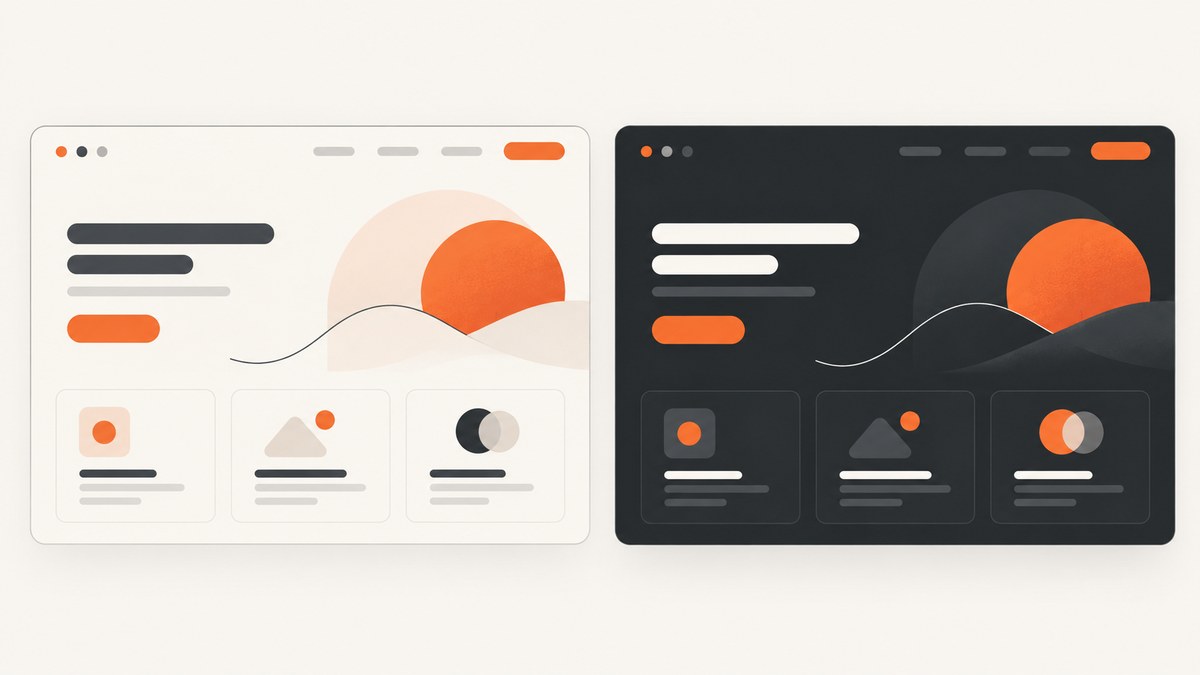
Good dark and light mode design keeps the same content, hierarchy, and component meanings while adapting colors to each scheme. Treat the modes as two deliberate palettes, not as an automatic inversion: choose semantic roles for page background, surfaces, text, borders, links, and states, then check the real foreground and background pairs in both themes.
The examples below are component patterns rather than claims about particular live websites. They show what to compare and how to implement a system preference with a persistent site override. For web platform behavior, see Chrome’s Modern Web Guidance on dark mode.
1. What makes a strong dark and light mode example?
A useful example shows the same interface in both modes and explains how each visual role changes. A light palette often places dark text on a pale page canvas; a dark palette uses lighter text on a dark canvas. But the relationship is more nuanced than swapping black and white. Cards, menus, borders, muted text, focus rings, and imagery all need intentional values.
| Design role | Light mode example | Dark mode example | What to check |
|---|---|---|---|
| Page canvas | Warm or neutral pale background | Deep charcoal, often not pure black | Long-form reading comfort and separation from browser chrome |
| Raised surface | White card against a slightly tinted canvas | A lighter charcoal surface against a darker canvas | Cards, menus, and dialogs remain distinct |
| Primary text | Dark neutral | Soft white or light neutral | Contrast against the exact surface behind it |
| Secondary text | Mid-tone neutral | Light but subdued neutral | Metadata remains readable; muted does not mean inaccessible |
| Links and actions | Brand accent with visible link treatment | Adjusted accent with sufficient contrast | Links are identifiable beyond color alone |
| Controls and boundaries | Visible borders and focus outline | Visible borders and a focus outline distinct from the surface | Keyboard focus, disabled, selected, and error states |
Compare examples using identical criteria. A beautiful swatch says little about a real interface: check body text, placeholder text, icons, code, controls, and text placed over imagery. Keep information architecture and spacing consistent so users recognize the same product in either mode.
2. Paired examples: what changes between themes?
Navigation bar
In a light header, a brand mark may sit on a white surface with a subtle lower border. In its dark counterpart, use a logo variant or a small light backing surface if the original mark disappears. Recheck active navigation, hover, dropdown boundaries, and keyboard focus in both states. A selected item can use a tinted background and a label or shape cue, rather than relying on hue alone.
Long-form article
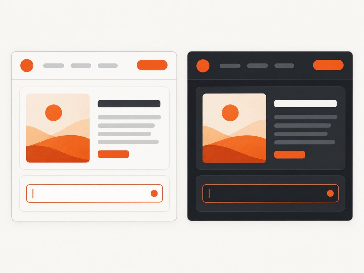
A strong article pairing preserves line length, type size, line height, and whitespace. The light version might use a near-white reading surface on a subtly tinted page; the dark version can use a charcoal reading surface against a deeper canvas. Body copy should remain prominent, while metadata stays secondary but legible. Links need enough contrast and an underline or other distinguishing treatment. A code block can keep a local dark scheme within a light article, as long as its text, boundary, and controls remain clear.
Form
Labels, required markers, helper text, errors, and success messages need equivalent prominence in both palettes. Give an invalid field more than a red border: pair it with an error message and, when useful, a symbol. A disabled control should look inactive but remain understandable. Test focus rings against both the control and nearby surface; a ring that works on a white page can disappear on a dark card.
Dashboard and chart
Dark mode can make charts feel vivid, but glowing saturated colors are not a substitute for readable data. Keep grid lines quiet without erasing them, and distinguish series through labels, line styles, markers, or shapes as well as color. Recheck legends, selected ranges, tooltips, and axis text against their actual surfaces. Do not invert a chart bitmap and assume its labels and data marks still make sense.
Brand assets and media
Inspect logos, illustrations, product screenshots, video controls, and photos in both contexts. Some assets may need a theme-specific version, a framing surface, or a different crop. Avoid globally applying an inversion filter: it can damage brand colors, photographs, and chart meaning. The page theme can change while a media component uses its own color scheme, provided the component stays legible and its boundary is apparent.
These patterns are design examples, not audits of named websites. Do not infer that a site passes accessibility requirements from its appearance alone; actual text and background pairs, states, and presentation must be checked.
3. Define semantic color tokens
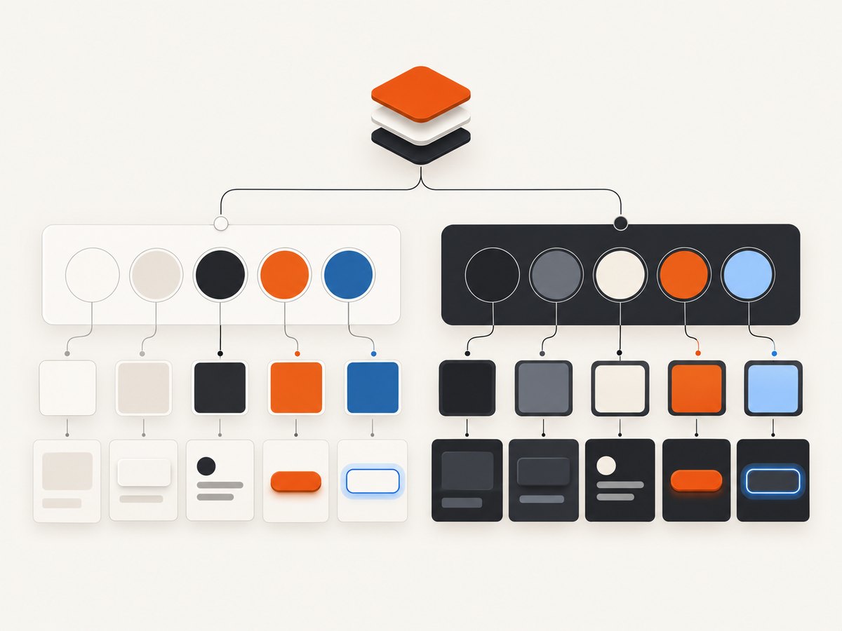
Use names based on purpose rather than appearance. Components can then consume --text or --surface-raised without knowing which theme is active. This sample provides a system-following default and an explicit theme override. It is a starting palette, not a certified contrast result: measure the final values used in your interface.
<!doctype html>
<html lang="en">
<head>
  <meta name="color-scheme" content="light dark">
  <style>
    :root {
      color-scheme: light dark;
      --page: #f6f7f9;
      --surface: #ffffff;
      --text: #20242c;
      --muted: #535c69;
      --border: #c5cbd4;
      --link: #075db5;
      --focus: #8a3ffc;
      color: var(--text);
      background: var(--page);
    }
    @media (prefers-color-scheme: dark) {
      :root {
        --page: #171a20;
        --surface: #222731;
        --text: #f1f3f6;
        --muted: #c1c8d2;
        --border: #515b69;
        --link: #8fc5ff;
        --focus: #d0a5ff;
      }
    }
    :root[data-theme="light"] {
      color-scheme: light;
      --page: #f6f7f9; --surface: #fff; --text: #20242c;
      --muted: #535c69; --border: #c5cbd4; --link: #075db5;
      --focus: #8a3ffc;
    }
    :root[data-theme="dark"] {
      color-scheme: dark;
      --page: #171a20; --surface: #222731; --text: #f1f3f6;
      --muted: #c1c8d2; --border: #515b69; --link: #8fc5ff;
      --focus: #d0a5ff;
    }
    body { margin: 0; padding: 2rem; background: var(--page); color: var(--text);
      font: 1rem/1.6 system-ui, sans-serif; }
    article { max-width: 68ch; padding: 1.5rem; background: var(--surface);
      border: 1px solid var(--border); border-radius: .75rem; }
    p { color: var(--muted); }
    a { color: var(--link); }
    :focus-visible { outline: 3px solid var(--focus); outline-offset: 3px; }
  </style>
</head>
<body>
  <button id="theme-toggle" type="button" aria-pressed="false">Use dark theme</button>
  <article><h1>Readable in both themes</h1>
    <p>Theme tokens keep component meaning consistent.</p>
    <a href="#details">Read the details</a>
  </article>
  <script>
    const root = document.documentElement;
    const button = document.querySelector('#theme-toggle');
    const saved = localStorage.getItem('theme');
    if (saved === 'light' || saved === 'dark') root.dataset.theme = saved;
    function updateButton() {
      const dark = root.dataset.theme === 'dark' ||
        (!root.dataset.theme && matchMedia('(prefers-color-scheme: dark)').matches);
      button.textContent = dark ? 'Use light theme' : 'Use dark theme';
      button.setAttribute('aria-pressed', String(dark));
    }
    button.addEventListener('click', () => {
      const currentDark = root.dataset.theme === 'dark' ||
        (!root.dataset.theme && matchMedia('(prefers-color-scheme: dark)').matches);
      const next = currentDark ? 'light' : 'dark';
      root.dataset.theme = next;
      localStorage.setItem('theme', next);
      updateButton();
    });
    matchMedia('(prefers-color-scheme: dark)').addEventListener('change', updateButton);
    updateButton();
  </script>
</body>
</html>
Save this as an HTML file and open it in a browser. The system preference applies when there is no saved override; selecting a theme pins it in local storage. If the user explicitly picked a theme, an OS preference change should not unexpectedly replace that choice. The listener updates the button when the system changes while the page follows system mode. The example applies the theme after the document begins parsing, so a flash can still occur; production sites can read and apply a saved choice early, though early declaration cannot eliminate every flash in every browser or loading condition.
For browser-native controls and viewport surfaces, declaring supported schemes and setting color-scheme on the root helps browser elements such as scrollbars and form controls follow the page. Chrome’s guidance also describes CSS light-dark() for role values where supported. A token approach remains useful when themes need overrides, broader browser support, or component-specific decisions. See the Chrome implementation guidance.
4. Check accessibility and readability in both modes
Contrast is a property of an actual foreground and background pair, not a theme label. USWDS gives a baseline AA ratio of 4.5:1 for most text and 3:1 for large text (19px or larger bold, or 24px or larger normal). These are technical criteria, not a recommendation to use maximum contrast everywhere. W3C explains that relative luminance matters more than hue for text contrast, and that larger text with wider strokes can be easier to read at lower contrast. Check the USWDS color guidance and W3C contrast explanation.
- Measure body copy, headings, links, placeholder text, disabled text, and text over images or gradients in each theme.
- Inspect hover, focus, selected, pressed, validation, and feedback states. A passing default state does not guarantee the states pass.
- Do not communicate status or required fields through color alone. Pair color with a label, icon, symbol, pattern, or other visible distinction. See W3C’s accessibility design tips.
- Test the whole reading experience. Type size, typeface, line length, line height, whitespace, content design, and writing style also affect readability; color is only one part of it.
Some readers sensitive to bright colors may need lower luminance even when contrast is adequate. Offer a thoughtful palette and avoid assuming that pure white text on pure black is the best experience for everyone.
5. A practical review checklist
- Inventory roles. List page, raised surface, primary and secondary text, links, borders, focus, selection, error, and success tokens.
- Build matched screens. Put the same page or component in light and dark mode side by side. Include content-heavy and interaction-heavy states.
- Review states and assets. Check keyboard focus, validation, disabled controls, charts, logos, images, and embedded code or media.
- Measure actual pairs. Run contrast checks against the colors users see, including overlays and text over imagery. Retest after any palette adjustment.
- Test preference continuity. Verify system default, saved site choice, reload, and OS preference change. Confirm the explicit choice stays pinned.
- Check real layouts. Review narrow and wide screens, browser-native controls, and long pages. Make sure the content hierarchy and component meanings stay stable.
6. Capture paired examples for review
Static screenshots make it easier to compare a shared component across themes or review a page with teammates. You can capture a page with your own browser tooling, then repeat under the other color scheme. If you publish screenshots as evidence, note what page state and theme they represent; a screenshot cannot prove contrast compliance or show every interaction state.
Or skip the browser setup
ScreenshotNeo is a website screenshot API and MCP server. The API can return an image or PDF from one GET request. For a basic example, replace the target URL with your page and provide your API key. See the ScreenshotNeo API documentation for options.
curl -G "https://api.screenshotneo.com/v1/shot" -d access_key=YOUR_API_KEY --data-urlencode url=https://stripe.com -o shot.webpimport requests
r = requests.get("https://api.screenshotneo.com/v1/shot", params={"access_key": "YOUR_API_KEY", "url": "https://stripe.com"}, timeout=90)
open("shot.webp", "wb").write(r.content)const q = new URLSearchParams({ access_key: 'YOUR_API_KEY', url: 'https://stripe.com' });
const res = await fetch(`https://api.screenshotneo.com/v1/shot?${q}`);Cookie banners, popups, and chat widgets are removed before the shot. Bot checks, blank pages, and failed loads are never billed. An MCP server lets AI agents take screenshots. The free plan includes 1,000 screenshots a month with no card; paid plans start at $5 for 3,000. Sign up for free and capture your first page.
7. Troubleshooting theme problems
| Symptom | Likely cause | Fix |
|---|---|---|
| Page flashes the wrong theme on load | The saved preference is applied after the page paints | Read and apply the stored choice as early as practical; retain the system-based fallback. Some flash risk can remain by browser and loading condition. |
| Native inputs or scrollbar stay light | The browser does not know the page supports dark controls | Declare supported schemes with the meta element and set color-scheme on the root. |
| Text looks washed out in dark mode | Muted colors were dimmed without checking their surface | Measure the actual foreground/background pair and adjust the token, not just the body color. |
| Saved theme ignores a later system change | A site override is intentionally pinned | Provide a clear control to return to system mode if your product supports that option. Do not silently replace an explicit choice. |
| Brand art or chart colors look wrong | Assets were inverted or reused without review | Use an appropriate alternate asset, framing surface, or chart-specific palette; preserve labels and non-color distinctions. |
| Focus indicator disappears | The ring has low contrast against the control or adjacent surface | Set a theme-aware focus token, add offset, and inspect keyboard navigation in both modes. |
8. Performance, reliability, and maintenance
Theme switching with CSS custom properties is lightweight: components reference tokens, and a theme changes the values. Avoid duplicating entire page stylesheets for two palettes when the same layout and component rules can use semantic variables. Store only the user’s choice, not a snapshot of the active colors.
Reliability depends on a predictable precedence rule: explicit site choice first, otherwise system preference. Apply the same tokens across shared components, and test new components in both themes during review. A component with a hard-coded background or text color can silently break when added to a different scheme. Keep a small role-based palette rather than exposing dozens of unrelated color values to every component.
There is no need to treat dark mode as a universal performance or battery promise. For design maintenance, the practical cost is creating and reviewing a second set of role values and testing states and assets. The upfront token system reduces repeated theme-specific fixes and makes later palette changes easier to audit.
FAQ
Should a website always default to dark mode?
No. A sound default follows the operating system preference and gives users a site-level choice where appropriate.
Can an article use a dark code block on a light page?
Yes. A component can use its own scheme when its text, controls, and boundaries remain understandable.
Does a contrast checker prove the whole design is accessible?
No. Contrast checking covers color relationships; interaction, semantics, focus, content structure, and other accessibility requirements still need review.
Should I invert every image for dark mode?
No. Inspect each asset. Some need an alternate variant or background; photos and data visualizations should not be blindly inverted.


