Dark Mode Website Design Examples: What to Look For
Learn how to assess dark mode website examples for hierarchy, readable text, functional color, imagery, theme switching, and responsive behavior.
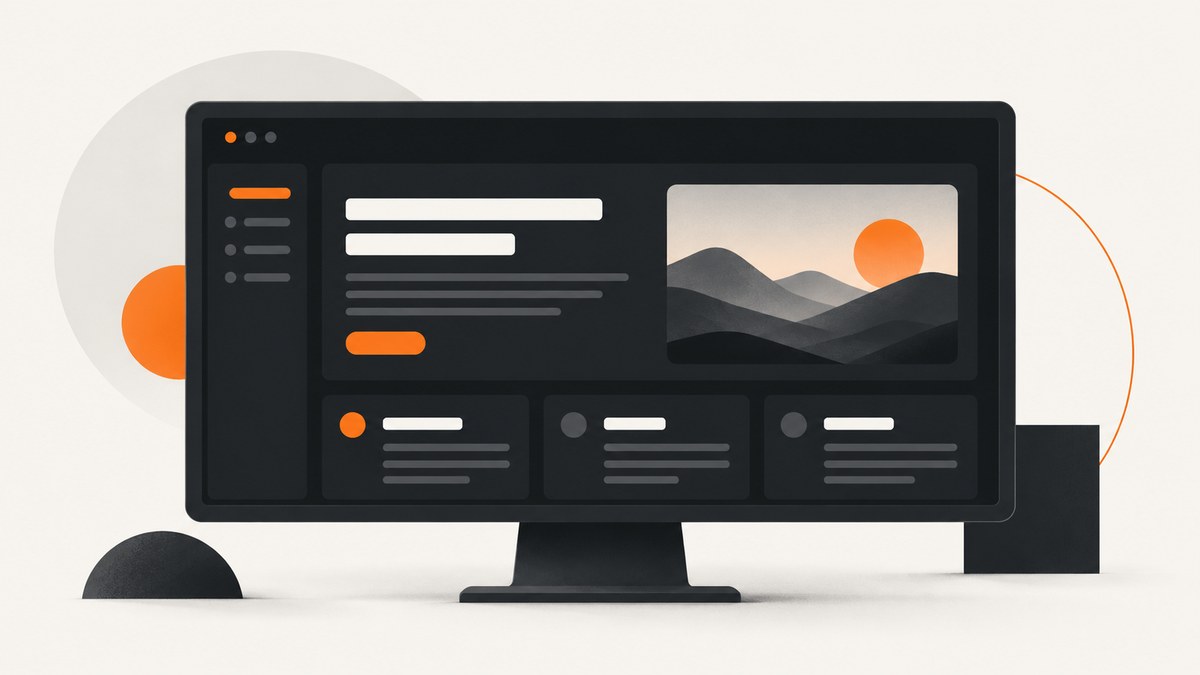
Good dark mode website design examples show a coordinated interface, not just a black background. Look at how each page separates surfaces, establishes reading order, keeps text and controls legible, uses color to signal function, adapts images, and behaves when the theme changes or the viewport shrinks.
This guide gives you a repeatable way to find and assess examples, then turn what you learn into a design and implementation checklist. Treat screenshots as inspiration, not proof of accessibility: contrast, focus states, zoom, responsive behavior, and real page states need separate review.
1. What makes a good dark mode website example?
A useful example demonstrates a complete theme. It accounts for the page background, content surfaces, typography, links, buttons, forms, status messages, images, and theme controls. The pieces should work together as a hierarchy: the reader can tell what is primary, what is interactive, and what is supporting information.
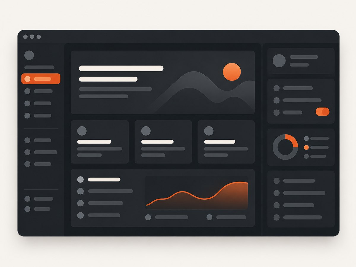
When you collect examples, record the page and the specific design decision that interests you. “Dark and attractive” is not a reusable observation. “The article surface is slightly lighter than the page background, while headings and links have distinct visual treatments” is something you can evaluate and adapt.
| Area | What to inspect | Useful question |
|---|---|---|
| Surfaces and hierarchy | Page background, cards, panels, dividers, overlays | Can you distinguish sections without making every surface equally bright? |
| Text and typography | Body copy, headings, captions, labels, muted text | Can you read the smallest meaningful text at normal zoom? |
| Functional color | Links, selected controls, errors, success, warnings | Does each state have a clear signal beyond its hue? |
| Images and media | Photos, charts, diagrams, video, text over images | Does the media remain clear, with equivalent information available where needed? |
| Theme behavior | Theme switch, native controls, page state | Does the whole interface follow the selected theme? |
| Responsive behavior | Small and wide viewports, zoom, content order | Does the hierarchy and legibility survive layout changes? |
2. Find examples and capture them consistently
Start with pages whose purpose resembles your own: documentation, dashboards, editorial pages, commerce, or marketing sites. Search for dark mode design examples in that category, then visit the live pages. Record the URL, date, viewport size, and whether the page was using a system-selected or manually selected theme. A dark screenshot without that context can be hard to reproduce or compare.
Capture more than the first screen. Include a content-heavy section, a form or interactive control if available, and the narrow layout. Keep viewport dimensions consistent when comparing pages. For a practical audit, capture both the light and dark versions, and note whether the theme control changes the page immediately or only after navigation.
Browser-based capture with Playwright
This runnable Node.js example loads a page, emulates dark color preference, waits for the page to settle, and saves a full-page screenshot. It is a starting point; some sites use their own theme setting, so you may need to click their switch and wait for the interface to update.
npm install playwright
npx playwright install chromium
// capture-dark.mjs
import { chromium } from 'playwright';

const url = process.argv[2] ?? 'https://example.com';
const browser = await chromium.launch({ headless: true });
const page = await browser.newPage({
  viewport: { width: 1440, height: 1000 },
  colorScheme: 'dark',
  deviceScaleFactor: 1
});

try {
  await page.goto(url, { waitUntil: 'networkidle', timeout: 60000 });
  await page.screenshot({ path: 'dark-page.png', fullPage: true });
  console.log(`Saved dark-page.png for ${url}`);
} finally {
  await browser.close();
}
Run it with node capture-dark.mjs https://your-site.example. Playwright’s color scheme emulation only affects pages that respond to the browser preference, commonly through CSS prefers-color-scheme. If the site defaults to light mode or stores a manual choice, use its theme control too. Do not assume that emulation proves the site’s theme switch works.
Capture a comparison set
For a small review, use a consistent matrix: light and dark theme, desktop and mobile viewport, and one representative content state. A desktop screenshot cannot establish how overlaid text behaves when a hero image crops on a phone. Avoid changing several variables at once; otherwise you may not know whether a difference came from the viewport, theme, or page state.
3. Evaluate the dark palette and reading hierarchy
Dark interfaces need distinct levels without relying on a stack of near-black colors that all look alike. Check the page canvas, primary content region, raised card, and overlays. Surface separation can come from subtle color differences, borders, spacing, or elevation cues. The hierarchy should remain apparent without making every panel glow.
Typography carries much of the hierarchy. Compare body text with headings, captions, metadata, and disabled-looking labels. A muted color that works for large metadata may disappear at small sizes. Line length, line height, typeface, whitespace, and wording all affect readability alongside color contrast. USWDS likewise cautions that readability depends on these factors, not color alone (USWDS color guidance).
Check contrast against the actual background
WCAG 2.1 Success Criterion 1.4.3 sets a minimum contrast ratio of 4.5:1 for ordinary text and 3:1 for large text, subject to its exceptions. These are thresholds; a ratio below the required threshold does not pass by rounding. The criterion also covers placeholder text and text shown on hover or keyboard focus. Its exceptions include inactive interface components, pure decoration, and logotypes. See the W3C Understanding document for SC 1.4.3.
Check the text and the background it actually touches. For text over an image or gradient, inspect the portions behind the letters rather than sampling a convenient flat area elsewhere. Repeat the check after responsive cropping and at increased zoom. GOV.UK guidance calls for text over images to contrast against all overlapping image areas at all screen sizes and zoom levels (GOV.UK accessibility guidance).
4. Check links, controls, and status without color alone
Color can reinforce meaning, but it should not be the only way someone identifies a link, an error, a selected filter, or a successful action. A link can also be underlined; an error can include an icon and explanatory text; a selected tab can use shape, weight, or an indicator. W3C’s guidance on SC 1.4.1 Use of Color explains that information conveyed through color differences needs another visual means.
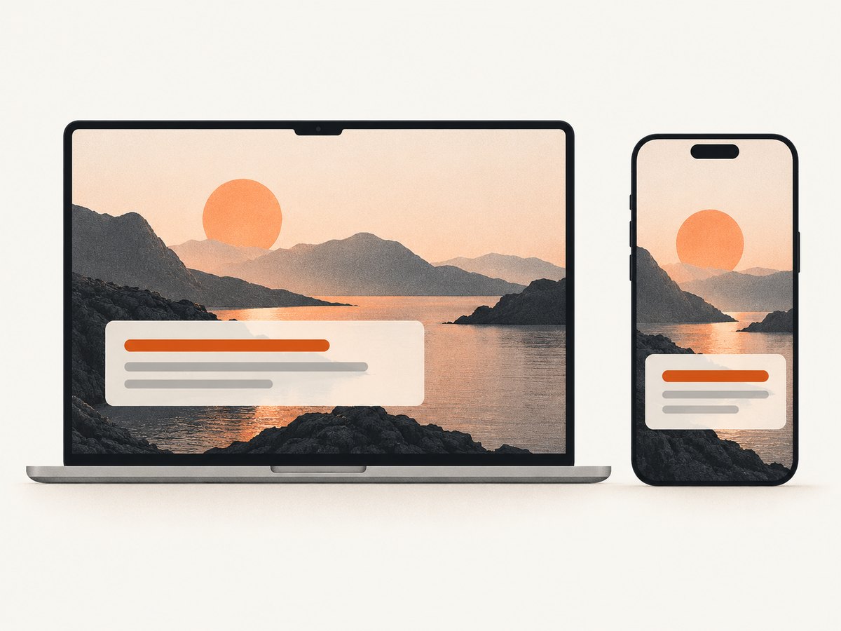
Inspect interactive states, not just the resting screen. Tab through the page and check focus visibility. Hover links and buttons, open menus, select options, and submit invalid form values where you can. Verify that focus and hover text remain readable against their changed backgrounds. Look for visible labels on forms, clear feedback after an action, and consistent navigation; these are part of a usable page, not optional finishing touches. W3C WAI’s design tips cover contrast, identifiable interactive elements, navigation, labels, feedback, grouping, and different viewport sizes.
5. Inspect imagery, charts, and embedded text
Dark surfaces change how media appears. A transparent illustration may blend into the page; a bright photograph can dominate the surrounding content; a chart designed only for a white canvas may lose grid lines or series distinctions. Check images in context and at the sizes where they will actually appear. Do not “fix” every image with a dark overlay: that can hide detail or undermine the image’s purpose.
For charts and diagrams, ensure the information is available in text as well. A concise summary may work for a simple chart; complex graphics can need a longer description or a data table. Text embedded in an image needs particular scrutiny because it may resize poorly and can become unreadable against parts of the image.
When comparing examples, write down what the media communicates and what alternative is provided. If the graphic is decorative, that is different from a chart that carries the only explanation of a result. A screenshot can help spot visual issues, but it cannot establish that alternatives or semantics are present; inspect the page itself.
6. Test theme switching and native browser elements
A manual theme switch should update the entire interface consistently, including menus, dialogs, controls, and content that appears after the switch. The document’s color-scheme can also tell the browser which native control palette to use. The Intelligence Community Design System documents a pattern that sets color-scheme to dark or light at the root when the selected theme changes; it notes that otherwise native elements such as scrollbars can retain the old scheme (IC Design System dark mode pattern).
/* Example only: connect these classes to your actual theme control. */
:root {
  color-scheme: light;
  --page: #ffffff;
  --surface: #f3f4f6;
  --text: #202124;
}

:root[data-theme="dark"] {
  color-scheme: dark;
  --page: #17191c;
  --surface: #22262b;
  --text: #f1f3f4;
}

body {
  background: var(--page);
  color: var(--text);
}

.card {
  background: var(--surface);
}
This demonstrates the relationship between a theme attribute, CSS tokens, and native color scheme. It is not a complete theme system or a compatibility guarantee for every browser or component. Test your own controls and embedded widgets. Also verify whether the manual preference persists, whether a system preference is respected by default, and what happens when the system preference changes while the site is open.
7. Make a repeatable review checklist
- Choose a representative page. Include meaningful body content and at least one interactive area if available.
- Record the conditions. Note URL, capture date, viewport, zoom, theme preference, and whether a manual switch was used.
- Compare surface levels. Identify the canvas, content surfaces, overlays, and dividers. Check whether the reading order is clear.
- Inspect text contrast. Include body text, labels, placeholders, metadata, focus text, and text over images. Check the applicable WCAG threshold.
- Test controls and states. Use keyboard focus and inspect hover, selected, disabled, error, and success treatments. Confirm that meaning is not encoded by color alone.
- Review media and alternatives. Check image crops, charts, diagrams, embedded text, and equivalent text information.
- Repeat at smaller widths and zoom. Confirm that order, contrast, and control labels remain useful.
- Separate observations from conclusions. Record what you saw. Do not call a screenshot accessible without testing the relevant criteria and states.
Use a simple table for notes: page and state, what works, what fails, evidence to recheck, and a design idea worth adapting. This keeps a reference library useful to the team and prevents a visually striking image from becoming an unexamined design rule.
8. Troubleshooting screenshot reviews
| Problem | Likely cause | Fix |
|---|---|---|
| The screenshot is light despite dark emulation | The site uses a manual theme setting or ignores the system preference. | Use the site’s theme control, then verify the resulting page state. Check whether the choice persists after reload. |
| The screenshot is incomplete or content is missing | Lazy loading, delayed scripts, consent prompts, or network activity may not have settled. | Wait for a meaningful selector or a suitable delay, scroll through lazy content if needed, and capture again. Record any overlays that affect the result. |
| Text looks acceptable in the image but fails contrast checks | Visual judgment is unreliable, especially for small text and subtle grays. | Measure foreground against the actual background and use the applicable WCAG threshold. Do not round a failing ratio up. |
| A hero caption becomes hard to read on mobile | The image crop or responsive layout puts text over a different, lower-contrast area. | Test each crop and viewport; adjust placement or provide a stable backing surface, then retest the overlap. |
| Some native controls remain light | The selected document theme and browser native color scheme are out of sync. | Coordinate the root color-scheme with the selected theme and inspect controls in the supported browsers. |
| Status is unclear in grayscale or to someone who cannot distinguish hues | Color is the only status cue. | Add a text label, icon, shape, or other clear indicator alongside the color. |
| A full-page capture takes too long or times out | The page has long-running network requests or extensive content. | Use a targeted selector or viewport capture for the question at hand, set a practical timeout, and avoid waiting indefinitely for all network activity. |
9. Performance, reliability, and cost of a screenshot workflow
Browser screenshots are useful for close inspection, but their reliability depends on repeatable conditions. Pin viewport dimensions and device scale, wait for content that matters rather than an arbitrary long delay, and capture named states. Dynamic ads, rotating content, fonts, and animations can make captures differ between runs. Disable animation or wait for a stable state when your tooling and review purpose support it, and document any such changes.
Full-page capture can take longer and produce larger files than a viewport shot, particularly for long pages and high device scale factors. Choose the smallest capture that answers the review question. For a visual hierarchy check, the whole page may help; for a control-state review, a focused element capture is often easier to inspect. Keep the original viewport and state in your notes so a teammate can reproduce the observation.
For an in-house workflow, account for browser runtime, machine or CI capacity, storage, and the effort to maintain the capture environment. Third-party screenshot APIs trade local browser setup for a request-based workflow; compare their current limits and pricing before adopting one. Regardless of capture method, an image itself cannot verify keyboard behavior, semantic labels, contrast across every state, or the presence of text alternatives.
10. Or skip the browser setup
ScreenshotNeo is a website screenshot API and MCP server for developers. Its API returns an image or PDF from one GET request. Cookie banners are accepted before capture, and 60+ known consent platforms, newsletter popups, and chat widgets can be removed; each step can be turned off. Bot checks, blank pages, failed loads, timeouts, and cache hits cost nothing, with X-Page-Verdict and X-Billed response headers indicating the result. Its MCP server gives Claude, Cursor, and other MCP clients the take_screenshot, get_page_info, and capture_pdf tools. See the ScreenshotNeo site and API documentation.
curl -G "https://api.screenshotneo.com/v1/shot" -d access_key=YOUR_API_KEY --data-urlencode url=https://stripe.com -o shot.webpimport requests
r = requests.get(
"https://api.screenshotneo.com/v1/shot",
params={"access_key": "YOUR_API_KEY", "url": "https://stripe.com"},
timeout=90,
)
r.raise_for_status()
with open("shot.webp", "wb") as image:
image.write(r.content)
const q = new URLSearchParams({ access_key: 'YOUR_API_KEY', url: 'https://stripe.com' });
const res = await fetch(`https://api.screenshotneo.com/v1/shot?${q}`);
if (!res.ok) throw new Error(`Screenshot request failed: ${res.status}`);
const image = Buffer.from(await res.arrayBuffer());
await import('node:fs/promises').then(fs => fs.writeFile('shot.webp', image));
Replace the example URL with the page you are reviewing and keep your API key private. ScreenshotNeo also supports full-page capture with lazy images loaded, CSS selector element capture, dark mode, 12 device presets or custom viewports, retina scale, custom CSS and JavaScript, wait conditions, request blocking, headers, cookies, user agent, timezone, geolocation, resizing, caching with a chosen TTL, signed public image links, async jobs with signed webhooks, bulk capture of 100 URLs per call, and a usage API. Check the docs for parameter names and current usage details before building a workflow.
Free includes 1,000 shots per month with no card. Paid plans start at $5 for 3,000 shots; the listed plans are Starter $5/3,000, Growth $15/15,000, Pro $39/60,000, Scale $99/250,000, and Business $249/1,000,000. Yearly billing gives two months free, and every feature is on every plan. Sign up for 1,000 free screenshots a month with no card.
11. Frequently asked questions
What are some good dark mode website design examples?
Look for pages that demonstrate a specific decision you can evaluate: clear surface hierarchy, readable muted text, identifiable controls, useful image treatment, or a consistent theme switch. Verify the live page and its responsive states; a gallery screenshot alone does not establish how the site behaves.
How do you design a website in dark mode?
Define a coordinated set of surface, text, border, and functional colors; apply it across all components; synchronize the selected theme with the browser’s color scheme; then test contrast, controls, images, keyboard states, zoom, and narrow layouts. Treat accessibility as a property to verify across the interface, not a property of a palette name.
Should dark mode use pure black?
There is no universal requirement in the cited guidance to use pure black. Choose surface colors that support hierarchy and keep text, controls, and media legible. Evaluate the actual combinations and the product’s context rather than adopting a single background value from a reference.
Does a dark screenshot prove a site is accessible?
No. It can help you inspect a visual state, but it cannot by itself verify keyboard access, text alternatives, semantic labels, every contrast ratio, or all responsive and interactive states. Use it as one piece of a broader review.
Does dark mode automatically follow a visitor’s preference?
Only if the site implements behavior that responds to the system preference, or offers a manual choice. Inspect both the initial state and the theme control; do not infer the behavior from a screenshot.


