How to Design a Photo Gallery for Your Website
A practical guide to responsive, accessible, fast photo galleries, with complete HTML, CSS, JavaScript, loading, lightbox, and testing advice.
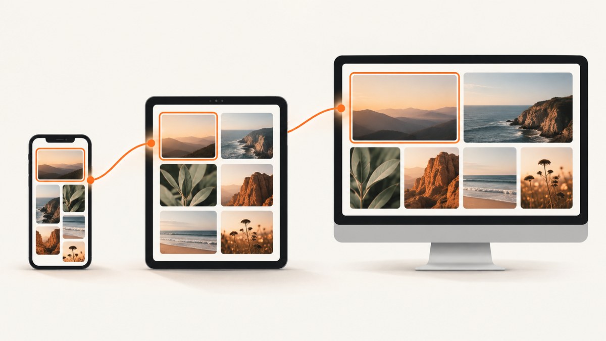
A good photo gallery helps visitors scan a collection, understand each image, and open a larger view without waiting or losing their place. The implementation should adapt to narrow and zoomed viewports, provide useful image alternatives, reserve layout space, and treat lightboxes or carousels as accessible interfaces.
For most collections, start with a responsive grid. Add a lightbox only when visitors need to inspect larger images. Use a carousel when showing one image at a time is genuinely more useful than letting people scan the collection. W3C notes that carousel content can be difficult to discover, so do not make a carousel the default for a collection that benefits from comparison. W3C carousel guidance
1. Choose the gallery pattern
Responsive grid
A grid is the best starting point for portfolios, product photos, event albums, and documentation examples. Visitors can compare several images at once, skip directly to an interesting item, and use normal page scrolling. Keep tile proportions consistent when that supports the visual design, but inspect crops carefully: object-fit: cover can remove an important subject near an edge.
Grid with a lightbox
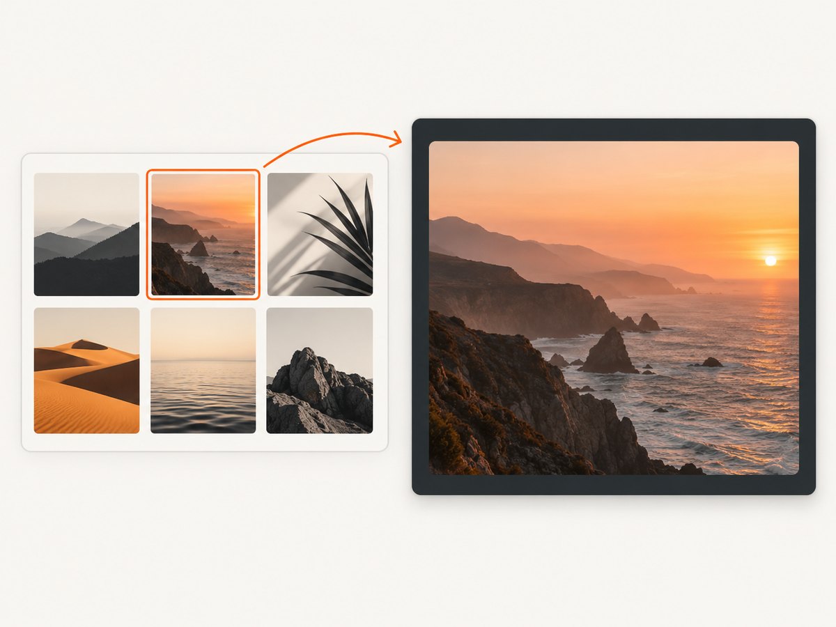
Use a larger view when thumbnails are only previews. The native <dialog> element provides a useful foundation for a lightbox. The dialog must have a clear close button, a meaningful accessible name, sensible focus behavior, and a way to move between images if that interaction is provided.
Carousel
A carousel presents one item at a time. If you use one, provide previous and next buttons, identify the current position, make every operation keyboard accessible, announce changes to assistive technology, and provide a pause control for automatic movement. Avoid autoplay unless movement has a clear benefit and visitors can stop it. W3C’s carousel tutorial covers these requirements.
2. Plan image meaning and alternatives
Write the alternative text after deciding what each image does on the page. The W3C Images Tutorial distinguishes informative, decorative, functional, text, complex, and grouped images.
- Informative photograph: describe the essential information, such as “Red fox standing on snow beside a pine forest.”
- Decorative image: use
alt=''when it adds no information beyond nearby text. - Linked or button image: describe the action, such as “Open winter landscape in full size,” rather than repeating the filename.
- Grouped images: when several images communicate one idea, avoid repeating the same description on every item. Provide one useful group-level explanation where appropriate.
Do not use filenames as alt text and do not force long descriptions on every photo. The right detail depends on the subject and its purpose. A bird-identification gallery needs different information from a general parks page.
3. Build a responsive, accessible grid
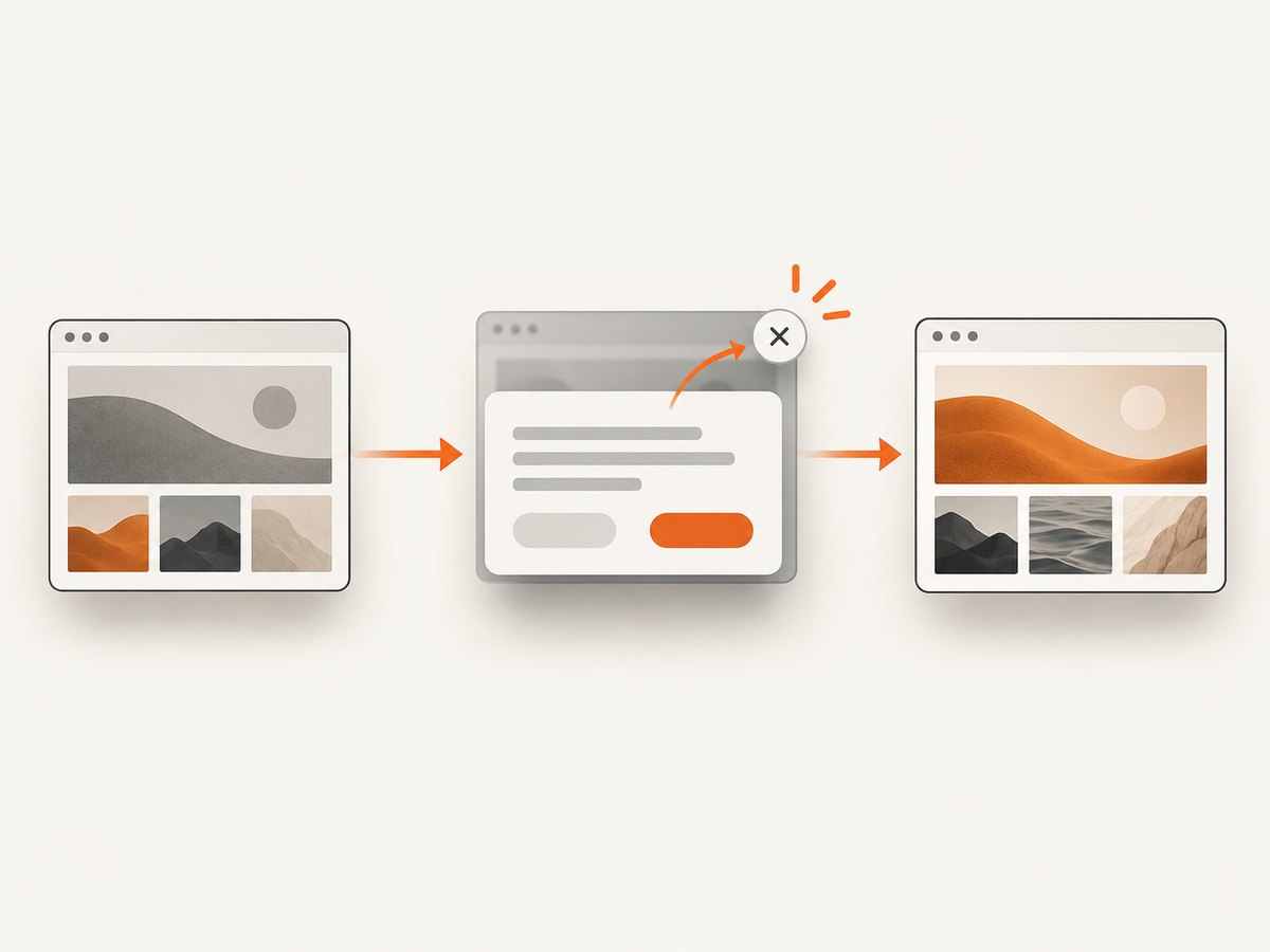
The following complete example uses semantic links, reserved aspect-ratio space, responsive images, and a native dialog. Replace the sample URLs and descriptions with your own assets.
<!doctype html>
<html lang='en'>
<head>
  <meta charset='utf-8'>
  <meta name='viewport' content='width=device-width, initial-scale=1'>
  <title>Trail photographs</title>
  <style>
    :root { color-scheme: light dark; }
    body { max-width: 72rem; margin: 0 auto; padding: 1rem; font: 1rem/1.5 system-ui, sans-serif; }
    .gallery { display: grid; grid-template-columns: repeat(auto-fit, minmax(13rem, 1fr)); gap: 1rem; }
    .gallery a { display: block; color: inherit; text-decoration: none; }
    .tile { aspect-ratio: 4 / 3; overflow: hidden; background: #ddd; border-radius: .5rem; }
    .tile img { width: 100%; height: 100%; object-fit: cover; display: block; }
    .gallery a:focus-visible, button:focus-visible { outline: 3px solid #0a7; outline-offset: 3px; }
    dialog { max-width: min(90vw, 70rem); padding: 0; border: 0; border-radius: .5rem; }
    dialog::backdrop { background: rgb(0 0 0 / .75); }
    .viewer { padding: 1rem; background: Canvas; color: CanvasText; }
    .viewer img { max-width: 100%; max-height: 75vh; display: block; margin: 0 auto; }
    .viewer header { display: flex; justify-content: space-between; gap: 1rem; align-items: center; }
  </style>
</head>
<body>
  <main>
    <h1>Trail photographs</h1>
    <div class='gallery'>
      <a href='photos/trail-01-large.jpg' data-full='photos/trail-01-large.jpg' data-title='Misty trail through a pine forest'>
        <div class='tile'><img src='photos/trail-01-640.jpg' srcset='photos/trail-01-320.jpg 320w, photos/trail-01-640.jpg 640w, photos/trail-01-1280.jpg 1280w' sizes='(max-width:  fortyrem) 50vw, 25vw' width='640' height='480' loading='lazy' decoding='async' alt='Misty trail through a pine forest'></div>
      </a>
      <a href='photos/trail-02-large.jpg' data-full='photos/trail-02-large.jpg' data-title='Wooden footbridge over a stream'>
        <div class='tile'><img src='photos/trail-02-640.jpg' width='640' height='480' loading='lazy' decoding='async' alt='Wooden footbridge over a stream'></div>
      </a>
    </div>
  </main>
  <dialog id='lightbox' aria-labelledby='lightbox-title'>
    <section class='viewer'>
      <header><h2 id='lightbox-title'></h2><button type='button' id='close'>Close</button></header>
      <img id='large-image' alt=''>
    </section>
  </dialog>
  <script>
    const dialog = document.querySelector('#lightbox');
    const image = document.querySelector('#large-image');
    const title = document.querySelector('#lightbox-title');
    let returnFocus;
    document.querySelectorAll('.gallery a').forEach(link => {
      link.addEventListener('click', event => {
        event.preventDefault();
        returnFocus = link;
        image.src = link.dataset.full || link.href;
        image.alt = link.dataset.title || '';
        title.textContent = link.dataset.title || 'Photo';
        dialog.showModal();
      });
    });
    document.querySelector('#close').addEventListener('click', () => dialog.close());
    dialog.addEventListener('close', () => returnFocus?.focus());
  </script>
</body>
</html>
In production, correct the sizes value to match your layout; for example, use 50vw below 640 pixels and 25vw above it. The example reserves space with width, height, and aspect-ratio, reducing layout movement while images load.
4. Deliver the right image bytes
Do not send full-resolution originals to every grid tile. Generate or request variants for the display role: a small thumbnail, a grid-sized image, and a larger dialog image. The browser can select an appropriate candidate from srcset. Google’s responsive image guidance explains resolution-specific sources.
Use loading='lazy' for images below the initial viewport. The first visible row should normally load immediately. Always reserve dimensions or an aspect-ratio box so late responses do not push content around. web.dev’s gallery guide demonstrates this approach and also shows loading a larger image only when a dialog opens.
Evaluate AVIF, WebP, and JPEG on your own photographs and browser targets. web.dev reports smaller files for the AVIF files in its demonstration, but that is not a universal size guarantee. Compare visual quality, encode time, delivery size, and fallback behavior using representative images. Tools named by web.dev include Squoosh, Cloudinary, Photoshop, GIMP, and ImageMagick; the reference does not establish a comparative ranking.
5. Make overlays and controls readable
Text over photographs must remain readable against the actual image, gradients, and background. Check contrast in the states users see, including focus, hover, loading, and a dark image behind a caption. A solid or translucent backing surface can help. web.dev demonstrates backdrop-filter as one styling option, but the finished contrast still needs checking. W3C’s design tips include contrast and responsive viewport guidance.
Give every control a visible focus style. Use real buttons for actions, links for navigation, and labels that describe the result. A close button labelled “Close” is clearer than an icon-only button without an accessible name.
6. Add keyboard and screen-reader behavior
- Tab should reach every thumbnail link and dialog control in a logical order.
- Opening the lightbox should move focus into it; closing should return focus to the thumbnail that opened it.
- Escape should close a modal dialog.
- If the dialog supports previous and next actions, disable or clearly handle boundaries and announce the new image title and position.
- Do not trap focus in a custom overlay unless you implement the complete dialog interaction correctly; native modal dialogs provide a safer starting point.
- If a carousel moves automatically, provide pause and stop controls and do not change content while a keyboard user is interacting.
7. Decide between grid, lightbox, and carousel
| Need | Recommended pattern | Implementation checks |
|---|---|---|
| Compare many photographs | Responsive grid | Consistent tiles, useful alt text, responsive sources |
| Inspect detail occasionally | Grid plus dialog lightbox | Focus return, close button, lazy-load large image |
| Tell a sequential story | Carousel only when justified | Keyboard controls, position announcement, pause control |
| Images are decorative | Grid without redundant announcements | Empty alt text and descriptive surrounding text |
Ask whether a visitor needs to scan the whole collection or view one item at a time. A carousel can save space, but it can also hide content and reduce discovery. A visible grid is usually easier to compare and browse.
8. Loading, caching, and reliability checklist
- Resize assets to the largest rendered size plus an appropriate density allowance.
- Compress without removing detail that matters to the subject.
- Provide
width,height, oraspect-ratiofor every image. - Use
srcsetandsizesfor responsive candidates. - Lazy-load below-the-fold thumbnails and dialog-only originals.
- Give every image a stable URL and configure cache headers at the delivery layer.
- Test slow networks, disabled JavaScript, zoom at 200%, narrow screens, and high-contrast or forced-colors modes.
- Check failed image requests and provide a useful fallback message or placeholder.
Measure the page with your real gallery. Compare delivered bytes, largest images, layout shift, and interaction delay before and after changes. Avoid claiming a fixed performance improvement without measuring your own collection and devices.
9. Troubleshooting common failures
Images are cropped badly
Cause: object-fit: cover fills a fixed box by cropping overflow. Fix: use a different focal position with object-position, choose a less aggressive ratio, or use object-fit: contain when showing the whole image matters.
The page jumps while images load
Cause: intrinsic dimensions are missing or the layout has no reserved space. Fix: include width and height attributes or an aspect-ratio wrapper for every tile.
Screen readers announce useless names
Cause: filenames, duplicate descriptions, or missing functional labels. Fix: write alt text for the image’s purpose; label a linked image with the destination or action.
The lightbox opens but keyboard focus disappears
Cause: focus was not moved into the dialog or restored afterward. Fix: use a modal <dialog>, keep a reference to the opening control, and restore focus on close.
The gallery is slow on mobile
Cause: full-resolution originals, too many eager requests, or oversized format choices. Fix: generate display-sized variants, lazy-load later rows, and compare modern formats against fallbacks on representative devices.
Carousel content cannot be found
Cause: only one item is visible and movement is automatic or controls are unclear. Fix: prefer a grid, or add explicit previous/next controls, position text, pause behavior, and keyboard support.
10. Verify the result before launch
- Resize from a narrow phone viewport to a wide desktop and zoom the page.
- Navigate with keyboard only; check focus visibility and order.
- Run a screen reader pass for headings, image alternatives, dialog names, and state changes.
- Throttle the network and confirm that placeholders reserve space.
- Open every large image and test close, Escape, browser back, and focus restoration.
- Check captions and controls over light, dark, and visually busy photographs.
- Test with JavaScript disabled to ensure the collection remains understandable.
Or skip the browser setup
If you need screenshots of gallery states for documentation, visual regression, or an AI workflow, ScreenshotNeo provides a single request to capture a URL as PNG, JPEG, WebP, or PDF. It can accept consent banners before capture and remove more than 60 known consent platforms, newsletter popups, and chat widgets. Bot checks, blank pages, timeouts, failed loads, and cache hits are not billed; response headers identify the page verdict and whether the shot was billed. It also provides an MCP server for Claude, Cursor, and other MCP clients.
See the ScreenshotNeo API documentation for all options, including full-page capture with lazy images loaded, CSS-selector element capture, dark mode, device presets, retina scale, custom CSS and JavaScript, waits, request blocking, headers, cookies, user agents, timezone, geolocation, transparent backgrounds, resizing, caching, signed links, asynchronous jobs, bulk capture, and usage reporting.
cURL
curl -G 'https://api.screenshotneo.com/v1/shot' -d access_key=YOUR_API_KEY --data-urlencode url=https://example.com/gallery -o gallery.webpPython
import requests

r = requests.get(
    'https://api.screenshotneo.com/v1/shot',
    params={'access_key': 'YOUR_API_KEY', 'url': 'https://example.com/gallery'},
    timeout=90,
)
r.raise_for_status()
open('gallery.webp', 'wb').write(r.content)
Node.js
const q = new URLSearchParams({
  access_key: 'YOUR_API_KEY',
  url: 'https://example.com/gallery'
});
const res = await fetch(`https://api.screenshotneo.com/v1/shot?${q}`);
if (!res.ok) throw new Error(`Screenshot failed: ${res.status}`);
const buffer = Buffer.from(await res.arrayBuffer());
require('node:fs').writeFileSync('gallery.webp', buffer);
Free usage includes 1,000 screenshots per month with no card. Paid plans start at $5 for 3,000 shots; every feature is available on every plan. Create a free ScreenshotNeo account and capture your first gallery screenshot.
FAQ
Should every thumbnail open a lightbox?
No. Add a larger view when detail is useful. A grid can be sufficient for decorative or quickly scannable collections.
Is a carousel always inaccessible?
No, but it requires deliberate keyboard operation, announcements, focus handling, and pause controls. A grid is often simpler for discovery.
What image format should I choose?
Compare AVIF, WebP, and JPEG using your own images, quality requirements, and browser targets. Keep a fallback where needed.
How many columns should a gallery have?
Let the grid respond to available width with a sensible minimum tile size. Verify the result at narrow widths and high zoom rather than choosing one fixed column count.
Can I screenshot a gallery after interactions?
Yes. Use ScreenshotNeo waits, custom JavaScript, click actions, selector capture, and device or viewport options to capture the state you need.


