How to Design a Website Image Upload UI
Design image uploads users can understand, access, and recover from. Learn how to handle selection, validation, previews, errors, and drag and drop.

A good image upload UI tells people what image they need, offers a familiar way to select it, confirms whether it was accepted, and makes mistakes easy to fix. Start with a labeled file-selection control and clear format and size requirements. Add drag and drop only as a convenience, never as the only way to upload. Show the selected filename and a remove or replace action; give specific, text-based errors when selection or upload fails.
This guide covers the interface, accessible HTML, client-side checks, server-side validation, progress and failure states, responsive behavior, and a practical review checklist. An upload asks people to share a file, so first decide whether the image is essential to the task and how it will be handled.
1. Decide what the upload is for
Before choosing a component, establish what the image is used for and whether it is required. GOV.UK advises requesting an upload only when it is critical to delivering the service. If the image is optional, say so and let users continue without one. If it is required, explain why in the surrounding task instructions rather than relying on a vague label such as “Upload.”
Define the constraints with the team that receives the file:
- Which formats are supported, such as JPEG, PNG, or WebP?
- What is the maximum file size and, if relevant, the maximum pixel dimensions?
- Can a person upload one image or several?
- Is a preview useful for confirming the selected image?
- Can the same uploaded image be reused later in the journey?
Do not publish limits in the interface until they match the server’s actual rules. A mismatch makes the control feel unreliable: a file may appear acceptable and then fail after upload, or be rejected earlier than the hint suggests.
2. Put instructions beside a real file control
Use a visible label that says what the image is for, and connect it programmatically to the file input. Place accepted formats and size limits next to that control. A dashed rectangle alone does not explain its purpose or make it operable. Canada.ca’s file-uploader guidance describes the label as the instruction and the hint as the place for file types and requirements such as maximum size.
<form action="/profile/photo" method="post" enctype="multipart/form-data">
  <label for="profile-image">Choose a profile image</label>
  <p id="profile-image-hint">
    JPG, PNG, or WebP. Maximum file size: 5 MB.
  </p>
  <input
    id="profile-image"
    name="image"
    type="file"
    accept="image/jpeg,image/png,image/webp"
    aria-describedby="profile-image-hint"
  >
  <button type="submit">Save image</button>
</form>
The value of accept can help the file picker show relevant files, but it is a selection hint, not security validation. Users and clients can bypass it, and file extensions or declared content types can be misleading. Enforce format, size, and any image-specific constraints on the server before storing or using the file.
If your design hides the native input behind a styled button, preserve its keyboard and screen-reader behavior. The label must still activate the input, focus must be visible, and the control must work without drag and drop. Prefer the native control unless the custom treatment solves a concrete usability need.
3. Treat drag and drop as an optional route
Drag and drop can help desktop users who already have a file open in a file manager. It should supplement the file picker, not replace it. WCAG 2.2 Success Criterion 2.5.7 requires a single-pointer alternative for functionality that uses dragging, unless dragging is essential or outside the author’s control. A choose-file button is a straightforward alternative.
A drop area needs understandable states: idle, active while an acceptable file is dragged over it, and rejected or failed. Give a short text cue such as “Drop an image here, or choose a file.” On drag over, indicate that the area can accept the file. If the drop fails, say what happened and how to continue. Do not use color as the only signal; pair a visual change with text or another perceivable cue.
Keep the target large enough to use comfortably, but do not make the whole page an unexplained drop zone. Restrict handling to the intended area so users do not accidentally navigate away or replace a selection. A file picker remains available on touch devices, keyboard navigation, and assistive technology.
4. Show selection, replacement, and removal
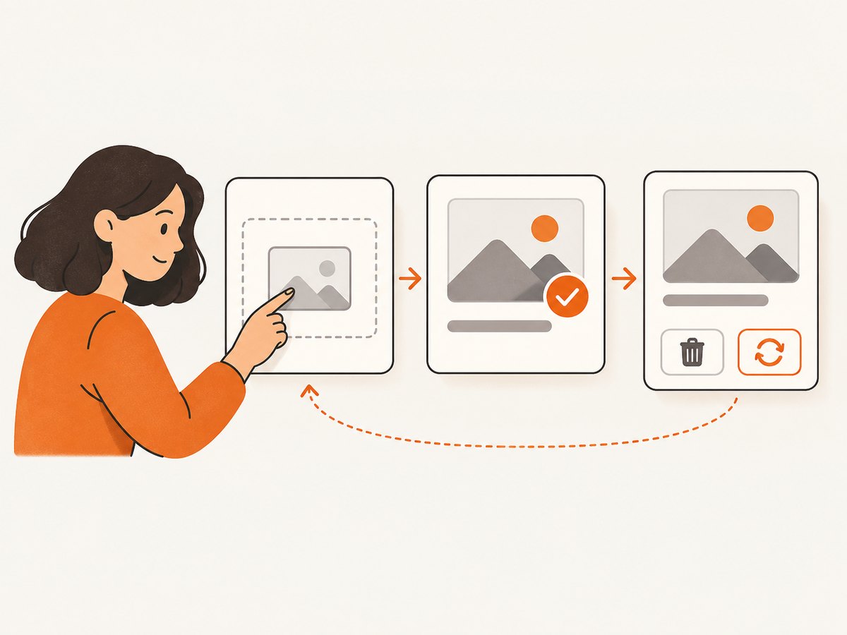
After a file is selected, show its filename and whether it meets the stated requirements. Provide an obvious way to remove or replace it before submission. Canada.ca’s component anatomy includes a file list, filename, and remove button; the same recovery pattern works for a single-image field.
<section aria-labelledby="selected-image-heading">
  <h3 id="selected-image-heading">Selected image</h3>
  <p>team-photo.png — ready to upload</p>
  <button type="button">Remove image</button>
</section>
In a real implementation, update this region when the selection changes and ensure the remove button clears the input as well as the displayed filename. For multiple files, identify each filename and give each item its own remove action; after removal, keep the remaining files and their status intact.
A thumbnail is useful when users need to confirm that they chose the right picture, for example when several similar images are available. It is not always necessary. GOV.UK advises considering people on public devices before making an uploaded file available to preview or download. If you show a preview, explain what it represents, avoid exposing it beyond the intended user, and revoke temporary browser object URLs when they are no longer needed.
5. Validate early, explain errors clearly
Client-side checks can give quick feedback about a missing file, unsupported type, or size limit. They improve the interaction, but they do not replace server validation. The server must make the final decision because the request can be sent without using your page at all.
When a check fails, identify the field and state the issue in text, along with a correction where known. For example, “Choose a JPG, PNG, or WebP image. The selected file is a PDF.” is more useful than “Upload failed.” WCAG requires detected input errors to be identified and described in text; its guidance says the message should make clear what is wrong and which item has the error.
<label for="profile-image">Choose a profile image</label>
<p id="profile-image-hint">JPG, PNG, or WebP. Maximum file size: 5 MB.</p>
<p id="profile-image-error" role="alert">
  This image is 8 MB. Choose an image smaller than 5 MB.
</p>
<input
  id="profile-image"
  type="file"
  accept="image/jpeg,image/png,image/webp"
  aria-describedby="profile-image-hint profile-image-error"
  aria-invalid="true"
>
Only expose aria-invalid="true" while the field is actually invalid. Associate the error with the field, and ensure it is announced when it appears. If a submission returns errors, preserve the rest of the form state where possible and move focus or provide a linked error summary so the person can find the problem. Do not rely on a red border, icon, or color change by itself.
6. Handle upload progress and server outcomes
Selection and upload are separate steps. After submission, show that work is in progress if the upload takes long enough that the person might otherwise wonder whether anything happened. Prevent accidental duplicate submissions where appropriate, and keep the selected filename visible. On success, confirm what happened and what the next step is.
Plan clear recovery messages for common server outcomes:
- Too large: name the size limit and invite the person to choose or export a smaller image.
- Unsupported or unreadable format: list supported formats and ask for a valid image.
- Network interruption or timeout: explain that the upload did not finish and offer a retry without making the person guess whether it succeeded.
- Server-side processing failure: preserve the selection if feasible and give a retry path; avoid claiming success until processing is complete.
For long uploads, show progress only when you can report meaningful progress. If you can report stages but not a reliable percentage, use stage text such as “Uploading image” and “Processing image.” Keep status messages available to assistive technology, and avoid rapidly announcing every tiny change.
7. Make the layout work at different sizes
Keep the label, hint, picker, selected-file status, and error close together so their relationship is clear on narrow screens. Let long filenames wrap or truncate with a way to inspect the full name; do not let them push remove controls off-screen. Make interactive controls easy to identify and operate, use sufficient contrast, and group related content. Check both keyboard and pointer use, including focus visibility and the order users encounter controls.
Test the complete journey at phone and desktop viewport sizes. Include a narrow layout, zoomed text, a keyboard-only pass, and at least one screen-reader check if available to your team. A drag target should not obscure the picker or consume excessive space on a small screen.
8. Consider reuse and privacy
If a person has already supplied an image earlier in the same journey, reuse may save effort. GOV.UK recommends making an uploaded file reusable within a journey unless doing so creates a major security or privacy concern. Reuse should be clear: identify the existing image and offer a way to replace it when the task requires a different one.
Think through who can access the upload, how long it is retained, and whether a preview or download is appropriate for the device context. The interface should not imply that a file is private or permanent unless the service’s actual handling supports that statement. Keep the requested image to what the task needs.
9. Build and review the flow step by step
- Write the requirement. State the image’s purpose, supported formats, file-size limit, and whether it is mandatory.
- Add the labeled control. Use a visible label, nearby hint, and an operable file input.
- Add optional drop handling. Preserve the picker and provide a single-pointer and keyboard-accessible route.
- Design selected state. Show the filename, acceptance status, and remove or replace action.
- Design failure states. Cover invalid format, excess size, failed drop, interrupted transfer, and processing failure with specific text and a next action.
- Enforce server rules. Repeat authoritative validation on the server, regardless of client checks.
- Review privacy and reuse. Decide whether previewing, downloading, or reusing the image is appropriate for the journey.
- Test the whole interaction. Try keyboard, pointer, narrow viewport, invalid files, removal, replacement, and retry after failure.
10. Troubleshooting image upload UI problems
| Problem | Likely cause | Fix |
|---|---|---|
| The picker does not open from the label | The label’s for value does not match the input ID, or a custom control intercepts activation. |
Connect the label and input IDs and test keyboard and pointer activation. |
| A valid image is rejected | The UI’s accepted types differ from server rules, or the server checks only a filename extension. | Align published requirements with server validation and check the decoded image format. |
| An invalid file is accepted | The implementation relies on accept or browser-side checks as its security boundary. |
Validate independently on the server before storing or processing the image. |
| Dropping a file does nothing | The target does not handle drag events or fails to prevent the browser’s default file navigation behavior. | Implement and test the full drop interaction, and show a failure message if it cannot accept the file. |
| Screen readers miss the error | The message is not associated with the input or is inserted without an announcement. | Reference the error with aria-describedby and announce dynamic feedback appropriately. |
| The selected file cannot be changed | The selected state replaces or hides the only input control. | Keep a visible replace route or restore the picker when the file is removed. |
| People submit twice | There is no progress feedback or duplicate-submit handling during a slow transfer. | Show a clear in-progress state and handle repeated requests safely on the server. |
11. Measure usability and service reliability
Review completion and failure points without collecting more personal information than needed. Useful operational signals can include upload success and failure counts, rejection reasons, retries, and processing duration. Avoid recording image contents or sensitive filenames in routine diagnostics. Compare the requirements shown in the UI with actual server rejections; if they diverge, correct the contract rather than asking users to try repeatedly.
For reliability, account for interrupted connections, retries, repeated submissions, and files that pass initial checks but fail processing. Give each outcome a clear state so the UI does not treat “request sent” as equivalent to “image saved.” If the workflow supports retry, ensure the action cannot silently create confusing duplicates.
12. Screenshot the UI during design review
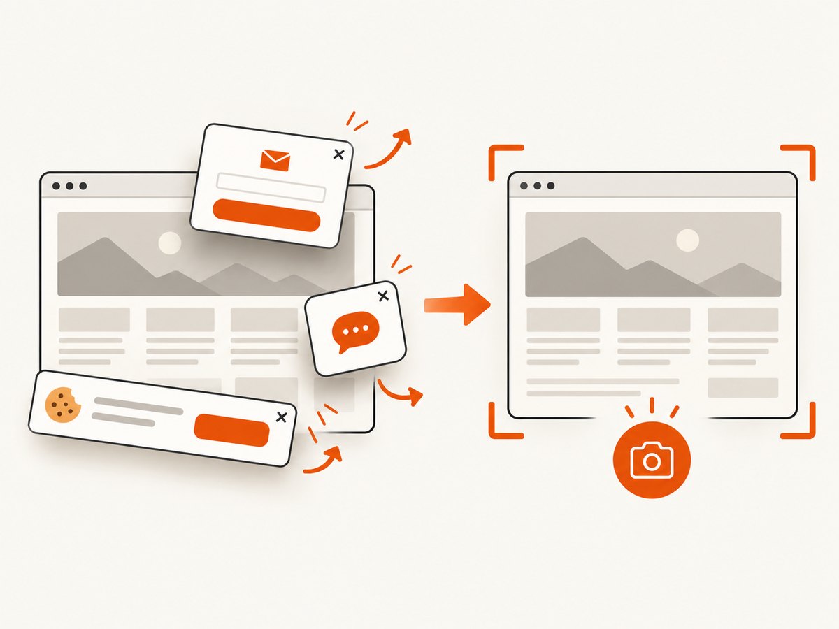
A screenshot can help a team review spacing, hierarchy, and responsive states across a set of test pages. You can capture a page yourself with a browser automation tool, or use a screenshot API when you need repeatable captures in a review workflow. ScreenshotNeo is a website screenshot API and MCP server for developers; its clean captures remove cookie banners, newsletter popups, and chat widgets before the shot, and only clean shots are billed.
Or skip the browser setup
Make one GET request to capture a page as an image. See the ScreenshotNeo API documentation for parameters and response details.
curl -G "https://api.screenshotneo.com/v1/shot" -d access_key=YOUR_API_KEY --data-urlencode url=https://stripe.com -o shot.webpimport requests
r = requests.get(
"https://api.screenshotneo.com/v1/shot",
params={"access_key": "YOUR_API_KEY", "url": "https://stripe.com"},
timeout=90,
)
open("shot.webp", "wb").write(r.content)const q = new URLSearchParams({ access_key: 'YOUR_API_KEY', url: 'https://stripe.com' });
const res = await fetch(`https://api.screenshotneo.com/v1/shot?${q}`);
if (!res.ok) throw new Error(`Screenshot request failed: ${res.status}`);
const fs = await import('node:fs/promises');
await fs.writeFile('shot.webp', Buffer.from(await res.arrayBuffer()));Cookie banners, popups, and chat widgets are removed before the shot. Bot checks, blank pages, and failed loads are never billed; response headers report the page verdict and billing status. An MCP server provides screenshot tools for AI agents, including Claude, Cursor, and other MCP clients. The free plan includes 1,000 screenshots a month with no card; paid plans start at $5 for 3,000. See ScreenshotNeo for the service and the docs for the API.
Sign up for 1,000 free screenshots a month, with no card required.
Frequently asked questions
Should an image upload always include a preview?
No. A preview helps when people need to verify they chose the correct image, but consider privacy and whether the device may be shared. A filename and clear selection status may be enough for simpler tasks.
Is a drag-and-drop box accessible by itself?
It should not be the only route. Keep a file-selection control that can be used without dragging, and make sure it works with keyboard and assistive technology.
Does the HTML accept attribute validate a file?
No. It can guide the file picker, but server-side validation must enforce the actual accepted content and limits.
Should the UI retain an image for later steps?
Reuse can reduce repeated work within a journey. Make the existing image and replacement option clear, and account for security and privacy before retaining or reusing it.


