How to Detect Whether an Element Is a Hidden Drawer or Slide-Over
Learn how to tell whether a panel is hidden, off-canvas, or modal by inspecting its markup, styles, accessibility state, and behavior.
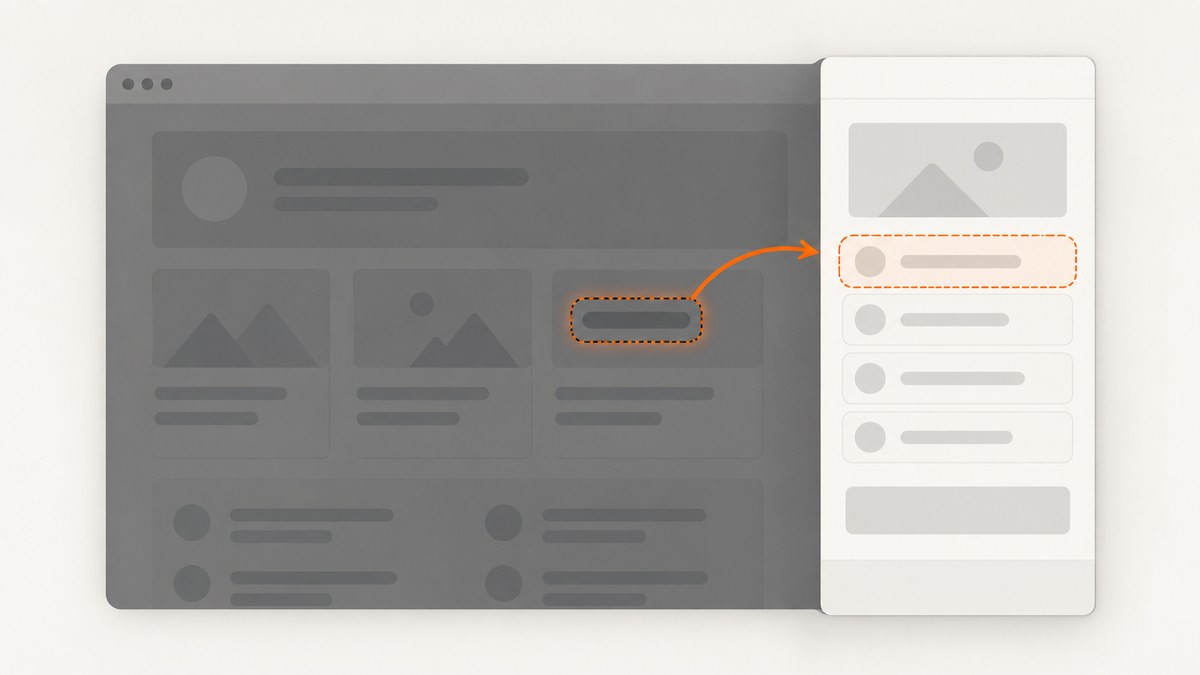
To tell whether an element is a hidden drawer or slide-over, inspect it before and after activating its trigger. Check the trigger’s aria-expanded and aria-controls, the panel’s computed visibility and position, and whether focus moves into the panel and returns to the trigger when it closes. A screenshot or static HTML snapshot can show appearance, but it cannot prove that a panel traps focus, responds to Escape, or makes the background inert.
Use several signals together. A transformed panel may remain rendered while visually off-canvas; aria-hidden affects accessibility exposure but not pixels; and a modal dialog requires working interaction behavior in addition to dialog semantics.
1. Find the control that opens the panel
Start with buttons and links near the panel or its navigation entry. Look for a disclosure control and compare its state before and after activation:
<button aria-expanded="false" aria-controls="filters-panel">
  Filters
</button>

<aside id="filters-panel" hidden>
  ...
</aside>
aria-expanded communicates whether a disclosure is expanded. A corresponding aria-controls value may point to the controlled element by ID. Record the exact ID, then activate the control and check whether the state changes from false to true and whether that target changes visibility. Those attributes identify a relationship; by themselves, they do not prove the panel is visually hidden or correctly implemented. The WAI-ARIA Authoring Practices describes a disclosure as a widget that lets content be collapsed or expanded. WAI-ARIA Disclosure Pattern.
Check both activation methods
- Focus the trigger and press Enter or Space, as appropriate for its element.
- Close the panel, then activate the same trigger with a pointer.
- After each activation, read the trigger state and inspect the target element.
If the trigger state changes but its target does not, the attributes may be stale, the wrong element may be targeted, or an animation may still be running. If the panel opens but the state remains collapsed, assistive technology can receive a misleading state. Check the behavior rather than inferring it from the component’s class names.
2. Inspect the panel’s role and accessible name
A panel can be a navigation drawer, a non-modal disclosure, or a modal dialog. Inspect its native element and role, then check how it is named. A dialog should have an accessible name, commonly from a visible heading referenced with aria-labelledby, or an appropriate label.
<section role="dialog" aria-modal="true" aria-labelledby="settings-title">
  <h2 id="settings-title">Settings</h2>
  ...
</section>
Role alone is not enough. A role="dialog" element with no accessible name can leave screen-reader users unsure what opened. And aria-modal="true" communicates that the displayed dialog is modal; it does not itself block clicks or keyboard interaction with the page behind it. MDN: aria-modal.
When possible, prefer the native <dialog> element for a true modal. A closed native dialog is hidden with display: none; calling showModal() places it in the top layer. The platform provides useful dialog behavior, but still check the dialog’s name, its close controls, and the resulting focus behavior. MDN: dialog element.
3. Determine how it is visually hidden
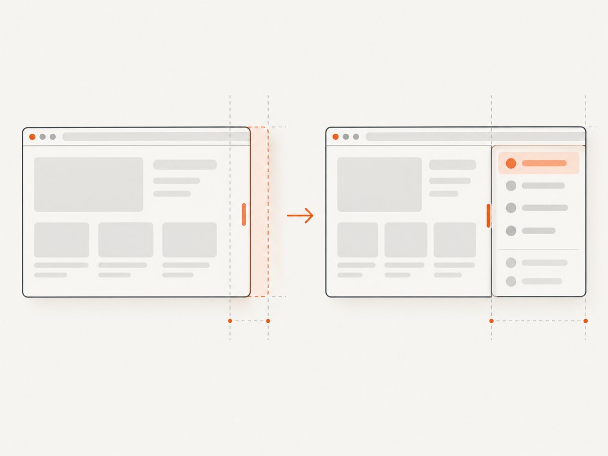
Inspect the element in the DOM and compare its computed styles and geometry while closed and open. Common mechanisms have different implications:
| Mechanism | What to look for | What it tells you |
|---|---|---|
| DOM removal | The panel is absent while closed and inserted on activation. | There is no closed panel node to inspect for styles; observe the after state too. |
hidden or display: none |
The attribute is present or computed display is none. |
The element is not rendered in the ordinary layout while closed. |
| Off-canvas transform | Computed transform translates the panel beyond the viewport. | The panel can remain rendered and participate in animation while visually displaced. |
| Opacity or clipping | opacity: 0, clip-path, overflow clipping, or related styles. |
Pixels may be invisible or clipped even though the node remains present. |
| Accessibility-only hiding | aria-hidden="true" without a visual hiding style. |
It affects accessibility exposure, not visual rendering. |
Do not treat a class such as translate-x-full as proof by itself. Framework names and transition conventions vary. Inspect computed values and bounding rectangles at runtime. During an animation, capture more than one moment: the closed starting position, an intermediate position if relevant, and the settled open position.
aria-hidden="true" does not hide pixels. It also must not be placed on focusable content or an ancestor containing focusable content: keyboard users could reach controls that are hidden from assistive technology. When a panel is closed, ensure it is both visually unavailable and not left as an unexpected tab stop.
4. Test modal behavior and focus management
Decide whether the panel is actually modal by trying to interact with the rest of the page while it is open. If users can still reach and operate background content, it behaves as a non-modal disclosure or navigation drawer. If the background is obscured and made non-interactive, it may be a modal dialog.
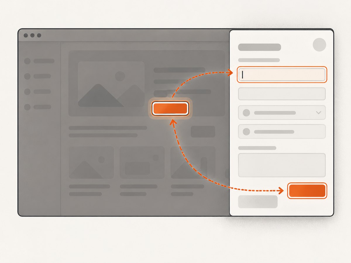
A modal needs more than a backdrop. Verify the complete open and close path:
- Open with keyboard and pointer input. Focus should move into the panel.
- Tab through the controls. If modal, focus should not move into background content.
- Activate an explicit close button and test Escape.
- After closing, check that focus returns to the control that opened the panel.
- Try clicking or tabbing to background controls while it is open.
- Repeat while the panel is animating, if opening or closing uses a transition.
Native modal dialogs opened with showModal() move focus inside and support Escape by default. Custom slide-overs must implement equivalent behavior themselves. The inert attribute can make descendants non-interactive; aria-modal="true" alone does not do that. Confirm that the implementation restores any background state and returns focus when it closes.
Non-modal drawer or modal slide-over?
“Drawer” and “slide-over” describe a visual pattern, not a complete accessibility contract. A side navigation drawer may be a disclosure: opening it reveals navigation while the rest of the page stays usable. A settings panel over a dimmed, inert background may be a modal dialog. Classify based on observed background behavior and focus handling, not the direction it slides from.
5. Inspect it with browser automation
For repeatable checks, use a browser automation script to save before-and-after attributes, computed styles, geometry, and focus. The following Playwright example assumes your app is already running and the trigger has an accessible name of “Filters.” Install Playwright in your project and point BASE_URL at the page under inspection.
import { chromium } from 'playwright';

const browser = await chromium.launch({ headless: true });
const page = await browser.newPage();
await page.goto(process.env.BASE_URL ?? 'http://localhost:3000');

const trigger = page.getByRole('button', { name: 'Filters' });
const targetId = await trigger.getAttribute('aria-controls');
if (!targetId) throw new Error('Trigger has no aria-controls target');
const panel = page.locator(`#${CSS.escape(targetId)}`);

async function snapshot(label) {
  console.log(label, await page.evaluate((id) => {
    const el = document.getElementById(id);
    if (!el) return { missing: true };
    const s = getComputedStyle(el);
    const r = el.getBoundingClientRect();
    return {
      hiddenAttribute: el.hasAttribute('hidden'),
      ariaHidden: el.getAttribute('aria-hidden'),
      role: el.getAttribute('role'),
      ariaModal: el.getAttribute('aria-modal'),
      display: s.display,
      visibility: s.visibility,
      opacity: s.opacity,
      transform: s.transform,
      rect: { x: r.x, y: r.y, width: r.width, height: r.height },
      activeElement: document.activeElement?.id || document.activeElement?.tagName
    };
  }, targetId));
  console.log('expanded:', await trigger.getAttribute('aria-expanded'));
}

await snapshot('before');
await trigger.focus();
await page.keyboard.press('Enter');
await panel.waitFor({ state: 'attached' });
await page.waitForTimeout(350); // allow the panel transition to settle
await snapshot('after');
console.log('focused inside panel:', await panel.evaluate(el => el.contains(document.activeElement)));
await page.keyboard.press('Escape');
await page.waitForTimeout(350);
console.log('focus returned to trigger:', await trigger.evaluate(el => el === document.activeElement));
await browser.close();
This is a diagnostic starting point, not a conformance test. A removed-and-reinserted panel, a nested shadow root, a different trigger name, or a transition longer than 350 ms requires adapting the selectors and waits. The script checks whether focus is inside after opening and whether Escape returns focus; add explicit checks for tab order, background inertness, accessible name, and the pointer close path for your component.
6. Capture visual evidence without mistaking it for behavior
A screenshot helps compare the panel’s visible geometry and backdrop before and after activation. It cannot show focus order, accessibility-tree exposure, Escape handling, or background inertness. Use a runtime interaction trace alongside images when classifying a panel.
For a quick manual record, capture the closed state, activate the trigger, wait for the transition, and capture the open state. Compare the panel’s viewport position and whether the background is dimmed. If you need to inspect a component on a page, take a screenshot of the page or target element and retain the DOM and interaction observations separately.
7. Troubleshooting common inspection results
| Symptom | Likely cause | What to check or fix |
|---|---|---|
aria-expanded changes, but the panel seems unchanged. |
The target is wrong, styles are overridden, or a transition has not settled. | Resolve the exact aria-controls ID, inspect computed styles, and wait for the animation’s end state. |
| The panel is visible but absent from the accessibility tree. | aria-hidden="true" remains set while open, or the node is otherwise excluded. |
Update accessibility state on open; ensure the state matches the visible UI. |
| Keyboard focus reaches controls behind a modal-looking panel. | Background content is not made inert, or focus handling is incomplete. | Use a native modal dialog or implement background inertness and modal focus management. |
| Escape closes the panel but focus disappears. | Close logic removes the focused node without restoring focus. | Save the invoking control and restore focus to it after close. |
| Focus stays behind after opening. | A custom drawer did not move focus, or the opening handler ran before its content existed. | Move focus to a suitable control or heading after rendering; retest after transitions. |
| A closed custom panel remains tabbable. | Opacity or transform hides pixels without removing controls from keyboard navigation. | Manage inertness or visibility/focusability when closed, and restore it when open. |
| Automation reports the target is missing. | The panel is conditionally mounted, the ID is wrong, or the trigger has no valid control reference. | Inspect the DOM after activation and handle attachment/removal; do not assume the node exists before opening. |
8. Keep the evidence reliable and the inspection efficient
Transitions and asynchronous rendering are the main sources of misleading observations. Prefer waiting for a specific state—such as the panel becoming visible or reaching its expected geometry—over a fixed delay. A delay can be useful for a quick script, but it can be too short on a slow page and unnecessarily long on a fast one.
Repeat the interaction from a clean page state. Record the browser, viewport, input method, trigger state, panel state, and focus before and after. If the panel depends on authentication, feature flags, responsive breakpoints, or network data, include those conditions in the record. A single desktop screenshot does not establish behavior on mobile or with assistive technology.
For a fast manual check, use this checklist:
- Find a trigger and note
aria-expandedandaria-controls. - Verify the target ID and inspect hidden state, computed styles, and geometry.
- Check dialog semantics and an accessible name if it is presented as a dialog.
- Open with keyboard and pointer; verify focus entry, close paths, and focus return.
- For a claimed modal, verify that background content is obscured and unavailable.
- Keep screenshots as visual evidence and an interaction trace as behavioral evidence.
Or skip the browser setup
ScreenshotNeo can capture a page with one request. It accepts cookie and consent banners before capture and removes more than 60 known consent platforms, newsletter popups, and chat widgets; each step can be turned off. Bot checks and CAPTCHAs, blank pages, timeouts, failed loads, and cache hits are not billed, with the outcome identified in response headers. Its MCP server gives AI agents tools for screenshots, page information, and PDFs. The free plan includes 1,000 screenshots a month with no card; paid plans start at $5 for 3,000. See the ScreenshotNeo API documentation.
curl -G "https://api.screenshotneo.com/v1/shot" \
  -d access_key=YOUR_API_KEY \
  --data-urlencode url=https://stripe.com \
  -o shot.webp
Or skip the browser setup with the ScreenshotNeo website screenshot API when you want visual evidence without installing a browser automation stack. A screenshot still cannot establish focus management or modal behavior; use the interaction checks above for those. Sign up for 1,000 free screenshots a month, with no card required.
FAQ
Can a drawer be visually hidden but still accessible?
Yes. For example, a panel moved off-screen with a transform may remain in the DOM and accessibility tree. Check whether its closed controls remain reachable by keyboard and whether its accessibility state accurately describes the interaction.
Does aria-hidden="true" hide a panel from the screen?
No. It changes accessibility exposure, not visual rendering. Use visual styles or the hidden attribute for visual hiding, and do not put aria-hidden="true" on focusable content or an ancestor of focusable content.
Is a dimmed background enough to call a panel modal?
No. Check whether background controls are actually unavailable, whether focus enters and stays in the dialog, whether there is a close path, and whether focus returns to the opener.
Can one screenshot confirm a panel is accessible?
No. It can document appearance at a moment in time. Accessibility state, keyboard behavior, transitions, and focus return require inspecting the DOM and exercising the interaction.


