How to Diagnose CSS That Breaks Full-Page Website Screenshots
Find out whether a broken full-page screenshot comes from capture settings, CSS, missing resources, or browser differences, then make the cause reproducible.
A full-page screenshot that looks wrong does not automatically mean the CSS is broken. First compare it with a viewport screenshot, then inspect the affected element’s computed styles, verify that its stylesheets and dependent resources loaded, and hold the browser environment steady. In Playwright, fullPage: true captures the page’s full scrollable area; it does not repair the layout. The steps below help isolate the cause and leave you with a repeatable capture.
1. Define the mismatch before changing anything
Write down exactly what looks wrong: an element’s position or width, a missing font or background, unexpected clipping, or a difference that starts at a particular point in the long image. Record where the mismatch first appears and whether it occurs in an ordinary viewport capture too. “The screenshot looks off” is hard to investigate; “the sticky header overlaps the first section only in the full-page capture” is a useful testable symptom.
Save the URL and the capture conditions with the image. At minimum, record viewport width and height, browser and version, operating system, headless setting, device scale factor, and screenshot options such as full-page, clipping, and scale. Keep those values identical when comparing a known-good image with a failing one. Playwright documents full-page, clipping, and scale options in its screenshot API guide.
- Describe the element and visual property that differs.
- Mark the first location in the full-page image where it differs.
- Note whether the same element is wrong in a viewport capture.
- Save the image and the exact capture configuration together.
2. Confirm what the capture actually includes
Make a viewport capture and a full-page capture from the same page state. If practical, also capture just the affected element. Compare the three images at the same scale. If the viewport image is correct and only the full-page image differs, that narrows the investigation, but it does not prove that CSS is defective: capture scope or page behavior can be involved.
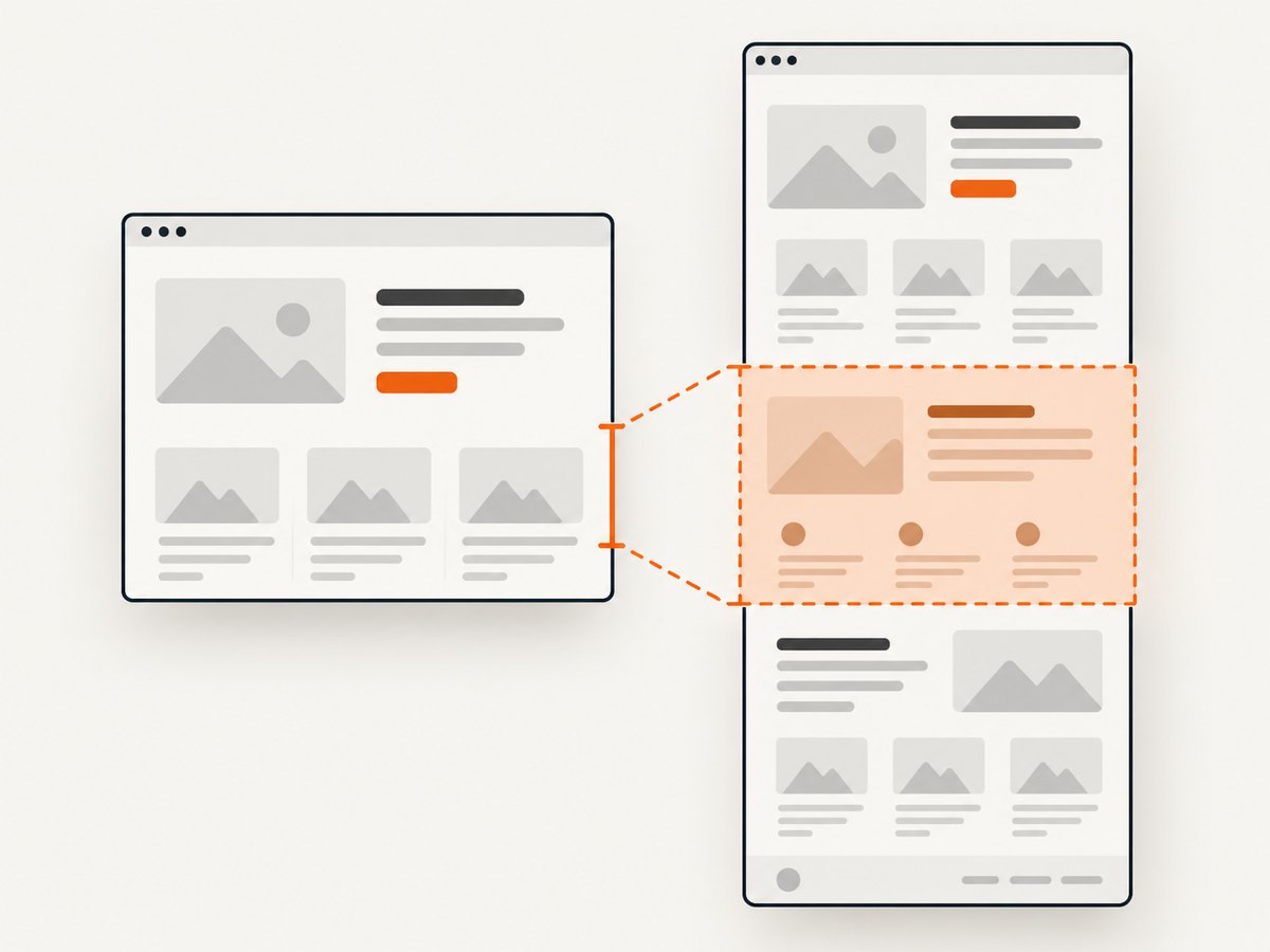
Playwright’s fullPage: true option captures the full scrollable page as if it fit on a very tall screen. It changes the screenshot’s capture scope; it does not change authored styles or make a broken rule correct. Check that the reference and failing runs use the same fullPage, clip, and scale settings.
import { chromium } from 'playwright';

const browser = await chromium.launch({ headless: true });
const page = await browser.newPage({ viewport: { width: 1440, height: 900 } });
await page.goto('https://example.com', { waitUntil: 'networkidle' });

await page.screenshot({ path: 'viewport.png' });
await page.screenshot({ path: 'full-page.png', fullPage: true });
await page.locator('main').screenshot({ path: 'main.png' });

await browser.close();
Replace https://example.com with the page under investigation and main with the selector for the region you are comparing. The example takes three images from one page instance so the capture conditions stay aligned. If the page never reaches network idle, use a wait condition that matches the page’s actual behavior and document it; do not silently compare runs that waited for different states.
3. Inspect the affected element’s computed CSS
Open the page in Chrome, right-click the element that looks wrong, and choose Inspect. In the Elements panel, select the element and compare the Styles and Computed panes. Styles shows declarations and their cascade state; Computed shows the final values the browser applies. Chrome’s DevTools overview describes these panels and CSS debugging workflows.
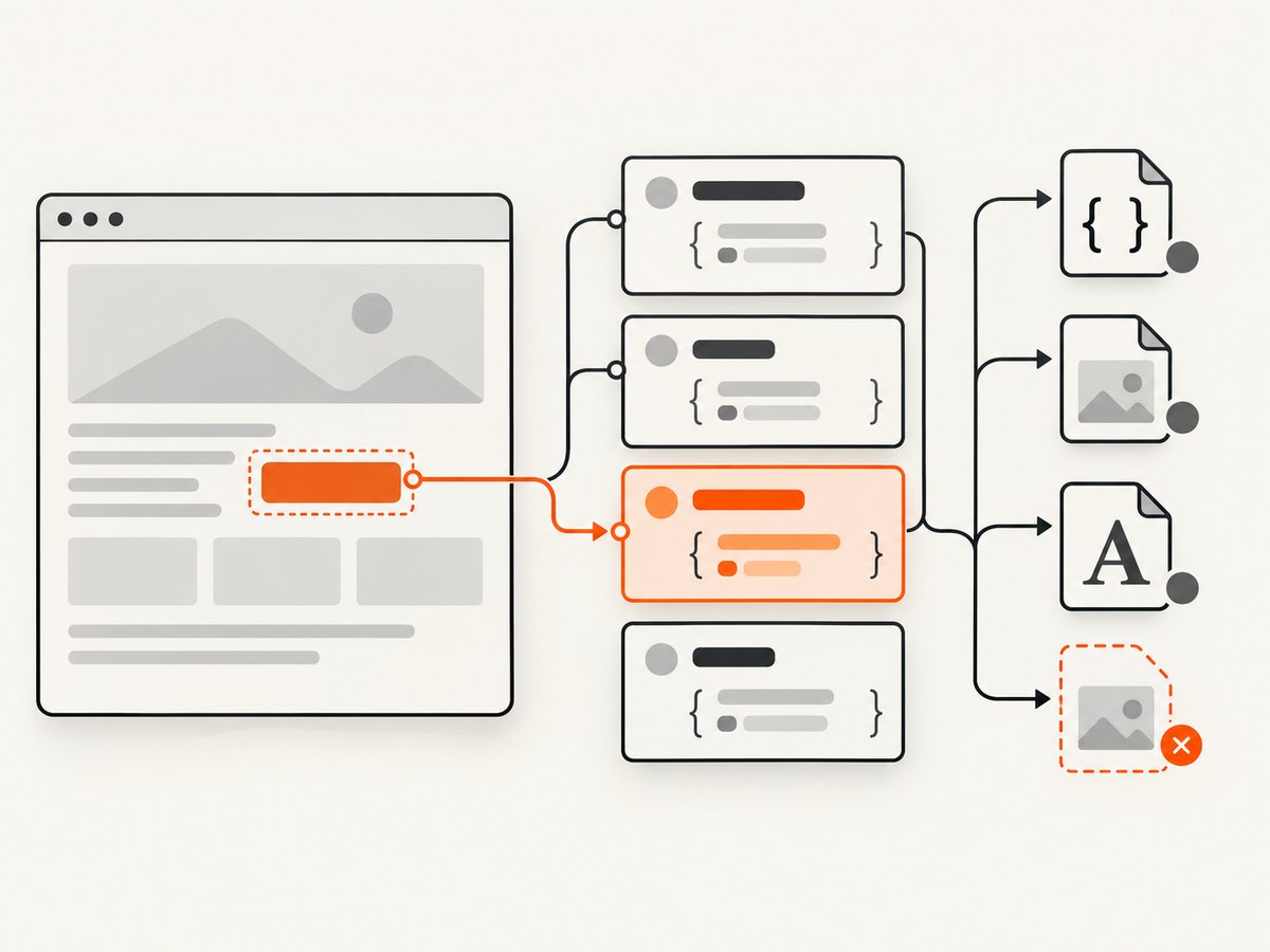
- Check the computed value for the property that appears wrong: for example,
position,width,overflow,font-family, orbackground-image. - In Styles, find the winning declaration. Look for crossed-out overrides, inactive declarations, inherited values, and media queries that do not match.
- Trace variables such as
var(--content-width)to the custom property that supplies the value. A correct-looking declaration can still resolve to an unexpected computed value. - Toggle one suspected rule or edit its value temporarily. If the screenshot symptom changes as expected, make the verified correction in the source stylesheet.
Check the element and its ancestors. A child can have the expected width but still be clipped by an ancestor’s overflow, placed in an unexpected containing block, or affected by a transformed parent. For long pages, inspect the first location where the mismatch begins and a nearby section that still looks correct. Comparing the two often reveals the boundary where a style or layout context changes.
4. Check media queries and rendering-dependent styles
A page can legitimately render differently when a media query or CSS media feature changes. Look for rules involving viewport dimensions, color scheme, reduced motion, print styles, or other environment-dependent conditions that apply to the affected element. In Chrome DevTools, open More tools and choose Rendering. Use its CSS media feature emulation to compare conditions without editing the source stylesheet. See the official Rendering tab documentation.
Keep the actual browser viewport, device scale, and emulated media settings in your notes. Emulation is a way to test a hypothesis; it does not establish which settings the screenshot job used. When comparing output, change one condition at a time and capture again.
5. Verify stylesheets, fonts, and referenced resources
If the intended CSS did not load, inspecting the rule in your source repository will not tell you what the browser rendered. In DevTools, open Sources and inspect the resources the page loaded. Look for missing stylesheets, failed imports, and errors involving CSS @import or url() references. The Chrome Sources panel guide covers loaded resources and resource errors.
Pay particular attention to resources that change the visual result without changing the rule itself:
- Stylesheets: Was the expected stylesheet loaded, and did an import or URL reference fail?
- Fonts: Did the intended font load? A fallback font can change line wrapping, component height, and every section below it.
- Images and backgrounds: Did the referenced asset load, and does the computed URL point to the expected resource?
- Late-loaded resources: Did the capture happen before the stylesheet, font, or image was ready?
Compare the loaded resource list and visible result with the browser session that produces the expected image. A resource failure can masquerade as a CSS bug: for example, a missing font may look like incorrect width or spacing, while a failed background URL may look like a missing declaration.
6. Check for unstable layout and capture timing
A screenshot may capture an intermediate layout while content, fonts, or images are still loading. Reload the page with Chrome DevTools Rendering open and watch for layout shift regions or other rendering overlays. If the page visibly changes after the screenshot would have been taken, identify the event that stabilizes it and wait for that condition explicitly.
Prefer a meaningful condition such as a key element becoming visible or a known loading indicator disappearing over an arbitrary delay. A fixed delay can be a useful diagnostic experiment, but it is not proof that the page is ready on every run. If the page updates continuously, identify which parts are expected to vary and exclude them from a visual comparison only when that matches the test’s purpose.
await page.goto('https://example.com', { waitUntil: 'domcontentloaded' });
await page.locator('main article').waitFor({ state: 'visible' });
await page.screenshot({ path: 'article.png', fullPage: true });
Replace the URL and selector for the page. This example waits for an article element to be visible; visibility alone does not guarantee that every image or custom font has loaded. Add only the readiness checks your page needs, and use the same checks for each comparison run.
7. Compare browser and machine conditions
When computed styles and loaded resources look correct, compare the renderer and machine. Playwright documents operating system, browser version, settings, hardware, power source, and headless mode as factors that may affect rendering. It also notes that visual snapshots can differ across browser and platform combinations. See Playwright’s visual comparisons guidance.
Reproduce the capture on a fixed operating system and browser build where possible. Then change one environment variable per run: for example, headless mode while keeping the browser version and viewport fixed. If you change browser, platform, viewport, device scale, and color scheme together, a changed image cannot tell you which change mattered.
| Comparison | Hold steady | Change one at a time |
|---|---|---|
| Viewport vs full page | URL, browser, viewport, page state | Capture scope |
| Known-good vs failing run | Capture options and page readiness checks | One suspected CSS rule or resource |
| Machine or CI comparison | URL, browser build, viewport, capture settings | Operating system, headless mode, or another environment factor |
8. Record the cause and make the fix reproducible
Once a change corrects the symptom, save the minimal CSS or environment change, the before-and-after images, and the exact capture conditions. Keep visual baselines associated with a stable browser and platform configuration. If the output still varies after the CSS and resources are verified, describe the remaining difference as environment-dependent until you have evidence for a specific CSS cause.
A useful issue note includes the URL, browser and operating system, viewport and device scale, headless setting, readiness condition, screenshot options, first affected element, computed property before and after, and the smallest change that corrected the image. This gives another developer enough information to reproduce the problem without guessing.
Or skip the browser setup
If you need a clean reference capture while diagnosing the page, ScreenshotNeo is a website screenshot API and MCP server for developers. It returns a PNG, JPEG, WebP, or PDF from one GET request. The ScreenshotNeo site links to its API and MCP tools; see the API documentation for request options.
curl -G "https://api.screenshotneo.com/v1/shot" -d access_key=YOUR_API_KEY --data-urlencode url=https://example.com -o shot.webpimport requests
r = requests.get(
"https://api.screenshotneo.com/v1/shot",
params={"access_key": "YOUR_API_KEY", "url": "https://example.com"},
timeout=90,
)
open("shot.webp", "wb").write(r.content)const q = new URLSearchParams({ access_key: 'YOUR_API_KEY', url: 'https://example.com' });
const res = await fetch(`https://api.screenshotneo.com/v1/shot?${q}`);
if (!res.ok) throw new Error(`Screenshot request failed: ${res.status}`);
await Bun.write('shot.webp', res);Replace the example URL with the page you want to capture. ScreenshotNeo removes cookie banners, popups, and chat widgets before the shot. Bot checks, blank pages, and failed loads are never billed; the response identifies page verdict and billing status in headers. Its MCP server lets AI agents use take_screenshot, get_page_info, and capture_pdf. The free plan includes 1,000 screenshots a month with no card; paid plans start at $5 for 3,000. The full-page capture options and other settings are in the documentation.
Sign up for ScreenshotNeo and get 1,000 screenshots a month free, with no card.
Troubleshooting checklist
| Symptom | Likely cause | What to check |
|---|---|---|
| Only the full-page image is wrong | Different capture scope or page behavior during a tall capture | Compare viewport, element, and full-page images with identical options. |
| Text wraps differently | Unexpected computed width, fallback font, or different renderer | Inspect computed width and font family; verify the font resource loaded. |
| Background or stylesheet is missing | Failed stylesheet, import, or CSS URL resource | Inspect loaded resources in Sources and check the relevant CSS reference. |
| Position or clipping changes down the page | Ancestor layout context, overflow, or a rule changing at a section boundary | Inspect the affected element and ancestors where the mismatch begins. |
| Image differs between runs | Unstable page state, late content, or environment variation | Fix the readiness condition; compare browser build, platform, and headless mode. |
| A media query seems to be ignored | The capture environment does not match the condition you expect | Inspect active rules and emulate the CSS media feature in Rendering. |
Performance, reliability, and cost notes
Full-page images can be much taller than viewport images, so capture scope affects the amount of page included and the resulting artifact. For diagnosis, begin with the smallest useful scope: a viewport or element image can make repeated comparisons easier to inspect; use full-page output when the defect depends on content below the fold. Keep the viewport, scale, browser build, and readiness checks fixed so each rerun changes as little as possible.
Reliability comes from reproducibility: record the page state and renderer, verify that required resources loaded, and use a page-specific readiness condition. Neither a screenshot option nor a wait condition repairs CSS. If you use a hosted capture API, check its response status and billing/verdict headers so you can distinguish a successful capture from a blank page or other unsuccessful result. ScreenshotNeo says blank pages, bot checks, failed loads, timeouts, and cache hits are not billed; inspect its response headers for the page verdict and billing status.
For ScreenshotNeo, the published plans are Free: 1,000 shots per month; Starter: $5 for 3,000; Growth: $15 for 15,000; Pro: $39 for 60,000; Scale: $99 for 250,000; and Business: $249 for 1,000,000. Yearly billing gives two months free, and every feature is on every plan. Those prices help estimate service spend; the local Playwright workflow instead uses your own browser automation setup and machine resources.
FAQ
Does full-page capture apply different CSS?
It selects the full scrollable area for the screenshot. If the output differs, compare capture settings and page behavior, then inspect the rendered styles; the option itself is not a CSS fix.
Why does my full-page screenshot look different from the page in the browser?
The browser view may differ in capture scope, page readiness, loaded resources, media settings, or rendering environment. Compare viewport and full-page output under recorded conditions to narrow it down.
How do I find which CSS rule is breaking my screenshot?
Select the affected element in DevTools Elements, compare Styles and Computed, and trace the winning value and its ancestors. Test one suspected declaration at a time.
Should I change the CSS or the screenshot test?
Change CSS when inspection confirms the rendered value is wrong for the intended design. Change the test setup when it captures the wrong state or uses inconsistent environment settings. Record the evidence for either choice.


