Dynamic Image Templates for Websites
Learn when to transform existing images for responsive delivery and when to generate graphics from reusable templates, with practical implementation patterns.
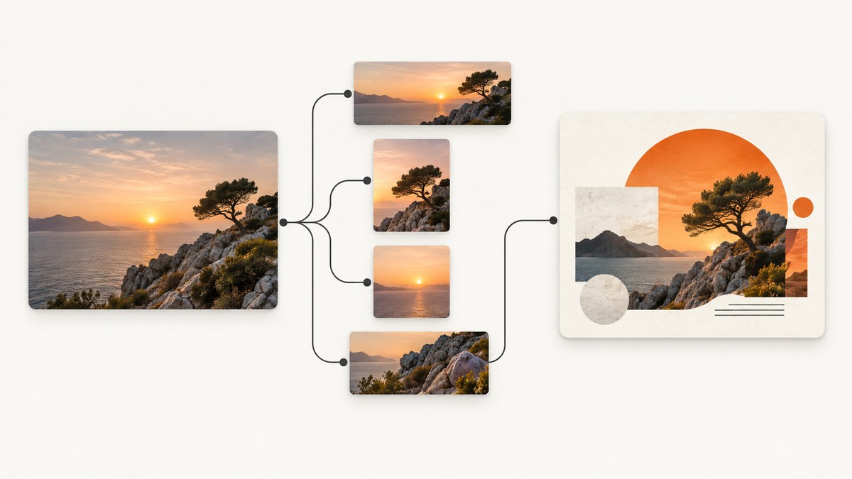
Dynamic image templates for websites can mean two different things: transforming an existing image to fit a page, or filling a reusable design with changing content to create a new graphic. Use transformations for responsive delivery of photos and other source assets. Use template rendering for composed outputs such as a campaign banner with a product image and changing offer. They solve related image problems, but they are not interchangeable.
This guide explains both patterns, how to choose between them, and how to integrate them into a site. The examples show responsive HTML with ordinary image URLs; the exact transformation URL syntax depends on the image service you use.
1. Choose the image job before choosing a tool
Start with what the page needs to display. If you already have the right image and need differently sized or cropped versions for different screens, use dynamic image transformation. If you need to combine an image with changing text, colors, or other design elements, use a template rendering API.
| Question | Responsive transformation | Template rendering |
|---|---|---|
| What goes in? | An existing image | A template plus changing values |
| What comes out? | A resized, cropped, or otherwise transformed version | A newly composed graphic |
| How does a site request it? | Usually through transformed delivery URLs in HTML | Usually through an API request that identifies a template and its edits |
| Typical need | Fit an image to a card, page, or device | Generate individualized banners or other repeatable graphics |
One workflow can use both: a template service can compose an image, and an image delivery service can subsequently resize that output for page layouts. Keep those jobs explicit in the architecture so image generation and delivery settings do not become tangled.
2. Serve responsive images with transformed URLs
For responsive delivery, generate image URLs for several widths and let the browser select an appropriate candidate. The srcset attribute lists candidate images and their intrinsic widths; sizes tells the browser how much layout space the image is expected to occupy. Cloudinary documents this responsive image approach, along with dynamic resizing and transformation delivery through URLs. See its guides to responsive images and image transformations.

Runnable HTML example
Replace the example paths below with URLs from an image service that supports transformations. The width-specific URLs are illustrative placeholders; each service has its own URL syntax and account configuration.
<img
  src="https://images.example.com/products/jacket-960.jpg"
  srcset="https://images.example.com/products/jacket-480.jpg 480w,
          https://images.example.com/products/jacket-960.jpg 960w,
          https://images.example.com/products/jacket-1440.jpg 1440w"
  sizes="(max-width: 600px) 100vw,
         (max-width: 1100px) 50vw,
         33vw"
  width="960"
  height="640"
  alt="Blue jacket on a hanger"
  loading="lazy"
  decoding="async">
The browser uses the candidates and layout hint to choose an image. The width and height attributes provide an aspect ratio before the image loads, which helps reserve layout space. Use loading="lazy" for below-the-fold content; for a prominent image at the top of the page, avoid lazy loading if it would delay the visible content.
Art direction with picture
Use <picture> when mobile needs a different crop or composition, not just a smaller file. The browser evaluates sources in order and uses the first supported matching media condition.
<picture>
  <source
    media="(max-width: 600px)"
    srcset="https://images.example.com/campaign/mobile-640.jpg 640w,
            https://images.example.com/campaign/mobile-960.jpg 960w"
    sizes="100vw">
  <img
    src="https://images.example.com/campaign/desktop-1200.jpg"
    srcset="https://images.example.com/campaign/desktop-800.jpg 800w,
            https://images.example.com/campaign/desktop-1200.jpg 1200w"
    sizes="(max-width: 1100px) 100vw, 1100px"
    width="1200"
    height="600"
    alt="Summer collection displayed outdoors">
</picture>
Transformation services can provide resizing, cropping, format changes, optimization, and overlays. Cloudinary describes these capabilities in its transformation documentation; check the chosen provider’s current syntax and behavior, especially for crop gravity, quality, format negotiation, and overlays.
Generate candidates in JavaScript
If the application builds URLs dynamically, use the image provider’s URL builder or SDK so transformations are encoded consistently. Cloudinary documents a JavaScript package for creating transformation URLs and assigning them to an image element. Keep the resulting URLs stable and deterministic so caching can work effectively. See Cloudinary’s JavaScript transformation guide.
// Generic pattern: makeImageUrl must be implemented with your provider's SDK.
const widths = [480, 960, 1440];
const srcset = widths
  .map((width) => `${makeImageUrl("/products/jacket.jpg", { width })} ${width}w`)
  .join(", ");

const image = document.querySelector("#product-image");
image.src = makeImageUrl("/products/jacket.jpg", { width: 960 });
image.srcset = srcset;
image.sizes = "(max-width: 600px) 100vw, 50vw";
makeImageUrl is intentionally provider-specific: supply it using the SDK and account details for your chosen service. Do not copy an invented transformation path and assume it is valid for a real provider.
3. Generate composed graphics from reusable templates
Template rendering starts with a design containing editable layers, such as text boxes and image containers. A request identifies the template and provides replacements for selected layers; the service renders a finished image. Bannerbear documents this model in its API reference and describes its image generation API.

This is a fit for graphics where the layout is mostly fixed but content changes, for example a title card for each article, a product promotion for each catalog entry, or a social graphic for each event. It is not a substitute for srcset: a generated banner does not automatically give the browser the right responsive source sizes for every layout.
Typical template-rendering flow
- Create and configure a template in the rendering service. Give editable layers stable identifiers.
- Store the template identifier and layer mapping in application configuration.
- Send an API request containing the template identifier and the specific text, image, or color changes for the desired output.
- Receive or retrieve the rendered asset, then store or serve it according to the provider’s documented workflow.
- Use responsive delivery markup if that output must appear at multiple sizes on a web page.
Bannerbear’s v5 reference describes requests that specify a template and modifications, with JPG and PNG outputs and PDF available when requested. Its product documentation lists additional formats and template capabilities. Confirm current formats, API version, workflow, limits, and commercial terms in the vendor documentation before building around them: API reference and Image API.
4. Decide what should be generated and what should be delivered
Use these steps to make the implementation decision:
- Write down the changing inputs. If only width, crop, or format changes, transformation is the likely fit. If text, images, or colors in a designed composition change, template rendering is the likely fit.
- List display contexts. Record card widths, mobile and desktop crops, and any high-density display needs. For responsive images, generate suitable candidates and provide accurate
sizes. - Define output requirements. Specify format, dimensions, transparency, and whether a distinct crop is needed. Verify the selected service supports the required output.
- Choose where work happens. Browser markup can let the browser select an image URL. Template composition generally requires a render API workflow and a place to associate generated output with its input data.
- Check operational fit. Review authentication, request limits, cache behavior, versioning, error handling, storage, and current service pricing before launch.
Cloudinary notes that transformations can be performed on the fly and that transformation usage can affect plan terms. Its resizing guidance explains why requesting a suitably sized image can avoid transferring a full-size original just to display it smaller. Check the current details in its resizing and cropping guide and your account terms.
5. Handle caching, layout, and failure cases
Cache by all inputs that affect the output
A transformed URL should change when its source or transformation changes. A template-generated asset should be associated with the template version and input values that produced it. If a changing title or image is omitted from a cache key, the site can serve stale output. If every request creates a random URL, cache reuse is reduced. Follow the provider’s caching and invalidation model rather than assuming the same rules apply across services.
Reserve image space and provide a fallback
Set intrinsic dimensions or an aspect ratio to avoid page movement. Include a useful alt description. When an image is important to the page, ensure its source URL is available and consider a fallback asset if the rendering workflow is asynchronous or can fail. Do not make essential page content depend on a successful optional decorative graphic.
Protect credentials and user input
Keep private render API credentials on a server, not in browser JavaScript. Validate text and image URLs before using them as template inputs, and use the service’s supported authentication and access controls. If a URL is generated from user input, validate allowed schemes and hosts according to your application’s security requirements.
6. Troubleshooting
| Symptom | Common cause | What to check |
|---|---|---|
| Browser always loads the same candidate | srcset descriptors or sizes do not match the layout |
Use width descriptors such as 480w, and set sizes to the rendered CSS width. Inspect the selected current source in browser developer tools. |
| Image is blurry on a high-density display | The largest candidate is too small for its rendered dimensions and pixel density | Add a larger candidate and ensure the transformation service returns the requested width. |
| Crop subject is missing | A center crop does not match the source composition | Use a deliberate focal point or art-directed crop if the provider supports it; inspect candidate crops at each aspect ratio. |
| Template output has missing or unchanged values | Modification keys do not match editable layer identifiers, or the wrong template is referenced | Compare request fields with the current template and API reference; verify the requested template version and inputs. |
| Old image remains after an update | A CDN or browser cache is serving an earlier URL or output | Use a URL or versioning strategy that changes with the source or template inputs, and follow the provider’s invalidation guidance. |
| Render request fails intermittently | Network errors, invalid input, service limits, or an asynchronous workflow treated as synchronous | Inspect the response and provider documentation, validate inputs, and implement bounded retries for retryable failures. Avoid retrying permanent validation errors. |
| Large page images load slowly | Full-size originals are being transferred for small display slots | Request appropriately sized derivatives and use responsive candidates; verify actual transferred dimensions in developer tools. |
7. Performance, reliability, and cost
For responsive delivery, smaller appropriately sized derivatives can reduce transferred image data compared with sending an original that is much larger than its display slot. The browser’s candidate selection only helps if the candidates and sizes reflect the actual layout. Test representative viewport widths and network conditions in your own application; no single candidate set fits every page.
Transform-on-demand reduces the need to manually create every derivative, but the provider may account for transformations or delivery according to plan terms. Cloudinary says transformation operations can factor into plan pricing, so check current account terms rather than relying on a fixed cost assumption. For template rendering, estimate how many distinct outputs the application needs, whether requests happen during a user interaction or ahead of time, and how rendered files are stored or reused. The source documentation describes features, not a comparative cost or speed benchmark.
For reliability, treat a generated image as a dependency that can fail. Validate inputs before a render call, set request timeouts in server workflows, distinguish retryable network errors from invalid requests, and retain a fallback for important placements. If rendering is asynchronous in your chosen service, model its documented completion workflow rather than blocking a page request indefinitely.
8. Or skip the browser setup
If your actual need is a screenshot of a rendered web page, use ScreenshotNeo, a website screenshot API and MCP server for developers. It captures a URL as PNG, JPEG, WebP, or PDF. This is page capture; it does not replace source-image transformations or template composition. See the ScreenshotNeo API documentation.
curl -G "https://api.screenshotneo.com/v1/shot" -d access_key=YOUR_API_KEY --data-urlencode url=https://stripe.com -o shot.webpimport requests
r = requests.get("https://api.screenshotneo.com/v1/shot", params={"access_key": "YOUR_API_KEY", "url": "https://stripe.com"}, timeout=90)
open("shot.webp", "wb").write(r.content)const q = new URLSearchParams({ access_key: 'YOUR_API_KEY', url: 'https://stripe.com' });
const res = await fetch(`https://api.screenshotneo.com/v1/shot?${q}`);ScreenshotNeo removes cookie banners, newsletter popups, and chat widgets before capture; bot checks, blank pages, and failed loads are never billed. Its MCP server lets AI agents take screenshots. The free plan includes 1,000 screenshots a month with no card; paid plans start at $5 for 3,000. Sign up free and capture 1,000 screenshots a month with no card.
9. Frequently asked questions
Can a dynamic image template replace CSS?
No. CSS lays out page content. Image transformations alter image assets, while a template renderer creates a composed image. Use the right layer for the job.
Should every image have several srcset candidates?
Use candidates where display size varies enough to make responsive delivery useful. A fixed-size small icon may not need a complex candidate set.
Can I generate a banner once and reuse it?
Yes, when the inputs remain the same and the service workflow allows you to retain or cache its output. Track the inputs and template version so updates can produce a distinct asset.
Do transformed image URLs guarantee a faster page?
No. They can avoid oversized downloads, but results depend on candidate selection, image dimensions, caching, network, and how the page uses them. Measure the page you ship.
Where does screenshot capture fit?
Screenshot capture turns a rendered web page into an image or PDF. It is useful for page previews and visual records, while the two image patterns above handle image delivery and graphic generation.


