How to Fix Incorrect Scaling and Resolution in Chromium Headless Screenshots
Fix blurry, oversized, or wrongly sized Chromium headless screenshots by separating viewport, virtual screen, device scale factor, and capture timing.
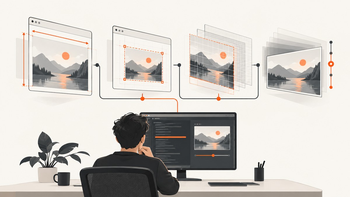
Incorrect Chromium screenshot size usually comes from mixing four different layers: the requested window or screenshot dimensions, the page’s CSS viewport, the virtual display and device scale factor, and the moment capture occurs. Measure each layer separately before changing flags.
A reliable debugging sequence is:
- Record the exact browser binary, version, headless mode, automation library, screenshot API, operating system or container, and launch arguments.
- Measure
window.innerWidth,window.innerHeight,devicePixelRatio, screen dimensions, and the output bitmap dimensions. - Use
--window-size=WIDTH,HEIGHTfor the target capture size. - Use virtual-screen configuration or CDP screen emulation only when the page must behave as if it runs on a particular display.
- Treat loading and rendering timing as a separate problem from resolution.
Why Chromium screenshots have several sizes
A screenshot can have a requested size in CSS pixels and a different bitmap size in physical pixels. A page can also see a virtual screen whose size and scale factor differ from the screenshot command. Finally, a screenshot can have the right dimensions but capture an incomplete page because fonts, lazy images, timers, or network requests were still running.
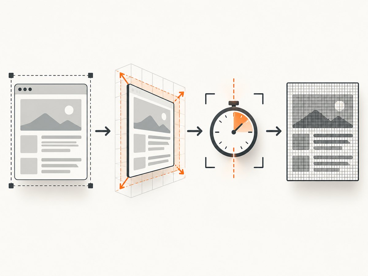
| Layer | What it controls | How to inspect or set it |
|---|---|---|
| Screenshot or window bounds | The requested capture area | --window-size=WIDTH,HEIGHT |
| CSS viewport | What responsive CSS and JavaScript see | window.innerWidth, window.innerHeight; automation viewport APIs |
| Virtual display | Screen size, scale factor, orientation, work area, and multiple displays | --screen-info, CDP Emulation.addScreen |
| Bitmap output | The actual PNG, JPEG, or WebP pixel dimensions | Read image metadata after capture |
| Capture timing | Which page state is rendered into the bitmap | --timeout, --virtual-time-budget, waits in your automation library |
Start with a reproducible diagnostic
Save the exact command and environment before trying fixes. Chromium’s headless packaging is version-sensitive: precompiled headless shell binaries have been distributed as chrome-headless-shell through Chrome for Testing since M118, and the old Headless implementation was removed from the Chrome binary in M132. On current Chrome, --headless=old has no effect. See the Chromium Headless README.
google-chrome --version
which google-chrome chromium chromium-browser chrome-headless-shell 2>/dev/null || true
node --version
python --version
Record these values:
- Browser name and complete version.
- Binary path and whether it is Chrome, Chromium, or
chrome-headless-shell. - Headless mode and every command-line flag.
- Puppeteer, Playwright, Selenium, or CDP version.
- Expected CSS viewport dimensions.
- Expected output pixel dimensions.
- Actual output dimensions and a minimal URL that reproduces the issue.
Measure the page’s CSS viewport and scale
Run this JavaScript in the page or through your automation protocol:
JSON.stringify({
  innerWidth: window.innerWidth,
  innerHeight: window.innerHeight,
  outerWidth: window.outerWidth,
  outerHeight: window.outerHeight,
  devicePixelRatio: window.devicePixelRatio,
  screen: {
    width: screen.width,
    height: screen.height,
    availWidth: screen.availWidth,
    availHeight: screen.availHeight
  },
  visualViewport: window.visualViewport ? {
    width: window.visualViewport.width,
    height: window.visualViewport.height,
    scale: window.visualViewport.scale
  } : null
}, null, 2)
Compare those values with the image’s metadata. If the CSS viewport is correct but the bitmap is exactly two or three times larger, investigate the device scale factor or virtual screen. If the bitmap is correct but the page layout is wrong, investigate the viewport. If both are correct but content is missing, investigate timing.
Fix the CLI screenshot path
For a static capture where the target screenshot dimensions are the main requirement, use a positive integer width and height with --window-size. Chrome’s documented example pairs that flag with --screenshot; the default output filename is screenshot.png. See the Chrome Headless command-line documentation.
google-chrome \
  --headless \
  --disable-gpu \
  --window-size=412,892 \
  --screenshot=shot.png \
  https://developer.chrome.com/
Use plain positive integers. Values such as 1280px, missing commas, zero, negative numbers, or a nonnumeric height are invalid. Chromium’s current headless command handler rejects malformed or nonpositive values and can ignore them, leaving a default size in effect. Always inspect the produced image rather than assuming the flag was accepted.
Check the output dimensions
identify shot.png
# or, with Python and Pillow:
python - <<'PY'
from PIL import Image
im = Image.open('shot.png')
print(im.size)
PY
If your requested width and height are 1280 by 720 but the file is 2560 by 1440, the page may be rendered with a device scale factor of 2. That can be correct for a high-density virtual display; it is not evidence that the CSS viewport is wrong.
Set the CSS viewport in automation
When using Puppeteer, set the viewport explicitly and then verify it inside the page. Keep viewport dimensions and screenshot options conceptually separate.
import puppeteer from 'puppeteer';

const browser = await puppeteer.launch({
  headless: true,
  args: ['--window-size=1280,720']
});
const page = await browser.newPage();
await page.setViewport({ width: 1280, height: 720, deviceScaleFactor: 1 });
await page.goto('https://example.com', { waitUntil: 'networkidle0' });
console.log(await page.evaluate(() => ({
  innerWidth: window.innerWidth,
  innerHeight: window.innerHeight,
  devicePixelRatio: window.devicePixelRatio
})));
await page.screenshot({ path: 'shot.png', fullPage: false });
await browser.close();
With Playwright, the equivalent is:
import { chromium } from 'playwright';

const browser = await chromium.launch({ headless: true });
const context = await browser.newContext({
  viewport: { width: 1280, height: 720 },
  deviceScaleFactor: 1
});
const page = await context.newPage();
await page.goto('https://example.com', { waitUntil: 'networkidle' });
await page.screenshot({ path: 'shot.png' });
await browser.close();
Do not use both a library-level viewport and a conflicting command-line size without checking the result. The browser can start with one window size while the automation context emulates another viewport.
When to use virtual screen configuration
Use a virtual screen when the page must respond to display characteristics such as screen size, scale factor, orientation, work area, or multiple monitors. Chrome documents that headless mode uses a configurable virtual screen independent of physical displays. Current virtual-screen configuration is version-sensitive and is documented for stable Chrome releases starting with version 142.
The command-line --screen-info option describes virtual displays. In a running browser, the DevTools Protocol provides Emulation.addScreen and Emulation.removeScreen for dynamic monitor scenarios. Chrome documents these features for Puppeteer and CDP workflows. Use them only when you need display-aware behavior; they are unnecessary for a single fixed bitmap.
google-chrome \
  --headless \
  --screen-info='{"workArea":{"x":0,"y":0,"width":1920,"height":1080},"devicePixelRatio":2}' \
  --window-size=1280,720 \
  --screenshot=shot.png \
  https://example.com
The exact accepted --screen-info schema depends on the browser build. Check that build’s documentation and log output before relying on a complex multi-display configuration. If your only requirement is a 1280 by 720 image, start with --window-size=1280,720 and an explicit automation device scale factor.
Understand device scale factor and apparent zoom
window.devicePixelRatio expresses the relationship between CSS pixels and device pixels. A value of 2 commonly produces a bitmap twice as wide and twice as tall for the same CSS viewport. It also changes how raster assets and media queries behave.
Debug in this order:
- Record
devicePixelRatiofrom the page. - Record virtual-screen scale information if you configured a screen.
- Compare CSS viewport dimensions with bitmap dimensions.
- Only then change
deviceScaleFactoror virtual-screen scale.
Changing page CSS, applying a transform, or shrinking content to compensate for a bitmap ratio hides the cause and can break responsive layouts. Set the scale at the browser or emulation layer when you need a specific pixel density.
Separate resolution from capture timing
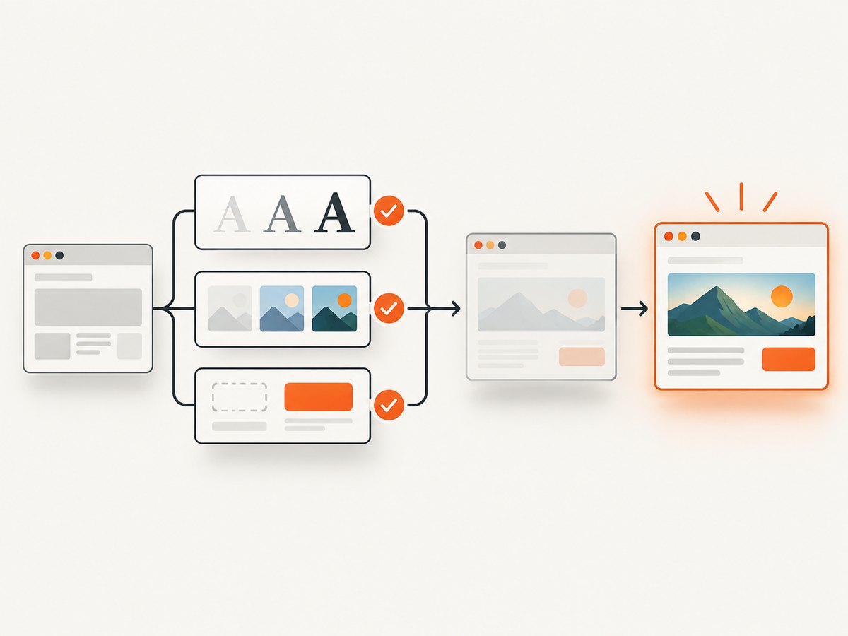
A screenshot with the right dimensions can still look wrong because capture happened too early. Chrome’s --timeout flag defines the maximum wait before capture even if loading continues. The --virtual-time-budget flag advances timer-driven page code. Both affect page state, not intended resolution.
google-chrome \
  --headless \
  --window-size=1440,900 \
  --timeout=10000 \
  --virtual-time-budget=5000 \
  --screenshot=shot.png \
  https://example.com
For automation, wait for the condition that represents readiness:
await page.goto(url, { waitUntil: 'networkidle0', timeout: 30000 });
await page.waitForSelector('#main-content', { visible: true, timeout: 10000 });
await page.evaluate(() => document.fonts ? document.fonts.ready : null);
await page.screenshot({ path: 'shot.png', fullPage: true });
Lazy-loaded images may require scrolling or an application-specific readiness signal. A timeout does not guarantee that every image, font, animation, or client-side request has completed.
Common symptoms and fixes
| Symptom | Likely cause | Fix |
|---|---|---|
| Bitmap is exactly 2× or 3× larger | Device scale factor or virtual display scale | Compare devicePixelRatio with output dimensions; set the intended scale explicitly. |
| Responsive layout uses the wrong breakpoint | CSS viewport differs from window size | Inspect innerWidth; set the automation viewport directly. |
| Requested size is ignored | Malformed --window-size syntax |
Use WIDTH,HEIGHT with positive integers and check logs. |
| Screenshot is correct size but blank | Capture occurred before navigation or rendering finished | Wait for navigation, a selector, fonts, and required application state. |
| Images are missing below the fold | Lazy loading depends on scrolling or intersection observers | Scroll through the page or trigger the site’s documented loading path before capture. |
| Old headless flags have no effect | Running Chrome M132 or later | Use current headless mode or the separately distributed chrome-headless-shell. |
| Page changes between runs | Animations, timers, ads, or network responses | Freeze or disable animation where appropriate, use a deterministic wait, and control virtual time. |
| Full-page shot has unexpected width | Full-page capture uses document dimensions rather than the viewport | Measure document scroll width separately and avoid treating full-page output as a viewport screenshot. |
Performance, reliability, and cost
Performance
- Use one browser process with reused pages or contexts for batches instead of launching Chrome for every URL.
- Choose the smallest viewport and scale factor that meet your output requirement.
- Disable unnecessary animation and third-party requests in controlled test environments.
- Wait for a specific readiness condition instead of using an unnecessarily long fixed delay.
- For full-page captures, account for image decoding, lazy loading, fonts, and the larger bitmap in memory.
Reliability
- Pin or record the browser build, automation library, and flags.
- Log viewport, device scale factor, screen information, URL, timing settings, and output dimensions with each failure.
- Use a minimal reproduction URL and compare a normal headful run with headless output when behavior diverges.
- Do not infer a resolution problem from a visually incomplete page until timing and network state are checked.
Cost
Local Chromium has infrastructure and maintenance costs but no per-shot API charge. Hosted screenshot services generally price captures, bandwidth, or browser runtime differently, so compare the billing unit that matches your workload. If failed loads and bot checks are a significant part of a pipeline, check whether those attempts are billable.
Or skip the browser setup
ScreenshotNeo provides a website screenshot API and MCP server when you want a clean image without maintaining Chromium launch flags. The API accepts one GET request and returns PNG, JPEG, WebP, or PDF. Read the ScreenshotNeo API documentation for all options.
curl -G "https://api.screenshotneo.com/v1/shot" -d access_key=YOUR_API_KEY --data-urlencode url=https://stripe.com -o shot.webpimport requests
r = requests.get("https://api.screenshotneo.com/v1/shot", params={"access_key": "YOUR_API_KEY", "url": "https://stripe.com"}, timeout=90)
open("shot.webp", "wb").write(r.content)const q = new URLSearchParams({ access_key: 'YOUR_API_KEY', url: 'https://stripe.com' });
const res = await fetch(`https://api.screenshotneo.com/v1/shot?${q}`);Before capture, ScreenshotNeo accepts cookie and consent banners and removes more than 60 known consent platforms, newsletter popups, and chat widgets; each step can be disabled. Bot checks, CAPTCHAs, blank pages, timeouts, failed loads, and cache hits are not billed, and response headers identify the page verdict and whether the shot was billed. Its MCP server includes take_screenshot, get_page_info, and capture_pdf for Claude, Cursor, and other MCP clients. The Free plan includes 1,000 screenshots per month with no card; paid plans start at $5 for 3,000 shots. Create a free ScreenshotNeo account.
FAQ
Why is my headless Chrome screenshot twice the expected size?
Check devicePixelRatio and virtual-screen scale first. A CSS viewport of 1280 by 720 with a scale factor of 2 can produce a 2560 by 1440 bitmap.
How do I set the viewport size for a Chromium screenshot?
For the CLI, use --window-size=WIDTH,HEIGHT. In Puppeteer or Playwright, set the context or page viewport and verify window.innerWidth inside the page.
Should I use --timeout to fix blurry screenshots?
No. --timeout changes when capture occurs. Blurriness or a pixel-size ratio usually points to scale factor, image decoding, fonts, or output processing.
When do I need --screen-info?
Use it when the page must behave as though it is on a particular virtual display. A fixed screenshot size usually only needs an explicit window or viewport size.
What should I include in a Chromium scaling bug report?
Include the browser build and binary, operating system or container, headless mode, flags, automation and CDP versions, expected and actual CSS viewport values, device pixel ratio, output dimensions, and a minimal reproduction.


