How to Fix Screenshot Differences Between Headed and Headless Playwright Runs
Make headed and headless Playwright screenshots match by pinning environments, fonts, viewports, timing, and capture settings.
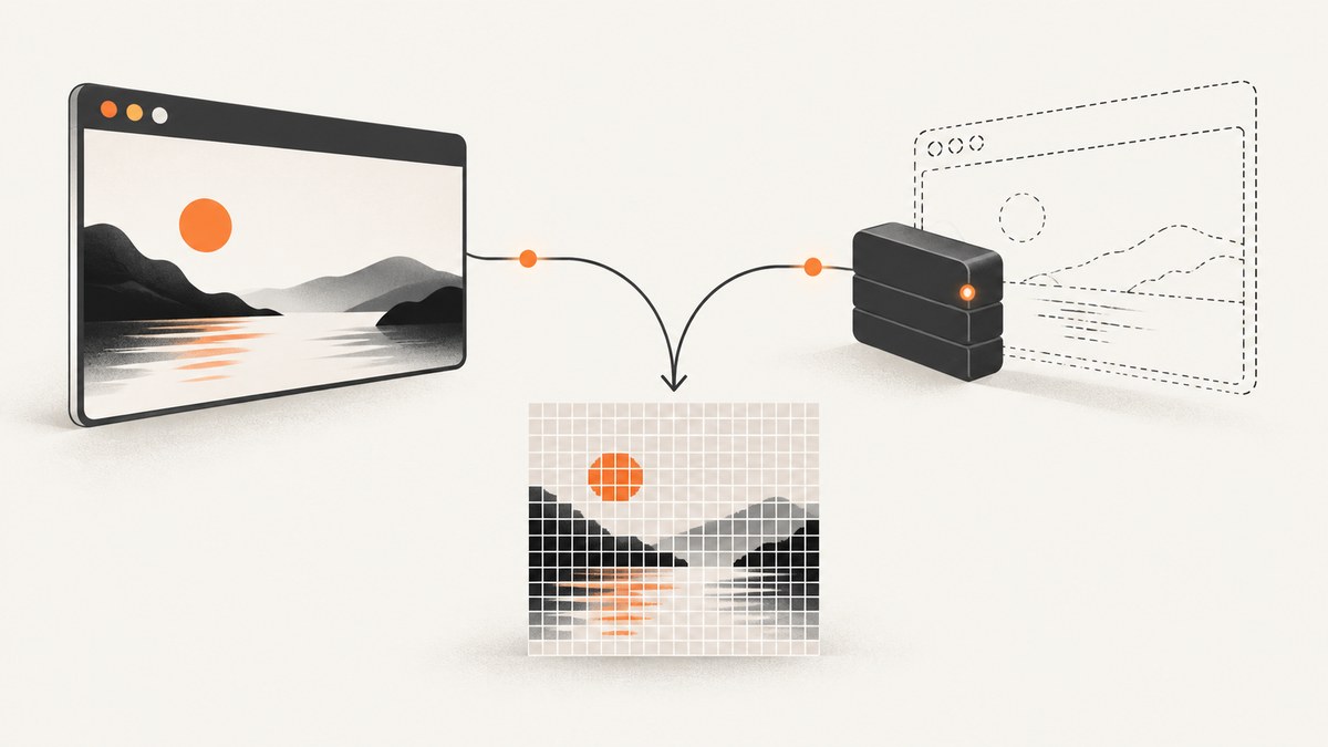
Headed and headless Playwright runs can render different pixels even when they execute the same test. The reliable fix is to make the rendering environment and capture settings identical, then remove dynamic visual state. Playwright’s guidance is explicit: “For consistent screenshots, run tests in the same environment where the baseline screenshots were generated.”
This guide gives a deterministic setup, explains every setting that commonly causes drift, and shows how to diagnose a mismatch without hiding real regressions.
Why headed and headless screenshots differ
Headed mode displays a browser window; headless mode renders without one. Both use the same browser engine, but the execution context can still differ. Playwright documents variation from the operating system, browser version, browser settings, hardware, power source, and headless mode. Fonts, anti-aliasing, GPU paths, and native widgets are especially sensitive. Snapshot names include browser and platform because screenshots can differ across browsers and operating systems. See the visual comparisons documentation.
Other differences come from your test: an implicit viewport, a different device scale factor, a locale or timezone inherited from CI, an animation captured at another frame, or data that changes between requests. Treat headed versus headless as an environment-reproducibility problem first.
Deterministic fix in seven steps
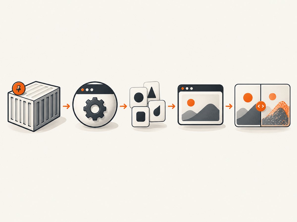
- Pin the runtime. Use the same container or OS image for baseline generation and comparison. Pin the Playwright package and browser build. Install the same font files in local and CI images.
- Set viewport and pixel density. Define width, height, and
deviceScaleFactorin the browser context. Do not rely on a desktop window size in headed mode or a CI default in headless mode. - Keep screenshot scale constant. Use
scale: 'css'for one output pixel per CSS pixel, orscale: 'device'for device pixels. Use the same value in both runs. - Freeze timing. Disable animations and transitions, wait for the same readiness signal, and use a stable data fixture. Screenshot assertions disable animations by default; make that explicit in shared helpers.
- Remove transient UI. Hide carets, mask dynamic locators, and inject CSS for clocks, rotating banners, ads, and third-party widgets.
- Match capture scope. Use the same viewport, element locator, clip rectangle, and
fullPagechoice. A full-page capture can trigger lazy loading and produce a different document height. - Compare causes before thresholds. Check environment, browser and Playwright versions, fonts, viewport, scale, locale/timezone, animation state, data, and capture scope. Only then adjust a comparator threshold.
Minimal stable Playwright test
This TypeScript test uses Playwright Test’s screenshot assertion with deterministic options:
import { test, expect } from '@playwright/test';

test('stable visual', async ({ page }) => {
  await page.goto('http://localhost:3000/', { waitUntil: 'networkidle' });
  await expect(page).toHaveScreenshot('home.png', {
    animations: 'disabled',
    caret: 'hide',
    scale: 'css',
    fullPage: true,
  });
});
Generate and compare the baseline with the same project and environment. The exact viewport and scale are project decisions; what matters is that they never change between modes.
Pin the browser project and context
Put shared settings in playwright.config.ts so headed and headless commands cannot silently diverge:
import { defineConfig, devices } from '@playwright/test';

export default defineConfig({
  testDir: './tests',
  use: {
    baseURL: 'http://localhost:3000',
    browserName: 'chromium',
    viewport: { width: 1440, height: 900 },
    deviceScaleFactor: 1,
    locale: 'en-US',
    timezoneId: 'UTC',
    colorScheme: 'light',
    reducedMotion: 'reduce',
    screenshot: 'only-on-failure',
  },
  projects: [
    { name: 'chromium', use: { ...devices['Desktop Chrome'] } },
  ],
});
Run headed with npx playwright test --headed and headless with npx playwright test; both commands now use the same project values. Keep the Playwright npm version and installed browsers locked in your package lock and CI image.
Control fonts, locale, and operating system
Font fallback changes line breaks, element heights, and anti-aliasing. Install the exact font files required by the page in the image that creates baselines and the image that verifies them. Check that the browser can see them before the test, and avoid relying on fonts available only on a developer laptop.
Set locale and timezone explicitly. Dates, number formatting, text direction, and timezone-sensitive components otherwise follow the host. Also keep color scheme, reduced-motion preference, user agent, and browser channel constant when those affect CSS or JavaScript.
For the strongest reproducibility, run both modes inside one container image. The headed run can use a virtual display such as Xvfb while retaining the same OS libraries and fonts as headless; the important property is the shared image and browser build.
Make timing and dynamic content deterministic
Waiting for networkidle alone does not make a page stable. WebSockets, polling, ads, and rotating content can continue after the network goes quiet. Prefer an application-level readiness marker:
await page.goto('/dashboard');
await page.locator('[data-test="dashboard-ready"]').waitFor();
await expect(page).toHaveScreenshot('dashboard.png', {
  animations: 'disabled',
  caret: 'hide',
  scale: 'css',
});
Mask values that are intentionally variable:
await expect(page).toHaveScreenshot('orders.png', {
  animations: 'disabled',
  caret: 'hide',
  mask: [page.locator('[data-test="clock"]'), page.locator('.live-price')],
  maskColor: '#FF00FF',
  scale: 'css',
});
For stubborn widgets, inject a screenshot-only stylesheet. Playwright supports the style and stylePath options for this purpose:
await expect(page).toHaveScreenshot('home.png', {
  style: `
    *, *::before, *::after {
      animation: none !important;
      transition: none !important;
      caret-color: transparent !important;
    }
    .ad, .chat-widget, .rotating-banner { visibility: hidden !important; }
  `,
  caret: 'hide',
  scale: 'css',
});
Use masking or CSS only for known nondeterminism. Hiding a component that should be tested can conceal a regression.
Viewport, device scale, and screenshot scale
Viewport width controls responsive breakpoints; height affects what is initially visible. deviceScaleFactor controls the emulated device pixel ratio. Screenshot scale controls output pixels independently: css keeps one pixel per CSS pixel, while device multiplies dimensions on high-DPI contexts. A headed laptop often has a device scale of 2 while CI defaults to 1, producing apparent size and anti-aliasing differences.
Choose values deliberately and record them with the baseline. If you compare an element screenshot, keep the locator and its scroll position identical. If you compare fullPage: true, ensure lazy images are loaded and that fonts have finished loading before capture.
Headed versus headless command checklist
| Axis | What to pin | Typical symptom |
|---|---|---|
| OS/container | Same image, libraries, virtual display | Text anti-aliasing or spacing changes |
| Browser | Engine, channel, exact build | Different shadows, gradients, layout |
| Playwright | Package and lockfile | Changed screenshot defaults |
| Fonts | Same files and font loading | Fallback glyphs, line wraps |
| Viewport/DPR | Width, height, deviceScaleFactor | Responsive breakpoint changes |
| Output scale | css or device |
Image dimensions differ |
| Locale/timezone | Explicit values | Date and number text changes |
| State | Fixtures, animations, network data | Only dynamic regions differ |
Debugging a remaining diff
- Save the headed and headless images with descriptive names and inspect their dimensions.
- Print the browser version, Playwright version, viewport, DPR, locale, and timezone in CI logs.
- Check computed fonts and whether web fonts loaded before the assertion.
- Disable animations and mask known dynamic regions; rerun once.
- Compare viewport and full-page dimensions. A one-pixel width change can trigger a media query.
- Review the diff at 100% zoom. If only anti-aliasing differs, the OS or graphics stack is still different.
- Keep comparator thresholds strict until deterministic causes are eliminated.
Do not add a large pixel threshold as the first fix. Thresholds are useful for unavoidable rasterization noise, but they can hide layout or content regressions.
Common errors and fixes
| Error or symptom | Cause | Fix |
|---|---|---|
| “Snapshot … does not match” only in CI | Different OS, fonts, browser build, or locale | Run baseline and comparison in one pinned container; install fonts and set locale/timezone. |
| Image is exactly twice as large | DPR or scale differs |
Set deviceScaleFactor and scale explicitly. |
| Text wraps to another line | Font fallback or viewport width | Wait for document.fonts.ready, install the font, and pin width. |
| Only a clock, ad, or chat panel differs | Dynamic third-party UI | Mask it or hide it with screenshot CSS; freeze network data where possible. |
| Full-page height changes | Lazy content or late layout shift | Scroll/load lazy regions, wait for a readiness marker, then capture with the same scope. |
| Headed passes but headless fails after browser update | Rendering behavior changed | Pin the browser revision and review the baseline intentionally before updating. |
| Timeout while waiting for network idle | Long polling or open sockets | Wait for a specific selector instead of global network idle. |
Performance, reliability, and cost
Headless usually uses fewer display resources, but screenshot speed is dominated by page load, fonts, JavaScript, and full-page scrolling. Reuse a browser process across tests, create isolated contexts, and avoid arbitrary long sleeps. Selector waits and application readiness markers reduce wasted time while improving repeatability.
Keep visual tests focused: one stable baseline per meaningful state. Parallel workers can contend for CPU and produce timing-sensitive pages, so cap workers for noisy suites and keep test data isolated. Cache dependencies and browser binaries in CI, but invalidate the cache when the lockfile or browser revision changes.
Visual snapshots have no universal pixel-difference rate or threshold. Record why a tolerance exists, scope it to a region when possible, and review baseline changes as code changes. The same environment rule applies to local development, pull requests, and release jobs.
Or skip the browser setup
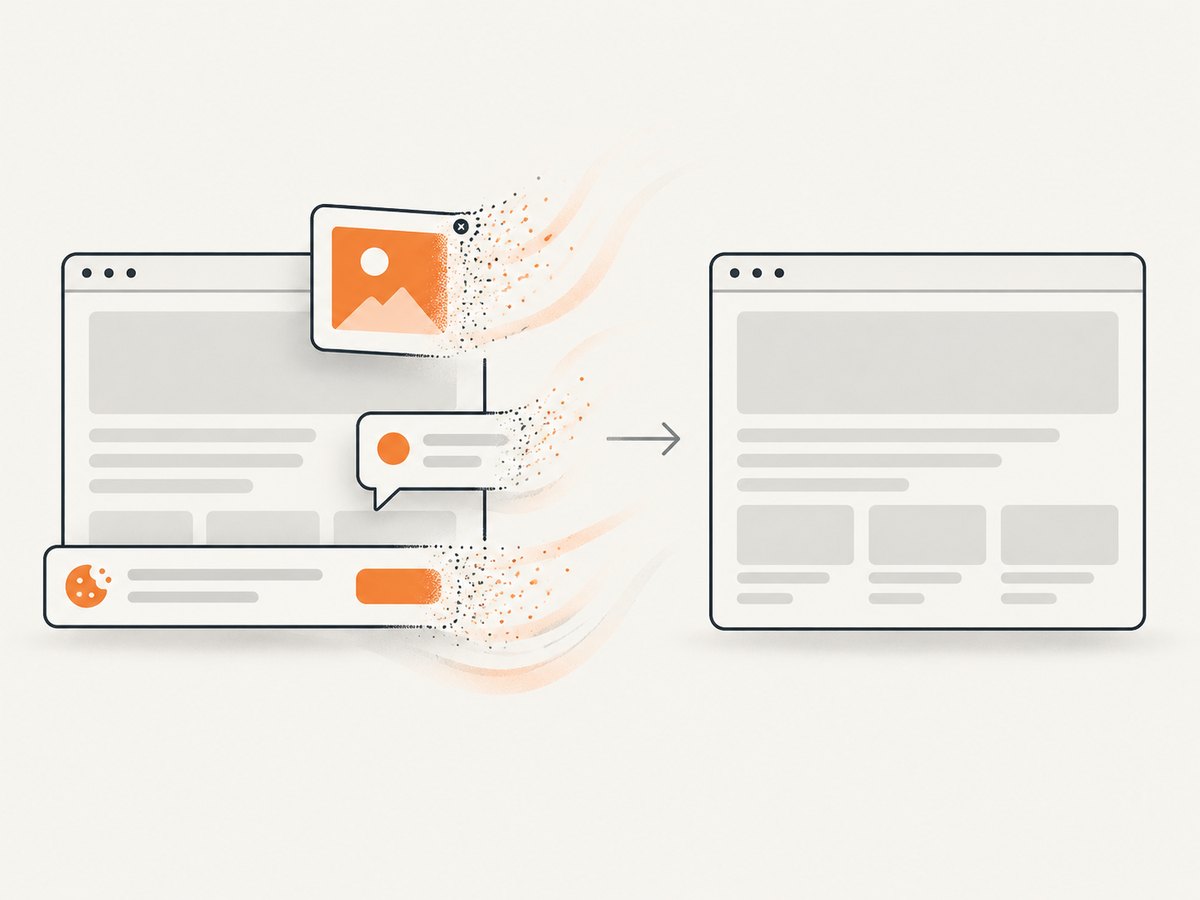
ScreenshotNeo provides a website screenshot API when you need a clean capture without maintaining Playwright images, fonts, and virtual displays. One GET request returns PNG, JPEG, WebP, or PDF. Cookie and consent banners, newsletter popups, and chat widgets are removed before the shot; each step can be turned off. Bot checks, blank pages, timeouts, failed loads, and cache hits are not billed, and response headers identify the page verdict and whether it was billed. Its MCP server exposes take_screenshot, get_page_info, and capture_pdf to Claude, Cursor, and other MCP clients.
See the ScreenshotNeo API documentation for all options. Basic calls:
cURL
curl -G "https://api.screenshotneo.com/v1/shot" -d access_key=YOUR_API_KEY --data-urlencode url=https://stripe.com -o shot.webpPython
import requests
r = requests.get("https://api.screenshotneo.com/v1/shot", params={"access_key": "YOUR_API_KEY", "url": "https://stripe.com"}, timeout=90)
open("shot.webp", "wb").write(r.content)
Node.js
const q = new URLSearchParams({ access_key: 'YOUR_API_KEY', url: 'https://stripe.com' });
const res = await fetch(`https://api.screenshotneo.com/v1/shot?${q}`);
ScreenshotNeo also supports full-page and element captures, dark mode, device presets or custom viewports, retina scale, custom CSS and JavaScript, click and wait actions, blocked resource types, headers, cookies, user agents, authorization, timezone, geolocation, transparent backgrounds, resizing, cache TTLs, signed links, asynchronous jobs with signed webhooks, bulk capture of 100 URLs per call, usage reporting, and an OpenAPI spec. Parameter names used by other screenshot APIs also work, which simplifies migration.
The Free plan includes 1,000 shots each month with no card. Paid plans start at $5 for 3,000 shots; yearly billing gives two months free, and every feature is on every plan. Create a free ScreenshotNeo account to try it.
FAQ
Should I use headed mode in CI?
Use whichever mode matches your baseline environment. If headed behavior matters, run headed in a pinned container with a virtual display; do not mix a laptop baseline with headless Linux verification.
Does disabling animations fix font differences?
No. It removes time-based motion, while fonts and rasterization depend on environment, browser build, and device scale. Pin those separately.
When is scale: 'device' useful?
Use it when you need device-pixel output for a high-DPI workflow. Use css when cross-machine pixel dimensions and simpler diffs matter. Keep the choice identical for baselines and comparisons.
Can a screenshot pass while the page is broken?
Yes. A screenshot checks pixels, not accessibility, network errors, or interactive behavior. Pair visual assertions with semantic and functional tests.
How do I handle intentional redesigns?
Review and update the baseline in the same pinned environment, documenting the reason. Keep the diff visible in code review.


