How to Fix Overlapping Images When Converting HTML to PDF
Diagnose and fix overlapping images in HTML-to-PDF output with print CSS, page geometry, sizing, breaks, renderer settings, and runnable examples.
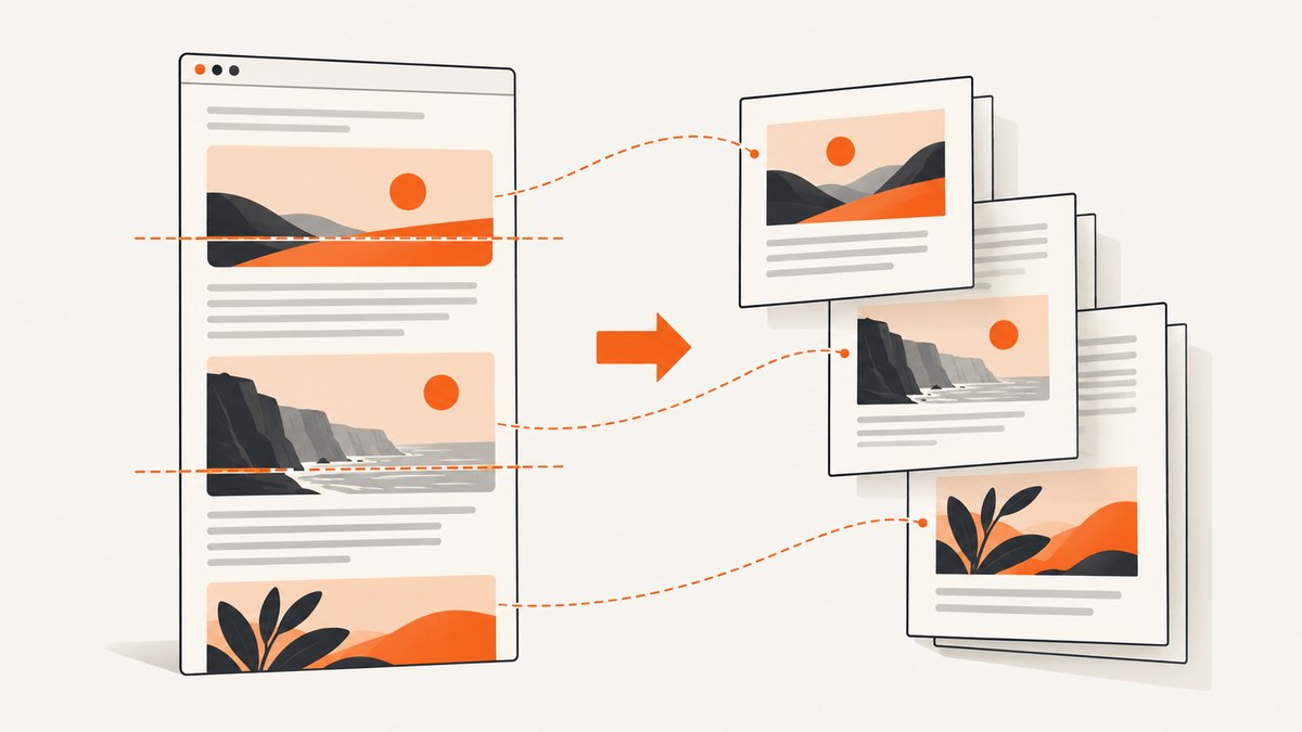
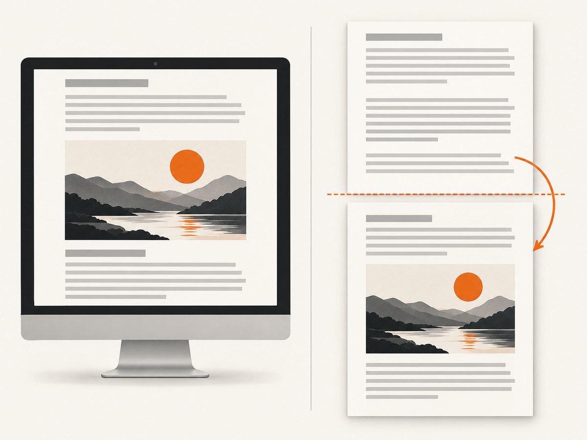
Overlapping images in a generated PDF usually come from a difference between screen layout and print layout, mismatched page geometry, or content crossing a page boundary. Start by identifying the renderer and version, then compare screen and print CSS, align @page with the PDF options, constrain the image and its containing block, and test page-break rules one change at a time.
The exact cause depends on your HTML, CSS, renderer, and output. The sequence below gives you a reproducible way to find it without guessing.
1. Record the renderer and make a small reproduction
Write down the library or service, exact version, operating system, input URL or HTML, PDF options, and a PDF that shows the defect. Pagination and CSS support differ between engines, so a fix for one renderer may not apply to another.
Reduce the document to one problematic image and its parent container. Keep the same image URL, dimensions, fonts, and relevant styles. A small reproduction makes it easier to compare one change at a time.
2. Check whether print CSS changes the layout
Puppeteer generates PDFs with the print CSS media type by default. Its documentation also explains that you can call page.emulateMediaType('screen') to generate a PDF using screen media instead. Compare both modes before changing image rules.
const { chromium } = require('playwright');

(async () => {
  const browser = await chromium.launch();
  const page = await browser.newPage({ viewport: { width: 1280, height: 900 } });
  await page.goto('https://example.com/report', { waitUntil: 'networkidle' });

  // First render with print CSS (the default for PDF generation).
  await page.pdf({ path: 'print-css.pdf', format: 'A4', printBackground: true });

  // Then render with screen CSS to isolate media-query changes.
  await page.emulateMedia({ media: 'screen' });
  await page.pdf({ path: 'screen-css.pdf', format: 'A4', printBackground: true });

  await browser.close();
})();
If the image overlaps only in the print version, inspect every @media print rule affecting the image, its parent, or neighboring content. Look for changed display, position, height, overflow, float, transform, and grid or flex declarations.
3. Align CSS page geometry with PDF options
Paper size, margins, and scale are separate controls. A CSS @page rule can request one geometry while the API call supplies another. The renderer may then scale or reposition content, making a page boundary appear to cut through an image.
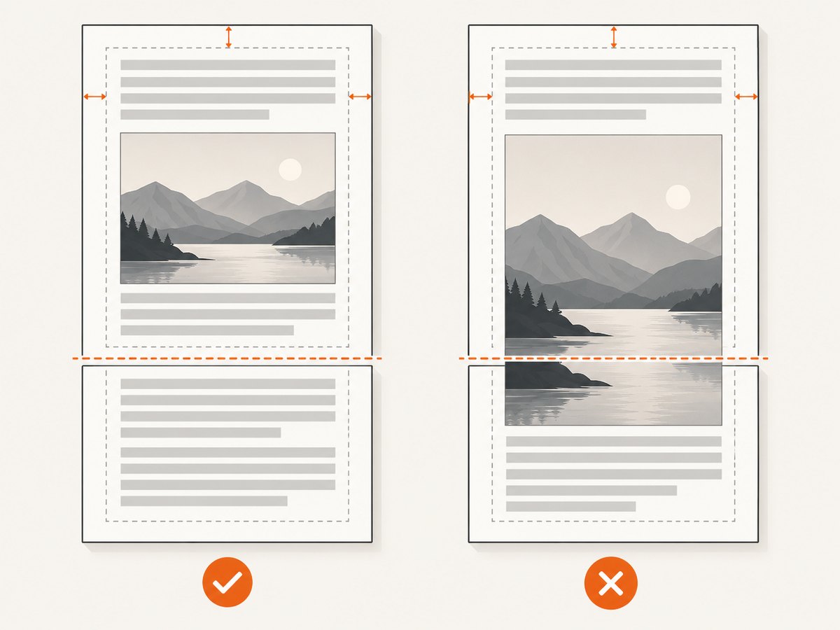
Puppeteer exposes paper dimensions, margins, scale, and the preferCSSPageSize option in its PDF options. The default for preferCSSPageSize is false, so content is fitted to the supplied paper size unless CSS page sizing is given priority. See the Page.pdf documentation and PDFOptions reference.
@page {
  size: A4 portrait;
  margin: 16mm 14mm 18mm;
}

html, body {
  margin: 0;
  padding: 0;
}

.report-image {
  display: block;
  width: 100%;
  height: auto;
}
const puppeteer = require('puppeteer');
(async () => {
const browser = await puppeteer.launch();
const page = await browser.newPage();
await page.goto('https://example.com/report', { waitUntil: 'networkidle0' });
await page.pdf({
path: 'report.pdf',
format: 'A4',
printBackground: true,
margin: {
top: '16mm',
right: '14mm',
bottom: '18mm',
left: '14mm'
},
scale: 1,
preferCSSPageSize: true
});
await browser.close();
})();Use either explicit width and height or a named format consistently. If you use @page for the document, test with preferCSSPageSize: true. If the API owns the geometry, remove conflicting @page size declarations and keep the margins synchronized.
WeasyPrint documents the same approach through CSS @page rules for page size and margins. Its common-use-case documentation is at WeasyPrint common use cases.
4. Constrain the image and its containing block
Inspect the rendered dimensions and position of both the image and its parent under print media. The goal is to ensure that the image participates in normal document flow and that its dimensions are based on the containing block.
.image-card {
  width: 100%;
  box-sizing: border-box;
  break-inside: avoid;
  page-break-inside: avoid;
}

.image-card img {
  display: block;
  max-width: 100%;
  width: 100%;
  height: auto;
  object-fit: contain;
}

@media print {
  .image-card {
    position: static;
    overflow: visible;
  }
}
Treat intrinsic dimensions, absolute positioning, transforms, lazy loading, and replaced-element sizing as hypotheses to inspect in your document. The available documentation does not establish one universal image-sizing cause for every renderer.
Use browser inspection before PDF generation to capture the computed values:
const box = await page.$eval('.image-card img', (img) => {
  const rect = img.getBoundingClientRect();
  const style = getComputedStyle(img);
  return {
    rect: { x: rect.x, y: rect.y, width: rect.width, height: rect.height },
    display: style.display,
    position: style.position,
    width: style.width,
    height: style.height,
    maxWidth: style.maxWidth,
    objectFit: style.objectFit
  };
});
console.log(box);
5. Test page-break behavior at the defect
If the overlap starts where an image or its parent crosses a page boundary, test pagination rules on the parent container. WeasyPrint lists support for break-before, break-after, and break-inside, along with the CSS2 page-break-* aliases. Verify the result in your actual engine; support and effects vary.
.image-card {
  break-inside: avoid;
  page-break-inside: avoid;
}

.section {
  break-before: page;
  page-break-before: always;
}

.after-image {
  break-before: avoid;
  page-break-before: avoid;
}
These rules are not interchangeable fixes. Start with break-inside: avoid on the smallest container that must stay together. If that leaves too little space, deliberately move the whole section with break-before: page. Avoid applying page breaks to every image, because that can create empty or mostly empty pages.
6. Wait for images and fonts before creating the PDF
A PDF can capture a partially laid-out page if images, web fonts, or client-side content are still loading. Wait for the relevant selector and for the image elements to complete before calling the PDF method.
await page.goto('https://example.com/report', { waitUntil: 'networkidle0' });
await page.waitForSelector('.report-image img');
await page.evaluate(async () => {
  const images = Array.from(document.images);
  await Promise.all(images.map((img) => {
    if (img.complete) return Promise.resolve();
    return new Promise((resolve) => {
      img.addEventListener('load', resolve, { once: true });
      img.addEventListener('error', resolve, { once: true });
    });
  }));
  if (document.fonts) await document.fonts.ready;
});
If the page uses lazy loading, scroll through the document or trigger the application’s loading behavior before rendering. Keep this as a controlled test: first prove that all assets are present, then investigate CSS and pagination.
7. A complete Puppeteer diagnostic script
const puppeteer = require('puppeteer');

const url = process.argv[2] || 'https://example.com/report';

(async () => {
  const browser = await puppeteer.launch({ headless: true });
  const page = await browser.newPage();
  await page.setViewport({ width: 1280, height: 900, deviceScaleFactor: 1 });
  await page.goto(url, { waitUntil: 'networkidle0', timeout: 90000 });
  await page.waitForSelector('img');

  await page.evaluate(async () => {
    await Promise.all(Array.from(document.images).map((img) => {
      if (img.complete) return Promise.resolve();
      return new Promise((resolve) => {
        img.addEventListener('load', resolve, { once: true });
        img.addEventListener('error', resolve, { once: true });
      });
    }));
    if (document.fonts) await document.fonts.ready;
  });

  const images = await page.$$eval('img', (nodes) => nodes.map((img) => {
    const r = img.getBoundingClientRect();
    const s = getComputedStyle(img);
    return {
      src: img.currentSrc || img.src,
      x: r.x, y: r.y, width: r.width, height: r.height,
      display: s.display, position: s.position,
      breakInside: s.breakInside
    };
  }));
  console.log(JSON.stringify(images, null, 2));

  await page.pdf({
    path: 'diagnostic.pdf',
    format: 'A4',
    printBackground: true,
    margin: { top: '16mm', right: '14mm', bottom: '18mm', left: '14mm' },
    scale: 1,
    preferCSSPageSize: true
  });
  await browser.close();
})();
8. WeasyPrint example
WeasyPrint uses CSS paged-media rules for page geometry and breaks. Keep the CSS in the HTML or pass a stylesheet explicitly.
from weasyprint import HTML, CSS

html = HTML(string='''
<!doctype html>
<html>
<head>
  <meta charset="utf-8">
  <style>
    @page { size: A4; margin: 16mm 14mm 18mm; }
    .image-card { break-inside: avoid; page-break-inside: avoid; }
    img { display: block; max-width: 100%; height: auto; }
  </style>
</head>
<body>
  <div class="image-card">
    <img src="https://example.com/image.jpg" alt="">
  </div>
</body>
</html>
''', base_url='.')
html.write_pdf('report.pdf')
Consult the WeasyPrint API reference for the page-break properties supported by your installed version.
9. Troubleshooting checklist
| Symptom | Likely area to inspect | Next fix to test |
|---|---|---|
| Works in the browser, overlaps in PDF | Print media rules | Compare print and screen computed styles; test emulateMediaType('screen'). |
| Overlap begins at a page boundary | Pagination | Apply break-inside: avoid to the image container, then test a deliberate page break. |
| Image is wider than the page | Geometry or intrinsic width | Use max-width: 100%, synchronize margins, and check scale. |
| Image position changes between runs | Assets or fonts not ready | Wait for images and document.fonts.ready before PDF generation. |
| Only one renderer fails | Engine-specific CSS support | Reduce the case and verify the property in that renderer’s documentation. |
| Blank space appears after adding breaks | Break applied too high in the tree | Move the rule to the smallest required container. |
10. Performance, reliability, and cost considerations
- Performance: Waiting for network idle, images, and fonts increases render time but removes timing-dependent layouts. Use a targeted selector and a bounded timeout instead of an unbounded delay.
- Reliability: Pin the renderer version, keep a minimal regression document, and compare PDFs after every CSS or option change. Record media type, page size, margins, scale, and break rules with the output.
- Resource use: Large images increase memory and PDF size. Resize source assets when possible and avoid loading images that are not part of the document.
- Cost: Self-hosted browser or WeasyPrint jobs consume your own compute. A hosted screenshot or PDF API trades browser maintenance for per-request pricing; evaluate it with your document’s page count and failure handling.
Or skip the browser setup
ScreenshotNeo provides a website screenshot API and MCP server. It can capture a page as PNG, JPEG, WebP, or PDF with one request, while exposing PDF paper size, margins, landscape mode, and page ranges. See the ScreenshotNeo documentation for the complete option list.
curl -G "https://api.screenshotneo.com/v1/shot" -d access_key=YOUR_API_KEY --data-urlencode url=https://stripe.com -o shot.webpimport requests
r = requests.get("https://api.screenshotneo.com/v1/shot", params={"access_key": "YOUR_API_KEY", "url": "https://stripe.com"}, timeout=90)
open("shot.webp", "wb").write(r.content)const q = new URLSearchParams({ access_key: 'YOUR_API_KEY', url: 'https://stripe.com' });
const res = await fetch(`https://api.screenshotneo.com/v1/shot?${q}`);Before capture, ScreenshotNeo accepts cookie and consent banners and removes more than 60 known consent platforms, newsletter popups, and chat widgets; each step can be turned off. Bot checks, blank pages, timeouts, failed loads, and cache hits are not billed, and the response identifies the result with X-Page-Verdict and X-Billed headers. Its MCP server provides take_screenshot, get_page_info, and capture_pdf tools for Claude, Cursor, and other MCP clients.
There is a free plan with 1,000 screenshots per month and no card. Paid plans start at $5 for 3,000 shots. Create a free ScreenshotNeo account.
FAQ
Should I set image height explicitly?
Only when the design requires a fixed box. For ordinary document images, a block element with max-width: 100% and height: auto lets the image preserve its aspect ratio.
Does break-inside: avoid guarantee a one-page image?
No. If the element is taller than the printable area, the renderer must split or overflow it. Reduce the image or choose a layout that can span pages.
Should I switch renderers?
Consider a different renderer when your required paged-media features are unsupported or incompatible with the existing HTML and CSS. A renderer change is an option for demanding print workflows, not proof that it fixes this particular overlap.
What information is needed to diagnose a specific PDF?
Provide the renderer and version, HTML, relevant CSS, PDF options, intended paper geometry, and a sample output showing the overlap. Without those details, the checks above are a diagnostic sequence rather than a confirmed diagnosis.