How to Fix Puppeteer Flexbox Alignment Differences in Screenshots
Fix Puppeteer flexbox screenshot mismatches by matching viewport inputs, checking headless screens, and inspecting computed layout before changing CSS.
When a Puppeteer screenshot shows flex items aligned differently from the page you see in Chrome, treat it as a reproducibility problem first. Match the viewport width and height, device scale factor, headless screen, browser mode and page state. Then inspect the browser’s computed flex layout in DevTools. Only after those inputs match should you change CSS.
A reliable order is:
- Record the expected and actual capture environments.
- Set Puppeteer’s viewport and device scale factor explicitly.
- Make headless screen settings deliberate.
- Inspect the flex container and items with Chrome DevTools.
- Check whether full-page capture changed the viewport.
- Separate font-rendering differences from flex positioning.
1. Reproduce the capture with identical inputs
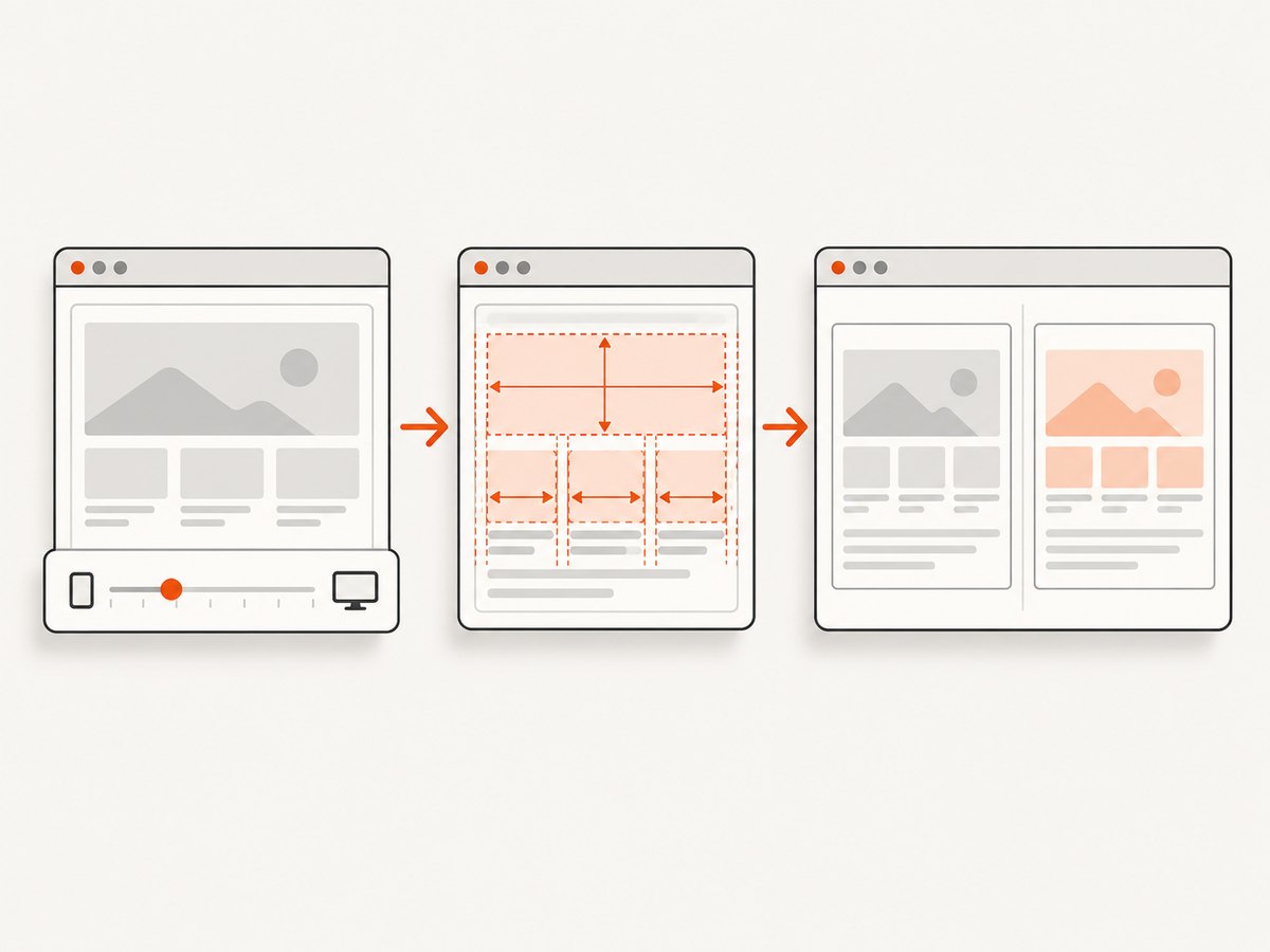
Puppeteer’s Viewport API uses CSS pixels for width and height. Its deviceScaleFactor defaults to 1; a value of 0 resets to the system default. Set all three values explicitly so the browser performs layout and rasterization under the same conditions as the reference image.
| Input | Why it changes the result | What to record |
|---|---|---|
| Viewport width and height | Controls media queries, wrapping, available flex space and vh/vw units |
CSS-pixel width and height |
| Device scale factor | Changes raster dimensions and can expose rounding differences | Explicit numeric value, usually 1 or 2 |
| Headless or headful mode | Changes window and screen behavior | Launch mode and Puppeteer version |
| Virtual screen | Can affect screen-dependent CSS and APIs | --screen-info, --window-size, orientation and scale |
| Browser and operating system | Font metrics and rendering can differ | Chrome/Chromium version and OS |
| Page state | Fonts, animations, network timing and content affect geometry | Loaded URL, cookies, auth, reduced motion and wait conditions |
The Puppeteer viewport reference documents these viewport fields and defaults: Viewport interface.
Minimal diagnostic script
import puppeteer from 'puppeteer';

const browser = await puppeteer.launch({ headless: true });
const page = await browser.newPage();

await page.setViewport({
  width: 1440,
  height: 900,
  deviceScaleFactor: 1
});

await page.goto('https://example.com/layout', { waitUntil: 'networkidle0' });
await page.screenshot({ path: 'diagnostic.png' });

console.log(await page.evaluate(() => ({
  innerWidth: window.innerWidth,
  innerHeight: window.innerHeight,
  devicePixelRatio: window.devicePixelRatio,
  screen: {
    width: window.screen.width,
    height: window.screen.height,
    availWidth: window.screen.availWidth,
    availHeight: window.screen.availHeight
  }
})));

await browser.close();
Run the same script with the dimensions and scale used by the reference capture. Save the printed values with the screenshot so a later comparison is based on facts rather than visual guesses.
2. Configure the headless screen deliberately
Puppeteer documents a default headless screen of 800×600 when no screen configuration is supplied. The screen-configuration guide describes --screen-info, --window-size, scale, orientation and related properties. Chromium’s headless screen documentation describes the virtual screen format and a default scale factor of 1.0.
import puppeteer from 'puppeteer';

const browser = await puppeteer.launch({
  headless: true,
  args: [
    '--window-size=1440,900'
    // Add a deliberate --screen-info value only when your
    // reproduction requires virtual-screen properties.
  ]
});

const page = await browser.newPage();
await page.setViewport({ width: 1440, height: 900, deviceScaleFactor: 1 });
await page.goto('https://example.com/layout', { waitUntil: 'networkidle0' });
await page.screenshot({ path: 'screen-configured.png' });
await browser.close();
Do not assume that a larger window fixes a flexbox mismatch. It can hide the original cause by changing available space, wrapping and viewport units. Keep the screen and page viewport settings documented together.
3. Inspect computed flexbox layout in Chrome DevTools
Open the same URL in Chrome at the same viewport size. In Elements, select the suspected container. A flex badge identifies flex containers; click it to enable the layout overlay. The Flexbox editor lets you inspect or change properties such as justify-content and align-items. Compare computed values and geometry before editing source CSS. See Chrome’s guide, Inspect and debug CSS flexbox layouts.
- Confirm
display: flexordisplay: inline-flex. - Check
flex-directionand whether the main axis is horizontal or vertical. - Compare
justify-content,align-items,align-contentandgap. - Check
flex-wrap; a one-pixel width change can move an item to a new line. - Inspect container width and height, padding, borders and scrollbar presence.
- Inspect each item’s flex basis, grow, shrink, min/max size and margins.
- Look for intrinsic sizes from images, long words, buttons or replaced elements.
- Record the bounding rectangles with JavaScript:
const layout = await page.evaluate(() => {
  const container = document.querySelector('.toolbar');
  return {
    container: container && {
      rect: container.getBoundingClientRect().toJSON(),
      styles: (() => {
        const s = getComputedStyle(container);
        return {
          display: s.display,
          flexDirection: s.flexDirection,
          flexWrap: s.flexWrap,
          justifyContent: s.justifyContent,
          alignItems: s.alignItems,
          alignContent: s.alignContent,
          gap: s.gap,
          width: s.width,
          height: s.height
        };
      })()
    },
    items: [...document.querySelectorAll('.toolbar > *')].map((el) => ({
      text: el.textContent.trim(),
      rect: el.getBoundingClientRect().toJSON(),
      styles: (() => {
        const s = getComputedStyle(el);
        return {
          flex: s.flex,
          flexBasis: s.flexBasis,
          flexGrow: s.flexGrow,
          flexShrink: s.flexShrink,
          minWidth: s.minWidth,
          maxWidth: s.maxWidth,
          margin: s.margin
        };
      })()
    }))
  };
});
console.log(JSON.stringify(layout, null, 2));
If the computed values and rectangles differ, fix the environment or the CSS that produces those values. If they match but pixels still differ, investigate fonts, antialiasing, image decoding and color management rather than changing alignment rules.
4. Full-page screenshots can change the layout
A mismatch that appears only with fullPage: true deserves special attention. Historical Puppeteer discussion explains that full-page capture and viewport clipping behavior can involve changing the viewport height. That can alter vh-based layouts and move fixed or sticky elements. It is a caveat to verify against your current Puppeteer version, not a universal explanation.
// Compare viewport and full-page captures without changing CSS.
await page.setViewport({ width: 1440, height: 900, deviceScaleFactor: 1 });
await page.screenshot({ path: 'viewport.png', fullPage: false });
await page.screenshot({ path: 'full-page.png', fullPage: true });
Check whether the page contains:
height: 100vh,min-height: 100vhor calculations based on viewport height.position: fixedorposition: stickyelements.- JavaScript that reads
window.innerHeightorvisualViewport. - Intersection observers or lazy loaders that react to the capture viewport.
For a controlled comparison, capture a fixed viewport first. If you need a tall image, prefer a capture method that preserves the intended viewport and clips or stitches content according to your Puppeteer version’s documented behavior.
5. Check fonts and rendering separately
Text can make a flex row appear misaligned when the actual cause is a different font metric. Wait for web fonts before measuring, and make sure the same font files, weights and operating system are available.
await page.goto('https://example.com/layout', { waitUntil: 'networkidle0' });
await page.evaluate(async () => {
  if (document.fonts) await document.fonts.ready;
});
await page.screenshot({ path: 'fonts-ready.png' });
Compare font family, weight, line height and text-transform in computed styles. A 2018 Puppeteer issue mentions --font-render-hinting=none as a historical experiment for text spacing. It is not current general guidance; test it only with the exact Chromium and operating-system combination involved: historical issue discussion.
6. A complete reproducible Puppeteer workflow
import puppeteer from 'puppeteer';

const url = process.argv[2] || 'https://example.com/layout';
const browser = await puppeteer.launch({
  headless: true,
  args: ['--window-size=1440,900']
});

try {
  const page = await browser.newPage();
  await page.setViewport({ width: 1440, height: 900, deviceScaleFactor: 1 });
  await page.emulateMediaType('screen');
  await page.goto(url, { waitUntil: 'networkidle0', timeout: 90000 });
  await page.evaluate(async () => {
    if (document.fonts) await document.fonts.ready;
  });
  await page.screenshot({ path: 'repro.png', type: 'png', fullPage: false });

  const report = await page.evaluate(() => ({
    url: location.href,
    viewport: { width: innerWidth, height: innerHeight },
    dpr: devicePixelRatio,
    screen: { width: screen.width, height: screen.height },
    fonts: document.fonts ? document.fonts.status : 'unavailable'
  }));
  console.log(JSON.stringify(report, null, 2));
} finally {
  await browser.close();
}
7. Troubleshooting checklist
| Symptom | Likely cause | Fix |
|---|---|---|
| Items wrap in Puppeteer only | Different CSS width, scrollbar, font metric or scale | Set width and device scale explicitly; inspect container width and flex-wrap. |
| Vertical centering shifts | Different container height or vh value |
Compare innerHeight, computed height and full-page behavior. |
| Fixed header moves in full-page image | Capture method changes viewport or clips differently | Compare fixed-viewport capture and current Puppeteer semantics. |
| Only text edges differ | Font file, weight, OS or antialiasing difference | Wait for document.fonts.ready; verify installed fonts and browser versions. |
| One item is wider | Intrinsic content, image dimensions or min-width | Inspect flex basis, min/max sizes, margins and replaced-element dimensions. |
| Layout differs after navigation | Capture occurs before fonts, CSS or data finish loading | Use a meaningful wait condition, then verify computed styles before capture. |
| Headless differs from headful | Virtual screen or window configuration | Record mode and configure --window-size or screen information deliberately. |
| Changing a launch flag appears to help | Flag changes rendering environment rather than fixing flexbox | Keep the flag experimental, pin versions and reproduce on the target OS. |
8. Reliability, performance and cost considerations
- Pin the environment. Keep Puppeteer, Chromium, OS, fonts and launch arguments consistent in CI and local debugging.
- Wait narrowly.
networkidle0can be slow on pages with long-lived connections. A selector or application-ready signal is often more predictable. - Capture only what you need. A viewport screenshot is faster and less sensitive to full-page viewport behavior than a very tall image.
- Use deterministic page state. Freeze animations, use stable test data and provide explicit image dimensions where possible.
- Compare metadata with pixels. Store viewport, DPR, browser version and computed layout alongside failing images.
- Do not treat retries as a layout fix. Retry only transient navigation failures; repeated captures with different inputs make diagnosis harder.
9. Or skip the browser setup
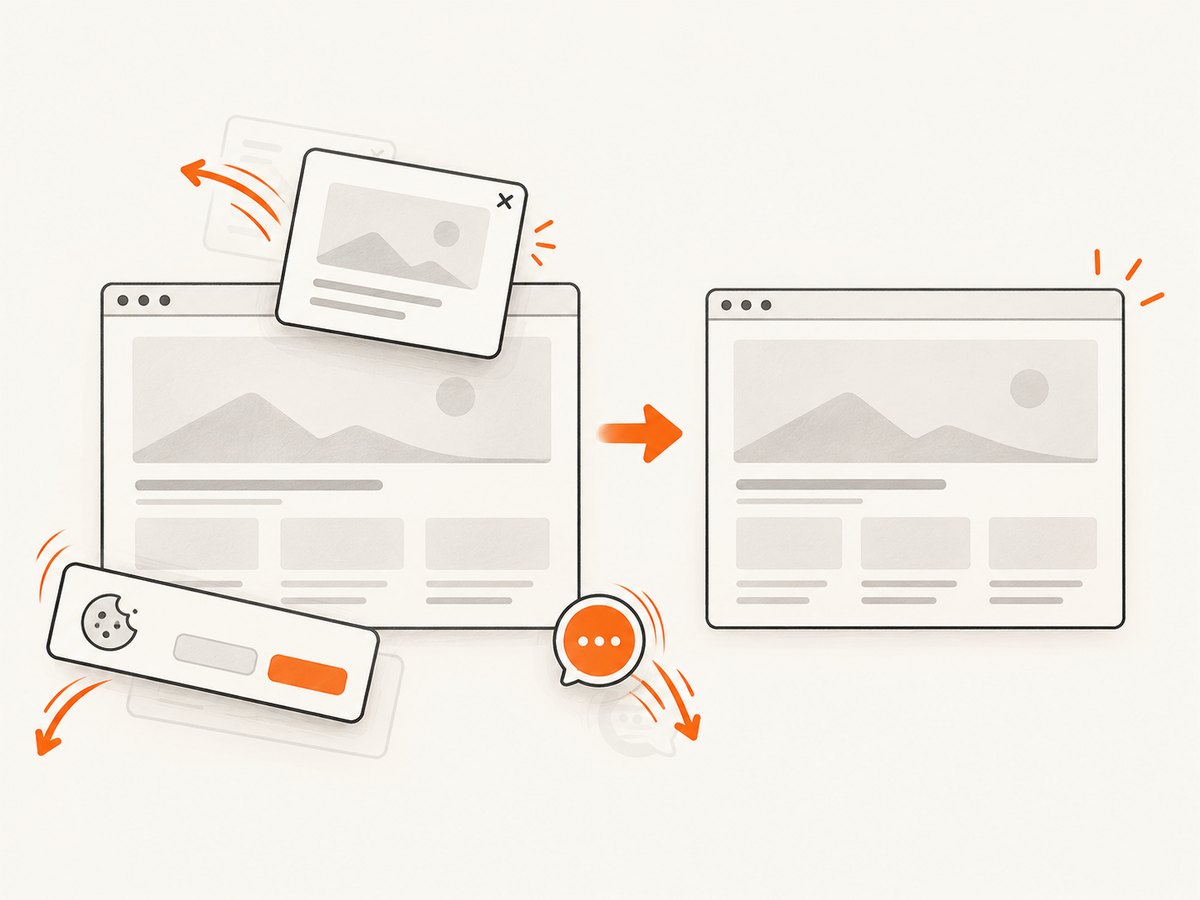
ScreenshotNeo provides a website screenshot API and MCP server. You still get a clean PNG, JPEG, WebP or PDF without maintaining Puppeteer and Chrome configuration. Before capture it accepts consent banners and removes more than 60 known consent platforms, newsletter popups and chat widgets; each step can be turned off. Bot checks, CAPTCHAs, blank pages, timeouts, failed loads and cache hits are not billed, and the response identifies the result with X-Page-Verdict and X-Billed headers.
See the complete option list and parameter reference in the ScreenshotNeo documentation.
cURL
curl -G 'https://api.screenshotneo.com/v1/shot' \
  -d access_key=YOUR_API_KEY \
  --data-urlencode url=https://stripe.com \
  -o shot.webp
Python
import requests

r = requests.get(
    'https://api.screenshotneo.com/v1/shot',
    params={'access_key': 'YOUR_API_KEY', 'url': 'https://stripe.com'},
    timeout=90,
)
r.raise_for_status()
open('shot.webp', 'wb').write(r.content)
Node.js
const q = new URLSearchParams({
  access_key: 'YOUR_API_KEY',
  url: 'https://stripe.com'
});
const res = await fetch(`https://api.screenshotneo.com/v1/shot?${q}`);
if (!res.ok) throw new Error(`Screenshot failed: ${res.status}`);
const data = Buffer.from(await res.arrayBuffer());
await Bun.write('shot.webp', data);
ScreenshotNeo also supports full-page and element capture, dark mode, device presets or custom viewports, retina scale, custom CSS and JavaScript, waits, request blocking, headers, cookies, user agents, authorization, timezone, geolocation, transparency, resizing, chosen cache TTLs, signed links, asynchronous jobs with signed webhooks, PDF options, bulk capture of up to 100 URLs per call, usage reporting and an OpenAPI specification. Its parameter names are compatible with those used by other screenshot APIs, which helps when switching.
An MCP server exposes take_screenshot, get_page_info and capture_pdf to Claude, Cursor and other MCP clients. The Free plan includes 1,000 shots each month without a card; paid plans start at $5 for 3,000 shots. Create a free ScreenshotNeo account.
10. FAQ
Does changing justify-content usually fix the mismatch?
Only when computed styles show that the value differs from the intended layout. First match capture inputs and inspect the flex overlay.
Should I always use deviceScaleFactor: 2?
No. Use the scale factor used by the reference image. The important property is that it is explicit and consistent.
Why does a full-page screenshot change a vh layout?
Some capture approaches alter or emulate viewport height while collecting the full document. Verify your Puppeteer version and compare with a fixed viewport.
Can headless Chrome guarantee identical pixels on every operating system?
No. Fonts, Chromium builds and rasterization environments can differ. Pin the environment when pixel comparison matters.
When should I use an API instead of Puppeteer?
Use Puppeteer when you need browser-level control or local debugging. Use ScreenshotNeo when you want a request-based capture, cleanup of common overlays, billing only for clean results and optional MCP access for AI agents.


